• STACKED
  • About Us
  • Categories
    • Audiobooks
    • Book Lists
      • Debut YA Novels
      • Get Genrefied
      • On The Radar
    • Cover Designs
      • Cover Doubles
      • Cover Redesigns
      • Cover Trends
    • Feminism
      • Feminism For The Real World Anthology
      • Size Acceptance
    • In The Library
      • Challenges & Censorship
      • Collection Development
      • Discussion and Resource Guides
      • Readers Advisory
    • Professional Development
      • Book Awards
      • Conferences
    • The Publishing World
      • Data & Stats
    • Reading Life and Habits
    • Romance
    • Young Adult
  • Reviews + Features
    • About The Girls Series
    • Author Interviews
    • Contemporary YA Series
      • Contemporary Week 2012
      • Contemporary Week 2013
      • Contemporary Week 2014
    • Guest Posts
    • Link Round-Ups
      • Book Riot
    • Readers Advisory Week
    • Reviews
      • Adult
      • Audiobooks
      • Graphic Novels
      • Non-Fiction
      • Picture Books
      • YA Fiction
    • So You Want to Read YA Series
  • Review Policy

STACKED

books

  • STACKED
  • About Us
  • Categories
    • Audiobooks
    • Book Lists
      • Debut YA Novels
      • Get Genrefied
      • On The Radar
    • Cover Designs
      • Cover Doubles
      • Cover Redesigns
      • Cover Trends
    • Feminism
      • Feminism For The Real World Anthology
      • Size Acceptance
    • In The Library
      • Challenges & Censorship
      • Collection Development
      • Discussion and Resource Guides
      • Readers Advisory
    • Professional Development
      • Book Awards
      • Conferences
    • The Publishing World
      • Data & Stats
    • Reading Life and Habits
    • Romance
    • Young Adult
  • Reviews + Features
    • About The Girls Series
    • Author Interviews
    • Contemporary YA Series
      • Contemporary Week 2012
      • Contemporary Week 2013
      • Contemporary Week 2014
    • Guest Posts
    • Link Round-Ups
      • Book Riot
    • Readers Advisory Week
    • Reviews
      • Adult
      • Audiobooks
      • Graphic Novels
      • Non-Fiction
      • Picture Books
      • YA Fiction
    • So You Want to Read YA Series
  • Review Policy

Cover Changes Round 3, or When Things Aren’t Getting Better

August 4, 2011 |

It’s been a while since we’ve talked covers here, and I thought it would be fun to look at some recent cover changes. Some of these are good, some are bad, and some are straight up strange. Without further ado.


I’m quite fond of the cover for Jennifer Donnelly’s Revolution. I like that it’s current and historical, which really speaks to the story itself. The half-and-half color and black and white set up is eye catching, and this stands out on the shelf. As much as I don’t usually like people on the cover, this one just works.

But then, it was changed.


I really dislike this change. The girl looks like she’s mid-sneeze, and why she’s pressing the key against a weird part of her face (not kissing it or rubbing it in some sort of sentimental way) is beyond me. Her fingers are also oddly similarly sized for being different fingers. I think this doesn’t tell anything about the story, and the cover is generic enough to match every other book cover with a girl’s face on it. And if we’re going to talk about the historical aspect being not represented here, we can, but I think that the heavy eye make up does that enough itself. Also, I don’t think this looks like a teenager at all. I’m also not a fan of the muted color scheme, as it isn’t eye catching at all.

The next two cover changes really irk me. As you know, I really dislike how YA books have shied away from featuring plus size girls on the cover, and both of these books have suffered from this syndrome in their hard cover versions.


Fat Cat by Robin Brande’s original cover isn’t bad, actually. I like the color combo, and I think that it stands out on the shelf because it’s not a girl, and because it’s purple and yellow. Even though it doesn’t feature a plus size girl (which the book does), I think this is an acceptable cover. It doesn’t have food on it, and it doesn’t have a skinny girl lying around pretending to be the main character.

Unfortunately, that changed in the paperback version.

Please, can we get anymore stereotypical? A bag of potato chips? The title spelled out in the chips (and an eaten apple — because let’s make sure there’s something healthy there, too). I hate this cover. It’s a total disservice to the content inside, and it does nothing but perpetuate the idea that I so greatly hate. This cover has a tag line on it which reads “How far would you go to change your life, win the science fair, and get back at the guy who broke your heart?” Not bad, but again, the image does nothing for that. Why did this cover need to change? The first one was pretty stand out, and now, it just falls into the trend that doesn’t need to continue being perpetuated. Honestly, there needs to be more said about this issue because raising a stink about white washing covers has caused things to change — why isn’t the same being done for fat washing? It’s not okay.

I’ve talked about Cherie Bennett’s cover for Life in the Fat Lane before. This is actually the reprint cover, as the original cover from this 1999 books looked like this. I hate this cover so much. It’s disgusting and triggering, and it’s completely unrealistic. Because anyone believes someone who pinches that little on her stomach is fat.

Unfortunately, the new paperback does no favors, either.


Did you guys know this book is about a 200 pound girl? Would you get that from this cover? That girl is, at most, 150 pounds (if she’s 8 feet tall, perhaps). This cover makes me irate in so many ways, and it’s again another wretched example of putting a skinny girl on a cover. Can I tell you something? If you’re a fat girl looking for a story about a fat girl and this is what the cover looks like, I don’t think you’re going to relate to the story at all. Why the hell would you want to pick it up? If you’re a 200 pound teen girl, you don’t look like that. You’re turning off your audience in one image. Let’s also talk briefly about the tag line: “It could happen to you.” Fat — and let me say this with emphasis — is not a disease you catch. Fat people can do stuff that not fat people can do. I know, right? So this book then aims to make readers feel bad about their bodies and that they don’t look like the 200 pound girl on the cover. Absolutely disgusting.

If you’re trying to reach a certain readership, and you present them with this image and that tag line, you are failing so hard. This is a complete wreck, and it’s really unfortunate, but the fact of the matter is, I won’t buy a book with a cover that so greatly distorts things and that aims to make readers feel BAD about who they are. Because you know what, that’s what this does. What a shame.

I have to admit to not reading this book because I am so turned off, but I should also say this: it doesn’t sound like a body positive book from the description. The girl begins skinny (perhaps that explains this cover?) but then packs on the pounds and gets to be a “blimp,” as the description on GoodReads says. Maybe the cover isn’t so far off. But then that begs the question of why this book is still in print and being pushed, since it’s clearly not meant to make anyone feel good, especially when the last line in the description considers fat girls a world in which to be “left alone.”


There seem to be two camps of readers: those who love Melinda Marchetta and those who can’t get into her. I fall squarely into the “can’t” side of the equation, and I’ve given her three goes before. Alas, I adore this cover for Finnikin of the Rock. It perfectly captures the fantasy of the story, and the colors and placement of the sword make this a stand out on the shelf. I love book covers that capture the elements of the story, and this is one of them. What else I like about this cover is that it sort of looks like there is a face in the background — you have to focus a little bit, but the red dot on the sword handle, combined with the way the tree branches bend at the top and the curve of red and black at the bottom sort of make a face shape.

And here’s the small makeover the paperback cover got:


This time, there really is a face! I think this makes the cover a little creepier, which still works quite well. What I find interesting is that they moved the placement of the title and the author on the paperback — the author went to the top of the cover and the title to the bottom (along with a blurb). The sword changed a bit too, now lacking the red that laced up the blade. The coloring is a tad bit different too; this one’s more muted than the hard cover, perhaps because of the addition of the face element. For me, both covers work quite well, and I think both speak to the content and they appeal greatly to the readership.


The cover for Karen Healey’s Guardian of the Dead has always been one of my favorites. It captures the story so well, and the image is hard to miss on the shelf. While it’s a dark cover, the white mask really speaks to the Maori legends at play in the story, and that, combined with the trees in the background and red title font, really do make it eye catching. There are a lot of pleasing visual elements here. Also, it’s just the right amount of creepy, too, to draw both fans of creepy stories and those who might not be sure if they do or not.


I do not like the paperback redesign, though. It steals away all of the awesome elements of the hard cover, and it instead gives us this washed out red person. The title font even loses its spark in the redesign, fading instead of standing out. While I understand the importance of having the Morris sticker on the front, for me, that’s the only thing that stands out on the cover. This is one that fades into the shelf space, and it tells nothing about the story at all. Why did they take away the mask? The trees? The awesome title font? The paperback cover is forgettable.


I’ve always had a love for Jon Skovron’s cover for Struts & Frets. I love the way that it’s set up like a sketch book, and the font for the title is so perfect. Even with a person on the cover, it’s still a knock out, as the person really gets to the story, I think. The color of the cover is striking, too: how many covers feature a neon green against red? This is a knock out.

And let’s look at the redesign — I don’t get why it was redone, but I like this one, too:


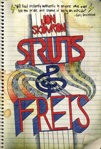
The same cool sketch set up, but this time instead of being stars from the center out, it’s just the notepad with a bit of a green hue to it. I love the treble in the middle, along with the streams of what I assume are meant to be sound. I dig the way the neck of the guitar plays into the title itself, which serves as the tuning peg. It’s very smartly designed and extremely appealing. I also dig the title font and coloring, as they mirror the original. I feel like this didn’t need the redesign, since the hard cover was pretty darn good, but this book lucked out because both covers are excellent.

The last cover redesign I want to talk about is one that came to my attention via Melissa Walker’s Cover Story post.


I completely adore this cover. I love the semi-faded title font and author font, and I love how the flag is the backdrop. All we get for people are the silhouettes. It’s pitch perfect in capturing the story, and it’s a cover that pops on the shelf. Stripes! They don’t get used enough in cover designs, and I think it’s effective here from that stand point and because of simply what it represents in the context of the story.

As Melissa’s post talked about, all of Reinhardt’s paperback books are getting a redesign to become more cohesive and easily identifiable. I like the idea of having authors have their books look like they belong together (from the publisher’s/author’s perspective, it’s branding) but for me, it’s about reader’s advisory and about shelving. I love when I can look at a book’s cover and know who I could recommend it for because it is reminiscent of other authors who are similar.


That said, I think this redesign takes away some of the elements that make the hard cover such a wow cover. This is pretty generic. Though, I think the fact it’s brighter than the hard cover does give into the hint that while this story is a bit of a tear jerker, it is ultimately a hopeful journey. And, too, it plays into the idea of the journey with the road and brothers walking together (though the taller guy from the back looks more like a dad than a 19 or 20 year old boy, doesn’t it?).

What do you think? Are any of the recovers better than others? Worse?

Filed Under: aesthetics, cover designs, Uncategorized

What I’m Reading Now, Twitter-Style

August 3, 2011 |

Most of these won’t be released until later in the year, but I like to give our readers a taste of what I’ve been reading lately. Look for longer reviews of some of these closer to publication date.

Silent in the Sanctuary by Deanna Raybourn

Lady Julia & Brisbane investigate a murder within the March home. Second book in series takes 200 pages to get going, but when it does, it’s just as good as the first.


Silent on the Moor by Deanna Raybourn

Third book in series finds Lady Julia dropping in on Brisbane for a surprise visit at his new home and stumbling upon a murder on the moor. Lots more romance in this one!

Tankborn by Karen Sandler

YA SF about humans grown in “tanks” and used as slaves by natural borns. From the first crop in Lee and Low’s new YA imprint – the story is good and the cover is a standout.

 
Blood Red Road by Moira Young

Saba is on a quest to find her kidnapped brother in a future wasteland. I’m struggling with the dialect & lack of punctuation, but I’m told it’s excellent so I persevere.

A Long, Long Sleep by Anna Sheehan

Five-star SF about a girl left in stasis & awakened 60 years later. So many delicious secrets & Rose is a great protag. This is the book Across the Universe wanted to be.

The Shattering by Karen Healey

Keri, Janna & Sione’s siblings all committed suicide, but they’re convinced it was murder. Slow-burning book that builds into something moving & utterly fantastic.

Wisdom’s Kiss by Catherine Gilbert Murdock

This MG has EIGHT POVs, all told in different ways (letters, diary entries, traditional narration, etc.). Result: no character development. Sadly disappointing.

Filed Under: Uncategorized, What's on my shelf

Twitterview: Carrie Harris

August 2, 2011 |

Welcome to another Twitterview here at STACKED. This month, we’re talking to Carrie Harris, debut author of the recently released zombie comedy Bad Taste in Boys (reviewed here). Carrie and I met while serving together on the 2009-2010 Cybils judging panel, and it’s been such a blast to be in contact with her as she’s prepared for and finally released her first book. She’s one heck of a busy woman.

Here, she’ll talk about her unique writing inspirations, what it’s like to be in charge of the Class2k11, and there’s a giveaway of a signed copy of her book at the end.

Pitch BAD TASTE IN BOYS in 140 characters.
Science geek learns that football players are taking steroids…that turn hot gridiron hunks into flesh eating zombies! Gotta find a cure!

What inspired BAD TASTE IN BOYS?
I got the idea after watching the movie Beetlejuice (with the dead football players) and reading Frankenstein. I love me some weird science!

Why zombies?
I like my monsters campy, and there’s nothing sillier than a bunch of shambling corpses. Especially if they’re on roller skates.

Why not vampires?
I don’t have anything against vamps. They are also funny on roller skates. If you don’t believe me, watch Fright Night Part 2.

Kate, your main character, is a geek in the best sorts of ways. Was she inspired by anyone/thing in real life?
I have some major geek-of-all-trades tendencies. Kate’s more of a dedicated science geek, but we do share that obsessive stubbornness.

What should readers walk away with from BAD TASTE IN BOYS?
Above all, I want them to have FUN. Sometimes you just need a laugh, & I think that’s just as valuable as books that say something profound.

Talk about your book trailer — how’d it come to be? Favorite moment in filming?
It was a labor of love for me and some fabulous friends. My eyes popped out of my head the 1st time Kate threw the zombie into the locker.

Biggest surprise that came up in the writing process?
The original bad guy got cut out of the manuscript entirely, and one of my favorite characters ended up being implicated instead.

What about the biggest surprise in the post-publishing process?
People cite things in the book that made them laugh–but it’s never the same thing twice! Sometimes it’s something I didn’t even find funny.

This is your first published novel. What’s been your experience as a debut novelist?
The kidlit community as a whole is SO AWESOMESAUCE! I can’t get over how nice people are, even when I’m squealing in their faces.

You’re also the president of the Class2k11. What’s that been like?
Tremendous amounts of fun punctuated with episodes of crazy making workloads. But ultimately one of the best things I’ve ever done!

You’ve been actively involved in the blogging community for a while — what’s been your fav blogging experience?
It was a heckload of fun to have Richard Simmons announce my book deal on my blog. Okay, so it REALLY wasn’t him, but close enough.

Who or what do you write for?
My goal is to crack myself up. I think if the writer’s having fun, that really shows & it can be infectious. Only not like a zombie virus.

Why do you choose write for a teen audience? Is it intentional or led by the story itself?
I haven’t really matured since junior high. At least not in terms of my sense of humor. So YA is really a natural fit for me.

Who are your top three writing influences?
Stephen King, Scooby Doo, and the Muppets. Honestly, everything I’ve learned about comedy, I learned from the Muppets.

Who do you believe is breaking ground in YA right now?
I went pretty crazy when I read BLOOD RED ROAD. It’s a voice that I honestly can say I’ve NEVER heard before, and that’s frawesome.

What’s the best writing advice you ever received?
Gwendolyn Brooks once told me to be myself. I’m not sure she realized “myself” was a monster-crazed snarf addict. But I run with it anyway.

What’s your best writing advice to give?
No way I can top Gwendolyn Brooks! I’m a monster-crazed snarf addict; what do I know?!?

What’s your writing routine?
Write whenever my kids will let me & sometimes when they won’t. I always reread a couple of pages before I leap in to get into the voice.

What gets you jazzed to write?
It’s FUN! At the end of the day, I think that’s the only and best reason to do it. If it’s not fun, it’s time to rest and come back fresh.

What’s next for you?
The paperback of BAD TASTE IN BOYS will be out next summer, followed by the next Kate Grable adventure, BAD HAIR DAY, in the fall!

Favorite ice cream?
Amaretto cherry, naturally. And now I’m hungry for it despite the fact that it’s 10 AM.

And most importantly, how would you survive the zombie apocalypse?
I married a ninja. That’s the ultimate in zombie survival techniques. I can hide behind him and yell helpful things like “AIM FOR THE HEAD!”

For your launch, you hosted “Night of the Giving Dead” to raise money for U of Michigan Hospital’s Giving Library. What inspired the idea?
Cynthea Liu did a similar launch party a few yrs ago. My husband is a cancer survivor and kids’ cancer physician, so it’s close to my heart.

How much did you raise for the event?
We raised over $7000 in kids’ books for the hospital. In many cases, that’s one of the only normal things these kids can do–READ!

Favorite zombie book and why?
Right now, I’m in love with HOLD ME CLOSER, NECROMANCER. It has potato hockey and disembodied heads and ZOMBIES. What’s not to love???

Favorite zombie film and why?
It’s a toss-up between ZOMBIELAND and SHAUN OF THE DEAD. I laughed so hard at them that it’s impossible to pick without my head exploding.

Last and most importantly: fast zombies or slow zombies? I’ll leave it at that for you to interpret.
Slow zombies! I like my zombies snarfy, and it’s hard to laugh when an undead blur is knocking you over and eating your liver.

Filed Under: Author Interview, debut authors, Giveaway, Uncategorized

Brooklyn, Burning by Steve Brezenoff

August 1, 2011 |

As a reader, one of the things I really enjoy about a book is reading about people who are nothing like me. A successful book can take me away from my world and transport me somewhere completely foreign, do it successfully and leave me with a sense of understanding and appreciation of different experiences and lifestyles. Steve Brezenoff’s sophomore ya novel Brooklyn Burning offered me just that.

A fire that began over a year ago at the old warehouse in Greenpoint, Brooklyn, is an open case. There’s no suspect in the crime, though many believe 16-year-old Kid has had something to do with it.

Who is Kid? Well, Kid is a genderless teen who lives sometimes in the streets of Brooklyn and sometimes in the basement of the bar run by Fish. Kid was madly in love with Felix, who took up residence in the old warehouse that summer. But when the fire happened, he disappeared. And now Kid is lost, shuffling among a few bar regulars who become friends, including Konny. The Konny with whom Kid has also been madly in love with; she doesn’t reciprocate the crush, though.

But this summer, someone new’s in town. Someone who, like Kid, struggles with identity and struggles to find a place to fit in. Scout quickly becomes Kid’s closest friend, but knowing what Kid knows about those who just show up for the summer, Kid’s cautious in pursuing a romantic relationship with Scout, even though there are real feelings developing between the two of them. But this might be the summer that things just change and Kid may have to come to terms with these feelings and may have to pursue one of the scariest things imaginable.

Part love story, part mystery, and part story of identity, Brooklyn, Burning was unlike any story I’ve read before. Although the description sounds a little convoluted, it can’t be explained any other way. Kid and Scout are both genderless in the story. We don’t know whether they’re male or female, and the importance of this is that it doesn’t matter one bit. Kid expresses feelings toward Felix and toward Konny, and as readers, we accept this. We have to accept this, as it’s the only way to understand why Kid chooses not to identify as either male or female, and it’s also the only way to understand why Kid develops such incredible feelings toward Scout.

This is not a quick paced book. It’s slow and deliberate, as we’re introduced to the life that Kid leads: there is little safe in Kid’s world. Although bar owner Fish lets Kid periodically stay in the lower level of the establishment, we know when the cops drop by the question Kid about the warehouse fire and to give Fish grief about serving underage clients that this living arrangement is unstable. It’s nothing that could be considered a real life. Kid’s mother and father aren’t in the picture either: even though Kid’s mother accepts the lifestyle Kid leads, Kid’s father does not. He’s delineated as downright angry, and in those brief moments when Kid does sneak time in at home, we know it’s extremely uncomfortable. We feel it right along with Kid.

Brezenoff develops an extremely sympathetic character in Kid, even if as readers we really do not get to know the character well. We know more about the circumstances surrounding Kid, but do we really know Kid? I’m not sure. And I’m not sure Kid would want us to, either. Being a teen with little stable in one’s life and with the knowledge that one’s gender identity is fluid, rather than solid is good enough. This flux is the heart of the story. We’re meant to accept Kid at face level and ride along as Kid’s accused of starting this massive fire and while Kid experiences the ups and downs of connecting with other people romantically. As readers, we bring our own experiences in love — both required and not requited — and we feel everything Kid goes through in deciding whether pursuing a relationship with Scout is worthwhile. The moments when Kid opens up to Scout are aching, as it’s here we not only get a sense of the greater context of the story but also of the immense uncertainty that exists in this 16-year-old’s life. Because we have to keep reminding ourselves that Kid is only 16, not an independent adult.

There is a lot in this story readers will latch onto, including the setting. I’ve spent no time in Brooklyn personally, and though I’ve read a few stories set in this part of New York City, the street setting here is palpable. It’s a minute setting without a huge setting, as Kid’s life really revolves within a few blocks; it’s Kid’s entire life encapsulated in this tiny niche within one of the largest cities in the world. The parallels are obvious, but they’re pretty powerful. For urban teens, this will resonate greatly, but even for readers in the suburbs or in rural areas, this still works. It gives them a glimpse into the city life but also offers the realization that even life in a big city can be small and isolated.

Then, there’s the mystery of the fire. Kid gives readers small insights into this aspect of the plot, but it’s never made a huge part of the story. Except, of course, it really is the story here: we know Kid knows something, but as readers, we’re as privy to this information as the police are. As the story unfolds though, and Kid becomes more comfortable with Scout (and with the fact Felix is not going to be coming back), we get more. It’s the big reveal about the cause of the fire that re-grounds the story in Brooklyn and re-grounds the story as one about gender politics. The pacing is spot on here, and the way the intricate strings of the story tie together here is well done without feeling moralistic or political and more importantly, it never panders to the readers.

I finished this book a couple of weeks before diving into A. S. King’s Please Ignore Vera Dietz and when I finished King’s book, I was immediately reminded of Brooklyn, Burning. Although the narrative structures and storylines aren’t the same, they’re fantastic read alikes to one another, as they tackle heavy issues of love, family, acceptance, and the importance of place. It’s a realistic story and one that throws readers into an unstable world, but one that ends with just the right amount of hope. My only real issue is that it might be a difficult sell to readers, given that the book’s difficult to describe succinctly without labeling it as one type of book. But I believe pairing it up with books of similar threads will be key to getting it in the right hands. Like always, it’s worth reading the author’s note at the very end, as well. Some of what’s mentioned there will answer your own and teen reader questions about the setting and about Kid.

Keep your eyes on this one next January. I think it has a real chance at recognition by the Stonewall Awards, a recognition for books that highlight LGBTQ issues.

Review copy received from the publisher. Brooklyn, Burning is available now.

Filed Under: Reviews, Uncategorized, Young Adult

Forgotten by Cat Patrick

July 29, 2011 |

Every night before sixteen year old London Lane goes to sleep, she writes a note to herself outlining the things of importance that happened that day: she found out about a test tomorrow, she wore a certain outfit to school, she had a fight with her mother. This is necessary because her memory is wiped while she sleeps, and she wakes up not remembering a single thing that happened before.

This is already a fairly tricky concept, but Cat Patrick makes her debut novel Forgotten even trickier. Not only does London not remember what happened in the past, she does “remember” what will happen in the future. So she’ll know the answers to tomorrow’s test today, but as soon as tomorrow actually arrives, she won’t even know there was a test scheduled in the first place – unless she leaves herself a note.

I don’t know if there is a way to tell this story and manage to avoid gigantic plot holes. Patrick doesn’t find a way to do it, but she’s still crafted a heck of an absorbing read, so I was able to suspend my disbelief a little more than I’m normally willing to.

Of course, there’s more to the story than just London surviving high school with her condition without anyone catching on. (Her mother and her best friend are two of the few people who know about it.) One day, London meets Luke, a cute boy at her school, but she doesn’t have any future memories of him. Knowing her condition, she concludes that this means she won’t ever see him again. If she did, she would “remember” it.

Except she does see him again. And she continues to see him, and even starts to date him, all without ever remembering him. There is clearly something different about Luke.

And then there’s that strange memory that keeps invading London’s mind – a memory of a funeral sometime in the future, where London sees a number of friends and family members and feels a deep sense of sorrow. Whose funeral will it be? And can London prevent the death from happening?

The twin mysteries of Luke and the funeral propel the story forward. London’s relationship with Luke is sweet – she manages to convince him she remembers him day after day by keeping meticulous notes of their conversations – although it does get a little tiresome to hear her remark on how hot he is every time she meets him. Frustratingly, and this may be a bit of a spoiler so stop reading now if you’re sensitive to that sort of thing, the mystery behind Luke is never fully explained. He does have a secret, but it doesn’t have anything to do with why London doesn’t remember him in her future – that part is never explained. I could get over so many of the other problems with the concept, but this one made me a little crazy.

The mystery concerning the funeral memory is handled better. I’ve read several accounts of readers being blindsided by what they perceived as a “twist” near the end of the book, but it seemed to me like a perfectly rational explanation for the clues Patrick had placed throughout the novel. I suppose what I mean is that I treated this book as much more of a traditional mystery than others may have – I expected there to be a major solution near the end and felt the answer Patrick gave us worked well. It was logical (within the context of London’s condition, at least), fit all of the clues, and packed a pretty good emotional punch as well.

Patrick has a real sense of urgency to her writing style, making this a page turner that I wanted to finish in a single sitting. She also gave me a good sense of London’s character – I felt like I knew her, and as a result I sympathized with her and rooted for her. Overall, Forgotten is a strong debut. Even less than careful readers will pick up on its problems, but it’s enjoyable and engrossing nonetheless.

Review copy picked up at TLA. Forgotten is available now.

Filed Under: Reviews, Uncategorized, Young Adult

  • « Previous Page
  • 1
  • …
  • 443
  • 444
  • 445
  • 446
  • 447
  • …
  • 575
  • Next Page »
  • Facebook
  • Instagram
  • Pinterest
  • Twitter

Search

Archives

We dig the CYBILS

STACKED has participated in the annual CYBILS awards since 2009. Click the image to learn more.

© Copyright 2015 STACKED · All Rights Reserved · Site Designed by Designer Blogs