• STACKED
  • About Us
  • Categories
    • Audiobooks
    • Book Lists
      • Debut YA Novels
      • Get Genrefied
      • On The Radar
    • Cover Designs
      • Cover Doubles
      • Cover Redesigns
      • Cover Trends
    • Feminism
      • Feminism For The Real World Anthology
      • Size Acceptance
    • In The Library
      • Challenges & Censorship
      • Collection Development
      • Discussion and Resource Guides
      • Readers Advisory
    • Professional Development
      • Book Awards
      • Conferences
    • The Publishing World
      • Data & Stats
    • Reading Life and Habits
    • Romance
    • Young Adult
  • Reviews + Features
    • About The Girls Series
    • Author Interviews
    • Contemporary YA Series
      • Contemporary Week 2012
      • Contemporary Week 2013
      • Contemporary Week 2014
    • Guest Posts
    • Link Round-Ups
      • Book Riot
    • Readers Advisory Week
    • Reviews
      • Adult
      • Audiobooks
      • Graphic Novels
      • Non-Fiction
      • Picture Books
      • YA Fiction
    • So You Want to Read YA Series
  • Review Policy

STACKED

books

  • STACKED
  • About Us
  • Categories
    • Audiobooks
    • Book Lists
      • Debut YA Novels
      • Get Genrefied
      • On The Radar
    • Cover Designs
      • Cover Doubles
      • Cover Redesigns
      • Cover Trends
    • Feminism
      • Feminism For The Real World Anthology
      • Size Acceptance
    • In The Library
      • Challenges & Censorship
      • Collection Development
      • Discussion and Resource Guides
      • Readers Advisory
    • Professional Development
      • Book Awards
      • Conferences
    • The Publishing World
      • Data & Stats
    • Reading Life and Habits
    • Romance
    • Young Adult
  • Reviews + Features
    • About The Girls Series
    • Author Interviews
    • Contemporary YA Series
      • Contemporary Week 2012
      • Contemporary Week 2013
      • Contemporary Week 2014
    • Guest Posts
    • Link Round-Ups
      • Book Riot
    • Readers Advisory Week
    • Reviews
      • Adult
      • Audiobooks
      • Graphic Novels
      • Non-Fiction
      • Picture Books
      • YA Fiction
    • So You Want to Read YA Series
  • Review Policy

Double Take, Part IV

May 29, 2009 |

This one just handed itself to me!

First, Dirty Laundry by Daniel Ehrenhaft, published December 30, 2008 by HarperTeen. This book follows the fledgling actress Carli as she prepares for her new role as a boarding school student and leaves her family and friends behind. Of course, she meets interesting characters in her new life and that leads to a number of interesting adventures. The story’s told through shifting narrators.


And….here’s the double take:


Cracked up to Be by Courtney Summers was published just a week before Dirty Laundry, on December 23, 2008 by St. Martin’s Griffin. The story follows Parker Fadley as she becomes secluded after a horrible event has left her feeling bad about herself. Although the description doesn’t give away a whole lot, it sounds a bit reminiscent of Laurie Halse Anderson’s Speak.

Cover-wise, both fit the story descriptions. They’re a little bit different, but again, being published a week apart from one another and with such similar covers, it’ll be hard for either to stand out on their own. Both covers feature the girl in her school uniform lying down (with her head to the left) and both feature a stack of books on her stomach. The cover for Dirty Laundry, however, doesn’t showcase the girl’s head or face at all and instead features her feet and shoes. The uniforms on both covers are different, even though they feature the same style of a plaid skirt, polo shirt, and cardigan.

So … which one did it better?

Filed Under: aesthetics, cover designs, Uncategorized, Young Adult

Blast from the Past!

May 26, 2009 |

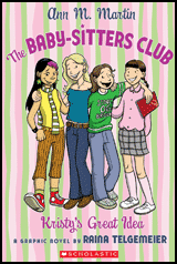
Did you have a favorite book or series from your youth you sometimes think about rereading? Well, if you’re like me and were enamored with The Babysitters Club right down to owning the movies and the board game, then you’re in luck. Not only are you in luck, but you’ll get to experience it in an entirely new way.

Scholastic has begun republishing the series as graphic novels. Although I am definitely biased and prefer the traditional text series, I think this is such a cool idea. Not only will it appeal to a new generation of girl readers who may otherwise find a lot of The Babysitters Club “old” (much like I did with The Bobbsey Twins), but it will definitely be a great series for those of us 80s and 90s kids who grew up with Kristy, Mallory, Claudia, and the rest of the gang.

You can preview the first few books here. Not only can you preview them, you can also partake in the quizzes to find out which babysitter you are (I’m Kristy). I’m kind of sad my favorite sitter, Abby, has yet to make the cut here. I’ll also confess here that one of the reasons I’m still fascinated with the series is that Ann M. Martin was indeed the first author I ever met (my mother let me miss a couple of hours of school to go see her in person back in 2nd grade!).


And if The Babysitters Club isn’t enough excitement for you, then hold your horses for this one. The Boxcar Children series — you know, the kids who solve mysteries — turns SIXTY years old. What better way to celebrate than to see the books being rereleased for a new reading audience to celebrate its inception more than half a century ago (WOAH!). You can check out the website here for more Boxcar Children fun.

Do you have a favorite series from your youth you’d love to see make a reappearance? I think it’s great that youth reading has gotten so good lately through not only strong promotion but through strong and interesting writers and stories. I’m just as excited to see these old staples of my childhood reappear, either in their traditional sense or remixed.

Filed Under: Favorite Picks, middle grade, Series, Uncategorized, Young Adult

Once Upon a Time in the North, by Philip Pullman

May 23, 2009 |

I’ve mentioned before how much I love Philip Pullman and his trilogy His Dark Materials, so it comes as no surprise that I went into reading Once Upon a Time in the North knowing that I would love it. A few years ago, Pullman published a little red volume called Lyra’s Oxford, a companion to the trilogy that told a short story about Lyra set a few years after the events of the last book took place. Once Upon a Time in the North is a similar companion book, a little blue volume that tells a sort of prequel to the famous trilogy, focusing upon Lee Scoresby (the aeronaut from the country of Texas – Mr. Pullman knows how to flatter us Texans!) and how he came to befriend the great armored bear, Iorek Byrnison. The story is essentially an adventure tale about a corrupt politician, a greedy oilman, a seedy bar, a few hired killers, two pretty but very different ladies, and the cowboy who gets embroiled in it all. It has a distinctive Old West flavor (despite being set in the far, frigid North) and is written with the considerable level of skill I’ve come to expect from Pullman. This book is a treat for fans of His Dark Materials, who finally get to see how two of the most pivotal characters met each other. It’s also heartwrenching at one point, when Pullman makes reference to an event that will happen much, much later.

The story is only about a hundred pages, so naturally it left me wanting more. Still, it was a good way to tide me over until The Book of Dust is published (hopefully sometime before I die), and I’ve read there will be a third little green volume that tells Will’s story.

While I love audiobooks, listening to these books on CD would be unconscionable. Once Upon a Time in the North is a beautifully-made book, and it’s chock full of “extras” that require hands-on reading. Aside from the short story, the reader is also treated to two letters from Lyra concerning her doctoral dissertation, snippets from a manual on aeronautics, beautiful woodcuts by John Lawrence, and an honest-to-goodness board game in a pocket at the back, which I am going to coerce someone to play with me very soon. It has thick, high-quality paper and is all wrapped up in a beautiful cloth cover. It’s a perfect complement to Lyra’s Oxford, which contains similar extras, including woodcuts by Lawrence and a postcard from Mary Malone. Instead of a board game, the story about Lyra features a beautiful fold-out map of the alternate universe Oxford in which Lyra lives (pictured to the right). I have always loved the tactile feel of a book, but these volumes take my love to another level.

I’m interested to see how libraries deal with books such as these. At the library where I work, the copy of Lyra’s Oxford includes the fold-out map, but the copy of Once Upon a Time in the North does not include the board game. My local library, on the other hand, retains the board game as well as the map for patrons. I haven’t been able to get my hands on the library copy, so I don’t know if all the pieces in the game are still there or if the map has been torn.

I’ve always loved the extras that books sometimes have. When I was very into epic fantasy as a teenager, I’d pick the book with the map on the endpages over the book without the map every time. I especially loved it when the author’s world was so intricate and detailed, it merited a glossary at the back. Is there a particular book you’ve read where the extras really enhanced your enjoyment? How does your library handle books with easily torn components or parts that are easily stolen/lost?

Filed Under: aesthetics, Fantasy, Reviews, Uncategorized, Young Adult

GIVEAWAY reminder!

May 23, 2009 |

Just a reminder that you have ONE WEEK LEFT to enter our giveaway. I will indeed be selecting 2 winners — the first winner will receive After the Moment along with a book in their preferred genre and the second will win one book in their preferred genre. There are only 10 entries so far, so your chances of winning are good! You can comment here or on the other post following the rules.

Filed Under: Giveaway, Uncategorized

Why covers matter

May 20, 2009 |

Although we’ve all heard the adage that you shouldn’t judge a book on its cover, I beg to disagree. I think that the cover is indeed an important attribute to a book and that you will judge it before reading it. Obviously, some covers will tell you more and some will tell you less (or nothing, as is the case with hard cover books missing their jackets). And not only do you judge the book, other people who may see you reading judge the book, too.

This isn’t something I thought about too much before taking my young adult materials course. We were reading Judy Blume’s Forever . . . which is one of those “classic” titles of teendom. Within my class of about 11 people, the currently available copy of book had three covers, and each of these covers portrayed something entirely different about the book.

The first:


What does this cover suggest? To me, it’s reminiscent of many titles currently on the market. It reminds me a lot of the Sarah Dessen or the Jennifer Weiner covers in particular. Sweet with a definite bent for teens or young adults. When I shuffled through the used books at the bookstore, this was the copy I chose because it was most appealing to me (and as I found out, probably most relevant to the story itself).

The second:


This one’s pretty basic as well. It’s very similar to the recent cover from Sarah Dessen’s Lock and Key (seen here). The cover doesn’t tell you much about the story, but it’s also discrete enough to carry around anywhere and no one will really know what sort of book you are reading. The first cover, on the other hand, definitely looks like it’s a teen book or a book for the younger 20-something crowd. This one could scream romance, I suppose, but since there are no pictures of people or places, it isn’t too obvious. Moreover, the benefit of a cover like this is that it allows the reader to imagine everything for themselves; the publisher hasn’t given us an idea of what the main character looks like. The downfall, however, is that the book’s physical appearance isn’t memorable.

The third:


What says steamy romance more than the trade paperback size, red cover, and envelope with a lipstick kiss? Talk about a totally different message than the first book cover; in fact, this cover screams everything that the first cover doesn’t — this isn’t a sweet romance but rather a hot and heavy lust-driven book. Obviously, that sort of cover appeals to an entirely different audience than the first, even though the book is the same. It seems to me that inevitably, one group of readers will be disappointed to discover that it’s not what they were lead to believe it is based on the cover.

The cover images, the font (notice the first doesn’t capitalize Blume’s name and the second uses a teen-ish style), and even the size of the book really do impact the reader’s sense of the story. Notice, too, how a cover often changes when the book goes from its first release in hard back to its second life as a paperback. I would love to ask people who read books that have different covers what impact that had on their reading.

I’m willing to bet that readers of Forever . . . see and appreciate the value all three covers have. For some readers, the story really can be a steamy romance like the third cover suggests while for others, it’s a sweet story like the first portrays. But which do you think that people would feel most comfortable checking out from the library? Bringing to a busy lunch room on break? Reading on the train? What do YOU prefer when it comes to a cover?

EDIT:

Janssen has convinced me that it would also be worth including these two covers still readily available at the library:

This one just looks very, very dated. I’m a big believer in the notion if the book’s circulating and still on the shelves decades after it was published, it might be worth spending a few dollars to replace it with a more current look. It might seen an entirely new life, too. This particular cover just reminds me of those Lifetime movies that came out back in the early 90s.

And finally:

Really, this one’s not out dated, but it does strike me as a book geared for adults more than teens.

Filed Under: aesthetics, cover designs, Uncategorized

  • « Previous Page
  • 1
  • …
  • 398
  • 399
  • 400
  • 401
  • 402
  • …
  • 404
  • Next Page »
  • Facebook
  • Instagram
  • Pinterest
  • Twitter

Search

Archives

We dig the CYBILS

STACKED has participated in the annual CYBILS awards since 2009. Click the image to learn more.

© Copyright 2015 STACKED · All Rights Reserved · Site Designed by Designer Blogs