• STACKED
  • About Us
  • Categories
    • Audiobooks
    • Book Lists
      • Debut YA Novels
      • Get Genrefied
      • On The Radar
    • Cover Designs
      • Cover Doubles
      • Cover Redesigns
      • Cover Trends
    • Feminism
      • Feminism For The Real World Anthology
      • Size Acceptance
    • In The Library
      • Challenges & Censorship
      • Collection Development
      • Discussion and Resource Guides
      • Readers Advisory
    • Professional Development
      • Book Awards
      • Conferences
    • The Publishing World
      • Data & Stats
    • Reading Life and Habits
    • Romance
    • Young Adult
  • Reviews + Features
    • About The Girls Series
    • Author Interviews
    • Contemporary YA Series
      • Contemporary Week 2012
      • Contemporary Week 2013
      • Contemporary Week 2014
    • Guest Posts
    • Link Round-Ups
      • Book Riot
    • Readers Advisory Week
    • Reviews
      • Adult
      • Audiobooks
      • Graphic Novels
      • Non-Fiction
      • Picture Books
      • YA Fiction
    • So You Want to Read YA Series
  • Review Policy

STACKED

books

  • STACKED
  • About Us
  • Categories
    • Audiobooks
    • Book Lists
      • Debut YA Novels
      • Get Genrefied
      • On The Radar
    • Cover Designs
      • Cover Doubles
      • Cover Redesigns
      • Cover Trends
    • Feminism
      • Feminism For The Real World Anthology
      • Size Acceptance
    • In The Library
      • Challenges & Censorship
      • Collection Development
      • Discussion and Resource Guides
      • Readers Advisory
    • Professional Development
      • Book Awards
      • Conferences
    • The Publishing World
      • Data & Stats
    • Reading Life and Habits
    • Romance
    • Young Adult
  • Reviews + Features
    • About The Girls Series
    • Author Interviews
    • Contemporary YA Series
      • Contemporary Week 2012
      • Contemporary Week 2013
      • Contemporary Week 2014
    • Guest Posts
    • Link Round-Ups
      • Book Riot
    • Readers Advisory Week
    • Reviews
      • Adult
      • Audiobooks
      • Graphic Novels
      • Non-Fiction
      • Picture Books
      • YA Fiction
    • So You Want to Read YA Series
  • Review Policy

YA Hardcover to Paperback Makeovers: Six to Consider

June 12, 2017 |

It’s been a minute since I’ve done a look at YA book cover changes. For some reason, I keep a massive list of them but can forget to actually write about them when I’m working on posts. Alas, I’ve put together two at once — the one here and one for next month — and hope to continue highlighting these with more frequency because I love looking and thinking about YA book covers.

As usual, some of these changes are great and others are less so. I’d say on the whole, this round falls a little more into the “less so” category for me, but I suspect some of you might feel differently. As always, I’d love to hear what you think, which covers you prefer, and what cover changes you’ve seen lately that have caused you to pause and think.

Original covers in this round-up are on the left, with the redesigns on the right.


Kids of Appetite by David Arnold covers


Kids of Appetite kicks off this round of cover changes and I have to be honest: I dislike both covers. Quite a bit, in fact. The hardcover looks to me like it’s not only trying too hard, but also that it’s doing too much. The text takes up a significant amount of real estate, and a good portion of that is a tag line that doesn’t seem to add much. I’ve never been a huge fan of illustrate covers, and this one is no exception. As nice as it is to see an inclusive illustration, none of the characters have any personality since we’re only able to see their backs.

The paperback takes what the hardcover did and turned the kids into telescopes. One of them even has on a scarf which kills me. It’s trying so hard to be clever and literary. More, the paperback redesign takes on a new trend from this particular paperback imprint that I’ve not been fond of: it’s making the paperback cover into two pieces, wherein the design is on top, with an underlaid cover that has praise all over it (in redesigns like the one for Jeff Zentner’s The Serpent King or Jandy Nelson’s I’ll Give You The Sun, one of those cover pieces is simply a quote from inside the book, which literally tells you nothing about the book). These kinds of choices scream adult audience, serious literary business. And if that’s the angle, then it’s succeeding, but….it’s not a YA look. What the paperback does have going for it, though, is the lessening of text. The title and author look much better on this one. It’s also interesting that they not only cut the tag line, but they also got rid of “bestselling” before “author of Mosquitoland.”

Neither of these covers really does it for me. If I had to pick one, though, I’d likely go hardcover, if for no reason other than it features at least two teens of color on it.

Kids of Appetite by David Arnold will be available in paperback on September 5.


ten things we did by sarah mlynowski cover change


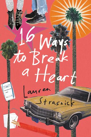
The original cover for Sarah Mlynowski’s Ten Things We Did (And Probably Shouldn’t Have) came at the same time we got the original cover for Siobhan Vivian’s Not That Kind of Girl. They feature the same couple in slightly different positions. Back in those olden days of YA in 2011, covers with people on them were all the rage. On the right, though, we have a brand new edition of Mlynowski’s title in paperback that seems to follow the conventions of 2017 design: illustrated and, as I’ve noticed in a number of “lighter” YA titles, totally covered in stuff. See, for example, Lauren Strasnik’s 16 Ways to Break a Heart. Maybe it’s the color choice, but the new Ten Things cover looks really middle grade leaning to me, despite the fact the cover does feature a wine bottle, red underwear, and other items that one wouldn’t associate with middle graders. It is also certainly not a middle grade read in terms of content.

This is a tough one for me, since I don’t especially care for either of the covers. It is interesting to note that the new design denotes that Mlynowski is a New York Times Bestselling author, whereas the original hardcover has a blurb from Sara Shepard. Neither of the covers really do much for what the book is about; I almost wish that the Strasnik design scheme was what we saw for this particular cover, as that might make it feel more appropriate or appealing.

Ten Things We Did hit paperback in its new look June 6.


amy chelsea stacie dee cover change


How about before saying anything about these covers, we pause and just appreciate how different the stories these covers are telling? And yet, what I love about both of them, is they both convey a sense of something Not Good happening. Amy Chelsea Stacie Dee in hardcover looks like a pretty solid horror novel. The doll face is creepy, and it’s made even creepier by the dirt splotches on the doll’s face. The title fonts work pretty well, too, as they’re sparse and it’s really the face of the doll which stands out on the cover. As someone who likes scary, this cover would be enough to make me pick it up.

The paperback edition, though, is also pretty damn good. I think that maybe the hair strands on covers could become cliche very quickly (there’s at least two others that I know of for 2017 alone, including the new E. Lockhart) but on this cover, it certainly does something interesting in conveying the idea this book might be more thriller than horror. The color differences on the hair locks is notable, as is the small pink bow. Like with the original hardcover, there’s a careful use of fonts with the title, wherein both “Amy” and “Dee” are in the same design and “Chelsea” and “Stacie” are in an alternate font. What I don’t like about this cover, though, is the use of the tag line. I think the effect of the cover is lost a bit in there being too much text on it now. Were it gone, the starkness would speak volumes.

Each cover tells a different story about the feel of the book — the one on the left is certainly horror, whereas the one on the right conveys thriller or mystery. I think both work, though as someone who hasn’t read this book, it’s challenging to discern which one is more fitting for the story. But in considering which might make me pick up the book….both actually would catch my eye enough. Perhaps the one on the right is geared a little more toward adult readers than teen readers, but it’s hard to say.

The paperback for Mary G. Thompson’s Amy Chelsea Stacie Dee will hit shelves October 3. It might hit my own TBR a little sooner than that.


unnatural deeds cover change


Unlike the previous set of covers, I don’t necessarily think the design change for Unnatural Deeds by Cyn Balog offers up anything different. The two images are even almost exactly the same in where they’ve been placed on the cover: dead center. On the original hardcover, we have a pair of scissors cutting a flower, while on the right, we have a take on the “moth to a flame” cliche (just, you know, a butterfly to a lightbulb without any shade on it). The font on both covers feels somewhat uncreative, and it bothers my eyes a bit that the paperback font is not an even size between “Unnatural” and “Deeds.” I also find the fact that part of the word “Unnatural” actually clips the lightbulb to be bothersome. Or maybe it’s the fact that it looks like the lightbulb was slightly altered to allow the title to fit?

An interesting difference between the two: we lost the blurb on the paperback edition. Both still feature the tag line — and neither image really captures the idea of needing to kill to protect. In a lot of ways, these feel like safe images for what sounds like a murder-y type read. Although the cliched nature of the paperback bothers me, there’s something about the black background that works much better than the odd, bottom-of-the-river green on the hardcover.

I can’t say I love either of these nor feel they’re particularly fresh. That said, I suspect teen readers might feel differently, especially those who know what kinds of covers to look for for the types of books they love to read. What’s cliche to me as an adult can, and does, often not feel that way to teens, in part because they haven’t seen it enough to be tired by it. If I had to pick one cover doing it a bit better, I’d go with the new paperback, though I really hope that title font gets fixed. Kirkus called this a “PG-13 version of Gone Girl” and I think we get that more with the paperback, too.

Unnatural Deeds will hit paperback on November 1.


the memory of things by gae polisner cover change


I don’t think I have a cover change I like more in this round-up than this one. Gae Polisner’s The Memory of Things is a 9/11 themed YA novel, and the hardcover made that super clear. The “I” in the title there was masked as the Twin Towers, kind of, if the Twin Towers were uneven in their size. The color of the original was a bright baby blue, and the image in the background of a white angel absolutely popped. But, aside from the small use of the Towers in the title font, the cover didn’t say much other than maybe it’s a book about angels. Despite having enjoyed Polisner’s previous books, there was nothing about this cover that really spoke to me, other than appreciating that it’s pretty sparse.

It’s interesting how much a YA book cover not filled with blurbs or tag lines can stand out for that alone.

The paperback edition of the novel doesn’t make the 9/11 connection clear, and in a lot of ways, that’s of service to the book. The yellow color pops and is fresh, and the image we see is that of a cityscape. As a non-New Yorker, this image doesn’t exactly place me in that city, though it does place me in A city; I think this is a hugely positive thing, as it will appeal to a larger range of readers who, like me, can tire of the same New York City story (I tend to think sometimes New York City publishing forgets that not everyone cares about NYC….growing up, all anyone ever wanted to do in my town was get to Chicago, and though we’re seeing more Chicago-set books now, they’re still few and far between). The almost generic feel of the city here, though, works really well, and I appreciate how the color and saturation of the image actually work against the yellow background. More, that font! The font itself tells a story in a way that the original didn’t. Like the hardcover, the paperback is clean, clear of extra text, and I think it literally pops from the screen and will pop from shelves.

No question, the paperback is the big winner here for me. It hits shelves on August 29.


salt to the sea cover change


Finally, here’s the paperback makeover for Ruta Sepetys’s Salt To The Sea. The original cover tells a pretty powerful story. It’s clear, at least to me, this is a historical fiction read, and there’s something to be a big element of survival to it. The color saturation and the lines in the image itself are powerful. It has a cold feeling to it, and there’s always something neat about a book cover that makes you feel a sensation just by looking at it.

What the original cover has that’s kind of annoying: so much text. Not only do we have the blurb from the Wall Street Journal review, we have a note that it’s by an international bestselling author of another book and that the book itself is a New York Times Bestselling novel. Do teen readers care? I don’t think that they read those blurbs and are suddenly moved to pick up the book. But alas, I’m curious about how much the teen appeal is in consideration.

I say that because the paperback book is not, at least in my mind, for teen readers. The cover is very adult historical fiction, and it also tells absolutely no story except that there might be people who died, as represented by shoes. I think the tag line also conveys that, and it’s a tag line that isn’t on the original hardcover. But at least we lost the other text in this rendition.

As noted before, notice how the paperback edition of this book is two-fold: there’s the cover, and then there’s a bigger cover beneath it, like with Kids of Appetite. This isn’t a particularly library friendly style, though it is a style that really screams Literary Fiction Adults Will Like. In this case, we lose the cool of the blue water and we now have a green hue to it. Though it is, without question, a pretty and appealing cover, it doesn’t tell nearly the story the hardcover does. Nor, do I think, does it care about reaching teen readers. None of those shoes even look like they’d belong to a teen (we have children’s shoes, as well as what appear to be a pair of shoes from an adult couple).

Hands down, for me, the hardcover does it better. I wish it had about half the text it has on it, but it gives so much more feeling and emotion, and I think it appeals far more to the audience for whom it was published (if YA is for teens, of course, which is in and of itself a debatable suggestion).

Salt To The Sea hits paperback on August 1. Interestingly, as I looked up the pub date on Amazon for this one, it was quoted as being great for readers who loved All The Light We Cannot See…another adult-aimed read.


Filed Under: aesthetics, book covers, cover design, cover designs, Cover Redesigns, Cover Trends, ya, ya fiction, Young Adult, young adult fiction

6 Upcoming YA Hardcover to Paperback Cover Makeovers

February 27, 2017 |

Book covers are one of the most important marketing tools for a book — it’s what makes a reader who knows nothing about what is inside pick it up and look at it. A good cover sells a story, which sells a book. A cover that isn’t as good can make an otherwise solid story be overlooked in favor of a better, more appealing cover.

One of my favorite things to do is see which books get new covers when they’re released into paperback. It used to be that the hardcover books were the covers that sold to libraries and schools, while paperbacks were the ones to appeal to bookstore shoppers (in YA, that would be your teen readers). This isn’t necessarily the same, as hardcovers have just as much shelf potential in stores to make a splash in their initial releases. But we also all know that there’s a lot of power in what covers get the okay to make it to Big Chain Bookstore shelves.

Here’s a look at six YA books getting new looks in paperback. Some of these are standalone titles. Some are part of a series. Some are reissues of titles that have become classics. It’s interesting to look and see what the changes might suggest about how the book is being angled. In some cases, the paperback does it better; in others, the original cover is the clear winner. And still in others, they’re about the same.

As always, I’d love to hear your thoughts on these changes. Anything you like better or like less? Any other recent changes you think are worth talking about? I’ve been keeping a list, of course, and just pulled these from the top; there are so many other ones that have recently hit or will be hitting soon.

Covers on the left are the original; covers on the right are the reissue/paperback.


Cherry hardcover:paperback


Lindsey Rosin’s Cherry was one of my favorite reads last year and one that’s criminally underrated. The original cover, with its cherry lipgloss image, really did kind of capture the vibe of the book. It’s girl-positive, girl-friendly, and the tag line is the perfect wink-nudge that this is a book about sex. I mean, of course the title helps with that, too.

That said, it’s not particularly memorable as a cover on the shelf. It’s white with a light pink, and it could easily blend into so many other books.

The hardcover goes a little bolder, while still keeping that wink-nudge. This time, we have a cherry ice cream pop, with one bite out of the top. It’s a bolder pink color, and the title within the pink sets it a little bit apart. The tag line being put at the outside of the bite draws eyes in; there’s a psychology in how our eyes take in an image, and it’s a reverse-6. You start at the top left, then your eyes go out and down, then back up. This design utilizes that backward 6, as your eye is drawn to that tag line, then down and around. The bright green for Rosin’s name is a nice touch, too. There’s something crisp and fresh about it. The only thing I don’t love about the cover is that I’ve seen it before (Jenny Han’s Shug, Ibi Kaslick’s Skinny, and so forth).

The paperback ekes out the hardcover just a tiny bit for me. The redesign will hit shelves on August 15.


absolutely true diary of a part time indian hardcover paperback


In some ways, it’s hard to wrap my head around the idea that Sherman Alexie’s The Absolutely True Diary of a Part-Time Indian is ten years old. In other ways, though, it feels like a book that’s been around much longer than that, and neither of those statements are about the quality of the book. I picked this one up in my YA lit class in graduate school and fell in love with it, and it’s remained a go-to book rec (and best seller and regularly challenged book…) for a reason.

The original cover is iconic and memorable. It’s impossible not to connect the toy cowboy and indians to this book and the way they’re positioned on the cover expresses a lot about the cultural issues in the story itself.

But that paperback anniversary edition is hard to ignore, too. Maintaining those two plastic toys, their colors have been removed and replaced with a solid green and, like the original cover, Alexie’s name takes up the most real estate. But rather than sticking with the original font choice, it’s been flipped with the title font from the original design. It’s enough of a difference in design to be noticeable and yet, it’s also similar enough to pay homage to this book being a modern classic of YA lit.

Both covers are great and represent the book well. Both have good reader appeal, though I do wonder a bit if the paperback, with its emphasis on Alexie’s name (taking up more than half of the book) is a bigger appeal to adult readers than to teen YA readers. Perhaps it’s also worth noting that the reissue is a hardcover edition, which, while more expensive, means that it can continue to be part of the New York Times Bestsellers list *and* make for an excellent replacement copy for those well-read, well-loved library copies.

The 10th anniversary edition of Alexie’s book will be out October 7.


rebel of the sands hardcover:paperback


When books change cover in the middle of a series, it’s always a reason to pause and consider why the change was made. Was the book not selling? Did another book hit shelves around the same time with a look that might do better with intended readers? I think in the case of Alwyn Hamilton’s Rebel of the Sands, it’s a little bit of the former, laced with the fact that the original hardcover looks a lot like a retelling of 1001 Nights (which itself has been a trend in recent YA past).

On the one hand, the original cover is striking. It’s illustrated and gives a great sense of place. The paperback, on the other hand, screams “this is a read alike for Sarah J Maas” and any other number of recent fantasy series books with female leads. But oh, it’s boring. There isn’t anything particularly remarkable about the new cover, save for the fact we’ve dropped the tag line from the hardcover and instead included a blurb from Rae Carson — a likely good addition for readers who love her work and are looking for something similar.

Something about the paperback makes me uncomfortable, and I can’t quite put my finger on what it is. It’s such a drastic change, maybe, and/or perhaps it’s the use of coverings on a model that suggest a religious practice which the book itself doesn’t seem to take on. Maybe it’s a little of both.

Neither of these are particularly great, but on a personal level, the hardcover catches my eye far more than the overly dark paperback. But for teen readers? I suspect it’s likely the opposite.

Rebel of the Sands came out in paperback on February 14.


Scarlett Epstein Hates It Here Hardcover:Paperback


Another one of my favorite 2016 reads was Anna Breslaw’s hilarious and unshy-about-its-feminist-agenda Scarlett Epstein Hates It Here. And this is one of those cases where, I think, both of the covers do the book good justice and for about the same reason.

The hardcover on the left is fun. It’s a bright green color, which makes it stand out on a shelf, and further, there’s a geeky-looking Jewish girl at the center (if you’ve read the book, you know Scarlett is Jewish and while a reader who hasn’t read the book might not know, the model on the cover might be a good suggestion of that). The sketches are a fun addition, too, as they sort of highlight the idea of fandom, the fact that Scarlett lives in New Jersey, and she has a sense of humor. I’m a big fan of the font for the title, too.

The paperback goes a little further in highlighting Scarlett’s Jewish descent. It’s set up like a high school class photo, and the expression on the model’s face is precisely what I suspect Scarlett would do in many of the situations in the story. The plain striped shirt makes this cover have a timeless feel, which, while a strange thing to think about, is not — style of a model on a book cover can quickly date the cover. The wink-nudge to fandom is right there, too, with the comic bubbles for the second half of the title, as well as the drawn-on sunglasses over her face.

It’s interesting to note that the blurb for this book switched in the makeover: we went from a blurb from another author to a blurb from Buzzfeed. I have a suspicion that the Buzzfeed blurb will likely speak to teen readers in a different way than one from DC Pierson. Also of interest: Scarlett’s name continues to be in a script-like font, but the “S” in her first name flips the loop. Rather than going from the bottom curse of the “S,” it comes from the top.

Both are fun covers and both capture the feel of the book. The paperback will hit shelves on March 28.


the museum of heartbreak hardcover:paperback


When the publicity for The Museum of Heartbreak reached its peak last spring, I think I was getting an advanced copy every week or so. I know I ended up with a pile of them. But nothing about the cover, as cute as it was, compelled me to pick it up. There was a lot going on, and nothing told me what it was about. Was it a book about collecting things? With “Museum” in the title, I felt a weird disconnect with what was clearly a small shelf of trinkets.

Don’t get me wrong. The dinosaur is super cute. And there’s a random ferris wheel, a bizarre thing we see periodically on YA covers for some reason. Romance, maybe?

The paperback edition of this book, though, tells me a hell of a lot more about what’s inside. This is clearly a romance in some capacity. And while it’s again not showcasing the idea of a museum, the broken paper hearts suggest that there might be a collection of some sort going on. More, the title on the paperback is much more prominent and obvious than it is on the paperback.

In many ways, the hardcover original looks like a middle grade novel. Again, I think it’s the assortment of trinkets, which, in text, wouldn’t feel the same way as it does in an image. The paperback, though, screams YA novel. It might not be the most original, but it does suggest far more about the content, as well as the ideal readership.

The paperback wins for me, though I absolutely see where readers would wholly disagree and love how unique the hardcover is. The Museum of Heartbreak‘s paperback hits shelves on June 7.


three truths and a lie hardcover:paperback


I saved my favorite cover redesign for the final one in this round-up, which I suspect spoils the cover change I think was the best. Brent Hartinger’s Three Truths and a Lie is another one of those books I got a few copies of and didn’t pick up. The cover told me absolutely nothing except the title, which is a game that we’re all familiar with and become familiar with as teenagers (how many times did you have to play this as an ice breaker in a room full of people you don’t know?). I had no idea what genre the book was in, except that it was a bit of a departure from Hartinger’s other books.

And then I saw the paperback and suddenly, my interest in the book skyrocketed.

This is a thriller. Set in the woods. It’s going to have horror vibes. And that tag line is an absolute knock out — “It’s all fun and games . . . until someone gets killed.” These sorts of thrillers are my favorite, and without the change in covers, I’d have had no idea. I suspect the same will be said among other readers, both because they’ll understand the book’s genre and want it as soon as possible OR because they’ll understand that it’s squarely Not A Book For Them.

Readers who keep tabs on these things would likely know that this was a 2017 Edgar Nominee, meaning it’s up for consideration as one of the best YA mystery books of the year. But again: without much cover indication, even with the gloomy rain background, it would be a hard sell to readers.

On more shallow notes, I love the richness of the color, the way that it’s a reflection on the water (one of my favorite photography techniques). I love how small the title is, which gives that looming sense of doom and fear with that image. Everything about this paperback redesign works. 

The paperback hits shelves on August 1. And honestly, I might pick it up before then, if for no other reason than the paperback told me what it was about, and I’m sold.


Filed Under: aesthetics, cover design, cover designs, Cover Redesigns, ya, ya fiction, Young Adult, young adult fiction

Hardcover to Paperback YA Book Cover Makeovers, Wow There Are A Ton Coming! Edition

July 18, 2016 |

As I’ve gently suggested in the title of this post, there are a lot of hardcover YA titles getting new looks — and new titles — in their paperback editions. A handful of these are available now, but most will be hitting shelves in the near future. This isn’t even a comprehensive look at the ones I’ve noticed lately; I picked the ones that seemed like they had a lot to talk about or think about in regards to design and the changes made on the covers.

Some are winning looks and some are far less so. As always, I’d love your takes on these redesigns. Which ones are working for you? Which do you think appeals more to a teen readership? Which nails the content better? Tell me your thoughts and if you’ve seen any recent cover makeovers that are worth looking at, leave me those titles, too.


A Step From Heaven


A Step From Heaven won the Printz award in 2002 — one of the first books to receive the honor. It’s been in publication since then, but it’s had the same cover. It’s not at all a bad cover; it’s pretty straightforward and clearly a girl of East Asian descent. There is a real timelessness about the whole package, in that it doesn’t use a fancy font-driven style nor use illustration or a full stock image of a girl in clothes that could date it. It seems pretty clear there’s a reason this book’s cover has been around as long as it has.


This month, a reprint of the book is coming and it’s getting a makeover. Much as I think the original is a real solid cover, the redesign is beautiful. There’s a celebratory feel to it, and in many ways, the teen rendered in this image looks much older than the girl in the original image. The font selected for the title is really pretty and dreamy, which, along with the floral design surrounding the model, does give the book a contemporary, moody feel. I have a feeling this new package will absolutely introduce the book to a new generation of teen readers, and I think it’s the kind of repackage that might make librarians and teachers look at the conditions of their current copies and consider replacing.


I’m also a big fan of the lack of blurbs or praise on the new cover, aside from the obvious medal honors. That makes it feel timeless, too.


All We Left Behind


I remember reading the description of Sundberg’s debut All We Left Behind last year. It was compared to Courtney Summers and Ellen Hopkins, suggesting it’s a gritty and raw contemporary YA. I never got around to picking it up, since it was a big read — if I’m remembering, it was 400 or so pages, which is a big investment for a contemporary YA novel (I’m really picky about that, as anyone who has been around here a while will know). So imagine the surprise with that image of the book in my mind when I saw the redesigned cover.


The paperback is so light and airy. It reminds me of a summer-y, light read, even with the title — or maybe even because of that title. It’s an entirely different feel than the original cover which, while pretty generic, has some of those gritty elements going for it. Look, for example, at the fact we actually see an exposed bra strap on the hardcover. It skirts the line of sensual and sad in a way that doesn’t feel gross but instead really gives a sense of the content inside.


That paperback, though, might be the most generic thing I’ve seen in a while. It’s not bad, but it certainly tells me nothing of the book, and in a lot of ways, it looks like a cover that could be swapped onto any number of other books with the same forgettable effect. If this book really is raw and gritty, imagine the surprise readers, especially teenagers, will find picking up this cover and expecting a lighter book. I’ll take the hard pass on this one.


All We Left Behind will be available in paperback December 6. The original, if you’re interested, published in December of last year, which may be why it sort of fell off the radars of many readers.


ghost house


Now for the first book in this list that’s not just getting a cover makeover, but a title makeover as well: Alexandra Adornetto’s Ghost House, aka Lament in paperback.

First, the hardcover: it’s not bad, but it’s also not especially remarkable. There is a nice eerie feeling to it, conveying the fact this is a horror novel. The guy in the center of the image is dressed a little bit like he’s a member of an elite class, perhaps maybe even of a slightly different time period than the present (though the long hair may be what keeps that from reading 100% that way for me). The font for the title and author’s name are pretty standard, though the purple hues of the cover are nice. There’s definitely a spooky tone set by this cover. And of course, the title Ghost House helps that along.

The paperback goes for ye-old paranormal romance standards. In fact, I initially thought this was a new Lauren Kate book, since it takes the same white girl in a dress with a one word title with some swirly styling motif. No longer does this book read horror; it reads as straight-up paranormal romance. Good on the designer to note clearly that the book has been retitled, but the thing I cannot get over is the girl’s face. It’s a weird “come hither” look to it, which doesn’t showcase any fear or trepidation, despite the fact she’s alone in the woods in a fancy ballgown. Not to mention the fact she certainly doesn’t look like she’s lamenting anything. I don’t get it — there’s a big disconnect going on.

But if the goal is to get it into the hands of Lauren Kate fans, well, then that paperback is a big winner. Otherwise, it’s absolutely forgettable.


Lament will be available in paperback on August 30.


School For Brides


The most interesting thing to me about the paperback redesign of Patrice Kindl’s A School for Brides is the tagline modification. The hardcover on the left originally notes that these are girls looking for husbands in a town without any men. The paperback? No longer are they looking for husbands, but rather, they’re looking for eligible bachelors in a town with no men.

I have no idea which of those I think is “better,” per se, especially to a YA audience, but I think the change is noteworthy nonetheless.

And I think the reason I’m uncertain is because this book is the right book for the right reader, meaning that the readers picking this up know exactly what they want in a historical fantasy novel, and whether it notes these are girls looking for husbands or eligible bachelors (which sure makes it more contemporary than historical) doesn’t matter a bit.

From a design standpoint, both books deliver what you’d expect tone and topic wise. I love the use of white space and the various different blue and purple-y hues. There’s a nice moodiness with that sort of minimalism. The paperback might fall more on the fun side, though — I love the various images of the girls at this particular institution wearing different dresses, enjoying tea, writing letters, and so forth. If I had to pick one as more along my taste preferences, it might be the paperback, but because this is a book with a clear sense of readership and audience in design, I don’t think one is better than the other.

You can pick up the paperback edition of A School for Brides right now.


Wildlife


Six Impossible Things


This is a two-for-one makeover, and if I could say that both of these redesigned covers are among some of my favorite YA covers currently on the market, I will. Wildlife and Six Impossible Things by Fiona Wood were originally published in Australia and they were brought to the US in the last two years. Overseas, they were published in this order: Six Impossible Things, followed by Wildlife. In the US, they flipped the publications, since these are companion novels that can be read either way without losing anything. Rather, it’s one of those situations where you read one and when you see the recurring characters, you get excited, rather than feel you need more backstory.

The hardcover editions of both books feature couples. They’re stock images, and in both sets, the models look like actual teenagers (which is surprisingly refreshing). It was a little disappointing to see the stock image choice for Six Impossible Things focus on the girl, since this book is 100% from a male point of view, something that could be easily missed with a cursory glance of the image. The font stylization for both the hardcovers, though, are fabulous — there’s a nice ombre effect with natural settings being the background to them.

But those paperbacks!

I love the use of real images on them, as well, and I love how they give such a unique feel to each of the books. Wildlife has a lushness and a crispness to it, and it really captures the nature setting of the book (it’s set in a school outdoors trip). Using the same leaf shape to include the title and author’s name was a smart way to break up the repetition and make them stand out. The use of different colored keys for Six Impossible Things also makes it stand out, in addition to being a way that doesn’t put a girl at the center of the book’s cover. The use of one key as a drawing to mimic the same idea from the title/author styling of Wildlife is smart. But perhaps the smartest part of these two redesigns is how neatly they’re connected without screaming “series” to readers, since this isn’t, in fact, a hard series — both books make use of that textured white background. The top one being a piece of notebook paper (think trees, school) and the second being a piece of wood (which does have a tie in to the attic scenes in that book).

Both of these books are great contemporary YA, and without doubt, I’ll be adding both of the paperback editions to the hardcovers on my shelf — and I don’t feel like it’s being repetitive, since my hardcovers are the Australian originals. Wildlife is available now in paperback, while Six Impossible Things will be available September 6.


The Potion Diaries


Here is the second book on this round-up that features not just a cover redesign, but a title makeover as well. Amy Alward’s Madly was a debut last fall, and it featured a cover that, while eye-catching, really didn’t offer anything about the book at all. Is it magic? Is it contemporary? The look of the title and author, with the drawing, paired with the blurb declaring this a fun read and the tagline noting that it contains spells gives no real great indication of the genre. It’s confused, even if it’s a nice looking image.

The paperback of Madly will be retitled as The Potion Diaries and has an entirely different look. Aside from the unflattering pink circle blurb from Zoella (and the obnoxious proclamation inside it that the book is “so cool!”), the redesign is a winner. This cover knows what it’s doing — this is a bit of magic and fantasy. The reason, I think, that the quote feels so out of place and obnoxious is that the cover itself says the book is fun and cool. The fonts are winning here, as is the use of a crown to cap off that potion bottle.

This redesign will follow into the second book of this series, too:

royal tour

The other thing that’s interesting about this redesign is what it suggests about the book’s audience. The original hardcover looks really mature, like it’s aimed at an older teen readership. Perhaps it’s the bottle and the illustration and sort of the symbolism behind how they’re presented. It might also be the use of rich colors.

The redesigns, both of the first book and of the sequel, certainly aim at a much younger YA readers, and perhaps they’re even aiming for those middle grade readers who are ready for YA. Not having read the book, I can’t suggest which one might be more fitting in terms of readership.

Paperback, hands down. You can pick up The Potion Diaries in paperback October 18 — the same day as the sequel will hit in hardcover.


willful machines


Last but not least, Tim Floreen’s technology-themed YA title Willful Machines is also getting a makeover. This one is interesting to me for a number of reasons, but in particular, the original hardcover of the book reminds me a lot of so many other YA titles. It has hints of Leigh Bardugo’s Six of Crows, as well as hints of Leah Bobet’s An Inheritance of Ashes, even though all three of the books came out around the same time. So it was likely unintentional and perhaps made it challenging to make this book stand out since it’s not like either of those.

The redesign in paperback, though also not stunningly original, does stand out a lot more, in part because of the nice interplay between the white cover and dark, mysterious face, as well as because of the use of circuitry on the face. More, it appears to be a male face on the cover, and with the mystery behind it, has a real appealing quality. Who is this guy? What’s his story? Why’s he being compared to a machine?

I’d go with the paperback here, if for no other reason than it stands out a little bit more and the mystery surrounding the image on it would offer up mega reader appeal. It’ll also help the book not be unfairly compared to others which feature a similar hardcover design.

You can pick up the paperback edition of Willful Machines on October 18.


Filed Under: aesthetics, cover design, cover designs, Cover Redesigns, ya fiction, Young Adult, young adult fiction

Hardcover to Paperback Makeovers: 6 To Consider

May 23, 2016 |

It’s been a while since I’ve flexed ye old cover change talk muscles, but after writing a lengthy newsletter for Book Riot about cover trends in YA, I wanted to keep going. Let’s take a look at a few recent and upcoming YA books getting repackaged in their paperback editions. Some of these are winning makeovers and some of them might be less-so.

The original hardcover looks are all on the left, and their paperback redesigns are on the right. As always, feel free to weigh in with which you like best, which you think may serve the books or their readers best, and I’d love to know of other redesigns you’ve seen lately (I am currently obsessed with the paperback redesign of Fiona Wood’s Wildlife, which you can’t seem to find anywhere except in images from NOVL, so click to see it here).

Bonus for this round of makeovers: two of them are getting title changes in their paperback incarnations, too. Good luck any and all collection development and readers advisory librarians because I’m sure that won’t be slightly frustrating.

wrong side of right_thorne


Jenn Marie Thorne’s debut novel The Wrong Side of Right is going from a technicolor look with the simplistic image of a city skyline — DC, of course — and a collection of different handwritten fonts for the title to a cover which features a really uninteresting — and definitely not teenage looking — couple blowing bubbles in front of a painted American flag. The font on the paperback is really a downgrade from the original, as is the entire package. The tagline, “Their love is politically incorrect” makes me wonder what could possibly be politically charged about two white kids holding hands?

I think I’ve gone on the record a few times talking about how people on book covers don’t do it much for me unless it’s a person of color or someone who has something remarkable about them. In this instance, I think the paperback is a huge downgrade. It looks really generic and feels like it has an expiration date to it with the couple’s style.

The Wrong Side of Right will hit shelves in paperback on August 2.


Wrath and the Dawn_cover


When I first looked at the cover for the paperback of Renée Ahdieh’s The Wrath and the Dawn, I was underwhelmed (see: people on covers of books). It was nice to see a brown girl, of course, so I gave it bonus points for that.

But then I realized that it’s actually a genius cover: it’s the same as the hardback, but with the red designed layer removed. There’s been a tagline added and the title has been made bigger, but it’s the same girl, holding the same pose, and without being hidden.

What gives it an even bigger thumbs up is that the book’s sequel follows the same design as the original hardcover:

the rose and the dagger


Those who like keeping their designs the same in a series don’t have to worry about the redesign of the paperback of the first book impacting the hardcover of the second. It’s the same style; I will bet anything that the paperback of The Rose & The Dagger will remove the blue overlay and we’ll see the fierce brown girl as the starring image on the paperback next year. This entire package is smart, savvy, and unique from what so many other redesigns of series have done.

The Wrath and the Dawn is available in paperback now.


hotel ruby_young


Hotel Ruby, the second book Suzanne Young released last year from Simon & Schuster, sort of fell under the radar, despite the fact Young is a well-loved author (and we like her work here at STACKED since it’s so teen friendly). But this year, it’s getting a redesign in paperback, along with a new title. Rather than staying Hotel Ruby — which I’ll say is a little confusing because what does “Ruby” refer to here, the hotel or the girl in the image? — it will become Hotel for the Lost. Rather than sport an image of a girl behind golden doors of an elevator, it’s getting a spooky, chilling, eerie, and super atmospheric redesign. I love the gothic feel, the new title, and feel like it has such a bigger appeal to its package than the original.

The new tagline is really great: “Stay tonight. Stay forever.” I don’t need to guess what this book is about in the same way I do with the original cover and title. I really want to know why there is just one light on in that hotel, too.

My only criticism for the new look is that it’s not especially memorable; I’ve seen it before and will see it again. However, that sort of familiarity might work in favor for a novel like this, since readers will immediately know whether it is or isn’t a book for them.

Hotel for the Lost will be available October 4.


daughter of deep silence _ ryan


Carrie Ryan’s Daughter of Deep Silence had a big reveal, and I remember people being really excited by the cover. It’s not bad, despite being a pretty unremarkable white girl on the cover. The image of the ocean art behind her is memorable, and the deep ruby hue in the bottom half of the cover really makes the title and font choice stand out. At the same time, it sort of resembles an Ally Carter “Heist” series novel; they aren’t even in the same realm of books, but without thinking hard, I connect the two and wouldn’t be surprised if that was a challenge for readers hoping for one thing and getting another.

But that paperback redesign does the book even fewer favors. The weirdly hued blue against the weirdly hued yellow font that seems like a relic of the 1970s is completely forgettable, even off putting. I don’t think I even understand the tagline, either, nor what it has to do with the book’s title. Taglines should compel the reader to pick up the book, but this one, in conjunction with the title, lends itself to confusion, rather than curiosity.

It also looks like an adult novel, rather than a YA novel. If that’s the market that it’s geared toward, it might do better than in the teen section.

Daughter of Deep Silence will be available in paperback July 12.


aaron karo books


For better or for worse, there’s this redesign worth thinking and talking about. Galgorithm suffers from a pretty forgettable cover on the left, but a title that’s really obnoxious. I’m familiar enough to know this is a book about a boy who wants to get with a girl and is going to figure out a way to do it. But that title is just bad. I can’t see teens, especially teen boys, picking this one up based on the title alone. I try to avoid gender essentialism, but because it will never go away in the library world, it’s a thing that does merit being brought up in cases like this. Beyond the title, though, the cover is unremarkable. It’s the back of a guy who looks like any white guy, any high school, USA. Which isn’t a criticism but what it is.

The paperback redesign also comes with a title change. So now instead of Galgorithm, it’s either Me You Use or Me + You = Us. I actually have no idea.* How would this be looked up in a catalog or on a website to buy? It’s even more obnoxious needing to guess those combinations than it is to have to type in Galgorithm. At least the former is one word.

But the killer for me on the paperback is that John Green’s name is almost as big as the author’s, and it has a much more prominent and obvious placement. My eye drifts up to the pink “John Green” much more quickly than it does down to the lighter blue of “a novel by Aaron Karo,” despite the all-caps use.

Maybe a solution to this would be calling the book Me + You = Us, with the tagline from the original Galgorithm title. I’d be okay with generic high school white boy as the model, too.

(I’m not over that pull quote from Booklist on the paperback, honestly.)

Me You Us and/or Me + You = Us will be available June 21.

*When I went into Edelweiss, I was informed it’s Me You Us. So that formula on the cover image only makes me more irritated now. Good thing I knew the author’s name and could search that way, but I feel for anyone who doesn’t and will be fighting this battle in the future.


Devoted_Mathieu


Jennifer Mathieu’s Devoted is getting a makeover, going from a cover that’s wonderful and nicely explanative of the book itself — about a girl in a Duggar-like family who is eager to break free from it — to a painfully generic, way-too-bright, and overly-designed look. The girl on the left looks like the kind of girl Rachel in the story is; the girl on the right looks like the kind of girl Rachel in the story is influenced by.

The paperback has added a tagline and overlaid it on top of the girl’s hair, making it nearly impossible to read, in part because of the color choice and more because of the font choice. Sure, the book is about how Rachel can save herself, but, I kind of get that from the original cover, too. With a much better font. And no need for her hair to take on more work than necessary.

I keep thinking that that tagline is also the title, in part because of where it’s situated on the design and in part because the font for it is almost as big as the title. The title being shoved in a corner doesn’t help.

I’m a big fan of the color yellow, but it doesn’t fit the tone or feel of this book at all. It looks like it might be a nice, light, summer-y read, but it’s not. The color and structure of the hardcover are much more true to the book and will lead readers to a better expectation of what’s inside than the new cover.

Devoted will be available in paperback on September 20.

Filed Under: cover design, cover designs, Cover Redesigns, Cover Trends

Covering JANE-EMILY: A Look at Design

October 26, 2015 |

This week, both of my posts will be about Patricia Clapp’s classic Jane Emily, as I’m taking part in a read and blog along with Leila Roy and Liz Burns.

It’s been a while since I’ve done a YA book cover retrospective, wherein I pull up as many of the old covers of a book as possible and look at the ways it’s evolved and what/where it might fit into the book’s story. Jane Emily was originally published in 1969, to see a few cover evolutions over the course of its early life. When it was brought back into print in 2007 by Harper, it took on another cover that, despite being new, still harkened back to the original look.

I’ve tried to pull as much information as possible about these covers, but there may be places where it’s missing or unavailable. Anyone who knows more or knows of other cover variations — foreign covers, especially — feel free to let me know. I’d also love to know what you think about these covers, whether or not you’ve read the book. I’m purposefully talking about the covers before the content because, as we know, covers are what “sell” a book. Is a novel from 1969 still able to be sold to today’s teen readers?

You might be surprised.


Original 1969 Cover


jane emily hc 1969


The original cover for Jane Emily is quite simple and offers surprisingly little into what the story may be about. The girl on the cover appears to be a teenager, and behind her, there’s a younger girl looking into a wishing ball. The use of flowers here is representative of something in the book, though as they’re rendered here, they don’t make a whole lot of sense to the cover. The house, of course, does play a role in the story.

Design wise, this is dated, but it’s interesting to note that it does contain representations of all the key pieces of the story. Though the fact it’s focused heavily on the older girl — Louisa — seems misrepresentative of what the story’s truly about. This is something I’ll hit on in talking more in depth about the book, but the primary focus is on Jane, who you see looking through the wishing ball in the background.

Looking at this cover wouldn’t suggest it’s a horror read. It looks a little bit like it’s the kind of story a reader who loves Anne of Green Gables might want to pick up. Sure, Louisa has a romance in it and sure, there are moments of sweetness, but the feel of the book is atmospheric and haunting and creepy.


1971 Paperback

jane-emily 1971 dell


There is nothing I do not love about the 1971 Dell paperback edition of Jane Emily. This is a cover that screams horror, that embodies atmosphere, and it puts Jane/Emily in the center of the story. There’s also a really great pull quote from the Booklist review to hammer home to readers that this is a scary read.

It’s interesting to look at the way the house is depicted here, as opposed to how it’s depicted in the hardcover above. In this one, it’s clearly Gothic and sinister. In the hardcover, the house looks like the White House — it’s stately, clean, and not menacing, but elegant. This paperback cover doesn’t have a whiff of romance to it, either.

The look of horror and shock on the girl’s face is so fantastic. This cover would have absolutely sold me on the book when I was a teen reader (or honestly, a middle grade reader wanting to “read up”) and it’d be the kind of book that I’d have scooped up if I saw it in a used book store.


1974 Paperback


jane emily pink 1974


The quality of this cover image is bad, but it’s the best one I could find in my searching. From 1974, we take the look in a direction that tries to marry the romantic vibes of the original hardcover with the most sinister feel of the paperback. But this particular cover doesn’t offer a feeling of either one. It’s a weird shade of bubblegum pink, with a young girl who seems to have oddly blue-green skin looking into the mirror ball. There are still flowers here,but they’re roses (which isn’t the flower in the book that matters). And rather than a house in the background, we have a forest, along with a glowing orange orb that could be either a sun or a moon. It’s hard to say, seeing the sky is an odd shade of yellow.

Without question, this cover tries to appeal to female readers. But it also doesn’t do the story justice. You know there’s something odd going on with the mirror ball, but it looks more like a Wizard of Oz type tale than it does a horror read.

I snagged this cover image from a really fascinating post about the book from Kelly R. Fineman from 2008 on Livejournal. I love how she talks about rereading this one and how much she remembers the experiences of reading it.


Portuguese Edition 


jane emily portugese


Again, another poor quality image because the same one appears to be used over and over throughout the internet. This particular cover is of the Portuguese edition of Jane Emily. I’ve been unable to come up with a year for this one, as I’ve seen some sites suggest it came out at the same time as the hardcover, but I also found a glut of sites sharing reviews and discussions of this one from 2009.

The cover for this foreign edition is pretty great. It looks a lot like a horror film poster, and it’s effective in telling the reader this is about a younger girl and a house that isn’t all that it seems to be. This is a stripped down look from the others, too, as we don’t see a lot of the elements that make up the story shown. There’s not a mirror ball, nor is there a garden or flowers. Again, the focal point is on Jane, the younger girl, rather than Louisa, the teen in the story.

In a lot of ways, this cover looks like it’s aimed at an adult audience more than anything. It looks mature and complex even in its simplicity.

The font for the title reminds me a lot of Jane Eyre here. I can’t place my finger on why, other than the names looking similar. Perhaps I’ve seen an edition of the Bronte classic with this sort of font treatment.


1993 Beech Tree Books Paperback


jane-emily beech tree 1990s


If a cover could encompass the 1990s teen paperback aesthetic, this is it. It’s filled with clashing covers, weird illustrations, and it’s smashed together in a collage that indeed includes everything from the book. Where to begin?

First, we have Jane at the center. Kind of. But it’s not really Jane — it’s Emily through the mirror ball. Of course, unless you’ve read the book, you wouldn’t know that. Then there’s Louisa, who takes the big image in the middle of the page. She’s very “buttoned up” here, which I didn’t get the sense of from the book being her look or style. Behind her is the doctor (I believe!) that she begins to see romantically while at her aunt’s home. But that’s not a given; it could be her boyfriend from back home, Marcus. I’m betting though it’s the doctor by appearance alone.

Also included on the cover are the house, which looks more stately than ominous,as well as the flowers and garden that play a role in the story. Then there’s another weird bubble going on in the background, too. I’m not entirely sure the role of that, but I guess they needed to use something to fill the space on the cover since nothing else would bring it all together quite the same way.

The tag line for this, though, is the clincher for me: “A ghost story. And a romance.”

That makes it sound like it’s a possible romance with a ghost, doesn’t it? And yes, there is romance in here, but it’s hardly a big deal in the story and it’s not what a reader will pick this one up for. If they do, they’re going to be pretty surprised about how that all plays out.


2007 Harper Paperback Reissue


jane-emily


Taking bits from the Dell paperback is the Harper rerelease from 2007. I love this cover — it’s absolutely perfect for the novel, as it captures the eerie supernatural spirit. I love especially that it’s askew. We don’t see a hard-on image of Jane, but we see her on the side, holding onto the mirror ball and looking frightened by what she sees in it.

The house, which could look stately, is made to look creepy through the use of the branches and green-blue shades. It’s so simple, but there’s a sort of perfection in the simplicity.

My favorite part, though, might be the font treatment. I love how it feels old and classic, making it clear this isn’t the kind of scary story you’d pick up right now and expect today’s world to be inside. This has an old Gothic flavor to it, right down to the light yellow color on Clapp’s name. My only complaint about the choice in font, though, is that the title isn’t particularly distinct from Clapp’s name. This might not be the case were the title not also a name, which I can see causing some confusion.


While I only have seen the 2007 edition in person, since it’s the one I bought, it’s worth noting it’s also the largest in size. Jane-Emily is only about 140 pages long, so the previous editions of the book are thin. The 2007 edition, though, contains a second book within it, so it’s much more on par size-wise with traditional trade paperbacks in YA today, though it has two books inside.


Filed Under: aesthetics, book covers, cover design, cover designs, Cover Redesigns, Jane-Emily, ya, ya fiction, young adult fiction

  • « Previous Page
  • 1
  • 2
  • 3
  • 4
  • 5
  • …
  • 8
  • Next Page »
  • Facebook
  • Instagram
  • Pinterest
  • Twitter

Search

Archives

We dig the CYBILS

STACKED has participated in the annual CYBILS awards since 2009. Click the image to learn more.

© Copyright 2015 STACKED · All Rights Reserved · Site Designed by Designer Blogs