• STACKED
  • About Us
  • Categories
    • Audiobooks
    • Book Lists
      • Debut YA Novels
      • Get Genrefied
      • On The Radar
    • Cover Designs
      • Cover Doubles
      • Cover Redesigns
      • Cover Trends
    • Feminism
      • Feminism For The Real World Anthology
      • Size Acceptance
    • In The Library
      • Challenges & Censorship
      • Collection Development
      • Discussion and Resource Guides
      • Readers Advisory
    • Professional Development
      • Book Awards
      • Conferences
    • The Publishing World
      • Data & Stats
    • Reading Life and Habits
    • Romance
    • Young Adult
  • Reviews + Features
    • About The Girls Series
    • Author Interviews
    • Contemporary YA Series
      • Contemporary Week 2012
      • Contemporary Week 2013
      • Contemporary Week 2014
    • Guest Posts
    • Link Round-Ups
      • Book Riot
    • Readers Advisory Week
    • Reviews
      • Adult
      • Audiobooks
      • Graphic Novels
      • Non-Fiction
      • Picture Books
      • YA Fiction
    • So You Want to Read YA Series
  • Review Policy

STACKED

books

  • STACKED
  • About Us
  • Categories
    • Audiobooks
    • Book Lists
      • Debut YA Novels
      • Get Genrefied
      • On The Radar
    • Cover Designs
      • Cover Doubles
      • Cover Redesigns
      • Cover Trends
    • Feminism
      • Feminism For The Real World Anthology
      • Size Acceptance
    • In The Library
      • Challenges & Censorship
      • Collection Development
      • Discussion and Resource Guides
      • Readers Advisory
    • Professional Development
      • Book Awards
      • Conferences
    • The Publishing World
      • Data & Stats
    • Reading Life and Habits
    • Romance
    • Young Adult
  • Reviews + Features
    • About The Girls Series
    • Author Interviews
    • Contemporary YA Series
      • Contemporary Week 2012
      • Contemporary Week 2013
      • Contemporary Week 2014
    • Guest Posts
    • Link Round-Ups
      • Book Riot
    • Readers Advisory Week
    • Reviews
      • Adult
      • Audiobooks
      • Graphic Novels
      • Non-Fiction
      • Picture Books
      • YA Fiction
    • So You Want to Read YA Series
  • Review Policy

Diversity in 2016 YA Book Covers So Far

September 28, 2015 |

Last year, I did two posts that explored diverse YA book covers. I wanted to see those covers featuring people of color prominently and obviously. After paying attention for those posts, it’s a thing I’ve kept an eye on as more 2016 YA book covers have been revealed. I’ve collected the covers fitting “diverse” in that they feature people who aren’t white in a way that makes it obvious they are not white.

All of the 2016 YA book covers haven’t yet been revealed yet, and there’s always the possibility that some covers previously revealed will be redesigned. But so far, 2016 is looking to be like a real let down when it comes to racial diversity on YA covers.

There are six books that feature boats or ships on covers in 2016 so far.

There is not one single — not one single — interracial couple on a YA book cover for 2016.+

There are plenty of white couples though.

But what’s really frustrating about seeing this isn’t just that there are not interracial couples depicted on 2016 YA covers yet. It’s that I can only think of one single YA book featuring an interracial couple at all, and that’s Sarah McCarry’s About A Girl cover. Granted, there are not a lot of YA covers that feature couples, period, but when you see a sea of boats and white-with-white couples, this absence becomes obvious. There are interracial couples in YA books and more, there are interracial couples in real teen life. Why aren’t we seeing that on covers?*

I suspect it’s asking a lot or expecting a lot, since the field of people of color on YA book covers is, itself, a thing that merits attention because it’s novel. The growth of flat design and illustration-driven covers clearly plays a part in this, too — I’ve spoken pretty openly about my dislike of the illustration trend because I find it kind of boring and monotonous, and I think it’s also been a convenient way for diversity on covers to be ignored further. Getting away from people on covers isn’t bad, but when they then become merely shadowy figures, what does that say about a commitment to showcasing reality? It’s like slapping sunglasses on Asian models on covers so they appear more white than they are (and yes, this is a thing — would you know she’s supposed to be Korean if you didn’t know from the book’s description?).

Can we do better though? This is reality. And seeing nothing but white couples on covers is a lie to reality and it’s a lie to the richness in YA as it stands now. I would love to highlight at least one, if not two, YA books featuring interracial couples from traditional publishers in 2016. We don’t tend to do cover reveals here, but I would do one in a heartbeat for a book like that, especially if it’s by an author of color. To suggest these books “don’t sell” or “don’t do well” because of “the market” is bullshit. They don’t do well because they’re not even being put out there TO do well. And when they are put out there, they aren’t given marketing budgets. Or they’re books written by white people who get a person of color on the cover and thus, money and attention. This is what our readers are looking for — our readers are primarily gate keepers who serve diverse teens and they deserve to know about these books in this way.

Here’s a round-up of the YA covers from major publishers (as well as some of the smaller traditional ones!) featuring people of color on them as seen so far for 2016. Descriptions are from Goodreads. Let me know if I’ve missed any big ones in the comments, and please, I want to know: what YA covers featuring interracial couples can you think of? Are there any beyond the one that McCarry advocated for on her own?**


little white lies


Little White Lies by Brianna Baker and F. Bowman Hastie III (Soho Teen, February 9)***

Seventeen-year-old honors student Coretta White’s Tumblr, Little White Lies–a witty commentary on race and current events, as well as an exposé of her brilliant-yet-clueless parents–has just gone viral. She’s got hundreds of thousands of followers; she’s even been offered a TV deal. But Coretta has a confession: she hasn’t been writing her
own posts. Overwhelmed with the stress of keeping up with her schoolwork and applying for colleges, she has secretly hired a forty-one-year-old ghostwriter named Karl Ristoff to help her with the Tumblr. His contributions have helped make it a sensation, but unable to bear the guilt, Coretta eventually confesses the scandalous truth to a select
few to free herself of the burden.

The fallout is almost instantaneous. Before she knows it, her reputation has been destroyed. The media deal disappears. Even her boyfriend breaks up with her. Then Karl is thrust into the limelight, only to suffer a precipitous fall himself. Ultimately, the two join forces to find out who is responsible for ruining both of their lives . . . someone who might even have had the power to fuel their success in the first place. And to exact justice and a clever revenge, they must truly come clean to each other.


peas and carrots


Peas and Carrots by Tanita S. Davis (Knopf, February 9)***

In this new YA novel by Tanita S. Davis, the Coretta Scott King Honor author of Mare’s War, a white teen named Dess is placed into foster care with a black family while her mother is incarcerated.


steep and thorny way


The Steep and Thorny Way by Cat Winters (Amulet, March 8)

1920s Oregon is not a welcoming place for Hanalee Denney, the daughter of a white woman and an African-American man. She has almost no rights by law, and the Ku Klux Klan breeds fear and hatred in even Hanalee’s oldest friendships. Plus, her father, Hank Denney, died a year ago, hit by a drunk-driving teenager. Now her father’s killer is out of jail and back in town, and he claims that Hanalee’s father wasn’t killed by the accident at all but, instead, was poisoned by the doctor who looked after him—who happens to be Hanalee’s new stepfather.

The only way for Hanalee to get the answers she needs is to ask Hank himself, a “haint” wandering the roads at night.


flawed


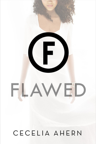
Flawed by Cecelia Ahern (Feiwel and Friends, April 5)

Celestine North lives a perfect life. She’s a model daughter and sister, she’s well-liked by her classmates and teachers, and she’s dating the impossibly charming Art Crevan.

But then Celestine encounters a situation where she makes an instinctive decision. She breaks a rule. And now faces life-changing repercussions.

She could be imprisoned. She could be branded. She could be found FLAWED.


skylighter


The Skylighter by Becky Wallace (Margaret K McElderry/S&S, March 22)

Johanna and Rafi are in a race against time to save their country before a power-mad Keeper destroys everything they hold dear in the “enthralling magical world” (Cinda Williams Chima, author of The Heir Chronicles) introduced in The Storyspinner.

As the last of the royal line, Johanna is the only person who can heal a magical breach in the wall that separates her kingdom of Santarem from the land of the Keepers, legendary men and women who wield elemental magic. The barrier protects Santarem from those Keepers who might try to take power over mere humans…Keepers who are determined to stop Johanna and seize the wall’s power for themselves.

And they’re not the only ones. As the duchys of Santarem descend into war over the throne, Johanna relies more than ever on the advice of her handsome companion, Lord Rafael DeSilva. But Rafi is a duke too, and his people come first. As their friendship progresses into the beginnings of a tender relationship, Johanna must wonder: is Rafi looking out for her happiness, or does he want the throne for himself?

With war on the horizon, Johanna and Rafi dodge treacherous dukes and Keeper assassins as they race to through the countryside, determined to strengthen the wall before it’s too late…even if it means sacrificing their happiness for the sake of their world.


saving montgomery sole


Saving Montgomery Sole by Mariko Tamaki (Roaring Brook, April 19)***


Montgomery Sole is a square peg in a small town, forced to go to a school full of jocks and girls who don’t even know what irony is. It would all be impossible if it weren’t for her best friends, Thomas and Naoki. The three are also the only members of Jefferson High’s Mystery Club, dedicated to exploring the weird and unexplained, from ESP and astrology to super powers and mysterious objects.

Then there’s the Eye of Know, the possibly powerful crystal amulet Monty bought online. Will it help her predict the future or fight back against the ignorant jerks who make fun of Thomas for being gay or Monty for having two moms? Maybe the Eye is here just in time, because the newest resident of their small town is scarier than mothmen, poltergeists, or, you know, gym.


mirage by tracy clark


Mirage by Tracy Clark (HMH, July 5)

Seventeen-year-old Ryan Poitier Sharpe is a gutsy, outgoing girl who spends her summer days hurling herself out of planes at her parents’ skydiving center in the Mojave Desert. Fiercely independent and willing to take risks, she challenges those around her to live life fully. But after a brush with death, Ryan is severely altered—she’s not the same thrill-seeking girl she once was and seems to be teetering on the edge of psychosis. As her relationships crumble and her life unravels, Ryan must fight the girl she’s become—or lose herself forever—in this eerie and atmospheric thriller.


So it turns out there is a list on Goodreads of YA and Middle Grade titles with POC lead characters, too. Here’s the link — and while maybe if you squint you can tell some of the YA titles include a person of color on the cover. . . I’m still completely underwhelmed.


*I realized after writing this, there is a second YA book I can think of with an interracial couple on the cover. That would be the paperback iteration of Una LaMarche’s Like No Other. Because the hardcover is illustrated and the characters have their backs to the reader, it’s not possible to tell.

**Sarah McCarry is white and thus has some sway in what she wants to happen in a way that minority authors wouldn’t have. Were she a woman of color advocating for a cover like the one she was able to get, I’m not sure she would have been as fortunate.

***These books are also written by readily identifiable authors of color. So fewer than half. Come on.

+ Guess what I discovered after writing this post? Two YA books hitting shelves in 2016 with interracial couples on the cover. Check Them Out. I still stand by my words, though: we need more.

Filed Under: cover design, cover designs, Cover Trends, diversity, publishing, Young Adult

Cover Doubles: Backs of Girls Edition

September 24, 2015 |

How about some cover doubles? Or, I should say, cover doubles with a side of a cover triple. Here are recent stock image reuses on book covers that have caught my eye. I’d love to know if you’ve seen any lately, whether they’re these doubles or others.

cover triple back of girl


The first book to have the back of this girl as its central image was Nina LaCour’s 2014 Everything Leads To You. It’s a great, moody image and captures the feel of the book well. It’s romantic and has a sense of longing and possibility. It’s “light” looking without suggesting it’s a light read.

Ryan Revisited was self-published this summer, and it’s a stark look. We get to see more of her body, and it’s interesting the choice to crop her for the LaCour title, as well as the Fayman one. I think the full body works in this cover, as there’s not other images competing for attention. For a self-published title, it’s a pretty well-done cover.

In 2016, that same girl will be a central image for the cover of Corey Lynn Fayman’s Desert City Diva. That’s an interesting cover all around — a burned out, broke down car and a really unfortunate spider crawling along the title. I wouldn’t want to be that girl. I kind of think she looks out of place, as she looks too “pretty” to be walking among those less-than-pretty things. Interestingly, this book is also set in California, like LaCour’s.


patterson forman double


Here’s another cover double that features the backside of a girl, but this time, she’s holding hands with her beau. This is a fascinating cover double to me because the books could not be more different. There’s Patterson’s Truth or Die, which is clearly a mystery/thriller genre read, and then there’s the paperback cover of Gayle Forman’s Just One Day which is a romantic YA read. The images are oddly effective on both covers though — there’s a target on the Patterson one to give it that thriller vibe, while the closer focus on the couple and their hand-holding on the Forman cover showcase the romance angle. Of course, the image is mirrored but otherwise, it’s exactly the same.


Filed Under: aesthetics, cover design, cover designs, Cover Doubles

Hardcover to Paperback Makeovers: 6 YA Changes to Consider

August 10, 2015 |

New catalog season on Edelweiss always makes me excited. It’s not just about the new books; it’s also about those books that end up getting makeovers from their hardback looks into something fresh in paperback.

I’ve rounded up six recovered YA titles hitting shelves in the next few months that have caught my eye. Some of these are winners and some…well, they should have stuck with the original idea. Perhaps most interesting is something I’ll note at the end of the post. There’s definitely a new trend emerging in YA cover design, and while I think I get the point of it, I’m not sure it’s entirely successful at what it’s attempting to do.

I’d love to hear what you think about these make overs, too. Which ones are great and which ones leave you feeling a little cold? Sound off in the comments and feel free to share any recent cover changes you’ve spotted that have stood out to you. As always, the hardcover image is on the left, with the paperback iteration on the right.

I picked up Jennifer Longo’s Six Feet Over It last year and talked about it a little bit in a post last fall about the microtrend of the death business in YA fiction. This book runs on the lower end of YA in terms of its voice and appeal, as the main character is a young high schooler, as opposed to the older ones that have become more abundant.

When I first saw the hardcover of this book a couple of years ago, it seemed to me like the model looked photoshopped. I spent a long time looking at it, and then I asked multiple people to explain to me what seemed “off” about this image. Everyone said the same thing: her neck looks really, really long. While people who are tall can have very long necks, the way she’s posed in the picture doesn’t show her height, so she looks strange if she’s not been digitally edited. The placement of the book’s title on the headstone is really creative, but the overall feel of the cover itself is dark and not particularly appealing. I like the use of the blurb on this one, as it’s from Jennifer Holm, suggesting that this is a suitable read for the younger teen set.

The paperback makeover for this one doesn’t really do much for me on a personal level, as I’m becoming really over the illustrated cover trend. However, I think this cover fits the book a million times better. It’s not as dark or foreboding, and it has a tiny bit of tongue-in-cheek humor to it, with the way that the girl is on a headstone that has a cartoon-y skull on it. It’s really appealing and inviting in the way that the original look simply isn’t, and more, it speaks to the bit of dark humor in the book itself. The tag line here actually works better than the blurb does on the hard cover, as it says essentially the same thing to readers, just in different words and a different approach. I do find it interesting that Longo is introduced as the author of Up To This Pointe beneath her name, since that book will publish after Six Feet Over It came out.

For me, the paperback is a winner here, even though it’s not my personal taste. It will hit shelves January 12.

Ellen Hopkins was always a go-to for me for readers seeking a good, fast-paced, edgy, dark, realistic YA book at the library. And for a long time, her packaging was brilliant — the books were shorter and fatter than most, and they were easily recognizable on the shelf.

But something happened and all of her work got a redesign to it, making the trim more in line with standard YA trade paperbacks, rather than they had been. The redesign meant a new marketing look, but somewhere in there, it just got really lost.

I’m not sure how I feel about the hardcover for Rumble, as it tries to blend the original Hopkins cover looks with the new one, and I’m not sure it entirely succeeds. But compared to the paperback, which has absolutely zero connection to Hopkins branding….it’s worlds better. The paperback looks really cheap and uninspired, and since it stands apart from all of her other books, I’m not sure it’s going to draw in long-time fans nor engage potential new readers. In many ways, the paperback looks more middle grade than it does upper YA, which is actually a bit of a problem, since her books aren’t aimed at that audience in any capacity.

Who is that stick figure? Why is the font for the title so thin? How come we don’t have the signature look of Hopkins name on the redesign? This looks so flimsy and forgettable in a way that Hopkins and her work simply are not. I have a hard time imagining a teen — or any reader, really! — looking at this cover and thinking it’ll be an intense, dark, gritty read. It looks sad.

Part of me hopes this isn’t a real paperback redesign and it’s instead a mistake that got out. It’d be a real shame to see these books get this sort of treatment because it weakens the work and absolutely weakens the appeal of the way these books look. Cover art and design is really important, especially when it comes to reader’s advisory and connecting the right book to the right reader. This cover is doing this book zero favors.

The hardcover is the winner here by leaps and bounds, even though it’s not spectacular itself. The paperback hits shelves February 2 and I really hope they reconsider this look.

Rachel DeWoskin’s Blind cover is doing something that differs in the redesign than all of the rest of the covers in this batch of makeovers: it adds a model to it. The original hardcover is pretty stark — it’s black, with a title that drives the cover, even though the title itself isn’t full. It’s an unfilled set of letters. Above it are the braille designations and the simple tag line “What do you see when your world goes dark?” You know immediately what the book is about, and the tag line further amplifies that this is a story about a blind character.

The redesigned cover brings a model into the picture. Notice on all of the other cover redesigns in this post, that the human models have been removed. The redesigns are moving more towards using an image-driven, people-less look or they’re using illustrations to render an individual. Not so in this case: but it also really works here, as this particular redesign tells us even more about the story than the original hardcover. We know it’s a girl who is blind, and we know that it might have something to do with fireworks, based on the font used for the title (and spoiler, it’s a firework that causes her to lose her sight). The tag line remains the same, but I think here it’s even more effective.

While both of these are solid covers that fit the story, I suspect that the paperback might have a tiny bit more appeal. Or, at least, gives readers even more insight into what the book’s about. The paperback edition of Blind will hit shelves April 5.

Maybe it’s because I read a little bit in an echo chamber, but wasn’t Skink No Surrender supposed to be a really huge book a couple of years ago? I can’t remember seeing a whole lot about it, other than it’s a title by Hiassen and he’s popular without additional significant hype.

This redesign is really fascinating to me because it definitely feels like the intended audience for this book is being shifted. The hardcover features handcuffs — so you know there’s a crime story here — and you get a tag line that reads “A missing girl, a hungry gator, only one way out…” The title font is what drives the image, and the white-on-red makes it really pop. This cover isn’t spectacular, but it stands out quite a bit from other YA titles since it’s so simple.

The paperback edition of Skink is so different and feels like it’s trying to reach an adult, rather than YA, readership. Or perhaps this cover is really aimed at those adults who read YA and are familiar with Hiassen. Look at the pull quote — rather than make use of the tag line, this one pulls out a review from Time, which calls Hiassen a master of Florida crime fiction. Is that something teenagers care about at all? Adults, on the other hand, will know what that means.

But the thing that’s most interesting to me in the redesign is how the title looks. Where the hardcover tells you the title is Skink No Surrender, the paperback redesign looks as though the title is Skink with the “No Surrender” being almost a tag line within the life raft. This particular redesign looks in line with his adult novels, while the original hardcover looks in line with his middle grade novels.

There’s not one that does it better here. Both elicit about the same reaction from me, but I think that’s because they seem to be serving different readerships. You can snag the paperback December 1.

The redesign of Kate Hattemer’s The Vigilante Poets of Selwyn Academy might be my favorite of the bunch, which is saying quite a bit since I don’t dislike the original look, either. I think that the hardcover is pretty appealing, especially as it has two teen boys featured on the cover in a way that makes them look like your average (art school) boys. The font drives the cover and I think the choices used in mixing the fonts really works. Likewise, the green on yellow color scheme is memorable to me, since I can’t say I see it frequently in YA. Maybe by some eyes it might look a little dated, but I don’t see it.

The paperback, though, I love. I love everything that it says — this is a book about art kids. But it’s a book about art kids that’s not necessarily traditional and that might be quite funny. I get that from the scissors cutting the string there, along with the mustache drawn on the figure’s face. I will say I’m not super keen on the title font treatment, as that thin wispy look just feels weak. And interestingly, there’s been an added tag line to the redesign, which reads “can four best friends, a manikin, and a heroic gerbil save Selwyn?” I find that particular tag line intriguing because what does a heroic gerbil have to do with this?

You can grab the paperback edition, which I think edges out the look of the hardcover, on March 8.

Finally, I don’t want to talk too much about the redesign of Charlie Price’s Dead Girl Moon aside from noting that this is another interesting example of new covers moving away from having anything resembling a real human model on the cover. Both covers convey the mystery here without much problem, though their color schemes and their execution of design differ.

Also interesting to me is that there’s been a pretty sizable chunk of time between the hardcover’s initial release — October 30, 2012 — and when the paperback will hit shelves — October 20, 2015. Generally, though not always, paperbacks tend to hit shelves about a year after their hardcovers come out. This can change depending upon a number of things, including a book’s popularity. That’s why books like Fangirl and The Fault in Our Stars had a good chunk of time between their hardcover edition and paperback. While I had a copy of Dead Girl Moon when it originally came out, I’m curious about the story here. Did it sell really well? Or, as I suspect the case may be, is the market right now a little bit stronger for these types of stories, so the holdup was to make sure it’d hit at the right time? That’s a question that may never be answered.

Both covers are fine, but again, the removal of actual people and models in this batch of redesigns really strikes me as noteworthy.

Filed Under: aesthetics, book covers, cover design, cover designs, Cover Redesigns, Uncategorized, Young Adult

Hardcover to Paperback Makeovers: 5 Changes To Consider

June 18, 2015 |

How about another round of books getting new looks in their paperback editions? I’ve been letting these pile up in a draft post and I’m ready to talk about a handful of them now; I’ll talk about some more soon since I’ve got a ton.

Let’s take a look at five of them this time — some of which are great makeovers and some which aren’t maybe as solid as their initial look in hardcover. Which do you think does it better? Have you seen other recent changes you’d love to talk about?

Ally Condie’s Atlantia is getting a pretty dramatic makeover in paperback. Where it looks like an adult science fiction title in its hardcover edition on the left, the change in paperback looks a lot more like a generic YA novel geared toward teen readers on the right. The paperback tells the readers almost nothing — it could be a book in any genre, since it’s nothing more than a big face. The tag line, which is repeated from the hardcover, doesn’t give much insight, either.

While I think there’s maybe more teen appeal on the paperback, I think that’s at the expense of being distinct and memorable. Also sort of interesting is that the author name seems to have shrunk in the new edition. Where it took up two lines and was more prominent than the title on the hardback, it’s gotten smaller on the paperback and the title has sized up.

The hardcover is a stronger image on this one and wins for me. The paperback edition will be available October 20.

The original look for Una LaMarche’s Like No Other followed in the tradition that began with Eleanor and Park — an illustration depicting two teens who clearly have some sort of romantic relationship with one another. It’s a cover trend I’ve never been fond of, since I think illustrated covers like this tend to not only tell you too much as a reader, but more, they actually begin blending together after a while (imagine someone asking for the book that’s got an image of a couple that’s illustrated — you could probably name a pile of them that all came out around the same time). I also think they tend to look a little young. Which isn’t to say I hate all illustrated covers, but rather, I dislike the ones that look like they’re modeling a trend. More, this one bothers me since it’s a story with people of color at the center and we don’t get to see them face first. We just get their backs.
The paperback for this one is a winner, though. While I’m not wild about the models’ faces being cut off, the fact we have their faces facing the readers is noteworthy. These are two people of color, and seeing that on a book, especially with the implication that they’re in some sort of relationship in the story and aren’t the same race, is important. This is a book you face out on a shelf because you know that readers are not only looking for these books, but readers are going to instantly identify with these faces. 
However, because we can’t skip a beat with following in the footsteps of trends, I find the pull quote on the paperback unnecessarily distracting. Any comps to The Fault in our Stars at this point feel like they’re a real reach, and while I get it’s an EW review, I think the fact that it’s called “one of the best” since a book published in 2012 really undermines so many other books at the expense of the one it’s featured on. I much prefer the blurb as featured on the hardcover. 
Though frankly, you could ditch the quote all together on the paperback and use just the title and image to sell the hell out of it. This is a book that has a nice look that will appeal to teen AND adult readers easily.
Like No Other will be available in paperback on July 14. 

I’ve got complicated feelings on the cover remake of Delilah S. Dawson’s Servants of the Storm, and it’s not because I dislike either of the covers. I think they’re both pretty great for depicting a horror story that follows in Gothic traditions. They have similar color schemes; the difference is primarily that they feature a different central image. The hardcover uses a girl who looks creepy, while the paperback makes use of a sign, a storm, and what is probably a not-too-happy carnival in the background. 
The paperback’s biggest difference in terms of the feel it gives off is through the tagline: “When we die, we belong to her.” Imagine that on the hardcover. THAT, I think, would offer up a different feel with that cover and be more effective. On the paperback, who does the “her” refer to? There’s not a person on the cover, and thus, there’s not a lot of intrigue in terms of who we’re supposed to be fearing. If the tagline were pulled off the paperback, it would be more effective, as there’s a lot of feeling in the image alone that isn’t necessarily contradicted by the tagline. 
I’m not sure one of these covers is better than the other. Both are actually pretty intriguing and would appeal to the same type of reader. 
Servants of the Storm hit shelves in paperback on June 2. 
The redesign for Sara Polsky’s This is How I Find Her might be one of the most dramatic in terms of the feeling it gives off that I have seen in a long time. The hardcover on the left has, since I initially saw it, made me immediately think of an Amish story. I don’t think that’s the intent, as this is a story about a girl dealing with her mother’s bipolar disorder and suicide attempts. The hardcover, aside from that, does give off a more somber feel than its redesigned paperback on the right. 
I’m having a hard time understanding the paperback. This looks like a lighthearted beach read, complete with a repeat of the tagline from the hardcover but in a context that makes it sound like a summer love, as opposed to dealing with a family challenge. More, I’m not sure I understand the font choice (I dislike the font here, period) and the decision to make the “I”s and “How” and “Her” pink, leaving the rest black. Is there something symbolic in it? Am I supposed to read another word in there? I am confused, rather than intrigued. 
Neither of these covers tells me anything about the story and neither is particularly appealing or memorable to me, except for how they don’t work. The hardcover might appeal more to older readers, whereas the paperback looks like it might reach younger readers more readily…even though it doesn’t exactly get to the heart of the story. 
The paperback edition of This is How I Find Her hit shelves on May 1. 

I saved the biggest change to talk about last because there’s so much to talk about with this one. The book on the left is Fat Boy vs. The Cheerleaders, a standalone novel that came out from Geoff Herbach last year. I love this cover for so many reasons; it’s bright, it’s different, and the can is representative of the story and actually plays a role in it. This cover is memorable and stands out on a shelf.

The title, though. While it’s accurate — this is a story about Gabe, a fat boy, and it’s about the things that happen to him in a turf war at school — it’s also sort of a turn-off. It generalizes the characters and creates a strange stereotyping of characters in high school. Since there’s not a lot to go off in terms of the story’s feel from the cover, even though it’s a good one, that title becomes the anchor for readers in terms of what the book will be about. And the title isn’t telling them a whole lot (or maybe it’s telling them everything and that’s not great, either).

The paperback makeover for this book means not only a facelift, but it received a title change, too. Rather than being Fat Boy vs. The Cheerleaders in paperback, it became Gabe Johnson Takes Over, which is a title that is so much better, more engaging, and less reliant upon stereotypes, which really are not at the heart of the story itself. The cover itself is fun, looking like a defaced school notebook, along with ephemera that is relevant to the story. The pop can hasn’t disappeared, though it’s taken a backseat. In many ways, this is a much more generic cover, but it’s not generic in the way you’d forget about it, like a large image of a girl’s face is. Where I usually don’t love when a review or blurb from a review is used on a cover, it works here. Part of why it works is that this book really got lost in the shuffle and because the title changed, this signals to readers that it’s a book that’s earned recognition before. It’s clearly not brand new or fighting for a spot. It’s instead working toward reaching its audience better.

What I like about this makeover, too, is that the cover doesn’t hide that it had a different original title. This is a useful tool for not just readers who may have picked up the book before, but it’s extremely useful for those who will wonder whether it’s a book they’ve purchased for a collection before.

While I’m sad that the cover isn’t the pop can anymore, I think the makeover, both the title and the image itself, does a huge service for this book. The paperback of Gabe Johnson Takes Over is available now.

Filed Under: aesthetics, book covers, cover design, cover designs, Cover Redesigns, Uncategorized

Color Me Purple: YA Covers Featuring Shades of Plum

May 14, 2015 |

One of the fun types of displays I enjoyed doing at the library was the most simple: books by color. “Have you RED these books?” “C’mon get happy” (books with yellow covers). “I don’t remember the title but the cover was blue.” They’re straightforward and an easy way to get some books out that might otherwise not see display time regularly.

As I was perusing books coming out this year, I noticed something I haven’t noticed in a while, which is purple book covers. I don’t think it’s a not thing nor do I necessarily think we have a new trend, but the array of purple-infused colors caught my eye. I couldn’t not do a big round-up of them.

I’m not going to include descriptions because I think there’s something really appealing about the visual effect alone. All of these are 2015 YA releases — some paperback rereleases of books that had different covers before — and if you can think of other purple or mostly purple 2015 covers, I’d love to see them in the comments.

Of course, if you do a display like this, I’d love to see that, too.


Filed Under: aesthetics, book covers, cover design, cover designs, Uncategorized, Young Adult

  • « Previous Page
  • 1
  • …
  • 6
  • 7
  • 8
  • 9
  • 10
  • Next Page »
  • Facebook
  • Instagram
  • Pinterest
  • Twitter

Search

Archives

We dig the CYBILS

STACKED has participated in the annual CYBILS awards since 2009. Click the image to learn more.

© Copyright 2015 STACKED · All Rights Reserved · Site Designed by Designer Blogs