
Ready to talk about more books getting makeovers in their paperback form? I have a slew of them, but I’m only going to talk about five for now (the rest are for future posts, no fear!). Let’s talk about the good, the bad, and the ugly.


Martine Leavitt’s My Book of Life by Angel is getting a really fresh look in the paperback, and I am a huge fan. I’ve read this one and while it wasn’t my favorite book, I don’t think that the original cover on the left was doing it much in the way of favor for teen readers. The story’s set in the late 1980s or early 1990s, during an epidemic of prostitution and drug sales in Vancouver, British Columbia. It’s a dark and gritty literary story, told in verse. The hardback cover wouldn’t tell you that though. It looks almost dated, like a book that came from the late 1980s or early 1990s, rather than one published in 2012. It does angle Leavitt as an award winner though, which I find interesting since that’s not on the paperback cover. In my mind, the hard cover looks like the literary book with award potential.
The paperback makeover, though, has total teen appeal. It shows this to not only be a dark and gritty story, but more than that, the new look reminds me of what Simon and Schuster did in their makeovers for Sonya Sones’s books (you can see the cover of her newest, To Be Perfectly Honest, as an example). The longer I think about the change and the way it reminds me of the new Sones looks, the more I really like it — I think they have exactly the audience who’ll want to pick this book up with the new design. The very thin font for the title works for me, as well. And the pops of color actually add a bit of edge to the image for me in a way that the fairly stark hardcover image doesn’t. Though I think the falling feather was meant to do that; it’s symbolic, but that says more to me about the audience for the hardcover as opposed to the paperback here.
I never bought the hardcover for my library, but I plan on ordering the paperback when it comes out February 18, since I think it’ll reach a whole new audience of readers.

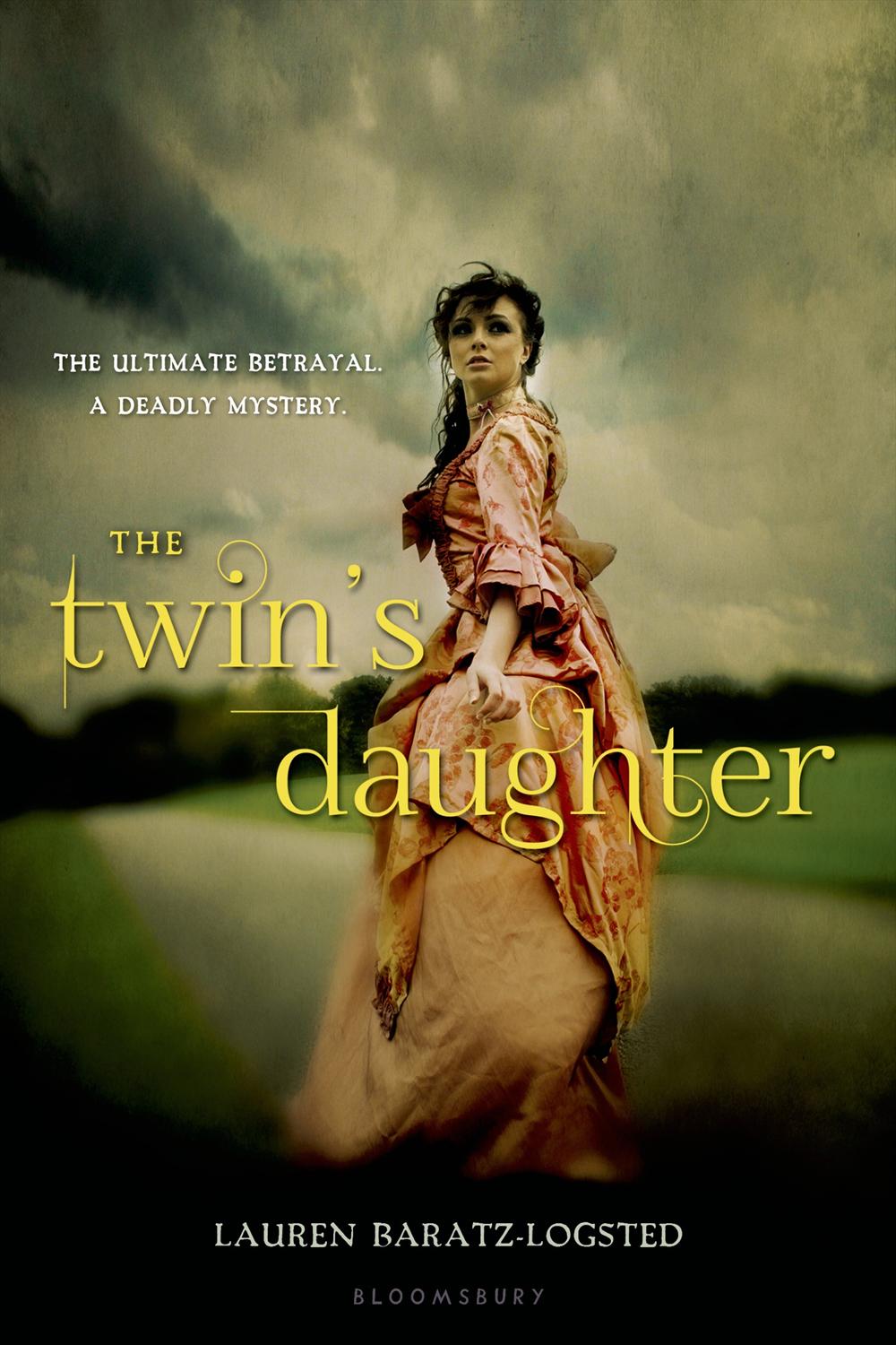
Lauren Baratz-Logsted’s The Twin’s Daughter — which I read and reviewed a long time ago — is coming out with a new look in paperback January 14. I love the hardcover look so much. I love that it features the twins, and that the image itself has the knife piercing through it (which fits the story). It’s actually a pretty simple design, but it packs a punch with the pink and black. And I love the tiny drop of blood that works as the apostrophe for “Twin’s.” For me, this cover conveys the gothic feel of the book and it’s iconic.
So the first thought I had on the paperback recovering is that the “t” in “Twin’s” is the same font as the “T” on Twilight. I really am not a fan of the title font at all. Aside from not really making a lot of sense (if they are going for a Gothic-y font, they missed the mark a lot here), it’s not consistent with the straight lines and the curved letters. Also, the kerning is a little off on “Twin’s” between the apostrophe and the “s” (kerning is space between letters — you want it uniform usually, and here there’s a little bit too much space). The girl in the big dress looks like a throwback to all of the covers that kind of came out at the same time that The Twin’s Daughter did in hardcover, in that it’s fairly non-descript and non-memorable. And the tag line — while it does tell what the story is about — kills me: “The ultimate betrayal. A deadly mystery.” I think why it kills me is because that is telling what the book is about, since the image on the cover is not.
For me, the big winner is the original cover. It tells you the story visually in such a careful and yet perfect way. The paperback looks like so many other covers and relies on the tag line to convey anything about the story inside.


Patricia McCormick’s Never Fall Down was one of those books that actually featured a person of color on the hardcover book. And it should have, since this is a story about a Cambodian boy. It’s a near perfect cover for the story, and it quite fits with the look of the other books McCormick’s published in recent years. It’s simple, and yet it’s also powerful. In many ways, I think it looks like an award-winning book. Obviously this is something I’ve been thinking about a lot, since I’ve mentioned it more than once in this post alone, but this cover is straight forward and you know from looking at it what it is about. And you know it’s a “serious” book. You also know it’s written by a National Book Award Finalist. The hardcover is a solid cover.
But I love the paperback. I love it. The paperback, to me, has so much more teen appeal. Why? It’s not a face on a cover. While I applaud the design team for including a person of color on the hardcover, I do think the solid image of a face is still not the most memorable way for a book to stand out on the shelf (the fact that it is a person of color that makes it stand out says a lot about how rare this happens on covers). Never Fall Down‘s paperback look does a lot of things aesthetically that I dig: the title takes up almost the entire cover, and it’s not done in a way that’s just a font. There’s movement and action within the font itself. It’s the movement that stays with me — and the fact the shades of green really do pop against the otherwise black cover. The impact is stronger than it is with the font on the hardback cover. I also think they did a good job designing the new cover to allow the National Book Award Finalist award to fit, without interrupting the image itself.
The paperback edition will be available in early 2014.


I think I’ve talked about how much I loved Paul Zindel’s The Pigman when I was a middle schooler and then when I revisited it a couple years ago I not only loved it still, but I thought it was still relevant (minus some of the dating things with technology).
They’re reissuing the book with another new cover in January. And I love it. I think that the cover on the left — which is the trade paperback cover that’s been available for a few years now — is memorable and strong. I love the piggy bank, and I love that it’s a bright yellow. But I think the redesign on the right gets so many things right, too, in a way that plays homage to the cover on the right. You have the piggy bank still. That font though. I think it’s one of my favorites, and I love how they styled it, as well. It feels vey contemporary because of how simple and minimalist it is. The white background ties the entire thing together. It’s fresh, and I think this cover will sell the book to another generation of teen readers in exactly the way it should.
Now I am ready to reread it again for myself.


I think Lissa Price’s Starters wins the award for most startling (and most baffling) makeover out of this set of changes. The hardcover on the left has always left me feeling really cold. It’s so . . . white and so creepy because of that. It looks really young, as well, and it never really called to me. Kim read it and found it to be a really fun read.
Let’s dissect the hardcover a bit. Besides being very white, the only color is through the form of a blue eye on the right and a brown eye on the left. There’s also the blue from the title, and there’s the blue tagline “Survival is just the beginning.” Note, too, that Kami Garcia’s blurb notes that this is a great book for fans of Suzanne Collins’s The Hunger Games. Worth noting is the girl’s face on the cover is unmarred by any text or anything. She is staring right at you.
The paperback redesign on the right. Aside from the fact it’s no longer a white cover, we have a girl staring out at readers again, but this time both of her eyes are brown. And her eyebrows stand out, as do her lips, since she’s wearing lipstick. She looks much older than the girl on the left, and her face is partially obscured by the title of the book. The author’s name, too, is tattooed on her forehead. I’ve doubts the model here is actually a teenager, either. There’s a brand new tag line for the book: “You can’t get them out of your head.” Then there’s also the new blurb from MTV (rather than the one from Garcia), which simply calls the book “A bona fide page-turner.”
I find the new look to be as cold as the original, but in a different way. It looks generic this time. So while the hardcover was cold in the creepy sense, the paperback is cold in the generic sense. I find the shift in how the book is being sold to readers interesting. The original sells it as a dystopian adventure a la The Hunger Games (both from the blurb and from the tag line) and in the redesign, it’s now being sold as something different. Something that I actually can’t even put my finger on — it’s called a page turner, but who are them? Why are they in my head? The girl on the cover doesn’t add anything to suggest what kind of story this might be.
Even though I find the original cover cold and unappealing, I think it might be the better fit for the story. The paperback doesn’t tell me anything and it doesn’t suggest to me who the readership for the book might be, either. Starters is out in paperback on July 23.
What do you think? Agree? Disagree? Which of these covers does it better?


