
You’ve seen a few of my cover features where I’ll talk you on a path down different covers from an author’s career. This time, I wanted to take one cover of a book that’s been around for 31 years and show the different iterations.
Most readers know this book, but I don’t know how many have actually read it. I read this book when I was in 7th grade, which I probably wouldn’t recommend. Although the cover’s changed a lot and now is actually marketed at teens, I’m still not entirely sure on the teen appeal of it. You be the judge:
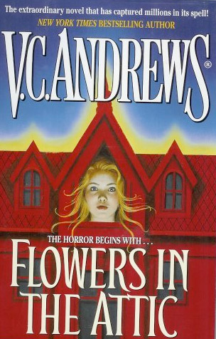
 This is the first cover of the first edition from 1979. This is the exact cover my copy had, and the other three books in this series had similar stylings, too.

This is another early cover, and I think it captures a bit of the feeling of the movie’s poster.

This is the original movie poster. It’s been made a little more contemporary over time, too.
 The DVD cover still gives off the creepiness, but to me, the oldest kids look way older than I ever imagined. The mother looks perfectly evil.

This is another movie cover, and I think this one might be my favorite. It really captures the mood of the book, though the oldest kids still look a little old to me.
 This cover looks a bit like a combination of the first and second ones above. I’m a fan of the use of color in this one, as I think the color actually makes it a little bit creepier.
 I hope someone can provide a little expertise for me. While looking up some covers, I stumbled across this one. Can we just say this one is totally not at all indicative of the story? This is too much like a romance and too little like a horror novel. And the color seems way inappropriate. I think this is a recent Canadian cover, but can anyone verify?
 Speaking of foreign covers, here’s an older UK cover. This one leaves no mystery as to the book’s genre. Oh, to be a pale girl coming out of a flower.
 And one in Spanish. Doesn’t this cover kind of remind you a bit of Independence Day?

What would we do if this book didn’t just have a girl on the cover? The wind and the coloring of the sky behind give this a nice spooky touch, even if the girl tells us nothing. Notice, too, she’s Virginia Andrews here and not V.C.?
 I know nothing about this one, but it gets to the point, too. A shadowy face and the large haunted house.
 This is today’s cover, and it’s sold in a two-volume collection. You can find this sold in the teen sections of your local bookstore, too. While it’s got teen appeal, the cover’s the same as a few others (check back soon for that feature) and I’m not sure how today’s teens will feel about the story. Is it still horror? I would love to know what they think. All I can tell is that hipsters are using a key movie promotion image for clothing, which bothers me just a bit.
I know I’m interested in picking it up again and reliving the story that haunted me for years.
Which cover appeals most or captures the book the most for you? Do you know of other covers (US or foreign)? Share them in the comments!
I like the most recent one best, but then that's because the rest of them are creepy. So, for a creepy story, even though I like the last cover best, I think it's far less appropriate than the rest of them. I have to say, the most recent one kind of has that object-on-a-black-background Twilight series thing going on.
I've never read this book, and I don't really want to! I'm not a fan of stories that haunt me for any length of time. It's really interesting, though, to see how the covers have changed over time.
I read this one in the 8th grade, I think. Mine had the second cover there. I don't know what it is with the dead roses, but I've seen them on several YA covers and they just don't do anything for me. But then, I'm not the target audience, so…
I love the UK cover! I also like the two covers which feature a young woman's face in the attic window. Movie covers? Blah.
Both the first two covers are die-cut, and had a second step-back cover treatment that was full-color, full-bleed of the 4 kids (and maybe the mom, I don't remember). It'd be awesome if you could actually find those images too to show what those books really were like. (By the way, your third image seems to be broken.)
I read it back when I was in middle school too. I think mine had the second cover.
I was confused about the shirt pictures? Is that supposed to be Flowers in the Attic related? If so, I wasn't getting it but it has been awhile since I read the book…
@Carin the third one's working for me? I'll see if I can find another image and try again. Also, I LOVE the idea of trying to find those to showcase the diecut. I think the first one I have somewhere, but the other will require a little work. I'll update if I find it.
@Autumn I think it was a promotion for the movie.
I love this post. This is one of my favorite books ever. I have that very first cover, and the blue one with Cathy's head sticking out of the attic, and the one of Christopher holding the door open.
The 3rd one is not working for me unless I open the image in a new tab.
Sorry about image #3, guys. It should work now! 🙂
WOW! I can't believe how many covers that book has gone through. I will say, to me the original is still the classic VC Andrews cover though. I always associate that cover look with her.
How did I JUST stumble upon this post? I love it. More, more!
!!! I'm glad you found it.
Wow I read the first one. That's the classic one. It's the best! That one with the two blonds in the foreground is probably good marketing though.
I read the first one! That's the classic cover!
The most disturbing thing about those two blonds on the cover it seems to really emphasis the incest aspect.