• STACKED
  • About Us
  • Categories
    • Audiobooks
    • Book Lists
      • Debut YA Novels
      • Get Genrefied
      • On The Radar
    • Cover Designs
      • Cover Doubles
      • Cover Redesigns
      • Cover Trends
    • Feminism
      • Feminism For The Real World Anthology
      • Size Acceptance
    • In The Library
      • Challenges & Censorship
      • Collection Development
      • Discussion and Resource Guides
      • Readers Advisory
    • Professional Development
      • Book Awards
      • Conferences
    • The Publishing World
      • Data & Stats
    • Reading Life and Habits
    • Romance
    • Young Adult
  • Reviews + Features
    • About The Girls Series
    • Author Interviews
    • Contemporary YA Series
      • Contemporary Week 2012
      • Contemporary Week 2013
      • Contemporary Week 2014
    • Guest Posts
    • Link Round-Ups
      • Book Riot
    • Readers Advisory Week
    • Reviews
      • Adult
      • Audiobooks
      • Graphic Novels
      • Non-Fiction
      • Picture Books
      • YA Fiction
    • So You Want to Read YA Series
  • Review Policy

STACKED

books

  • STACKED
  • About Us
  • Categories
    • Audiobooks
    • Book Lists
      • Debut YA Novels
      • Get Genrefied
      • On The Radar
    • Cover Designs
      • Cover Doubles
      • Cover Redesigns
      • Cover Trends
    • Feminism
      • Feminism For The Real World Anthology
      • Size Acceptance
    • In The Library
      • Challenges & Censorship
      • Collection Development
      • Discussion and Resource Guides
      • Readers Advisory
    • Professional Development
      • Book Awards
      • Conferences
    • The Publishing World
      • Data & Stats
    • Reading Life and Habits
    • Romance
    • Young Adult
  • Reviews + Features
    • About The Girls Series
    • Author Interviews
    • Contemporary YA Series
      • Contemporary Week 2012
      • Contemporary Week 2013
      • Contemporary Week 2014
    • Guest Posts
    • Link Round-Ups
      • Book Riot
    • Readers Advisory Week
    • Reviews
      • Adult
      • Audiobooks
      • Graphic Novels
      • Non-Fiction
      • Picture Books
      • YA Fiction
    • So You Want to Read YA Series
  • Review Policy

Hardcover to Paperback Cover Switch: Six to Check Out

August 7, 2012 |

Written by: Kelly on August 7, 2012.

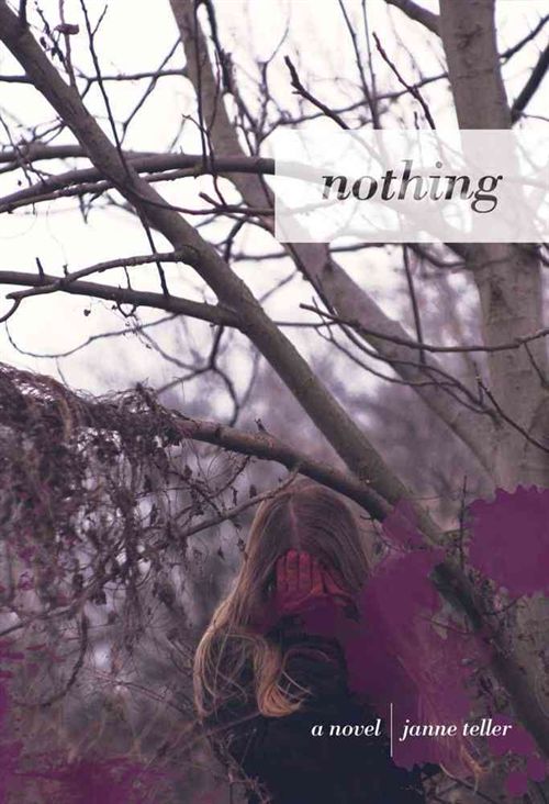
My list of books getting new paperback covers keeps growing, so I thought it was about time to share some of the ones catching my eye, either for good or not so good. This time, I even got one of the authors to give me a little bit of her mind on her book’s redesign.

Dandi Daley MacKall’s The Silence of Murder was the 2012 winner of the Edgar Award. I read it last year and found it unmemorable. What I do remember, though, is really digging the hardcover look, which is on the left. I love the image of the shattered bottle and the stark look of the green against the black background. It’s an exceptionally simple cover but I think it’s effective in not only being eye-catching, but it captures the idea of a mystery. The cover on the right is the paperback look and I think it’s a huge step down from the original. The color scheme is odd, but maybe more odd is the choice to have an illustrated person on the cover. Granted, it’s not a stock image, and while the boy in the hoodie with his mouth covered certainly follows what happens in the story, the cover looks very juvenile. The font, the unrefined lines, and the color scheme make it look very young — I’m especially put off by the almost too-happy color choices of yellow and orange in the tag line (“An Unspeakable Crime. A Voiceless Defendant”) and in the alternating colors in the author’s name. It’s a shame in the change because that original cover is so good. The paperback edition of The Silence of Murder will be released in October.

Apologies in advance for the bit of blur on the paperback cover, but I couldn’t find a full-size image outside the publisher’s catalog. Melissa Walker’s 2011 release, Small Town Sinners, is getting a slight change in look, too. Before I dive in with my thoughts, I asked Melissa what she thought:

I loved the hardcover image on Small Town Sinners — the girl, the apple, the field. I think it’s beautiful. So when I saw the paperback cover, which zooms in on the apple, I had to take a step back. I missed the setting, to be honest. But I also know that the apple is what people talked about when they saw the cover. That heart bite, the arresting red… it definitely catches the eye, and hopefully it will bring more readers to the paperback. 

I’m with her on this one. I really dug the hardcover look, which featured not just the apple, but the girl in the field in the background. There is a lot of symbolism in it, particularly noting the topic at hand in the book. The girl in white, the struggle she feels with following her faith straight and narrow or letting herself to feel around outside it highlighted in the way she shields her face. It is the apple that’s maybe most memorable, though, and I don’t think the paperback gets it wrong by focusing in on it. I’m glad to see the font and design of the title didn’t change in the process; I dig the light cursive for “Small Town” and the contrast in the straight look of “Sinners.” Note that the paperback edition of the book gets a tag line that the hardcover did not: “Does falling in love mean falling out of faith?” I’m not a huge tag line fan, and I think the downside of it here is that it suggests the book focuses more on the romance than on the struggle of faith (and family!) that Walker successfully delves into. Overall, it’s not a bad change, but I wonder what sort of readership this look would bring, as opposed to the original since the change isn’t that drastic. If you haven’t, I highly recommend checking out the entire cover story for the hardcover look over at Melissa’s blog (and if you dig cover posts and aren’t reading her “cover stories” posts, get on it). The paperback edition of Small Town Sinners will be available in January.

Joshua Cohen’s Leverage still makes my stomach turn when I think about it. It’s a hell of a powerful book if even thinking about it looking at the covers makes me hurt. The hardcover on the left is so perfect for this book. The stark look with the arm, vein-y and steroidal, stands out. You know immediately this is going to be a painful book and there is no doubt readers know this book will appeal to male readers and to sports fans. I love the way the font looks for the title — it’s very athletic, very sports jersey looking. I love the white cover a lot and the simplicity really conveys the enormity of the story inside (I know that sounds contradictory, but I think it’s true). The paperback cover, though? Also a real winner. This time, the design offers a greater insight into the fact this is a book that tackles sports head-on, and I love that it looks gritty. Like the original cover, the title design and font choice have that athletic look and I’m glad to see Cohen’s name gets to be even bigger on the paperback. But what I don’t care for? The tag line: “Too much pressure, too many victims — who will take a stand?” It’s so generic and while it does get at the heart of the story, it’s still fairly leading. I think that’s really my issue with tag lines. They force an interpretation of the story on the reader, whether intentional or not. Either way, both covers win in this change up, and I do hope that the new football-inspired look will draw more readers to this intense and gripping novel. Have I mentioned I love this one? Leverage will come out in paperback September 27.

I really liked Carol Lynch Williams’s Glimpse, a gritty verse novel about sisters and family secrets. The original hard cover look on the left stands out to me because of the brightness. Even though it’s a dark novel, I think the way the sun’s light contrasts with the darker woods and the way it’s setting instead of rising gives it that eery feel, that something isn’t quite right. I love that the girl’s face is all there, but it’s obscured enough to show only the look of trepidation and little else. I’m a fan of the way the title is centered and how the font is so narrow, almost whisper-thin, despite being right in the middle of the cover begging for attention. I think that’s fairly representative of the story itself. Of note is that the author’s name is almost buried in the lower right hand corner. The paperback cover isn’t bad, but for me, it’s forgettable. It looks very much like the cover that her latest novel, Waiting, gets in terms of a muted palate. The two girls are looking away from the reader, and I think there is a lot said in the fact the girls aren’t holding one another’s hands or embracing each other. Since this is a sister story, I like that there are two girls; however, the image of one girl in the hardcover is almost more authentic to the story and more haunting. I appreciate, though, how the thin font is still there for the title in paperback and I like how Williams’s name is more prominent. But for me, the winning look is still the hardcover. The paperback is far too generic for me and really reminds me a lot of the Cook redesign I talked about here. Glimpse is available in paperback now.

This is a book I keep meaning to read because it sounds like something that might be up my alley. Marcus Sedgwick’s White Crow cover make over might be one of my favorites — the hard cover on the left does absolutely nothing for me. It’s creepy, but more than anything, it’s just weird to me. The design, with the goth-like face floating above the too-narrow, too-cheap looking title and the random raven (or crow — it could be a crow) just does nothing. I really dislike the font choice for the author’s name too; it looks really old, and not in a good, vintage sort of way. The black-white-red look, which can often make a cover stand out, isn’t effective in capturing any sort of mood for the book. But let’s talk about the paperback. I love how creepy it is. The blue-grey coloring gives a much more haunting feel to it than the black and white look of the hardcover does. More than that though, it’s the girl. She’s got her back to us as readers, and she’s sitting in a simplistic chair in the corner, surrounded with candles. Is she performing some sort of ritual? Channeling the spirits? What the heck is she doing? I love the title font choice, as it’s much more haunting than the original. The paperback reminds me of so many horror film looks, and it draws me in much more because of that. I want to know what the story is here because I know there has to be one. I think it’s interesting that the hardcover look features a person with dark hair and the paperback appears to have a girl with much lighter hair in it. Both feature a pretty lame tag line: “What’s on the other side of death?” but despite being lame, I think the paperback cover draws readers in with those words a little bit more. For me, this is paperback all the way. I’d love that one on my shelf. White Crow will be out in paperback September 18. 

I read Lindsey Leavitt’s Sean Griswold’s Head a while ago, and I remember it being a sweet story about a girl juggling her father’s illness with figuring out who she is amid that stress. There is a little romance in the story which emerges as Peyton engages with her focus object — the back of the head of the boy who sits in front of her. I dig the hardcover look of this book because it’s not only pretty gender neutral, but because we don’t see the boy’s face. Again, it’s a fairly simplistic cover and concept. It’s appealing because, despite being simple, it’s also different enough to stand out. I dig the handwriting font for the title, though I think it is very easy to overlook the author name on this cover. It’s shoved in the corner in a narrow font. The paperback cover, on the right, conveys an entirely different feel than the original. This cover? Romance. This is the cover that will appeal to readers wanting a story with kissing in it (though that plays such a small role in the story that ultimately I think readers might be a little mislead). The couple, though, looks so modern and relatable, I think; these kids are freshmen in any high school right now, no question. There’s a much more feminine feel to the paperback version, and on many levels, it reminds me of the newer looking Lurlene McDaniel books. I think that’s because of how modern the couple appears. I am glad to see Leavitt’s name gets a lot more attention on the paperback, but the title is easy to miss, I think. I wouldn’t say the paperback nor the hardcover does it better. Rather, they aim at two entirely different audiences and I think readers will be drawn to one over the other, depending on what they’re expecting to get from the book. Sean Griswold’s Head will be out in paperback September 18.

Thoughts? Any do it better than others?

Filed Under: aesthetics, cover designs, Cover Redesigns, Uncategorized

Comments

  1. Liviania says

    August 7, 2012 at 5:20 am

    I much prefer the hardcovers of Sean Griswold's Head and The Silence of Murder.

  2. Kami says

    August 7, 2012 at 2:43 pm

    I like the new Glimpse cover! It reflects the book better. I like the original Sean Griswold's head better.

  3. Sarah says

    August 7, 2012 at 6:05 pm

    I really don't mind most of these redos (except the Sean Griswold one, which is really generic looking and the HB is great), but I hate the addition of the taglines on Small Town Sinners and Leverage. Okay, I kind of hate taglines on books in general, but the STS one is wholly misleading about the book, and the Leverage one is way wordy.

    I do think it's interesting that so many of the paperback cover redos lately involve Raleway font or Helvetica Neue Light or Opens Sans Light (or copycats)–I know these are trendy, but they don't translate well in digital images unless they're really big (like in Glimpse), because they're so lightweight.

  4. Sarah @ Y.A. Love says

    August 7, 2012 at 10:42 pm

    I'm not really sure what I think of these covers. I don't like the new cover for Sean Griswold's Head at all, but I agree that it will appeal to a new audience. I love the original cover for Leverage, and while I'm not thrilled with the new cover, I know that it will grab the attention of my students who love sports and football. The new cover for Small Town Sinners almost seems lazy to me. I like the apple, but really? They couldn't do anything better than that?

  5. Nicole says

    August 8, 2012 at 12:38 am

    I prefer the hardcover on all but SILENCE OF MURDER and WHITE CROW.

  6. Philip Heckman says

    August 8, 2012 at 2:28 am

    Any chance you can interview any of the art directors involved to get their reasoning for the choices they made?

  7. GreenBeanTeenQueen says

    August 10, 2012 at 9:29 pm

    I was going post a HC to PB post soon too and feature Sean Griswold's Head. I'm not really a fan. I understand why they changed it, but it's just so romancey and I love the first cover so much!

  8. Melu&Rob ~ says

    April 27, 2014 at 7:39 pm

    I would like to know who are the couple in the Paperback cover of Sean Griswold's Head. Is it a random image or are the known?? Please!! 🙂

The Hardcover to Paperback Cover Switch: Six to Consider

February 15, 2012 |

Written by: Kelly on February 15, 2012.

I haven’t talked about book cover changes lately, and it’s something I’ve been doing a lot of thinking about lately. I’m working on a post about series books and mid-series book cover changes (specifically, about how much they impact libraries and librarians), but in the mean time, I thought looking through some recent cover swaps would be fun. It’s always interesting to see how a cover is revisioned when it moves from hardcover to paperback, as sometimes it’s spot on, and other times, it’s worse.

Here’s the hardcover of Franny Billingsley’s Chime, and it’s a cover I’ve never been a fan of. I haven’t read the book, but from everything I know about it, it just doesn’t seem like a good fit of a cover. It’s the girl, I think — she detracts from the fantasy aspect of the story for me. I don’t care a lot for the color scheme here either, as it’s dull and almost lifeless. It’s a sleepy cover.

Billingsley’s book comes out in paperback in April, and it’s getting a makeover. This works for me, and I think it’ll attract a new range of readers. Even though I’m not a huge fan of the face-on-the-cover, this girl is much less “dead girl” than the hardcover edition, and she’s even got a spark of power to her (I see it in her eyes and the fact her hair isn’t blown across her face). Moreover, I’m a fan of the change from a drab color scheme to a brighter one. The cover kind of reminds me of the repackaged Francesca Lia Block books. I find it interesting the paperback features a blurb from Libba Bray, whereas the hardcover edition didn’t have a blurb.

The hardcover edition of Cathy Ostlere’s Karma is interesting to me because it’s so simple. I read this book last year, and it’s a lengthy verse novel about 1980s India and the search for heritage. It’s a hard sell conceptually for teen readers but I think the cover here does the story some favors in that it might entice otherwise skeptical readers. It’s pink with yellow designs that are an homage to Indian culture. The couple on the front (beneath the title and above the author’s name) make sense in context of the story, too. I love the title font and how it fits nicely with the font for the author’s name, too. Sometimes the simpler, the better.

The paperback of Ostlere’s book came out in January, and you know, I think they got it even more right in this cover. Even though both the paperback and cover fail to give the sense of time period (I’m not sure how they could), I feel like both do a good job giving a sense of place. Like the hardcover, the paperback features a great title font, though I do find the font selected for the author’s name to be a little distracting. It’s not as in sync with the title font as the different fonts on the hardcover edition are. I love, too, that the cover doesn’t appear to be whitewashed; while we don’t get to see a face, the hands and arms here are brown and not white. For me, the flowers she’s holding sort of represent the heritage aspect of the story. Although they’re wilting, the girl’s holding them with reverence and respect. More generally, I find the color palette works here, and it’s all together visually appealing. There is just enough going on to keep an eye engaged without being over-the-top.

Adele Griffin’s psychological thriller Tighter is another cover that had a dull color palette going for it, but because of the story, I think it works just fine. I like the shadowy figure against the cover, almost like there’s a film over the picture and the person is trying to see through. It’s fitting for the story and I think it helps give the book a genre classification. It’s reminiscent of a scary film. The title font works fine, as does Griffin’s name font. I do find it interesting her name is larger than the title itself.

The paperback edition of Tighter will come out in June, and I think it hits the mark pretty well, too. It’s got the sort of drab but haunting feel of the setting with the darker background color, and the girl who is ghostly captures the genre of the story. I note again the fact that the author’s name is larger than the title, which I think is an interesting choice. I like that the fonts are the same (or at least very close to the same) as those on the hardcover. They work well, and the slight blur to the title font isn’t dizzying nor distracting. My one comment on this one is I think the cover might be more appealing to female readers than the hardcover, simply because it’s more obvious it’s a girl at the center of the story.

I think that the cover of Julie Chibbaro’s Deadly is jarring because it’s an uncomfortable color of greenish yellow, but it’s a cover that stands out for me because of that (as well as the silhouette-style girl on the cover, her dress crawling with infestation). This book stands out on a shelf, and I think it does a good job reflecting the content inside. It’s a story based on the legend of typhoid Mary, and it’s heavily vested in the science of disease. I’m a fan of the red font and lower case only lettering on the title, and I like that the tag line shifts its color scheme when it’s laid over the girl. One of the themes of this story is the role of females in society and the book challenges what it was to be a female in the early 20th century, especially when it comes to being a female interested in science. I think the cover does an interesting job reflecting that in portraying a girl in a big dress and in the fact the girl’s at a full stance. Her head is up and the bugs are moving down and away. She’s got some power and defiance to her.

The paperback edition of Deadly will be out at the end of the month, and I’m not feeling it the way I felt the hardcover. It’s dark and shadowy, and I don’t think it at all gives a sense of time — though admittedly, it probably gives a decent sense of place, as the story’s set in early 1900 New York City. There’s a definite mood developed in the image, but I’m not entirely sure it fits the story itself. The girl in the dress is in the shadow on the ground and at full stance, but I don’t think it connotes quite the power the girl in the hardcover edition does. I’m not a fan of the title font here, as I think it kind of bleeds right into the image itself. For me, this book looks a lot more like a mystery than a historical fiction, and I’m afraid it’ll blend into other books that just look dark on the shelf.

I can’t remember if I’ve talked about not being a fan of Janne Teller’s utterly bleak novel Nothing — but see, the thing is, I wasn’t a fan and yet it’s a book I think about a lot and think deep down I kind of admired for being so risky and different. The hardcover of the book is spot on in depicting the feeling of hopelessness the book conveys. It’s a late fall or early winter setting, with the trees lacking their leaves (need I tell you the symbolism there?). I quite like how the title is in a light box on top of the trees but the title itself almost fades into the background as if it, too, were nothing. I think the single girl in the middle crying into the one spot of color in the cover captures the story so, so well. I’m a little torn on teen appeal of the cover since it is so heavily symbolic and it’s not necessarily a stand-out on the shelf; however, the teens that this book would appeal to will so get the cover and appreciate it. It may be what draws them to it in the first place.

The paperback of Teller’s novel will be out in March, and it, too, gives a nice sense of the bleakness in the story. But this time, we have two people embracing one another, almost in desperation. I don’t read this as romantic at all and I think that it captures the mood of the book well. It’s desperate (at least for most of the characters). The coloring of the cover is again dulled, though this time, there’s not a symbolic spot of color quite the way there was in the hardcover, unless you count the girl’s hair. The title being centered and spread widely across the center of the image works, too, and like the hardcover, I think the simplicity of it helps it sort of blend in all together. 

I have a pile more of cover changes I want to talk about, but I’ll save them for another post in the near future — except one. Most of the changes above haven’t elicited a whole lot of reaction from me. I don’t think any of them are way off base, even though I’ve certainly preferred some of the hardcovers over the paperback. But here’s one I really don’t like. One that I think is a mega disservice.

Gabrielle Zevin’s All These Things I’ve Done has a great hardcover image. I love that the title is in red on graying image, and the only other spot of color is the dripping chocolate heart. There’s the back image of the cityscape, and while it’s shadowy, there’s enough recognition to know it’s New York City (even if in the story it’s a distant, future NYC — the shadow effect here gives a bit of the potential for the physical appearance to be different at that time). Aside from the heart, I think this is a cover with appeal to both genders because it’s fairly ambiguous. I appreciate there’s not a face or a person on the cover, and really, there is something to be said for simplicity in cover design. The other thing I think is neat about this cover is the juxtaposition of the all lower case lettering of the title with the all upper case lettering of the author’s name at the top, and yet, neither competes to be the bigger role. They’re in harmony.

Enter the paperback edition of the Zevin title and while we still have quite a bit of a blurred city image that works well, we now have a girl face. A girl face that looks a bit vamp-ish and scary. For me, this book is much less about the dystopic future of a city without chocolate or coffee but about a girl who looks like she’s going to do some pretty bad things in the city. I can’t put my finger on exactly what movie or television show image it reminds me of, but it reads much more action-adventure to me than the story really is. Although the new color palette doesn’t bother me, it’s the way the girl still manages to jump out from it that doesn’t work for me. There may also be a little too much going on in terms of the fonts, the stacking, and the color use in the title and author text.

Now I’m curious — do you think any of these do it better in one edition or the other? I’ve heard more than once that the hardcover is the one aimed toward librarians while the paperback is the one aimed at the true teen demographic, though I’m not sure how much I buy that excuse at all if the true goal is to sell a book (there’d be as much emphasis on both then to produce the best possible cover, period). Or have you seen any changes recently — say the last six months or so — that have caused you to stop and wonder why the change was made?

Filed Under: aesthetics, cover designs, Cover Redesigns, Uncategorized

Comments

  1. Elizabeth Fama says

    February 15, 2012 at 2:57 pm

    Oh, gosh, this is one of my favorite topics ever. And this line from your post relates to my latest specific obsession: "The teens that this book would appeal to will so get the cover and appreciate it. It may be what draws them to it in the first place." It seems like many covers in the vein of CHIME are aiming to grab a particular audience — the ones who might swoon over gowns on covers — while assuming that readers who will like the content of the book will somehow find it through reviews and word of mouth. But it seems to me this is a risky strategy: the gown-lover will be disappointed, and the person who would have liked the book may be turned off by the cover.

    I used to have a theory that the hardcover was designed for quick, splashy sales, and the paperback was designed to reflect the content of the book and the demographic that has proven to enjoy it (for longer-term sales). But I don't think your examples bear out my theory.

    • admin says

      February 15, 2012 at 9:16 pm

      I understand the gown thing because it IS a huge trend on ya covers, but I'm not entirely sure if I think that's the audience for the Chime cover (admittedly, I can't figure it out either — the girl looks a bit blow-up doll to me). I'd even go as far as to say maybe it looks more gothic than I think the story is or aims to be.

      I have no idea on that theory, either. I've only ever heard the one about libraries vs. teen sales, which I don't think is true. I think — and this is purely my guessing — part of the idea of the cover change may be due to sales or mismarketed the first time around to simply as a way to reflect branding of the author/series/etc.

    • Elizabeth Fama says

      February 15, 2012 at 10:17 pm

      ACROSS THE UNIVERSE is another interesting example that I think points to trying to broaden (or re-hone) appeal after a first attempt. The hardcover is romantic, the paperback is much more sci-fi. You might even say the hardcover is more feminine and the paperback is more masculine? (That was one of my earliest HC/PB theories, which I can't prove to be true.)

      In any case, one thing we're forgetting in this conversation is that sometimes the paperback publisher is different, and they have the choice of imagining their own cover image, or paying to use the old (if it's for sale).

    • admin says

      February 15, 2012 at 10:20 pm

      heh Across the Universe was one I was thinking of including — but I do plan on talking about Glow in a future post, which took a total wrong-way turn in the hardcover/paperback exchange (and also, it's a series look change which is a whole nother post I've got prepared). And I'd agree on AtU: I think the paperback is a wider appeal. But I don't think that's always the case (Glow, again, but I'll get to that).

      And you're right, sometimes there is the publisher change. But that's pretty rare, at least from what I understand of the current YA landscape and cover swapping.

  2. Elle says

    February 15, 2012 at 4:53 pm

    This is really interesting! I think on all of these I like the hardcover best. I wonder if the book industry is changing so that now hardcovers really only appeal to the more 'classy' booklovers, the ones who really value the physical book (including beautiful cover), while the paperbacks are meant to appeal to a wider audience. I just feel like I know very few people (including me) who are willing to spend the $$ on a hardcover these days, especially when there is now also the ebook option. I think, as Elizabeth commented above, that it used to be about hardcovers being the big splashy sellers, but I think that may not be the case anymore.

    • admin says

      February 15, 2012 at 9:36 pm

      Interesting comment on the hardcover costs vs. paperback or ebook. I don't pay much attention to format when I buy. Rather it's about when I make the purchase. I'm really methodical and picky when I put down cash for a purchase (as in, if I'm planning on buying books). Format doesn't come into my mind. I'll buy hard cover if it's my option. No biggie.

      When I'm being impulsive and need to read something NOW, I'll ebook it. And then cover doesn't even matter for me at all.

      BUT it makes me wonder about teens themselves and their tight budgets (and libraries with tight budgets). Paperback is going to win hands down then.

  3. Blythe Woolston says

    February 15, 2012 at 6:28 pm

    The HB cover of CHIME almost hits the mark for me; it could be a bit muddier, to be honest. I'm less taken with the PB. It is far too brightly green. (I really loved the book.) I also prefer the original cover of NOTHING. The solitary figure hits the mark better; the other provides a hint of consolation that will not be forthcoming. (I really loved this book, too.)

    • admin says

      February 15, 2012 at 9:40 pm

      I could see a muddier version of the Chime cover working, especially if it made the girl less of the central image (if that makes sense). I, too, prefer the original Nothing cover, but there is something that feels really desperate in the second one, too. I can see consolation being read in it, especially for readers who haven't experienced the full force of the story.

  4. The Brain Lair (KB) says

    February 15, 2012 at 6:36 pm

    I gotta say I dislike both covers of Chime. I'm disappointed in the cover of Karma, though I think the HC needed a makeover, because it almost seems too happy for me. I like the original covers for both Nothing and All These Things I've Done. I agree that the All These Things PB cover is misleading.

    What do you think of the third Holly Black Curse Workers cover change? Totally messes up my set and students will NOT believe it's part of the same series!

    • admin says

      February 15, 2012 at 6:37 pm

      I have an entire post to talk about the changes happening with series books like Black's. Hang tight. 🙂

  5. Blythe Woolston says

    February 15, 2012 at 6:38 pm

    I like these photos by Jean Albus: imaginary cover for CHIME

    http://www.flickr.com/photos/pinkcloud/4430094918/in/photostream/

    and for Nothing

    http://www.flickr.com/photos/pinkcloud/6756142361/in/photostream

    • admin says

      February 15, 2012 at 6:40 pm

      I like both of those as imaginary covers, especially the one for Nothing (it's so perfectly bleak).

  6. Miss K says

    February 16, 2012 at 12:11 pm

    Not exactly related, but I wanted to share two vastly different covers that I encountered this week. For grad school, we are reading "Annie on my Mind", which is a novel about a lesbian couple. One student found the original 1982 cover: http://www.malindalo.com/wp-content/uploads/2011/08/081911anniecover1.jpg which is possibly the most stereotypical cover ever. The most recent cover is very different: http://www.amazon.com/Annie-My-Mind-Nancy-Garden/dp/0374400113/ref=tmm_pap_title_0.
    Interesting.

  • Facebook
  • Instagram
  • Pinterest
  • Twitter

Search

Archives

We dig the CYBILS

STACKED has participated in the annual CYBILS awards since 2009. Click the image to learn more.

© Copyright 2015 STACKED · All Rights Reserved · Site Designed by Designer Blogs