• STACKED
  • About Us
  • Categories
    • Audiobooks
    • Book Lists
      • Debut YA Novels
      • Get Genrefied
      • On The Radar
    • Cover Designs
      • Cover Doubles
      • Cover Redesigns
      • Cover Trends
    • Feminism
      • Feminism For The Real World Anthology
      • Size Acceptance
    • In The Library
      • Challenges & Censorship
      • Collection Development
      • Discussion and Resource Guides
      • Readers Advisory
    • Professional Development
      • Book Awards
      • Conferences
    • The Publishing World
      • Data & Stats
    • Reading Life and Habits
    • Romance
    • Young Adult
  • Reviews + Features
    • About The Girls Series
    • Author Interviews
    • Contemporary YA Series
      • Contemporary Week 2012
      • Contemporary Week 2013
      • Contemporary Week 2014
    • Guest Posts
    • Link Round-Ups
      • Book Riot
    • Readers Advisory Week
    • Reviews
      • Adult
      • Audiobooks
      • Graphic Novels
      • Non-Fiction
      • Picture Books
      • YA Fiction
    • So You Want to Read YA Series
  • Review Policy

STACKED

books

  • STACKED
  • About Us
  • Categories
    • Audiobooks
    • Book Lists
      • Debut YA Novels
      • Get Genrefied
      • On The Radar
    • Cover Designs
      • Cover Doubles
      • Cover Redesigns
      • Cover Trends
    • Feminism
      • Feminism For The Real World Anthology
      • Size Acceptance
    • In The Library
      • Challenges & Censorship
      • Collection Development
      • Discussion and Resource Guides
      • Readers Advisory
    • Professional Development
      • Book Awards
      • Conferences
    • The Publishing World
      • Data & Stats
    • Reading Life and Habits
    • Romance
    • Young Adult
  • Reviews + Features
    • About The Girls Series
    • Author Interviews
    • Contemporary YA Series
      • Contemporary Week 2012
      • Contemporary Week 2013
      • Contemporary Week 2014
    • Guest Posts
    • Link Round-Ups
      • Book Riot
    • Readers Advisory Week
    • Reviews
      • Adult
      • Audiobooks
      • Graphic Novels
      • Non-Fiction
      • Picture Books
      • YA Fiction
    • So You Want to Read YA Series
  • Review Policy

The Hardcover to Paperback Cover Switch: Six to Consider

February 15, 2012 |

I haven’t talked about book cover changes lately, and it’s something I’ve been doing a lot of thinking about lately. I’m working on a post about series books and mid-series book cover changes (specifically, about how much they impact libraries and librarians), but in the mean time, I thought looking through some recent cover swaps would be fun. It’s always interesting to see how a cover is revisioned when it moves from hardcover to paperback, as sometimes it’s spot on, and other times, it’s worse.

Here’s the hardcover of Franny Billingsley’s Chime, and it’s a cover I’ve never been a fan of. I haven’t read the book, but from everything I know about it, it just doesn’t seem like a good fit of a cover. It’s the girl, I think — she detracts from the fantasy aspect of the story for me. I don’t care a lot for the color scheme here either, as it’s dull and almost lifeless. It’s a sleepy cover.

Billingsley’s book comes out in paperback in April, and it’s getting a makeover. This works for me, and I think it’ll attract a new range of readers. Even though I’m not a huge fan of the face-on-the-cover, this girl is much less “dead girl” than the hardcover edition, and she’s even got a spark of power to her (I see it in her eyes and the fact her hair isn’t blown across her face). Moreover, I’m a fan of the change from a drab color scheme to a brighter one. The cover kind of reminds me of the repackaged Francesca Lia Block books. I find it interesting the paperback features a blurb from Libba Bray, whereas the hardcover edition didn’t have a blurb.

The hardcover edition of Cathy Ostlere’s Karma is interesting to me because it’s so simple. I read this book last year, and it’s a lengthy verse novel about 1980s India and the search for heritage. It’s a hard sell conceptually for teen readers but I think the cover here does the story some favors in that it might entice otherwise skeptical readers. It’s pink with yellow designs that are an homage to Indian culture. The couple on the front (beneath the title and above the author’s name) make sense in context of the story, too. I love the title font and how it fits nicely with the font for the author’s name, too. Sometimes the simpler, the better.

The paperback of Ostlere’s book came out in January, and you know, I think they got it even more right in this cover. Even though both the paperback and cover fail to give the sense of time period (I’m not sure how they could), I feel like both do a good job giving a sense of place. Like the hardcover, the paperback features a great title font, though I do find the font selected for the author’s name to be a little distracting. It’s not as in sync with the title font as the different fonts on the hardcover edition are. I love, too, that the cover doesn’t appear to be whitewashed; while we don’t get to see a face, the hands and arms here are brown and not white. For me, the flowers she’s holding sort of represent the heritage aspect of the story. Although they’re wilting, the girl’s holding them with reverence and respect. More generally, I find the color palette works here, and it’s all together visually appealing. There is just enough going on to keep an eye engaged without being over-the-top.

Adele Griffin’s psychological thriller Tighter is another cover that had a dull color palette going for it, but because of the story, I think it works just fine. I like the shadowy figure against the cover, almost like there’s a film over the picture and the person is trying to see through. It’s fitting for the story and I think it helps give the book a genre classification. It’s reminiscent of a scary film. The title font works fine, as does Griffin’s name font. I do find it interesting her name is larger than the title itself.

The paperback edition of Tighter will come out in June, and I think it hits the mark pretty well, too. It’s got the sort of drab but haunting feel of the setting with the darker background color, and the girl who is ghostly captures the genre of the story. I note again the fact that the author’s name is larger than the title, which I think is an interesting choice. I like that the fonts are the same (or at least very close to the same) as those on the hardcover. They work well, and the slight blur to the title font isn’t dizzying nor distracting. My one comment on this one is I think the cover might be more appealing to female readers than the hardcover, simply because it’s more obvious it’s a girl at the center of the story.

I think that the cover of Julie Chibbaro’s Deadly is jarring because it’s an uncomfortable color of greenish yellow, but it’s a cover that stands out for me because of that (as well as the silhouette-style girl on the cover, her dress crawling with infestation). This book stands out on a shelf, and I think it does a good job reflecting the content inside. It’s a story based on the legend of typhoid Mary, and it’s heavily vested in the science of disease. I’m a fan of the red font and lower case only lettering on the title, and I like that the tag line shifts its color scheme when it’s laid over the girl. One of the themes of this story is the role of females in society and the book challenges what it was to be a female in the early 20th century, especially when it comes to being a female interested in science. I think the cover does an interesting job reflecting that in portraying a girl in a big dress and in the fact the girl’s at a full stance. Her head is up and the bugs are moving down and away. She’s got some power and defiance to her.

The paperback edition of Deadly will be out at the end of the month, and I’m not feeling it the way I felt the hardcover. It’s dark and shadowy, and I don’t think it at all gives a sense of time — though admittedly, it probably gives a decent sense of place, as the story’s set in early 1900 New York City. There’s a definite mood developed in the image, but I’m not entirely sure it fits the story itself. The girl in the dress is in the shadow on the ground and at full stance, but I don’t think it connotes quite the power the girl in the hardcover edition does. I’m not a fan of the title font here, as I think it kind of bleeds right into the image itself. For me, this book looks a lot more like a mystery than a historical fiction, and I’m afraid it’ll blend into other books that just look dark on the shelf.

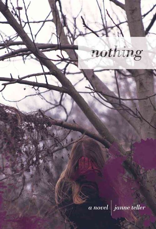
I can’t remember if I’ve talked about not being a fan of Janne Teller’s utterly bleak novel Nothing — but see, the thing is, I wasn’t a fan and yet it’s a book I think about a lot and think deep down I kind of admired for being so risky and different. The hardcover of the book is spot on in depicting the feeling of hopelessness the book conveys. It’s a late fall or early winter setting, with the trees lacking their leaves (need I tell you the symbolism there?). I quite like how the title is in a light box on top of the trees but the title itself almost fades into the background as if it, too, were nothing. I think the single girl in the middle crying into the one spot of color in the cover captures the story so, so well. I’m a little torn on teen appeal of the cover since it is so heavily symbolic and it’s not necessarily a stand-out on the shelf; however, the teens that this book would appeal to will so get the cover and appreciate it. It may be what draws them to it in the first place.

The paperback of Teller’s novel will be out in March, and it, too, gives a nice sense of the bleakness in the story. But this time, we have two people embracing one another, almost in desperation. I don’t read this as romantic at all and I think that it captures the mood of the book well. It’s desperate (at least for most of the characters). The coloring of the cover is again dulled, though this time, there’s not a symbolic spot of color quite the way there was in the hardcover, unless you count the girl’s hair. The title being centered and spread widely across the center of the image works, too, and like the hardcover, I think the simplicity of it helps it sort of blend in all together. 

I have a pile more of cover changes I want to talk about, but I’ll save them for another post in the near future — except one. Most of the changes above haven’t elicited a whole lot of reaction from me. I don’t think any of them are way off base, even though I’ve certainly preferred some of the hardcovers over the paperback. But here’s one I really don’t like. One that I think is a mega disservice.

Gabrielle Zevin’s All These Things I’ve Done has a great hardcover image. I love that the title is in red on graying image, and the only other spot of color is the dripping chocolate heart. There’s the back image of the cityscape, and while it’s shadowy, there’s enough recognition to know it’s New York City (even if in the story it’s a distant, future NYC — the shadow effect here gives a bit of the potential for the physical appearance to be different at that time). Aside from the heart, I think this is a cover with appeal to both genders because it’s fairly ambiguous. I appreciate there’s not a face or a person on the cover, and really, there is something to be said for simplicity in cover design. The other thing I think is neat about this cover is the juxtaposition of the all lower case lettering of the title with the all upper case lettering of the author’s name at the top, and yet, neither competes to be the bigger role. They’re in harmony.

Enter the paperback edition of the Zevin title and while we still have quite a bit of a blurred city image that works well, we now have a girl face. A girl face that looks a bit vamp-ish and scary. For me, this book is much less about the dystopic future of a city without chocolate or coffee but about a girl who looks like she’s going to do some pretty bad things in the city. I can’t put my finger on exactly what movie or television show image it reminds me of, but it reads much more action-adventure to me than the story really is. Although the new color palette doesn’t bother me, it’s the way the girl still manages to jump out from it that doesn’t work for me. There may also be a little too much going on in terms of the fonts, the stacking, and the color use in the title and author text.

Now I’m curious — do you think any of these do it better in one edition or the other? I’ve heard more than once that the hardcover is the one aimed toward librarians while the paperback is the one aimed at the true teen demographic, though I’m not sure how much I buy that excuse at all if the true goal is to sell a book (there’d be as much emphasis on both then to produce the best possible cover, period). Or have you seen any changes recently — say the last six months or so — that have caused you to stop and wonder why the change was made?

Filed Under: aesthetics, cover designs, Cover Redesigns, Uncategorized

Cybils and The Hub

February 14, 2012 |

If you haven’t already heard, today was the big announcements of the 2011 Cybils winners. You can see the list right here. If you’re interested at all in kidlit, these are the books (and apps!) you want to START with this year, if you haven’t already enjoyed them. They marry literary merit with reader appeal. Both Kim and I served this year in different capacities, but speaking for myself, I could NOT be happier with the YA Fiction winning title, Geoff Herbach’s Stupid Fast. It was one of my favorite reads last year. All of the finalists in my category were strong, but this one held a special little place in my heart.

Today I’m over at The Hub talking February debut novels, too. If you get a chance, hop over there and drop a comment or two.

Filed Under: cybils, debut authors, Uncategorized

There is No Dog by Meg Rosoff

February 14, 2012 |

What if God were a teenage boy? That’s the question Meg Rosoff asks in her latest novel for teens, and the results are pretty darn funny. The god of Earth is Bob, a perpetually teenaged boy whose mother won the creation of Earth in a game of cards and decided to give the job to her son. He created Earth in a creative but rather slapdash way, which means there are some truly unique creatures, but none of it works together very well. He also had the appalling self-centeredness to not only make humankind in his own image, but to make them all worship him to boot. 
Bob isn’t necessarily a bad guy, but he’s not exactly good either – selfish, lazy, and short-tempered are all excellent descriptors for him. In order to keep things on Earth somewhat controlled, the administration assigned Mr. B, a middle-aged middle-management type, to assist Bob. Poor, poor Mr. B. Was there ever a more thankless job? Particularly now that Bob has fallen in “love” (again) with a human girl named Lucy, throwing Earth’s weather completely off-kilter.
There is No Dog is more of a gimmick than an actual novel. I don’t think there’s any way to say that without making it sound bad, although that’s not my intent. Character development here is minimal. The jacket copy makes it seem like Bob is the protagonist, but if there is one, it’s Mr. B, the middle-aged consultant. He’s the only one who experiences any growth and the only one we get a real feel for.
It’s mostly for that reason that I hesitate to call There Is No Dog a YA novel. Bob is there, but he’s always played for laughs. He’s your stereotypical teenage boy whose delusions of grandeur are, in fact, not delusions at all. Lucy is 21 and is concerned with her career and falling in love, but in a much more adult way than a teen would be. Mr. B and the Eck (more on him later) are who we really care about, and neither of them are teenagers with teenage concerns. I’m actually quite pleased to have discovered this book. It seems to fit firmly into the 20-something age range, which can be tough to find. Often it seems the shelves overflow with books for teens and middle-aged adults, with not much in between.
This was a tough review for me to write, because I’m concerned that all of those things I mentioned in the two paragraphs above make it seem like I disliked the book. Far from it – I found it delightful and clever and funny and refreshingly different. The lack of character development didn’t bother me. Rosoff’s prose carries a laugh in almost every sentence, which means that this is first and foremost a humor book. (As opposed to simply a funny book. I hope this distinction makes sense.) In a humor book, things like character development and world-building and plot coherence aren’t as important. (And here again, I worry I’m making this book seem bad. I promise you, it’s not. You should read it.)
On a somewhat unrelated note, reading this book was a very interesting exercise in ARC study. Most of the book is written in past tense, but sometimes it jumps to present. There’s no rhyme or reason to the switches. Frequently, it happens mid-page or even mid-paragraph. It makes me think it’s unintentional – perhaps Rosoff originally wrote it in one tense and switched to the other for the final draft. I haven’t been able to locate a finished copy yet, but I certainly plan to. (It should come as no surprise that I prefer the sections in past tense.)
I can’t end this review without mentioning the Eck. Eck is Bob’s pet. He’s a “penguiny” creature, the last of his kind, and all he can say is “Eck.” He is by far the most delightful thing about this book. In fact, he’s the impetus for much of its action, since Bob’s mother loses the Eck in a card game and Bob (and others) attempt to get him back before he’s eaten. Apparently, there’s a rumor floating about that Ecks are delicious. Aside from Mr. B, he’s the creature we get to know best, and the book is all the better for it.
Review copy received from the publisher at ALA Midwinter. There Is No Dog is available now.

Filed Under: Fantasy, Reviews, Uncategorized, Young Adult

MWF Seeking BFF: My Yearlong Search for a New Best Friend by Rachel Bertsche

February 13, 2012 |

My husband and I will celebrate our 5th wedding anniversary in June. We’re both in our mid-twenties. Before we got married, we talked about everything you’d expect a couple who is about to get married to talk about: what we want in a career, where we want to live, do we want kids, what sort of life do we want for ourselves in one year, five years, thirty years. But maybe the most important thing we decided as a couple before we married was that no matter what, we would not become one another’s only friends. It was crucial we’d maintain our own private friendships separate and different from our relationship.

And despite the fact the things we talked about before — the plans we envisioned — have gone completely astray on nearly every level, the last part about maintaining separate and meaningful friendships outside ourselves is something we have done. To varying levels. I like to think that decision has made weathering the things that weren’t in the plan a lot easier to grapple with.

Because of the bumps in the road, because of the changes in place and space, I think he’s had a much easier time of this than I have. My friends? I made them in college (in Iowa) and I made them in graduate school (in Texas). I live near neither. My best friend lives half a country away, and we haven’t seen each other in years. Sure I’ve got friends near me — one who lives literally a hop down the road (um, or will until Friday when she moves a car ride away) — but getting together requires planning and work. Our lives our busy and getting together requires an hour or more in the car. It’s hard to call them up and say you’ve had a day and need them there to finish up a bottle of wine right now to make it better. My husband, on the other hand, went to school here, and he has a wealth of friends who live close. It’s easy for him to drop by their place after work, for him to go out with them after work. He’s met his tribe here, so to speak, while I haven’t.

Rachel Bertsche’s memoir, MWF Seeking BFF, caught my eye when I read about it last year because I felt like I would be able to relate to Bertsche. She’s in her late-20s, newly married, and she left everything she had behind her in New York City when she moved with her husband to Chicago. She lost her support system in the move, and now she was on her own to make a new BFF in her new city so she’d have someone to turn to when she needed it. Bertsche chose to do this through serial “girl dating” — meeting up with people she’d been connected with through people she knew or through various friend-dating services or through putting herself into activities she liked and chumming up someone she felt could be a good match for her. The book is a chronicle of her dates, as well as a musing upon the ideas of friendship and how friendship changes as you get older. It’s not like you can knock on your neighbor’s door and ask them to come out to play anymore when you’ve got a career and a family.

I brought my preconceived notions to the book: Bertsche starts by telling readers what her idea of a BFF is. It’s someone you can go to at any time and it’s someone you can call up at a moment’s notice to grab dinner with. It’s someone who sees you through the good and the bad. Someone who (her words) she can grab a mani/pedi with at the last second to gossip. She talks about her two best friends in New York City and how she’s looking for that sort of companionship in her new city. This is what she wants out of her serial girl dating. Immediately, I just … didn’t connect with Bertsche the way I hoped I would. Her ideas of friendship were so wildly different than mine. It was so singular, so narrow. I knew from the start she’d never be the kind of person I’d get along with and couldn’t see myself befriending.

As she goes on her dates, though, she offers up some interesting research and insight into friendship and what it really is. Bertsche meets a wide variety of women, ranging from her own age to much older and even much younger, and she gets to know women who are in various stages of life (some who are single and still looking for romance, some who are happily married with children, some who will never quite grow up, etc). After each interaction, Bertsche talks about what did and didn’t work and why she did or didn’t see the girl as someone who had that BFF potential. At the beginning of the book, it’s almost a check list to her. Would x-named girl be the kind of girl she could call up on Sunday morning and have brunch with in an hour? No? Well, time to drop her. Would this girl be the kind of girl she could spend an afternoon discussing Harry Potter with on end and then spend the evening devouring the latest television drama? No? Well, she won’t work either.

I found myself so irritated with her definitions and her boxes and I kept wondering how I’d make it through the book. It’s a longer read, since Bertsche does chronicle (to some level) all 52 of her dates. See, I’m a big believe in the fact friends all serve different purposes. At least, that’s how I view friendship. I have friends I turn to for different things and friends who offer me differing levels of support on different things, and I like to think I offer that back. I’d be hard-pressed to believe any of my friends has a whole picture of me or knows everything about me, and it’s a fact I’m okay with. Maybe one I’m comfortable with. And that’s not to say I don’t value friendship because I certainly do, but I prefer a wide network of friends who are one-or-a-few things to me and a much tighter network of intimate friends who know a lot more and will always know a lot more. I keep it this way because it helps me evaluate what I can offer them in return. I can’t be a good friend to everyone, and I never can pretend to be. But I can be a good friend to a few people, and I can be friendly and thoughtful and kind to many, many more. If I evaluated everyone in terms of their BFF potential, I’d never actually get to offer or experience friendship. Maybe it makes me sort of a hippie in thinking there is a bit of the organic in how it happens and how it develops and how those circles I maintain can always shift. I believe give and take happens when and where it should and when you’re in sync with someone else, you just know.

About half way through MWF Seeking BFF, Bertsche has a total light bulb moment. She, too, realizes that trying out everyone as a potential BFF — her idea of what a BFF is anyway — wasn’t going to help her really make friends. In fact, she says that her idea of a BFF was in and of itself out of sync with her life now. Nothing could ever be what it was like when she was younger and unmarried and in New York City. That realization was a huge one for her, and it shaped how she approached the remaining friend dates she made. It also made me step back and think about my own preconceived notions of Bertsche, too: I’d judged her immediately, hadn’t I? I considered my friendship compatibility with her, too. Who she offered herself at the beginning of the book rubbed me wrong but who she offered herself at the end of the book was someone I admired a bit.

Her biggest realization in the entire experiment? Friendship comes about when you learn to be independent. That’s really what her book is about — independence and figuring out how to be.

What stood out to me most in the book and what made it a worthwhile read, especially in the beginning where I did a lot more sighing than engaging, were the lengthy musings on what friendship is and what it really means. Bertsche made me do a lot of thinking about what friendship is and not just what it is to have a friend, but what it means to be a friend. The truth of it, and I think what makes it a hard topic to think about or talk about, is that sometimes you can never know what makes you a friend to someone else. What you believe you offer isn’t always what the other person is receiving. They may be getting something entirely different. Bertsche also broaches the idea of need fulfillment and about social networks and how or why some friendships endure while others never quite hit it off. She backs it with research and her own experiences, and because I’d been along with her on her dates, I felt like I got a good understanding of the hows and whys of her assertions. She mentioned more than once feeling a bit weird when she’d find common ground with someone over a sick or dead dad (hers had died when she was in her early 20s). But she offered it, and her returns either came back ten fold or never came back at all. As much as it was awkward to put herself out there like that, her reflections upon it were great, and I quite admired her at all for putting herself out there like that. Personally, the tough topics don’t make it out of my mouth until I truly know and trust someone wholly. Risk and reward are tricky.

More than once, I put the book aside and thought through my own feelings about friendship and what matters to me, and my husband and I even had a lengthy chat about what we believe our closest and most meaningful friendships are now and why they are that way. We talked about what we feel holds us back and what we do and don’t have in friendships and why we do or don’t care to have that. I couldn’t help think this would make an interesting book club title because the topics worth discussing here are many. Even if the chronicling of every friendship gets tiring — and it does — the moments of reflection at the end are worth it.

One of the points I disagreed with, though, had to do with maintenance of friendship. Bertsche (and many of those she pulls from) is a big believer in the value of the in-person interaction; she’s regularly discussing the phone call over the text message, over the email, over the Facebook or Twitter interaction. This sort of showed her privilege a bit in being an upper-middle class urbanite — something that also grated at me a bit as a reader. She had the opportunities to get out and do things, had the money and resources to go on all of these dates (she does admit to the cost of the endeavor).  The truth is, sometimes our good friends, those we want to give and share with, are never going to be there in the flesh with us when we need it. And while it’s certainly one thing to have that person next door, in today’s modern world, I think it’s becoming a lot more of a luxury than a regular experience. I don’t think maintaining a good friendship means you have to be there in person. It just means you have to be there, period.

My other big criticism of MWF Seeking BFF is that Bertsche periodically dives into female stereotyping. She becomes one and she pushes it in her own observations. There are moments where she discusses food and weight and bodies in a way that made me wonder why it was there in the first place. Then it hit me: target demographic. These bits weren’t authentic to the story nor did I think they were even authentic to Bertsche nor the experience she was trying to share. It felt simply like a way to make her story relatable to a certain 20-something female audience. Take a second to think about all of the magazines aimed at the demographic. It’s not entirely shocking, but I found it incredibly frustrating and simply noise to the greater stuff in this book. Is it possible for a memoir by a woman to not go down this road? Not everyone worries about whether they ate too much sushi, whether or not they’ve gained the average 2 pounds a year, whether they look like crap when they go to the grocery store when they’re feeling less than amazing. I can overlook it, but it doesn’t make it less irritating as a reader.

The book reads like a Malcolm Gladwell title in how it approaches weaving research and anecdote and in some ways, it reminded me a bit of Gretchen Rubin’s The Happiness Project (which I loved). I think the audience on this one is adult women, but because Bertsche’s relationship only plays into the story so long, it’ll easily appeal to those who are married or single. The premise is friendship, and she doesn’t stray too much from that. While walking away from the book didn’t necessarily change my ideas about friendship nor relationships, it did further cement them a bit. I noted a few pages with passages and ideas I believed, including this one: “It can be freeing to have relationships built on exactly who you are at the moment […] If it’s a good match, you’ll find that it wasn’t actually necessary for you to have all those shared experiences.” This is spot on.

Back to my original story: am I bummed to not have friends right here at my call in my new world outside college and grad school? Sure. But the truth is, what I get out of my friendships is worth more than the simple act of being able to walk to their house and share a drink. The real value is in something much deeper and something that transcends space and place, but you can never, ever go wrong simply being kind and thoughtful toward everyone, regardless of whether or not you are seeking a friend. You always get it back some how. I like to think every day I’m lucky for what I have when it comes to friends because they are worth more than their weight in gold. No matter what anyone says or tells you, they will always be as (and sometimes more) important than other relationships in your life.

I purchased a copy of this book.

Filed Under: 20somethings, Adult, Memoir, Reviews, Uncategorized

The Girl Who was on Fire (Movie Edition) Giveaway

February 11, 2012 |

 With the Hunger Games movie just a month and a half away (not that there’s a count down or anything), SmartPop books is re-releasing their anthology of essays on the series, The Girl Who was on Fire. This isn’t just a reissue to come out with the movie; this edition contains new essays from authors like Brent Hartinger, Jackson Pearce, and Diana Peterfreund. Take a look at the other contributors, too. It’s a powerhouse of current YA authors who know what they’re talking about.

I’m looking forward to diving into this one, especially given that Janssen wrote about how much she loved the collection last year. What a great book to sink into before seeing it on the big screen.

Thanks to the generosity of Sarah Darer Littman, who contributed one of the essays in the book, we’re giving away a copy here at STACKED. It’s open only to US and Canadian residents, and I’ll pull a winner on Feruary 29 — in time for the winner to dig into this before the film.

Filed Under: Giveaway, Uncategorized

  • « Previous Page
  • 1
  • …
  • 237
  • 238
  • 239
  • 240
  • 241
  • …
  • 404
  • Next Page »
  • Facebook
  • Instagram
  • Pinterest
  • Twitter

Search

Archives

We dig the CYBILS

STACKED has participated in the annual CYBILS awards since 2009. Click the image to learn more.

© Copyright 2015 STACKED · All Rights Reserved · Site Designed by Designer Blogs