• STACKED
  • About Us
  • Categories
    • Audiobooks
    • Book Lists
      • Debut YA Novels
      • Get Genrefied
      • On The Radar
    • Cover Designs
      • Cover Doubles
      • Cover Redesigns
      • Cover Trends
    • Feminism
      • Feminism For The Real World Anthology
      • Size Acceptance
    • In The Library
      • Challenges & Censorship
      • Collection Development
      • Discussion and Resource Guides
      • Readers Advisory
    • Professional Development
      • Book Awards
      • Conferences
    • The Publishing World
      • Data & Stats
    • Reading Life and Habits
    • Romance
    • Young Adult
  • Reviews + Features
    • About The Girls Series
    • Author Interviews
    • Contemporary YA Series
      • Contemporary Week 2012
      • Contemporary Week 2013
      • Contemporary Week 2014
    • Guest Posts
    • Link Round-Ups
      • Book Riot
    • Readers Advisory Week
    • Reviews
      • Adult
      • Audiobooks
      • Graphic Novels
      • Non-Fiction
      • Picture Books
      • YA Fiction
    • So You Want to Read YA Series
  • Review Policy

STACKED

books

  • STACKED
  • About Us
  • Categories
    • Audiobooks
    • Book Lists
      • Debut YA Novels
      • Get Genrefied
      • On The Radar
    • Cover Designs
      • Cover Doubles
      • Cover Redesigns
      • Cover Trends
    • Feminism
      • Feminism For The Real World Anthology
      • Size Acceptance
    • In The Library
      • Challenges & Censorship
      • Collection Development
      • Discussion and Resource Guides
      • Readers Advisory
    • Professional Development
      • Book Awards
      • Conferences
    • The Publishing World
      • Data & Stats
    • Reading Life and Habits
    • Romance
    • Young Adult
  • Reviews + Features
    • About The Girls Series
    • Author Interviews
    • Contemporary YA Series
      • Contemporary Week 2012
      • Contemporary Week 2013
      • Contemporary Week 2014
    • Guest Posts
    • Link Round-Ups
      • Book Riot
    • Readers Advisory Week
    • Reviews
      • Adult
      • Audiobooks
      • Graphic Novels
      • Non-Fiction
      • Picture Books
      • YA Fiction
    • So You Want to Read YA Series
  • Review Policy

Only you can educate yourself

July 25, 2012 |

I’m a huge believer in education. I don’t mean the kind that requires sitting for long hours in a classroom or spending thousands of dollars on degrees. Rather, I’m a huge proponent of learning how to do things and learning how things operate via whatever means possible. Put in the work of reading, of asking questions when you don’t know something, of listening and allowing others to teach, of trying and failing and of trying and succeeding and you can reap what I think is the most rewarding and the biggest accomplishment in life: knowledge. No one will hand you the things you want to learn. You have to go out there and figure them out yourself. It’s work. It’s not always easy, and sometimes it’s downright painful and unpleasant.

Part of being a librarian or being a book advocate more broadly is being aware of what’s available and what’s going to be available in the near future. It’s work to keep on top of trends and to look beyond what the best sellers list is, particularly if your goal is to earnestly match a reader to the right book (and the right book to that right reader). It’s no one’s responsibility but your own to learn what it is you need to learn in order to do so. No one will hold your hand through the process and no one should have to. What you choose to know is precisely that: what you choose to know.

I started thinking about this after reading this post over at YALSA’s The Hub blog. It’s not the most clear nor direct post I’ve read, since it doesn’t do a good job of defining who “we” may be, but the point I walked away from was that publishers put a lot of money behind their potential best seller titles (true) and that it can be hard to discover books that don’t have the marketing cash behind them. These are valid points; however, I take issue with this portion of the post: “We can only know about books that get promoted to the point where we can read reviews of them, or have them recommended to us by a librarian, bookseller, or friend. It seems, though, that we’re still relying primarily on major corporations to put books on our radar.”

It’s true that the big titles have the marketing power behind them and that often those titles are ones that will have some impact on reader taste and purchasing habits. These are the books you see at the grocery store, that get big print endorsements, that are in the airports, that sometimes have a spot on television, where authors do a big tour circuit and a big television circuit, and so forth. As far as I’ve figured out — and this isn’t an exact science — much of these big titles are either books that appeal to a broad audience (James Patterson, Jodi Picoult, and other household names) or they’re books that are along the same trend lines as books that have made a big splash (think of your Twilight and Hunger Games type books that hit much of the best seller list). Some of the books getting the big push are the type that are risky moves, in that they may or may not hit the mark in terms of earning out the big budgets they get. Sometimes, they’re total duds.

So while it’s true to an extent that those big budget books impact our collections and our habits and our reading experiences, I find it sort of sad to think there may be professionals/book lovers who believe that the only books we can know about are the ones getting the big money behind them. This is an absolute falsity. And while I do not think the writer of this particular post is calling out anyone in believing this, it is true that this sort of belief permeates a lot of professional culture (not just librarians, either). The thing is, it’s your own responsibility to learn what the outlets for this information is. No one can do it for you — you are responsible for what you choose to learn and how you choose to learn it, particularly in a society where information is so easily available. It doesn’t matter if you’re a casual reader, a teacher, a librarian, whoever. Your learning is your own responsibility.

But now that I’ve gotten that out of the way, I thought it might be a worthwhile thing to talk a bit about what you can do as a reader or professional to give yourself an edge about the books that are coming out that aren’t your blockbuster titles. The ones that publishers might not have a six-figure marketing plan for. The ones that might require you to know just a little more. Disclaimer to this: I’m sharing only a portion of what I’ve figured out and can offer this as a starting point for anyone thirsting for a deeper knowledge. My knowledge is primarily based on what interests me most, and that’s YA fiction. There are better people to reach on other topics like YA non-fiction, comics, adult books, and so forth. Some of this might be common sense but I’m hoping anyone who reads this might walk away with a new tool or two to expand their own knowledge.

Publishing 

Let’s start with the most basic definition: a publishing house is responsible for the work of putting the book together. They purchase the manuscripts (or develop them in-house), edit them (though some may hire out to freelancers to do this), and then either distribute them from their location or do so through a warehouse. They may or may not have in-house publicity and marketing teams, they may or may not have in-house artists, and they may or may not hire out for any part of life cycle of the production of the book (editing, type setting, copy editing, and so forth). This is a rough and dirty definition.

You may have heard of the “Big 6” publishers. These are the six with the biggest share of the market and the widest distribution. The “Big 6” include Hachette, Harper Collins, Macmillan, Penguin, Random House, and Simon & Schuster. Within each of those six publishing houses are numerous imprints — so you might know of Little Brown (an imprint of Hachette), Balzer + Bray (an imprint of Harper Collins), Tor (an imprint of Macmillan), Dutton (an imprint of Penguin), Delacorte (an imprint of Random House), and Pulse (an imprint of Simon & Schuster). There are many, many imprints within the “Big 6” and they all specialize in different arenas of the market. Likewise, each imprint may have their own editorial team, their own publicity and marketing teams, their own design teams, and so forth.

What’s nice about all of the different imprints operating under the big publishing house is that it allows for a wide swath of books. Since they specialize in different types of books, you can familiarize yourself with the sorts of books coming out of a particular imprint and figure out whether or not they’re more of the “blockbuster” books or the quieter titles. For example, Tor publishes books that are most likely to be science fiction or fantasy titles (though not always — there are exceptions), while Bloomsbury publishes books with an entirely different feel than Tor, even though both operate under the Macmillan house. The Zondervan imprint under Harper Collins, for example, specializes in Christian fiction exclusively.

I’d suggest spending a few hours at each of the Big 6 websites and learning a little about the kinds of books coming out of the imprints to get a feel for what they put out. Some of these publishers, like Hachette linked above, will even give you approximate numbers of books they put out per year (at 125 YA/Children’s titles a year, I highly doubt they’re all the big best seller titles).

While those “Big 6” hold the big share of the market, there are a ton of good size, mid-size, and small presses that produce books, too. Some are familiar and some are not so familiar. Some of them have imprints within them while others are wholly one line of titles. I’m not an expert of all of the presses out there, but I thought rather than allude to the ones I’m familiar with, I thought it’d be worthwhile to write out a list, with links, to their websites (this will make sense when I get to the second part of the post). Each specializes in a different type of book — some are more commercial fiction, some are more literary, and some are more for the educational/library market. Some are only YA books and some are primarily adult or children’s books with a special line of teen books. Again, this is an incomplete list, and if you know of other publishers worth including in this list of larger/mid and small presses producing YA fiction worth knowing, please comment. Additionally, it should be noted that these are primarily US-based, though a handful are Canadian and have US distribution.

Abrams

Albert Whitman

Annick Press

Candlewick Press

Charlesbridge

Chronicle Books

Disney Hyperion

Egmont USA

Flux

Frances Lincoln Books

Harlequin (Kimani is one of their big teen imprints)

Holiday House

Kensington Publishing

Lee & Low

Lerner (Carolrhoda is one of their big teen imprints)

Marshall Cavendish

Orca Books

Running Press

Saddleback Publishing

Scholastic Books

Sourcebooks

Sterling Books

Tanglewood Press

A few other presses I’m aware of but am not entirely sure of the scope of (in terms of how well distributed they are, whether or not they’re available in multiple formats, etc) include Entangled Publishing, Month 9 Books, and Strange Chemistry. They’re newer and I haven’t read/seen them pop up yet within my reading the review journals.

The third realm of publishing is something I’m going to just mention but not delve into, and that is self-publishing (which many self-published authors refer to also as “indie” publishing, so the terms may be interchangeable). There are many self-publishing tools, including Amazon, Smashwords, and so forth, but because it’s such a wide world within an already wide world, I’m not familiar with it much. Self-published authors choose to go this route for any reason. Finding out about self-published books can be trickier, primarily because they’re not as frequently reviewed in mainstream press (though it’s happening more often). It’s an arena that may or may not become bigger in the mainstream library/reading world. It’s uncertain at this point but at least worth being aware of.

Tools and Resources 

So now that you’ve got a sense of the types and numbers of publishers that exist — with links to their websites — how do you go about discovering the books? The easiest and most straightforward answer (and the one that is probably most time consuming) is spending time on the publisher’s websites and perusing their catalogs. Nearly every publisher has their catalog on their site, and many will have both the catalogs from the previous season and some for the next season, too.

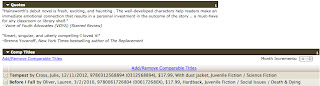
It’s a ton of work to do that, though, so I’d suggest setting up an account (for free) over at Edelweiss. If you’re not familiar with the site, it’s an interactive database where publishers can share their seasonal catalogs. You can hit up the catalogs of multiple publishers — both the big ones and the smaller ones — all in one place. Supplement that knowledge then with what you can pick up on the websites of the publishers who aren’t on Edelweiss. On Edelweiss, you can often find out what sort of distribution and marketing/publicity budget are behind the various titles, as well as comparable titles on the market and what the publicity and marketing plans may include. Sometimes you can see reviews from print and blog reviews. Not all of the publishers will provide this information, but some will, and that can be a good gauge for finding out what books might be getting a bigger push from the publisher than others. Worth noting though is that these plans can change, so they’re not always accurate. Still, a helpful and interesting look at what’s to come. Here’s an example of first print numbers, a marketing plan, and the comps/reviews that show up for a title:

Another incredible resource worth becoming familiar with is Netgalley, where publishers can share egalleys of their forthcoming titles, as well.  Unlike Edelweiss — where there are also options to request digital galleys — Netgalley is all for galleys. You won’t find the publisher catalogs there. You can, however, get a sense of what titles may or may not be getting a big push from it. If your goal is to know what’s coming out though, then both resources will serve you more than well.

Aside from studying the digital catalogs, I cannot emphasize enough how valuable galleys/ARCs are to discovering the lesser-known/less-prone-to-being-blockbuster titles. Via Edelweiss and Netgalley, you can request digital copies, and via trade shows or publisher contacts, you can seek print versions (if you’re a professional in some capacity either as a librarian or educator or blogger). I don’t need to rehash the value of ARCs, other than to reiterate how they are a valuable tool for collection development, readers advisory, and more.

Of course there are other resources including good blogs (which I will not be listing — you can find good book blogs through a million different keyword searches on any search engine and numerous professional journals have laid out their favorites, too). Blogs play an important role in raising awareness, particularly of lesser-known titles, so keeping an eye on a few that jive with your interests and passions or your professional needs/weaknesses is essential. Likewise, there are numerous thematic blogs and resources worth knowing, including blogs by debut authors (often those getting much less marketing/publicity push behind them), contemporary YA authors (again, often those getting much less push), urban fiction, for those trying to reach male readers, reluctant readers, and so on.

Maybe my biggest secret is this: as much as professional review journals such as School Library Journal, VOYA, and Kirkus are useful in terms of reviews, I find them more valuable in exposing me to new publishers or imprints. They provide the vital publishing information, and when I find myself drawn to a certain type of book, I note who publishes it. Through this, I’ve learned about smaller presses like Saddleback and Annick, both of which publish books for particular teen audiences that are sometimes overlooked by the bigger publishers. Make note of these publishers; that might be the most important part of a review because then you can go to their website, explore their back and future lists and figure out what you need to know. The more you pay attention to that information, the more easily you can know what kind of book you’re going to get out of those presses (i.e., you’ll quickly learn that Candlewick tends to lean toward more literary titles while Chronicle tends toward more “quirky” titles).

As far as self-published titles go, again, I’m not an expert on this by any means. But my suggestions of getting to know that field include paying attention to Netgalley (there are self-pubbed titles on there) and keeping an eye on what is and isn’t selling on Amazon.

Final Thoughts

Thinking about how vast the YA fiction publishing world is overwhelming. It is vast and it continues to grow. And by absolutely no means is it limited to the big blockbuster/best seller titles nor the books that publishers believe will be the hits. The thing is, it requires the time and effort to educate yourself on the landscape and to dedicate yourself to learning. It’s constant and regular and requires real time and effort to learn and discover what’s out there. But in my mind, it’s worth the hours because it means you are knowledgeable about what you’re passionate about. You’re better able to develop a library or reading list or reading recommendations because you’re aware of what exists — and even if you don’t know what exists, you know how to find it pretty damn easily. There’s a lot that could be talked about in terms of the long tail, as well, and about how there is an entire spectrum of books between the best sellers and the fan-fic/self-pub sensations.

Maybe, though, what is worth taking away from all of this is simple: being a book advocate means you need to do one thing: read. No one is going to hold your hand, no one is going to do it for you, but if you’re in this to do it right, it’s worth the effort and time to be the best you can be at it. Education never ends.

You just have to do it yourself and you are only as knowledgeable as you allow yourself to be.

Filed Under: Uncategorized

I Hunt Killers by Barry Lyga

July 24, 2012 |

Jasper “Jazz” Dent is the son of the world’s most famous serial killer, Billy Dent. Since Jazz was a little boy, Billy had been training Jazz in the family business. Billy himself is a true sociopath, and he killed far and wide in gruesome ways. He killed well over 100 people before he made a mistake and was eventually caught and given a life sentence.
Jazz was sent to live with his grandmother, Billy’s mother, who is senile, which means he pretty much takes care of himself. Despite being Billy’s son, Jazz himself had not yet committed murder and can pass himself off as a “normal” teen boy. He’s got a best friend and a girlfriend and is in the school play. But being the son of Billy Dent did a number on him, and he knows how to manipulate people, how to hurt them and get away with it, and he’s haunted by the voice of his Dear Old Dad that seems to always be telling him that other people don’t matter, that they exist only for his enjoyment.
When a young woman turns up dead in Jazz’s town, he’s convinced it’s another serial killer. The sheriff isn’t so sure, so Jazz sets out to prove it to him. As it becomes increasingly clear that this new killer has connections to Billy Dent, Jazz is even more determined to hunt him down and prove that he himself will not turn out like his father.
Let’s get the inevitable comparison out of the way: Yes, this is a lot like Dexter for teens. It’s not just a marketing phrase. I haven’t read any of Jeff Lindsay’s books, but I have watched a bit of the television show, and there are certainly a lot of similarities.
That said, what made I Hunt Killers an enjoyable read for me is how it diverges from Dexter. Jazz was raised to be a killer by his father and it’s a constant struggle for him to not act on impulses that have been hammered into him for years. He feels guilt over his actions (particularly when he manipulates people to get what he wants), and he’s horrified by his more violent thoughts. He doesn’t want to be a sociopath with no regard for others’ feelings or right to life. And this is the marked difference between the two characters: Dexter knows he is this way; Jazz fears he is this way. While Dexter as a character was engaging in a creepy way, Jazz as a character is engaging in a human way.
He’s also a character with a great voice. This story doesn’t sound like it was narrated by just anyone, and I thought Jazz came across as very authentically teen boy.
So, I like the way Lyga wrote his protagonist, but I also like the way Lyga writes, period. He’s clearly a pro. There are no awkward sentences, no stumbles, no rookie mistakes. I
don’t dislike debut novels, but sometimes it’s nice to read a book by
someone who’s done this before. It really shows here.
The mystery itself is enjoyable, if a bit predictable. Lyga doesn’t present the reader with a huge host of suspects, so it’s not hard to figure out the culprit. But the journey there is a thrill ride, and Lyga includes enough subplots to keep even the most perceptive reader’s interest.
Mysteries can run the gamut from pretty tame to pretty explicit, even when the subject is murder. I Hunt Killers is, probably unsurprisingly, on the more explicit end. The acts of violence are described in detail, and they are pretty twisted (the word “flayed” is used more than once). There’s also a fair amount of description of sexual assault. Dear Old Dad did pretty much anything you could think of to his victims, who were almost exclusively female. It’s certainly appropriate for a teen audience, but it won’t be for every teen. 
I Hunt Killers does what mysteries do best at the end: wrap up the current mystery and present us with other character-centric mysteries to solve in forthcoming novels. There’s closure AND there’s the desire to read more. I look forward to potential sequels, but I’ll have to space them out with some less brutal reads.
Review copy received from the publisher. I Hunt Killers is available now.

Filed Under: Mystery, Reviews, Uncategorized, Young Adult

So You Want to Read YA?: Guest Post from Kirstin Cronn-Mills

July 23, 2012 |

Today’s guest post for our “So You Want to Read YA?” series comes from author Kirstin Cronn-Mills. In addition to her post, I’m giving away an advanced copy of her forthcoming book, BEAUTIFUL MUSIC FOR UGLY CHILDREN (due out in October from Flux). 

Kirstin Cronn-Mills writes young adult novels and adult poetry. She teaches at South Central College in North Mankato, MN, where she is the faculty advisor for SCC PRIDE (People Really Interested in Diversity Education). She lives with her husband and teenage son and very much enjoys goofing around. Beautiful Music for Ugly Children is her second novel. 

In my day job, I’m a college
teacher—literature, academic writing, creative writing, critical
thinking. All of those classes require some exploration of “what
does this piece of communication DO?” And of course, communication
can do different things for different people. But it’s the first
question I ask when I decide what to teach (or write): what do I
want this book/idea/film/discussion to DO? I decided to approach
this post with the same spirit: if you’re going to read YA, what
do you want it to DO for you?

First, as an aside—do you want your
book to be a favorite of mine when I was young? Probably not, but if
you do, you need A Wrinkle in Time by Madeleine L’Engle,
Island of the Blue Dolphins by Scott O’Dell, or The Cat
Ate My Gymsuit
by Paula Danziger. I don’t know if any would
be considered YA (I’d call them middle grade), but they’re still
awesome books.
Back to today. Do you want your book
to scare you? For me, that’s dystopian YA—books set in the real
world with a futuristic or science-fictiony or fantasy twist. The
scariest book I’ve read lately is Delirium by Lauren
Oliver. Love is illegal, and it becomes very scary business when
Lena discovers what it means to be in love. My next-to-be-read
dystopian is The Way We Fall by Megan Crewe. Virus books
like this one—blabbing secrets! Hallucinations! Death!—scare the
crap of me, because they seem possible.
Do you want your book to amuse you?
There are plenty of funny YAs out there—too many to list—though
humor isn’t a subcategory of YA as much as it is a delightful spice
in in the YA mix. Will Grayson, Will Grayson is my suggestion
here. A double author book by John Green and David Levithan, the
story revolves around Tiny Cooper (“It takes a village to date Tiny
Cooper”) and two Will Graysons. When you’re a teenager,
EVERYTHING is either deadly serious or highly hilarious. I like my
novels with a mix of both, and this one delivers nicely.

Filed Under: Guest Post, So you want to read ya, Uncategorized

For Darkness Shows the Stars by Diana Peterfreund

July 20, 2012 |

Elliot North is a Luddite, a member of the land-owning aristocratic class that has sat at society’s peak since the Reduction crippled humanity. Thought to be the result of over-reliance on technology and scientific experimentation, the Reduction caused a large portion of the population to give birth to mentally deficient babies, a condition that persisted for generations.
The Luddites outlawed technology and have since then ruled over the “Reduced” (those with reduced mental capabilities) and the “Posts” (children of the Reduced born without mental deficiencies) who live on Luddite land and serve them in much the same way indentured laborers or slaves did in the American South. Posts are actually fairly new – for many generations, children of Reduced people were Reduced themselves. 
Kai is a Post. He grew up on Elliot’s father’s land, and the two became friends as children, despite the huge social gulf between them. And they eventually fell in love. When Kai decided to make a better life for himself, far away from a place that kept him a prisoner, he asked Elliot to come with him. 
She said no, choosing loyalty to her family over Kai. Now it’s four years later, and Kai has returned with a new name, a new job, and a secret. He and his group of explorer Posts have rented land from Elliot’s family in order to build a ship, which brings Kai into almost daily contact with Elliot. There’s tension and longing and restraint and recriminations and all the other good things you find in a really delicious romance.
For Darkness Shows the Stars is more like Austen than some other modern or SF/fantasy re-tellings in that Peterfreund concentrates a lot on the society and the complexities of her two leads and not as much on the plot. That’s not to say that there isn’t a plot, but this is certainly a character-driven story. Readers looking for a more “traditional” dystopian/post-apocalyptic novel that features plenty of action and shocking plot revelations will be disappointed. 
Readers looking for a steamy romance will also be disappointed – Elliot and Kai barely even touch. But it’s swoon-worthy all the same, for the same reason modern readers still find Austen’s original works swoon-worthy: mature, lovely writing that connects us so closely to Elliot and Kai that we feel each misunderstanding, each look, each unspoken sentiment keenly. It makes for a pretty intense read, and it’s a testament to Peterfreund’s writing that she’s made a book with almost zero physical contact so romantic.
I was pleased with the way she wrote the society as well. It’s an impressive feat of world-building, with plenty of detail that unfolds naturally over the course of the story. Unlike many stories that feature a blighted future society, this one makes sense in the context of the story’s events. It’s also not sensationalized. The Reduction is a terrible thing, and what the Luddites did to the Reduced and the Posts since then is also terrible, but I never felt that it was done to shock. And for all that this setting is so very different from that of today and is so vital to the story, it’s still just the setting. The real story is about Elliot and Kai’s relationship, and Peterfreund doesn’t make their desire to investigate the Reduction the primary plot point. Their relationship and their own growth as individuals are what she is most concerned with.
For Darkness Shows the Stars was a real breath of fresh air for me. It’s a dystopia and a romance and an Austen re-telling, but it’s a unique story and not a carbon copy of anything else. Plus the writing is excellent. Highly recommended.
Book borrowed from my local library.

Filed Under: Reviews, Science Fiction, Uncategorized, Young Adult

The mid-series cover switch

July 19, 2012 |

It’s not really a surprise anymore how much I think about book covers and about the trends relating to them. However, there is a trend that’s becoming more and more popular, and it’s one that doesn’t bother me much on a personal level so much as it bothers me as a librarian: the mid-series cover change. I’m not talking about when a series changes appearance when it goes from its hard cover iteration to a completely new paperback look; I’m talking about when the paperback change in appearance is forced on the hard cover before the entire series has released. Before I explain why it’s frustrating, let’s look at a handful of examples.

Glow by Amy Kathleen Ryan — on the left is the original hardcover book, followed by the paperback cover look. Here’s the second book in the series, and how it appears in hardcover:

Rather than continue with the dark, simplistic look of the original hardcover, Spark‘s first appearance will follow the look of Glow‘s paperback. For what it’s worth, I think the original look of the series was fantastic and gender neutral. It was stark, clean, and simple. The new designs are a little too gendered for my liking (because this series has great appeal to both males and females) and they’re way overcomplicated. There’s too much running/floating/weird expression making going on. They don’t scream scifi in the way the first look does.

Then there was the change-up in how Elizabeth Miles’s series about the three furies looks. On the left is the original hardcover look of book one, Fury. The paperback look is on the right. I’m not sure I understand the difference since the first certainly looks much more like it fits the content than the incredibly generic cover on the right. Here’s what book two in the series looks like, in hardcover form:

Envy at least has the same red flower petals donning the cover. It still tells me absolutely nothing about the book. Is it just me or does this model look like she’s in her 20s and in no way a teenager? The longer I look at this redesigned series, the more it reminds me of another series that got a similar redesign treatment. And looks just as generic, too.

Lauren Oliver’s Delirium came out in hardcover form with the design on the left. I remember thinking it looked sort of like the girl was mid-sneeze in the image. I think it was meant to be a dreamy look, but it doesn’t really look that way. The cover on the right is the paperback issue. Isn’t it strikingly similar to the Miles series in terms of having a big face surrounded by plants? They chose to stick with this look for the hardcover release of the second book and will continue it with the hardcover look of book three, too (at least at this point):

There is nothing spectacular about these at all. But at least they keep the same model on all of them. It’s a big departure from the original hardcover look, though, and looks so similar to Miles’s books.

There’s also Andrea Cremer’s series which got a makeover mid-series. On the left is the original hardcover look for book one, Nightshade. The cover on the right is the redesigned series look and is the paperback issue of the title. But that look is what carried over into the second book’s hardcover design and into the third book’s hardcover, too:

Wolfsbane is book two and Bloodrose is book three in the series. They don’t look anything like the first hardcover look, having a little more edge and urban fantasy appeal to them (the first hardcover look to me is a softer look). If you’re curious, the advanced review copy of Wolfsbane did carry the first look prior to publication but changed. I think I prefer the original look, but I haven’t read this series. I suspect the second look — the harder appearance — might be a better “fit” for it, though.

Ilsa J Bick’s zombie series “Ashes” is getting a way different look, too. On the left is the original hardcover design (which is creepy, especially in person) and on the right is the way it’ll look in paperback form. I like the look a lot, actually: it’s different and still manages to give off a nice creep factor — though in no way like the original look. The hardcover version of the second book in the series, Shadows will carry the new look on the cover:

Redesigns are into this running thing, aren’t they? I really dig this cover. I think what’s working for me in this redesign is the title treatment. It’s striking because it runs a little differently and allows the reader to sort of construct their own image of the story. Shadows doesn’t hint at the creep factor in the same way the original cover of Ashes does, but I think that might be okay. I have a feeling book two is less about the start of the apocalypse and a lot more about survival.

Tahereh Mafi’s Shatter Me is getting a new look, too. On the left is the original cover, which features all of the same elements that every other book does: a girl in a pretty dress. It doesn’t really tell anything about the book. It is striking in person, though, since the silver has a nice sheen to it. The right is the redesign of the series, featuring an eye floating in the air. It doesn’t really do anything for me. I guess it’s different from the trope covered in the original look. But here’s the redesigned look on the hardcover release of the sequel:

Unravel Me‘s hardcover looks so similar to the paperback release of Shatter Me that I am pretty sure they’ll be easily confused (I can imagine without doubt being asked if they’re the same book because they do look that similar to one another). I guess this cover is brighter and perhaps more hopeful as a result. Either way, it’s not a girl in a dress, though it’s not necessarily standing out anymore.

I loved the original hardcover look of Daisy Whitney’s The Mockingbirds. It’s so simple and clean and just fits the story. The paperback iterate is on the right. It’s not bad, and it, too, is pretty striking. I love the look of the girl on the cover and how it feels somewhat noir. That said, I am sad that the hardcover of the companion book, The Rivals, didn’t get the original treatment at all and went straight to the paperback look:

I wish they’d gone with the look of the ARC on this one for the hardcover release, rather than jump straight to this look. This carries that same sort of noir look as the paperback of The Mockingbirds, but it features some random guy on the cover (with weird face stubble if you zoom in enough).

Maureen Johnson’s The Name of the Star started out with the look on the left. I think it effectively captures the historical/mysterious nature of the book, though I was never a fan of the girl/shadow effect going on. On the right is the look of the paperback, which I really dig. It’s simple, but it captures the haunting feeling very well. The title treatment works for me. Here’s what the hardcover of the second book will look like:

I’m a big fan. BIG fan. Again, the simplicity does everything for it. You know where and when it’s set, and you know there’s something suspicious going on. And really, that is all you need to know. But this hardcover look and the paperback of The Name of the Star are certainly a departure from the very dark, shadowy look of the original hardcover.

Holly Black’s “Curse Workers” series almost made it through the entire hardcover trilogy of the series before getting a cover change, but not entirely. Above are the hardcover looks for White Cat and Red Glove. These covers were knockouts, in my mind, particularly White Cat. There is huge appeal for both males and females in it, and the fact the guy is so mysterious looking sells the story. Do I need to start on the creepy red glove on the girl’s shoulder in the second? Alas. Both of these books got the paperback redesign and now look like this:

These are so unremarkable to me. They look like advertisements out of the 1970s, with the look of the image and the font choices. The hardcover of the final book of the series, Black Heart, got this look, rather than the original one:

Books aren’t gendered, and I truly believe a good story can work for anyone, but these covers are definitely working toward appealing to females much more than males. I am not a fan of this new look, as I think it’s a little sleepy and won’t stand out on the shelves the same way the originals did.

And finally, let’s look at one last series which has had not just one redesign mid-way through the series, but two:

Beth Revis’s Across the Universe began its life with the look on the left. It’s standout, but I read a number of criticisms that it wasn’t authentic to the characters in the story (I don’t know since I haven’t read it). When it came out in paperback, it took on the look on the right. Still pretty standout, in my mind, though both versions of this cover have appeal to a more female readership. Here’s what the hardcover of the second book in the series looked like when it came out:

A Million Suns took the best parts of the first look for the series and mashed it with the good parts of the second book. Again: it’s striking. It looks like a space-set scifi novel. But with the paperback release of A Million Suns and the release of the third and final book in the series, Shades of Earth, all three books are getting a new look:

The hardcover of Shades of Earth will take on the look to the far right here, while the other two books will be issued in paperback with the new style. I think of the three iterations of the cover, this is the one that nails it. You know these books are scifi, and they are so neutral that readers who love genre fiction will know this is something they need to pick up. It’s completely ungendered. What’s so remarkable, I think, is that there isn’t a person or an image on the covers; it’s simplistic and clean.

Series looks change as a result of sales and marketing and for a number of different reasons. A new look can spark new interest, especially if the original look for a series didn’t necessarily hit the mark. In a crowded YA landscape, getting the look right is important to the bottom line. Working the right look for a series is tricky, too: whereas standalone titles can have their paperback look remarkably different from the hardcover and have little impact on future titles, a new look in a series can impact the sales for future and past titles in that series. 

Many readers comment that these sort of series look changes bother them because then their shelves look strange. The covers don’t match, the complete set may be in differing sizes and shapes. It’s not harmonic. But that doesn’t matter a whole lot to me, the reader. What matters to me is that this sort of mid-series change, where the hardcover book takes on the new look before the series has finished its run, is difficult to work with in the library.

First, when the covers change their appearance, there isn’t instant recognition of continuity on the shelves. A casual browser wouldn’t know, for example, that The Rivals, as it appears in its new hardcover look, is the companion to The Mockingbirds in its original look. A casual browser wouldn’t know that Unravel Me‘s hardcover is in anyway related to the hardcover of Shatter Me. Part of why so much time and thought and money is invested in cover designs is because that is how readers’ attention is grabbed: a good looking cover grabs them before they dive into the flap copy or description. This is the same case in the library, in that browsers are more apt to grab a book that appeals to them visually. So when the covers are so disparate, it’s tough to know whether or not they’re companions or part of the same series unless the time and energy is invested in reading the copy (browsers have to get to that point first, though).

More than that, though, many librarians are not up on their YA. This is for many reasons, including specialties, library size, time of day a patron visits the library and who they talk with, and so forth. So when a patron approaches a librarian and asks for the next book in a series or asks if two books in a series with varied looks are related, it’s possible that the librarian would have no clue. Even if they were to go into their library’s catalog, there wouldn’t necessarily be a lot of aid, either:

 
You’d have to do a little more digging to figure the connection out (a good librarian would do that, don’t get me wrong, but the truth is, there is nothing here to suggest a connection so the chances of it being investigated further are somewhat slim). It’s easier when the books put their series name on them somehow — as in the case of the Johnson and Ryan titles. But, as you can see above, not all of them do. 

Where as big book stores can more easily swap out their unmatched series, libraries don’t often have that sort of luxury. Which then brings me to wondering about whether or not libraries are doing themselves a disservice in someway by purchasing the hardcover editions of hot series books. By the time they purchase the books, a new design for the paperback might be in the works, and the new design might take effect starting with the second book of the series, which then gives them a mismatched set. Given how tight library budgets are, there are rarely times when both a full hardcover set and a whole paperback set can be purchased, so arguably, it almost makes sense to hold off on purchasing series books until they’re out in paperback form. Of course, that then is a disservice to patrons, who expect (rightly so) their libraries to be purchasing new items when they’re released — particularly if they’re buzzed, popular titles like most of these are and have been.

Even though libraries are only part of the purchasing power when it comes to publishing, it seems like these sorts of changes have a great impact on library collections. Not just because they don’t match, but because their lack of matching does make browsing, readers advisory (think about the things pointed out above, particularly when it comes to appeal of a new look to different readerships), and display marketing (think about how a display with the three different hardcover iterations of Revis’s title would look) more challenging. It makes keeping up with purchasing challenging too, since the books look different. The chances of the next book in the series to be overlooked because visually it appears so different from the first are good. This also further drives a wedge in the knowledge gaps that exist among staff who may know little or nothing about YA books and still find themselves needing to know about them.

What are your thoughts on series books that get changed half-way through? Do any of the ones above look better in their original or redesigned covers? Do you see appeal factors changed on any?

Filed Under: aesthetics, cover designs, Uncategorized

  • « Previous Page
  • 1
  • …
  • 201
  • 202
  • 203
  • 204
  • 205
  • …
  • 404
  • Next Page »
  • Facebook
  • Instagram
  • Pinterest
  • Twitter

Search

Archives

We dig the CYBILS

STACKED has participated in the annual CYBILS awards since 2009. Click the image to learn more.

© Copyright 2015 STACKED · All Rights Reserved · Site Designed by Designer Blogs