• STACKED
  • About Us
  • Categories
    • Audiobooks
    • Book Lists
      • Debut YA Novels
      • Get Genrefied
      • On The Radar
    • Cover Designs
      • Cover Doubles
      • Cover Redesigns
      • Cover Trends
    • Feminism
      • Feminism For The Real World Anthology
      • Size Acceptance
    • In The Library
      • Challenges & Censorship
      • Collection Development
      • Discussion and Resource Guides
      • Readers Advisory
    • Professional Development
      • Book Awards
      • Conferences
    • The Publishing World
      • Data & Stats
    • Reading Life and Habits
    • Romance
    • Young Adult
  • Reviews + Features
    • About The Girls Series
    • Author Interviews
    • Contemporary YA Series
      • Contemporary Week 2012
      • Contemporary Week 2013
      • Contemporary Week 2014
    • Guest Posts
    • Link Round-Ups
      • Book Riot
    • Readers Advisory Week
    • Reviews
      • Adult
      • Audiobooks
      • Graphic Novels
      • Non-Fiction
      • Picture Books
      • YA Fiction
    • So You Want to Read YA Series
  • Review Policy

STACKED

books

  • STACKED
  • About Us
  • Categories
    • Audiobooks
    • Book Lists
      • Debut YA Novels
      • Get Genrefied
      • On The Radar
    • Cover Designs
      • Cover Doubles
      • Cover Redesigns
      • Cover Trends
    • Feminism
      • Feminism For The Real World Anthology
      • Size Acceptance
    • In The Library
      • Challenges & Censorship
      • Collection Development
      • Discussion and Resource Guides
      • Readers Advisory
    • Professional Development
      • Book Awards
      • Conferences
    • The Publishing World
      • Data & Stats
    • Reading Life and Habits
    • Romance
    • Young Adult
  • Reviews + Features
    • About The Girls Series
    • Author Interviews
    • Contemporary YA Series
      • Contemporary Week 2012
      • Contemporary Week 2013
      • Contemporary Week 2014
    • Guest Posts
    • Link Round-Ups
      • Book Riot
    • Readers Advisory Week
    • Reviews
      • Adult
      • Audiobooks
      • Graphic Novels
      • Non-Fiction
      • Picture Books
      • YA Fiction
    • So You Want to Read YA Series
  • Review Policy

Hardcover to Paperback: Six YA Book Makeovers to Consider

December 2, 2013 |

Let’s do another round of hardcover to paperback makeovers, shall we? Every season, it’s fun to see what books are getting new looks, but it’s even more interesting to wonder whether the new covers nail the story better than the original. As usual, some of these are great changes and some definitely are not.

I picked up a copy of Steven Arntson’s The Wrap-Up List quite a while ago but never got around to reading it. I love the envelope cover, which is the initial hardcover look. It’s a really simplistic design, but it tells the reader quire a bit about the story. It’s gender-neutral, and it looks like the kind of book that could have good readership across age groups because there’s not a person on there nor is there an image that could be dated. But the argument here could be the exact opposite of what I’ve said: because it’s so simplistic a cover, it maybe doesn’t tell you anything about the story or about the intended audience of it. It’s possible that’s why I haven’t picked it up yet — I don’t know whether it’d fit whatever reading mood I’m in because I don’t know what it’s about. It’s not necessarily iconic nor memorable.

The paperback redesign on the right is also simplistic, but the addition of the tag line actually adds a lot to explaining what the story is about. This is a story about someone coming to terms with the end of their life! The wrap-up list then likely refers to the things they’re hoping to “wrap up” before they don’t have the time to do so any longer. The paperback also seems to “age” the book into a category a little bit more, too: it’s a torn piece of notebook paper, and the title itself is handwritten in pen. The note looks like it’s taped on the top of a student test. It’s a book meant for teen readers.

For me, this is a pretty even exchange. I think the paperback better targets the readership, but I don’t think either one is necessarily bad nor is either one outstanding. The Wrap-up List will be out in paperback from Houghton Mifflin Harcourt in paperback on May 13, 2014.

One of the things that made Out of the Easy‘s hardcover stand out to me was the color. It’s a couple of shades of really stand-out green, and it’s easy to spot on shelves. The cover image itself isn’t necessarily the most memorable, though. The girl looking at the bird cage fits the story (in a metaphoric sense), but I don’t know if it’s an iconic cover overall. It does, however, say this is a YA book. What’s interesting to pay attention to on the hardcover is what’s pulled out. The author’s name is large and noticeable, as is the title. But what caught my eye was that it notes she’s a New York Times Bestselling author. Hold that for a minute.

The paperback redesign, available March 4, does nothing for me. It reminds me a lot of an adult fiction novel, perhaps something literary or perhaps something geared toward female readers — I don’t want to call it chick lit nor women’s fiction, but that’s the vibe of the cover I’m getting. It’s kind of boring and forgettable in a way that the hardcover edition isn’t. It’s faded out, and even the lone hanging shirt and suitcase to me say something about the forgettable quality of the image. Check out, though, how the title and author treatments are different on the paperback: Ruta’s name is much larger and more noticeable, as she takes up two lines and nearly 1/3 of the real estate on the cover. The title, in contrast, is very small and positioned in such a way it’s easy to overlook. Rather than having Ruta called out as a NYT Bestseller by her name, she’s noted instead as an internationally best selling author (though the NYT recognition comes, too, just later on on the cover). And then there’s a blurb from Entertainment Weekly, too. For me, this cover is angled specifically at adult readers, rather than teen readers. It has a big name publication giving it acclaim, two notes of the author’s sales capabilities, and a cover that looks somewhat generic and inoffensive.

For me, the hardcover is much stronger than the paperback here for YA readers. Though for adult readers, I suspect the paperback is more appealing.

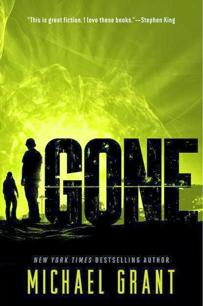
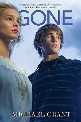
Michael Grant’s Gone series is getting a new makeover in paperback. Right now, the paperback editions of the hardcover books have the same cover, but with the publication of the final book in the series, the paperbacks are going in a new direction. So on the left, the hardcover edition of Gone, the first in the series. It’s a fairly generic — and I’ll even say unattractive — cover. Two people looking in the distances. They don’t really have anything memorable about them. But I’d say if anything, the original cover is gender neutral, even if it doesn’t tell you anything about the book itself. There is a tagline on the hardcover, “This is the way the world ends,” but that tag line in the original paperback edition changes. It’s instead a pull quote from a Booklist review. Later books in the series don’t have a tag line, but a pull quote from Stephen King.

I note the Stephen King pull quote because in the new paperback edition, shown on the right, it’s there but easy to miss. The white font sort of fades into the bright coloring of the background. For the most part, I dig this makeover. It’s gender neutral in the same way that the original covers are, but it gets rid of the people who are on it. And while I think they’re gender neutral, part of me wonders if the makeover helps give these books even more boy appeal than they originally had: they look more like action novels than they do Serious Stories with people on the front. Also worth noting that Grant’s name is much bigger on the new paperbacks, as is his distinction as a New York Times Bestseller.

For me, the new paperbacks are winners here. I think they’re much more appealing and they stand out. The other covers look like any number of other series (think Kevin Emerson’s series, for one).

To a cover makeover I don’t get at all: Robin LaFevers’s Dark Triumph. On the left, the original cover. I know very little about the time setting and story here, aside from what Kimberly’s written, so I don’t know about accuracy or relevancy to the story. But I know so much that this cover fits very well with the cover for the first book in the series, Grave Mercy. I like the tag line “Vengeance is divine,” and I like that this series has done a really good job of noting that it’s part of the His Fair Assassin series. It’s a very small detail, but it’s something worth its weight in a library setting for readers, as well as for those who help readers but may not be familiar with YA books. Overall, the cover on the left just fits.

But the paperback is getting a different look — but it’s a very small different look. The title and author treatments are identical, as are the tag line and noting of the series at the top of the cover. What’s changed is that the girl in the image is no longer looking from the side out, but she’s instead looking straight on at the reader. She’s not wearing a head covering, but instead, her hair is hanging down and loose. She doesn’t necessarily look like she belongs in a period in history in this cover. She looks very modern. Even somewhat goth. Rather than have her dagger to her chest, she’s now got it pointed out. This is a very action-oriented cover in the way that the other image is not. What’s interesting, too, is how the background’s changed. There’s light behind her in the paperback, where there is nothing but a closed space in the hardcover.

This isn’t a bad makeover in the least. I like that the designers took care to keep the style so similar that it won’t look weird when paired with Grave Mercy, which has not received a makeover in paperback form. But I can’t help wondering why the change? Was there something in the text that makes the paperback more true to the story than the hardcover? If anyone has read this one and wants to weigh in — whether one is a better and more truer design than the other — I’d love to know. Perhaps it has to do with historical accuracy?

The paperback edition of Dark Triumph will be available April 1.

It feels like I read Without Tess by Marcella Pixley a long time ago, and when I go back into my reviews, it turns out that I read and reviewed this one in September 2011. The hardcover on the left is very quiet, and I think it reflects the story quite well. I really like the title treatment and the use of the words and font down the front. They stand in place of any kind of tag line or blurb. The author’s name is small and in the corner, but it’s not hard to see and it stands out in dark gray against the stark white of the rest of the cover.

Of course, the quiet cover means that it doesn’t stand out on a shelf, nor does it necessarily give the reader any insight into what the story is about. But there is something to be considered about how the cover conveys tone very well here.

The paperback of Without Tess will release May 13, 2014, which is quite a long time between the initial publication in hardcover in 2011. Like the original, the cover here is also quiet, but it seems to be a different kind of quiet. This cover reflects the content a little bit more, and it portrays the sense of loss in a way that the flower and handful of words do not in the original. There’s been an addition of a blurb from Francisco X. Stork on the cover, which I think is a really nice name to have giving Pixley’s book some props — readers who dig the kind of quiet story Stork writes will likely find this one to be a good read. What I don’t like about the paperback, though, is the title font treatment. The color is right but I think that the font itself looks very young, casting this much more as a middle grade novel than as a young adult. Maybe it’s my screen resolution, but it looks as though there are small white lines aiming up toward the font, too, which only furthers the juvenile feeling. I also note that Pixley’s name is done in a thin, white font that is easy to miss with the blue background.

I think the hardcover of this book is much stronger, but I wouldn’t be surprised if the paperback has more appeal to a wider range of readers.

Anna Collomore’s psychological thriller The Ruining came out earlier this year with the cover on the left. It’s an eye-catching one: there’s the girl half underwater with the massive mansion in the back. It’s a neat contrast and a nice metaphor. I feel like this is quite a memorable cover because it’s so different. There’s not a blurb nor is there a tag line on the original cover. The title and the author’s name are done in pretty standard fonts that don’t detract from the greater image.

The paperback edition of Collomore’s The Ruining will be available February 6, 2014. And it’s completely different than the original cover: there’s a closeup of a girl who looks way, way older than a teenager. She’s clearly upset about something, and she looks slightly off. It’s a memorable facial expression, for sure. There’s a girl in the background, too, though little could be said about her expression nor of her body language because she’s so far back. Is she turning a light switch on or off? Is she just holding the wall to stay standing up? I like the pop of yellow and white that the wall brings to the cover, and I think that the pink used for the author’s name stands out nicely, too. But the title itself seems to get lost in this image in a way that doesn’t make the image stand out. It’s just easy to overlook. There’s a pull quote from a Kirkus review, too: “gripping stuff.” I don’t know how much that tells anyone anything about the book, nor do I think it helps give the cover something new or different, either.

It feels like this cover isn’t aimed at teen readers. It looks like the kind of cover you’d find in the adult section, and it’s really possible the target is adult readers here. If the girl looked younger, perhaps I’d feel differently. But she doesn’t look like she’s a teen. She also looks heavily photoshopped (unless that’s just my computer’s screen resolution). Either way, the new paperback doesn’t stand out to me and it’s easily forgettable in a way that the hardcover isn’t. You wouldn’t know this is a psychological thriller.

Hardcover wins this one, hands down.

So of the covers above, what do you think? Which ones are winners and which ones could have stuck to the original and been better?

Filed Under: aesthetics, cover designs, Cover Redesigns, Uncategorized, Young Adult

Hardcover to Paperback: Five to Check Out

October 22, 2013 |

One of my favorite things to look at in publisher catalogs each season are the titles being released in paperback and the changes that the covers may have undergone in the process. Sometimes it’s a huge change. Other times, it’s really subtle. Sometimes, it nails the story better than the original or highlights a different aspect of the story than the hardcover image did. And other times, it’s way off the mark.

In this edition of hardcover to paperback, most of the titles I wanted to talk about didn’t have huge changes. Many maintained a look they’d had in hardcover with slight tweaks (though one of the covers below got an entirely new look). None of these are bad changes, but some of them make me wonder what the change intends to do for the book in terms of selling it. If it’s not that different from the original, it makes me wonder why the change happened at all.

Let’s start with the big change.

The hardcover edition of Tiffany Schmidt’s Send Me a Sign is graphic and text driven — it plays into the idea of superstitions, which is a big element of the book. Mia, the main character, believes in signs. To me, the cover has a small element of sadness to it. While it’s bright, when you know what the book is about, the cover may suggest that there’s not necessarily a happy ending to the story. It’s a book about a girl diagnosed with cancer, and the white dandelion with its petals floating away may suggest death more than it does life. In many ways, the cover doesn’t tell you a whole lot about the story, though I think it does look like a YA novel. The swirly font may play into that a little bit. Note that there is a blurb.

The paperback cover of Send Me a Sign is something completely different. While anchored by one image of a boy and a girl, rather than font and a non-person image, it doesn’t do away with the original design completely. The font for the title is still swirly, and there is an homage to the signs and superstitions element to the plot with the four-leaf clover as the dot in the “i” for sign. Although I think the image itself isn’t entirely memorable — the couple looks like a couple that graces many a YA cover — what I love is that this cover speaks a lot more to both the content of the book and the readership of the book. There is a big romantic element to the story, and this image drives that message much more than the hardcover does. Teen readers who see this cover will know much more readily whether this is a book they want to read or not because it looks like many other books featuring similarly appealing story lines.

I happen to like both of the covers for this one. The first because it’s different from a lot of YA covers out there, and the second because it speaks better to the story.

Send Me a Sign will be available in paperback on January 14, 2014.

Jennifer McGowan’s Maid of Secrets is getting one of those makeovers I’m not sure I completely understand. On the left is the original hardcover. It’s not necessarily the kind of cover that stands out, but it also speaks to the content of the book. The girl has a great look on her face, including a fierceness in her eyes with just enough of a smile that it’s not a scary look. I love the dagger in her hands, since it offers up a little bit of an idea of the time frame of the story and even a little bit about what may be at stake. The font for the title isn’t necessarily memorable, but it works with the image to allow that image to stand out. And note that there is a blurb on the cover — a simple “Winning,” from Robin LaFevers, who is probably the perfect name to have gracing the cover of a book like this with a blurb. In many ways, I’d say the look of this particular cover suggests it’s a worthwhile read alike to LeFevers’s own series. I’m a big fan of cover alikes, since it does a lot of service to readers who want a book like one they’ve read before but don’t necessarily want to ask for help. It’s passive and easy.

The paperback look of the cover isn’t bad, but it also doesn’t do anything different. Sure, there are now three girls instead of a single one. What’s weird is that this cover seems to remove a lot of the power that the hardcover had, making it almost more of a story about the three girls than about power or intrigue. The girl in the middle is having her hair brushed, and the focus of the image is no longer on the expression on one girl’s face — it’s instead on the dresses the three girls have. I think in many ways there is a removal of power in this cover. There is still a dagger in the girl on the right’s hand, but look at how it’s much more an accessory to her dress than it is a tool she plans on using. The new cover changes up the title font, and I quite like it, though I think there is a lot more artistry at play with it than there is necessarily power. There’s no longer a blurb on the cover, as it’s been replaced with a note that this book is the first in a series — I actually find that helpful to be on the cover, since it will help readers know there are other books to come.

That said, will readers think that the paperback version of Maid of Secrets may appeal to readers who liked Robin LaFevers’s series? I’m not entirely sure. I don’t think they’ll be turned off by it, but I think they may not make the connection as readily. While I like both covers, they convey much different things, and I think the hardcover edges out the paperback for me.

The paperback edition of McGowan’s book will be available June 24, 2014.

The Tragedy Paper by Elizabeth Laban fascinates me from a cover perspective. It’s not entirely memorable, but it’s also not entirely forgettable either. There are a lot of elements in the cover that make it both: it’s a guy running away from something in a wooded area. There’s snow on the ground and snow falling. I feel like this describes a ton of covers, but I also feel like it describes this cover. I find the font for the title distracting and hard to read because it’s been made to look blurry and jagged. Since it’s white, that only adds to the challenge of not feeling like my eyes struggle to focus on it (basic design principles suggest that white font on a dark background is simply harder to read, no matter what). Note that the blurb for this book comes from an adult fiction author — Jennifer Weiner. That says a lot to me, too, particularly that this book may be aiming to be a crossover hit, as well as a book that is trying to be on trend with blurbs from well-known, New York Times Bestselling adult authors (see John Green’s blurb of The Fault in Our Stars from Jodi Picoult). The cover is being packaged in such a way that it looks like the kind of book that will receive award consideration or recognition. It’s an iconic-like cover with a blurb from someone well-known in the business, even beyond the YA world. This is not a bad cover.

But that paperback. Let’s talk about a cover that is meant for adults and not teens.

The cover for the paperback looks like a movie poster, and not in a good way. There is far too much going on in terms of design, with the original boy running through the woods layered on top of a girl who is looking away with a sadness in her eyes. I have a hard time believing the model looks like a teenager, too — she looks like a twenty-something, if not even older than that. But back to the boy running through the woods layer. I’m curious why it is he’s suddenly blurry now, too? And why did they choose to make the title font even more blurry than they were in the original hardcover look? I think they did a service in not making the author font blurry and also by making it not white, though that might be the strongest aspect of this cover. Also note that the blurb from Weiner was relocated to a position that makes it more prominent — upper right-hand corner. The Tragedy Paper‘s paperback cover looks like an adult trade paperback much more than it does a YA paperback. It loses an iconic YA look to it with the layering and further blurring of font, though I think that this book looks like one more adults would pick up than the one on the left.

That said, I am not a fan. I prefer the hardcover look of this one without question. The Tragedy Paper will be available in paperback on February 11, 2014.

Here is a makeover I don’t necessarily understand but I really, really like. Phoebe North’s Starglass is getting a new look in paperback. On the left is the original hardcover, and I think it’s a pretty good cover. I love the way the girl looks; even though her back is to the reader, we know there’s something she wants and she’s determined to go after it. It’s entirely in her body language, her stance, and even the wind in her hair doesn’t make her look like she’s anything less than ready to conquer the challenge ahead of her (because what she wants is ahead of her there). I love that she is dressed like a teenager, too — she’s wearing a longer coat and pants. I think the font for the title is fun and fitting, and you really get a nice sense of the book’s genre from the cover as a while. It’s science fiction. Likewise, I think the violet coloring of the cover as a whole helps it stand out on the shelves. Few covers are that color, and fewer still within science fiction are that color. The Veronica Roth blurb running along the top only helps make a case for readers to pick up the book.

On the right is the newly designed paperback of Starglass, and I really like this one, too. I may even like it a little bit more than the hardcover. In many ways, it looks like Beth Revis’s series, and I think the redesign tells readers that if they liked Revis’s book, they’ll probably want to give North’s a shot. The new cover makes it even more obvious this book is science fiction, but it’s not off-putting in any way. This is a girl looking down on Earth, and it’s clear from her body language that she, too, is determined to take advantage of her future (but maybe in this case, without forgetting the place where she may have came from). Again, I love the choice in how the model is styled here, too: she’s wearing pants and a killer pair of boots. Where I really liked the font for the title and author name on the hardcover, I love it on the paperback. There’s something about the clear glass look that really ties this cover all together. Again, the Roth quote is included, though I do find it interesting that Roth’s name is larger and much more obvious than North’s name on the cover.

While both covers do it really well, I prefer the paperback just a tiny bit more.

What I really appreciate about this particular cover makeover, though, is that the second book in the series, Starbreak, fits with either the hardcover or the paperback look:

Readers and librarians who purchased the hardcover of Starglass don’t have to worry about the second book in the series not looking like the first one at all. That is a huge reader service in the face of a redesign and one that as a librarian, I appreciate so much. It makes it clearer that these books belong together.

The paperback of Phoebe North’s Starglass will be available July 15, 2014.

I’m going to put this redesign of Sarah Skilton’s Bruised into the category of not understanding the intentions behind the redesign. On the left is the original cover, which is pretty excellent. I love the broken trophy of a tae kwon do girl — it’s a perfect representation of the story inside the book. The title font is nicely done, and I feel like the little splatters of blood hovering above the “i” tie into the reason why the tae kwon do girl is broken so well. The cover is fairly gender neutral, aside from the pony tail on the trophy, and it conveys the entirety of the story with very little. There is a tag line which reads “She failed to save his life. How will she live her own?” Again, a nice way to tie the cover together and tie it all right back to the story. Note that the author’s name is large and across the bottom, and there are no blurbs on the front cover (something that carries over to the paperback, as well, but it’s noteworthy because of how rare that seems to be).

The paperback redesign of Bruised is a head scratcher for me. It’s essentially the same cover, but with the title made to be a lot bigger and in a different style and stretched diagonally across the cover, rather than centered through the middle. It’s a nice font, but it’s lacking the sort of tie-in to the story that the original has with the blood splatters. The author’s name is now stacked on top of the title, and it’s been made smaller, but brighter. I think it might be easier to read, but it’s not as easy to find. As far as the image itself, we still have the broken trophy but it is not easy to identify as a broken trophy. The pieces are spread too far apart, and without studying it or having reference to what the original cover was, it’s not entirely clear what the image it supposed to be. It definitely loses its identity as a tae kwon do trophy, since there aren’t even legs in the shattered remains.

I can’t comment on the color change from bright blue to a deep blue, since I think both work fine and both are not the memorable aspect of the cover. For me, hands down, the hardcover is the winner here.

Sarah Skilton’s Bruised will be available in paperback on April 15, 2014.

What do you think? Which covers in these pairs do you prefer? Have you seen any other noteworthy hardcover to paperback changes lately? I keep a list of changes when I see them because I love thinking about the whats and whys of redesign.

Filed Under: aesthetics, cover designs, Cover Redesigns, Uncategorized, Young Adult

Hardcover to Paperback: Five Changes to Check Out

July 16, 2013 |

Ready to talk about more books getting makeovers in their paperback form? I have a slew of them, but I’m only going to talk about five for now (the rest are for future posts, no fear!). Let’s talk about the good, the bad, and the ugly.

Martine Leavitt’s My Book of Life by Angel is getting a really fresh look in the paperback, and I am a huge fan. I’ve read this one and while it wasn’t my favorite book, I don’t think that the original cover on the left was doing it much in the way of favor for teen readers. The story’s set in the late 1980s or early 1990s, during an epidemic of prostitution and drug sales in Vancouver, British Columbia. It’s a dark and gritty literary story, told in verse. The hardback cover wouldn’t tell you that though. It looks almost dated, like a book that came from the late 1980s or early 1990s, rather than one published in 2012. It does angle Leavitt as an award winner though, which I find interesting since that’s not on the paperback cover. In my mind, the hard cover looks like the literary book with award potential.

The paperback makeover, though, has total teen appeal. It shows this to not only be a dark and gritty story, but more than that, the new look reminds me of what Simon and Schuster did in their makeovers for Sonya Sones’s books (you can see the cover of her newest, To Be Perfectly Honest, as an example). The longer I think about the change and the way it reminds me of the new Sones looks, the more I really like it — I think they have exactly the audience who’ll want to pick this book up with the new design. The very thin font for the title works for me, as well. And the pops of color actually add a bit of edge to the image for me in a way that the fairly stark hardcover image doesn’t. Though I think the falling feather was meant to do that; it’s symbolic, but that says more to me about the audience for the hardcover as opposed to the paperback here.

I never bought the hardcover for my library, but I plan on ordering the paperback when it comes out February 18, since I think it’ll reach a whole new audience of readers.


Lauren Baratz-Logsted’s The Twin’s Daughter — which I read and reviewed a long time ago — is coming out with a new look in paperback January 14. I love the hardcover look so much. I love that it features the twins, and that the image itself has the knife piercing through it (which fits the story). It’s actually a pretty simple design, but it packs a punch with the pink and black. And I love the tiny drop of blood that works as the apostrophe for “Twin’s.” For me, this cover conveys the gothic feel of the book and it’s iconic.

So the first thought I had on the paperback recovering is that the “t” in “Twin’s” is the same font as the “T” on Twilight. I really am not a fan of the title font at all. Aside from not really making a lot of sense (if they are going for a Gothic-y font, they missed the mark a lot here), it’s not consistent with the straight lines and the curved letters. Also, the kerning is a little off on “Twin’s” between the apostrophe and the “s” (kerning is space between letters — you want it uniform usually, and here there’s a little bit too much space). The girl in the big dress looks like a throwback to all of the covers that kind of came out at the same time that The Twin’s Daughter did in hardcover, in that it’s fairly non-descript and non-memorable. And the tag line — while it does tell what the story is about — kills me: “The ultimate betrayal. A deadly mystery.” I think why it kills me is because that is telling what the book is about, since the image on the cover is not.

For me, the big winner is the original cover. It tells you the story visually in such a careful and yet perfect way. The paperback looks like so many other covers and relies on the tag line to convey anything about the story inside.

Patricia McCormick’s Never Fall Down was one of those books that actually featured a person of color on the hardcover book. And it should have, since this is a story about a Cambodian boy. It’s a near perfect cover for the story, and it quite fits with the look of the other books McCormick’s published in recent years. It’s simple, and yet it’s also powerful. In many ways, I think it looks like an award-winning book. Obviously this is something I’ve been thinking about a lot, since I’ve mentioned it more than once in this post alone, but this cover is straight forward and you know from looking at it what it is about. And you know it’s a “serious” book. You also know it’s written by a National Book Award Finalist. The hardcover is a solid cover.

But I love the paperback. I love it. The paperback, to me, has so much more teen appeal. Why? It’s not a face on a cover. While I applaud the design team for including a person of color on the hardcover, I do think the solid image of a face is still not the most memorable way for a book to stand out on the shelf (the fact that it is a person of color that makes it stand out says a lot about how rare this happens on covers). Never Fall Down‘s paperback look does a lot of things aesthetically that I dig: the title takes up almost the entire cover, and it’s not done in a way that’s just a font. There’s movement and action within the font itself. It’s the movement that stays with me — and the fact the shades of green really do pop against the otherwise black cover. The impact is stronger than it is with the font on the hardback cover. I also think they did a good job designing the new cover to allow the National Book Award Finalist award to fit, without interrupting the image itself.

The paperback edition will be available in early 2014.

I think I’ve talked about how much I loved Paul Zindel’s The Pigman when I was a middle schooler and then when I revisited it a couple years ago I not only loved it still, but I thought it was still relevant (minus some of the dating things with technology).

They’re reissuing the book with another new cover in January. And I love it. I think that the cover on the left — which is the trade paperback cover that’s been available for a few years now — is memorable and strong. I love the piggy bank, and I love that it’s a bright yellow. But I think the redesign on the right gets so many things right, too, in a way that plays homage to the cover on the right. You have the piggy bank still. That font though. I think it’s one of my favorites, and I love how they styled it, as well. It feels vey contemporary because of how simple and minimalist it is. The white background ties the entire thing together. It’s fresh, and I think this cover will sell the book to another generation of teen readers in exactly the way it should.

Now I am ready to reread it again for myself.

I think Lissa Price’s Starters wins the award for most startling (and most baffling) makeover out of this set of changes. The hardcover on the left has always left me feeling really cold. It’s so . . . white and so creepy because of that. It looks really young, as well, and it never really called to me. Kim read it and found it to be a really fun read.

Let’s dissect the hardcover a bit. Besides being very white, the only color is through the form of a blue eye on the right and a brown eye on the left. There’s also the blue from the title, and there’s the blue tagline “Survival is just the beginning.” Note, too, that Kami Garcia’s blurb notes that this is a great book for fans of Suzanne Collins’s The Hunger Games. Worth noting is the girl’s face on the cover is unmarred by any text or anything. She is staring right at you.

The paperback redesign on the right. Aside from the fact it’s no longer a white cover, we have a girl staring out at readers again, but this time both of her eyes are brown. And her eyebrows stand out, as do her lips, since she’s wearing lipstick. She looks much older than the girl on the left, and her face is partially obscured by the title of the book. The author’s name, too, is tattooed on her forehead. I’ve doubts the model here is actually a teenager, either. There’s a brand new tag line for the book: “You can’t get them out of your head.” Then there’s also the new blurb from MTV (rather than the one from Garcia), which simply calls the book “A bona fide page-turner.”

I find the new look to be as cold as the original, but in a different way. It looks generic this time. So while the hardcover was cold in the creepy sense, the paperback is cold in the generic sense. I find the shift in how the book is being sold to readers interesting. The original sells it as a dystopian adventure a la The Hunger Games (both from the blurb and from the tag line) and in the redesign, it’s now being sold as something different. Something that I actually can’t even put my finger on — it’s called a page turner, but who are them? Why are they in my head? The girl on the cover doesn’t add anything to suggest what kind of story this might be.

Even though I find the original cover cold and unappealing, I think it might be the better fit for the story. The paperback doesn’t tell me anything and it doesn’t suggest to me who the readership for the book might be, either. Starters is out in paperback on July 23.

What do you think? Agree? Disagree? Which of these covers does it better?

Filed Under: aesthetics, cover designs, Cover Redesigns, Uncategorized

Hardcover to Paperback Switches: 6 to Consider

April 11, 2013 |

Let’s have another conversation about cover changes. I love these posts, and I love thinking about the way that covers really do impact the audience to which a book is sold. Some of these changes are for the better, but some of them make me scratch my head a tiny bit. As usual, the hardcover is on the left and the paperback is on the right.

This isn’t the first time Jessica Brody’s contemporary novels have received a face lift when they’ve gone from hardcover to paperback. It sort of seems like the look she gets in hardcover is sharper than the one she gets in paperback, which tend to look more lighthearted and in the style of “chick lit” (if you’ll excuse my use of the term). With 52 Reasons to Hate My Father, I think the change to paperback is a huge improvement. I really dislike the hardcover. I don’t like the model and I think the use of the lights is super distracting (I keep thinking they’re diamonds, rather than lights). I think it’s sort of gaudy. There’s too much going on in it. 
The paperback, though, is a huge improvement. It gives the book a lighter feel to it, and the image is more cohesive and, I think, more relevant to the plot. Worth noting, though, is that beneath the author’s name, the note is that she’s the author of Unremembered. Unremembered came out on March 5, just recently, but the paperback edition of 52 Reasons to Hate My Father came out in paperback on February 5. I guess readers were just supposed to know her via her noteworthy book prior to it coming out? Or maybe this is a sign of how much is being hoped for for Unremembered? Whatever the reasoning behind that weird choice, I think the paperback edition of 52 Reasons is much better than the hardcover. 

Jennifer Miller’s The Year of the Gadfly isn’t a young adult book, but it was one of the titles on this year’s vetted nomination lists for the Alex Awards. It might be described as a cross between The Disreputable History of Frankie Landau Banks and The Mockingbirds. The hardcover on the left is, how to say, not appealing. It looks like an unmemorable literary tome. It says nothing as to what the content may be. I would say that there’s no hint this could be a book with great teen appeal either.

But oh that paperback. That paperback is one of my favorite covers in a very long time. This is a book that looks like it has appeal to teen readers. I love the use of the plaid for the entire girl. I love the way the yellow contrasts with the blue, but there is then the coordinating yellow stripe to tie it together. I love that she’s off centered. I love that the girl looks like she’s ready to take charge, too. She’s not crossing her arms and she’s not hiding. She’s standing proud and with confidence. Not to mention the font choice for the title and for the author’s name is so much better. There’s also the addition of a blurb for the paperback, which calls the book part Dead Poet’s Society and part Heathers, which again, hits some mega appeal factors for teen readers.

This is the kind of cover I can’t stop staring at. The Year of the Gadfly will be out in paperback on May 28, and I hope someone is kind enough to gift me a copy of this fine looking book. I’ve got a hardcover, but I want the paperback so bad.

Like Jessica Brody, Susane Colasanti is a regular to the change in cover looks when she goes from hardcover to paperback. In the case for Keep Holding On, I think it’s a hugely positive change. The reason is pretty simple though — it’s way less about the styling (which I like the handholding and the spots of red and pink giving just enough of a romantic feel) and more about the fact it’s much more timeless than the hardcover. The hardcover plays into the fashion trends of today. There are the skinny jeans. There are the Chucks. It feels very contemporary teen, whereas the paperback edition feels much more like the kind of book that won’t date.

Worth noting is the new tag line on the paperback: “Sometimes love is worth the risk.” Although this book certainly has some romance in it, the real meat behind the story is the plot about bullying (and this bullying comes through issues relating to social class). When the book first came out, that was the biggest selling point. So it’s interesting with the new tag line that the selling point’s changed to being more about the romance. I suspect had I read it with the new cover, I may have liked it more, since I found the bullying storyline weak.

Keep Holding On will be out in paperback on April 23. Interesting to note this might be the only paperback change for Colsanti’s books that actually doesn’t include a couple on it (just their hands).

I wish I could make the spacing on this pair less weird, but I can’t. On the left is the hardcover edition of Michelle Gagnon’s thriller Don’t Turn Around. Kind of creepy, with the hand coming out of the book, but the effect is also neat. I am a fan of orange covers because I think they’re pretty different (there are so few). But I really dislike ombre styling, which this cover is a major victim of in both the general cover and in the font coloring, too. The tag line for the hardcover is “Just keep running.” That doesn’t tell us a whole lot, but in conjunction with the title, I do think it says quite a bit. Also, I don’t want that hand after me.

The paperback version of Don’t Turn Around is nice and blue. I love the way the title has been played with quite a bit — I like the change in sizes there. This cover is, for the most part, very plain, but I think that plainness might be a huge advantage for the book. The cover reads as a thriller to me. Interestingly, the tag line also changed a little bit: “Off the grid. On the run.” Both of these covers are fine with me. I don’t necessarily think one is better or stronger than the other, nor do I think one will appeal to a different readership.

Don’t Turn Around will be available in paperback July 9.

I’m a little late to the party on this change, as the paperback edition of Jenny Downham’s You Against Me came out last September. But I think there’s something worth talking about here! 
The hardcover edition of the book is desperate, isn’t it? The girl and the boy are holding on to each other tightly. They fit the title and to some extent, it fits the content of the story, too. I kind of dig how gray the cover is. The only spot of color comes when the author’s name is highlighted. 
Now let’s talk about the paperback. There’s an entirely different feeling, as there is no longer an embrace between the boy and girl. The girl is walking away from the boy who is himself not even looking at the girl. He’s also got his hands in his pockets. There’s no stopping her nor is there even a sense of sadness about her leaving him. As is the case with the girl on a cover of a book, her hair is partially obscuring her face. The image conveys some sadness on her part, and it conveys complete indifference on his part. That’s quite different than the hardcover where there’s definite desperation between the girl and the boy. I don’t like the way the gray is on this cover, either. In combination with the picture, it’s just very sad. And while the book itself can’t be described as an uplifting read, there’s little to compel me toward picking up this copy. Even the slight color for the title is depressing: kind of pinkish red and brown. 
For me, this is a hardcover winner. 

While we’re on the boy-girl relationship displayed on the cover trope, how about the change for Katie Kacvinsky’s First Comes Love? The close up kiss kind of looks like every other book featuring a couple near kissing. The title fades into the background in favor of the faces, and the font choice is very thin to the point of being easy to miss. It is also the only spot of color on the cover. 
The paperback edition of First Comes Love brings something entirely new to the game, though. Here’s a very minimalist cover, and it’s one that features a nice neon-inspired green. That color not only makes the cover pop, but the use of another type of green on the heart-shaped cactus as the only image makes that image pop, too. What I don’t like about the change is the change in font for the title. Sure, it’s better than the thin font on the hardcover, but it looks very juvenile (the “first comes” part does). The “love” is only a little bit better. I don’t know if this cover conveys much about the book’s content, though. Maybe that love is thorny? I haven’t read it, so I can’t add much more. If it’s going for the love is thorny aspect, then this is a huge contrast from the hardcover’s almost-kiss. 
Even though I have some quibbles with the paperback, I think it’s a better cover overall. First Comes Love will be out in paperback May 7. 
What do you think? Which did it better in this batch of covers, the paperbacks or the hardcovers? 

Filed Under: aesthetics, cover designs, Cover Redesigns, Uncategorized

Hardcover to Paperback: Six to Consider

February 11, 2013 |

It’s been a while since I’ve put together a hardcover to paperback post, and my list of noteworthy changes continues to grow. I’ve narrowed down this post to just six to talk about, but there will be another post in the nearish future with some of the others I’ve left off. I swear as soon as I feel like I’m conquering the list of interesting changes to talk about, even more come up. Alas!

As usual, the hardcover edition is on the left side, with the paperback on the right. Of interest: the bulk of the covers below — and many I have on my list to talk about in future posts — are Penguin titles. They’re big fans of the cover change.

Of all the cover changes in this post, the paperback change for Nina LaCour’s The Disenchantments is by far my favorite. Not only is the paperback aesthetically pleasing, it’s completely relevant to the content of the book.

If you haven’t read The Disenchantments, you’d guess from the hardcover it’s a female main character. And while there IS a main female character, it’s actually told through the eyes of 18-year-old Colby. He’s on tour with his best friend Bev’s band, The Disenchantments. Doesn’t the cover on the right better convey the band feel? It looks like a tour poster or the cover of an album. Likewise, there’s a dude on it, and he looks a lot like what I sort of imagine Colby would look like. Bev, who I am assuming is the girl in the yellow cardigan and black shorts, looks as I sort of imagined her to look from the book too. This is a great cover change, and I think it’ll make an impact in readership. Plus, you can’t go wrong when your cover actually doesn’t do disservice to the content. Because as much as I do believe guys will read a story about girls and vice versa, the hard cover of The Disenchantments would never lead a male reader to think it’s a male voice telling the story.

I’m also a fan of the paperback tagline: “Maybe we always were the people we imagined ourselves to be.” The Disenchantments paperback will be available April 18.

Here’s an older book getting a fresh look for the spring: Maureen Johnson’s Devilish. The hardcover, for the most part, has a bit of a sweet look to it. Sure, there’s something devilish in the girl’s eyes, but the spare, white cover, along with the pinkish tones of the girl’s skin, shirt, and the cupcake, give it a sweet appearance.

The paperback, though, goes in an entirely different direction. It’s dark. It’s fiery. And it has a heck of a tagline: “All it’ll cost you is your soul.” The cover kind of reminds me of Karsten Knight’s Wildefire with the way the flames take up the cover. In thinking about aesthetic appeal on this change, I would think that there’s a huge appeal to female readers on the original hardcover, and I think there’s a nice gender neutrality to the paperback reissue. Having the bit about Maureen being a New York Tims Bestselling Author on the new paperback is a big deal, too.

Without doubt, this new look with breathe new life into this book. It’s one I would consider purchasing a second copy of, in hopes of reaching a variety of readers, depending on what kind of story they’re looking for here. Devilish will have its new paperback look February 21.

Speaking of Maureen Johnson, here’s another big change coming:

The Bermudez Triangle was originally titled that and the hardcover, much like the hardcover for Devilish, was light and airy. It was primarily white, though there were spots of color between the triangle hearts. You can make out three girls between those hearts. I like the effect a lot, though the cover itself is kind of bland. Which isn’t a bad thing. It’s just not entirely memorable.


Get a look at the paperback, though. Not only is it much more colorful and much more active (I love the idea of the girls taking a self-portrait and two of them hiding from the camera — this is a real captured moment) but the title was changed completely. No more Bermudez Triangle. Instead, the title is now On the Count of Three. There is a small note below stating the title changed, but it’s not entirely obvious and you wouldn’t get it immediately from the image for the book, either. The new paperback’s also got a tag line (this is the thing for paperbacks, it seems): “What do you do when your two best friends in the world start dating . . . each other?” That line tells a lot about the book and, I think, enhances the cover image in a good way.


The paperback is very appealing, and I like how Penguin is repackaging older Johnson titles to fit today’s YA book aesthetics, and I like how contemporary — and yet timeless — they feel.  On the Count of Three will be available April 18.

If you were thinking I was done with Penguin cover changes, you’d be wrong. Here’s another one, this time for Jess Rothenberg’s The Catastrophic History of You and Me. The hardcover isn’t bad by any means, but it’s a girl in a dress. I do think it’s standout, regardless, but I will say I think the paperback is even better.

The paperback edition, in addition to featuring an ampersand instead of the “and” for the title (you notice those things, don’t you?), has a very Gayle Forman If I Stay feel to it. In fact, the two of the covers are eerily similar and both have a timelessness to them. But you know what really interests me about this cover change is a very small thing: note that the blurb from Lauren Oliver is slightly different from the hardcover to the paperback: where there is “yes” and elipses in the hardcover blurb, there is on the paperback. It makes me curious to know which is correct, where the change happened, if there’s actually words between those elipses or if they’re just part of the emphasis. Curious!

I do like the paperback a tiny bit more, but that’s just because of my preference for the look of not having a person on the cover. I think it’s done fine on the hardcover. The paperback for The Catastrophic History of You & Me will be available April 18.

I’ve talked before about how Katie Williams’s The Space Between Trees hardcover is one of my all-time favorites. Not only is it haunting, it’s got some neat aesthetic elements to it, including the cut out element of the trees. The cover is a piece of art in and of itself.

I was waiting for the paperback to change, of course, so when it was brought to my attention, it took me a long time to accept the change. I’m not usually a fan of the dead girl on the cover, though sometimes it can be done well and be made completely appropriate to the story. I don’t know if I think that the girl on The Space Between Trees paperback is dead or if she’s sleeping. But what I love about this cover is how blue hued it is. It’s got a coldness to it that pervades the story itself. This cover is much more commercial and much more on par with what other similar covers are doing, so there’s something to be said about that change. I dig how the design managed to keep the font consistent between the hardcover and paperback, though — there’s something different about the font, and I’m glad it stayed and the use of the more script-like lettering for “Space” and “Trees” remained. I dig, too, how the author’s name is a little bit bigger. Part of me thinks the change came not just for the commercial aspect, but also because taking the care to do a paper cut cover for paperback edition would be a nightmare — anyone who works with books knows those things get torn so easily. The hardcover is durable and can be fixed much easier than a paperback cut would be.

This is another book that I think if I had the hardcover edition of, I’d purchase an additional copy in paperback for the library. There is a difference in appeal, I think. Plus, I don’t think I could ever get rid of the hardcover because it’s so gorgeous and so different. The paperback of The Space Between Trees will be available April 23. I want to make a special note, too, that Katie’s forthcoming title Absent (April 30) is one of the most brilliant books I’ve read and it’s one to keep on your radar.


The last cover change for this post is Tanita S. Davis’s Happy Families. The hardcover of the book isn’t bad. And it’s quite representative of the content — it’s a story about twins who learn that their father is transgendered and it shakes their world up completely. The male and female silhouettes, along with the use of purple to represent the blending of the pink and the blue is smart and savvy. I love how it plays with AND against the notion of gender and traditional gender roles. The thing I didn’t love about the cover, though, was how white and empty it felt. Though it’s smart, it’s not entirely obvious to readers who aren’t familiar with the book’s content. 
I dig the paperback edition of Happy Families though: I love the idea of the house upside down and the notion of chaos contained therein. I love the slightly crooked lettering of the title and how it represents the unevenness and the uncertainty of everything. I love how both the title and the house are shadowy and, like the hardcover, silhouette-like. More than those things, though, I love the coloring. I like the yellowish green tint. The cover reminds me quite a bit of Cecil Castellucci’s First Day on Earth in terms of color and the mood conveyed with that color. 
Both covers work for me, but I do prefer the paperback just a tiny bit. It’s different. Happy Families will be in paperback May 14. 
What are your thoughts? Where’s the paperback better than the hardcover and vice versa? Any other recent changes you’ve noticed or are looking forward to? 

Filed Under: aesthetics, cover designs, Cover Redesigns, Uncategorized

  • « Previous Page
  • 1
  • …
  • 4
  • 5
  • 6
  • 7
  • 8
  • Next Page »
  • Facebook
  • Instagram
  • Pinterest
  • Twitter

Search

Archives

We dig the CYBILS

STACKED has participated in the annual CYBILS awards since 2009. Click the image to learn more.

© Copyright 2015 STACKED · All Rights Reserved · Site Designed by Designer Blogs