• STACKED
  • About Us
  • Categories
    • Audiobooks
    • Book Lists
      • Debut YA Novels
      • Get Genrefied
      • On The Radar
    • Cover Designs
      • Cover Doubles
      • Cover Redesigns
      • Cover Trends
    • Feminism
      • Feminism For The Real World Anthology
      • Size Acceptance
    • In The Library
      • Challenges & Censorship
      • Collection Development
      • Discussion and Resource Guides
      • Readers Advisory
    • Professional Development
      • Book Awards
      • Conferences
    • The Publishing World
      • Data & Stats
    • Reading Life and Habits
    • Romance
    • Young Adult
  • Reviews + Features
    • About The Girls Series
    • Author Interviews
    • Contemporary YA Series
      • Contemporary Week 2012
      • Contemporary Week 2013
      • Contemporary Week 2014
    • Guest Posts
    • Link Round-Ups
      • Book Riot
    • Readers Advisory Week
    • Reviews
      • Adult
      • Audiobooks
      • Graphic Novels
      • Non-Fiction
      • Picture Books
      • YA Fiction
    • So You Want to Read YA Series
  • Review Policy

STACKED

books

  • STACKED
  • About Us
  • Categories
    • Audiobooks
    • Book Lists
      • Debut YA Novels
      • Get Genrefied
      • On The Radar
    • Cover Designs
      • Cover Doubles
      • Cover Redesigns
      • Cover Trends
    • Feminism
      • Feminism For The Real World Anthology
      • Size Acceptance
    • In The Library
      • Challenges & Censorship
      • Collection Development
      • Discussion and Resource Guides
      • Readers Advisory
    • Professional Development
      • Book Awards
      • Conferences
    • The Publishing World
      • Data & Stats
    • Reading Life and Habits
    • Romance
    • Young Adult
  • Reviews + Features
    • About The Girls Series
    • Author Interviews
    • Contemporary YA Series
      • Contemporary Week 2012
      • Contemporary Week 2013
      • Contemporary Week 2014
    • Guest Posts
    • Link Round-Ups
      • Book Riot
    • Readers Advisory Week
    • Reviews
      • Adult
      • Audiobooks
      • Graphic Novels
      • Non-Fiction
      • Picture Books
      • YA Fiction
    • So You Want to Read YA Series
  • Review Policy

Double Take, Part ??

May 28, 2010 |

In this double take, the photos used aren’t the same, but they’re quite similar:

The first is The Weight of Silence by Heather Gudenkauf, an adult mystery/thriller/suspense novel about a girl who has gone mute after witnessing her father committing an act of violence.

The second is Crossing Oceans by Gina Holmes, another adult novel, this one a tearjerker about a woman who returns to her hometown after she learns she is dying and attempts to mend fences with family and friends.

Which cover do you prefer? I like the contrast of colors in The Weight of Silence and the image of the charm hanging from the girl’s hands. The music note lends an eerie feeling to this story about a girl unable to make a sound. The beach scene in Crossing Oceans is peaceful, but not striking. I haven’t read either book, but it doesn’t seem as if either cover is misleading – I’d expect something slightly creepy from the first book and a tearjerker or family drama from the second.

I also have a feeling that I’ve seen other covers similar to these – the back of a girl in a dress, her hands lightly touching. Have you noticed any more?

Filed Under: cover designs, Cover Doubles, Uncategorized

Cover Spotlight: Nancy Werlin

May 19, 2010 |

I’ve been trying to read more Nancy Werlin lately for a number of reasons. I read The Rules of Survival last year and really liked it. Her early mysteries were also released (or rereleased) on audio with very appealing covers and copy descriptions, and she has a new book publishing this year. She’s a perennial favorite among teens, as well.

She’s also been the recipient of new covers for almost all of her books, including many interesting redesigns when the book goes from hard cover to paperback. Although her repitoire isn’t as lengthy as, say, Richard Peck, she’s been publishing for a while and the changes to the covers have certainly made even her older titles quite contemporary.


1994’s Are You Alone on Purpose before and after. I think it’s quite interesting that the gender of the main character on the cover is different.


1998’s The Killer’s Cousin before and after. I completely love the new cover. It has a very contemporary feel but it also feels timeless. The cover on the left feels like a 90s teen book design.


2000’s Locked Inside doesn’t work in the same way that The Killer’s Cousin does for me. The new design, on the right, feels older than the cover on the left (the original). Very My So-Called Life.


2001’s Black Mirror has two covers that work well, I think. I prefer the newer one on the right slightly more, as I think it’s a littler clearer that the story focuses on a person of color. The one on the left gives a bit of the wilderness feel to it. I think the cover on the left might have more boy appeal to it, too.


2004’s Double Helix with the audiobook cover on the left and the book’s unchanged cover on the right. I love this book’s cover: it conveys the science element quite clearly, and this is a title that stands out on a shelf.


2006’s The Rules of Survival with the hardcover on the left and the paperback on the right. Talk about two different audiences. The left screams boy appeal while the right, in its purple, definitely has a better girl factor. This one works well both ways.


2008’s Impossible with the hardcover on the left and the paperback on the right. I like both of them for different reasons. The one on the left feels fresh to me, while the one on the right feels girly. Both of those feelings work for me.

September 2010’s Extraordinary has a really cool, girly cover to it. I will be interested to see how this one may get made over into paperback — after I read it, of course.

Filed Under: aesthetics, cover designs, Uncategorized, Young Adult

Double take and things that look quite similar

May 12, 2010 |

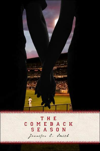
Hand holding is so hot right now, isn’t it? Check out this double take, followed by many of the similar covers flooding the market right now:

Sing Me to Sleep by Angela Morrison was published by March 2010 by Razorbill.


Sharing Sam by Katherine Applegate was published March 2004 by Delacorte.

I’m a bigger fan of Sing Me to Sleep, as I think the snow falling and the font for the title works much better than Sharing Sam.


Know of any others or do you have a favorite? Share in the comments!

Edit (5/15/10)

Thanks to Linda over at Jacket Whys (a blog that if you have any interest in cover design, you need to check out), here are a few more hand-holding covers:


Filed Under: aesthetics, cover designs, Uncategorized

Double Take, Part ??

May 4, 2010 |

Here’s an upcoming title along with a recently released title with another double take. This one is a mirrored image, though the coloring and effects are exactly the same:


Chasing Brooklyn by Lisa Schroeder was published by Simon Pulse in January 2010.


While browsing for new titles on Net Galley, I stumbled across this one. So, no guarantee on final cover art, of course, but this was what they had up there.

Saving Max by Antoinette van Heugten will be published by Mira September 28, 2010.

I’ll be honest: I’m not a huge fan of either one. Do you have a preference?

Filed Under: aesthetics, cover designs, Uncategorized

Covers change the story

April 29, 2010 |

Remember this post, a long time ago, about changing covers on Judy Blume? My coworker and I got to talking about the changing covers of Jane Austen’s Pride and Prejudice — check out what vibes these different cover portrayals give the books:

Our main character look young. The cover’s a bit dated, but it looks classic.

This one looks like a fun ball, no? I love the blue and black with pink contrasts.

Good models on this one, for sure.
Twilight inspired? I mean, the quote at the top says “The Love That Started It All.” That wasn’t Romeo and Juliet? Alas, this one has no people and gives an edgy vibe.


This looks like a sweet read, no? I love how Austen’s name is central here.


This is a standard B&N issue. Looks a classic, and the girl on the bottom left looks angry about it.
Steamy romance inspired?


A total classic look.


Another “classic” look. Wait for the contrast with the next two:

This is my FAVORITE and one that has total appeal to a certain audience. I’m toying with buying a copy of this one for my teen department, since I think it would expose new readers to Jane Austen.

This gorgeous cover is apparently a rare find from UK’s “Book of the Month Club” copyright 1996. It took an hour to find an image of it, so it’s borrowed from Ebay (obviously, I kept the copyright on it there). This is my coworker’s favorite, and I have to say, it is beautiful. Just compare this one to my favorite — two entirely different takes on the book, no?

Do you have a favorite? Do any speak to you more? I – gulp – have NOT read this book, so I can’t give an opinion on content to cover matching. But that last one I’d pick up in a heart beat (as I would pick up the one I can’t locate an image from — think gorgeous old pink dress).

Filed Under: aesthetics, cover designs, judging a book, Uncategorized

  • « Previous Page
  • 1
  • …
  • 26
  • 27
  • 28
  • 29
  • 30
  • …
  • 38
  • Next Page »
  • Facebook
  • Instagram
  • Pinterest
  • Twitter

Search

Archives

We dig the CYBILS

STACKED has participated in the annual CYBILS awards since 2009. Click the image to learn more.

© Copyright 2015 STACKED · All Rights Reserved · Site Designed by Designer Blogs