• STACKED
  • About Us
  • Categories
    • Audiobooks
    • Book Lists
      • Debut YA Novels
      • Get Genrefied
      • On The Radar
    • Cover Designs
      • Cover Doubles
      • Cover Redesigns
      • Cover Trends
    • Feminism
      • Feminism For The Real World Anthology
      • Size Acceptance
    • In The Library
      • Challenges & Censorship
      • Collection Development
      • Discussion and Resource Guides
      • Readers Advisory
    • Professional Development
      • Book Awards
      • Conferences
    • The Publishing World
      • Data & Stats
    • Reading Life and Habits
    • Romance
    • Young Adult
  • Reviews + Features
    • About The Girls Series
    • Author Interviews
    • Contemporary YA Series
      • Contemporary Week 2012
      • Contemporary Week 2013
      • Contemporary Week 2014
    • Guest Posts
    • Link Round-Ups
      • Book Riot
    • Readers Advisory Week
    • Reviews
      • Adult
      • Audiobooks
      • Graphic Novels
      • Non-Fiction
      • Picture Books
      • YA Fiction
    • So You Want to Read YA Series
  • Review Policy

STACKED

books

  • STACKED
  • About Us
  • Categories
    • Audiobooks
    • Book Lists
      • Debut YA Novels
      • Get Genrefied
      • On The Radar
    • Cover Designs
      • Cover Doubles
      • Cover Redesigns
      • Cover Trends
    • Feminism
      • Feminism For The Real World Anthology
      • Size Acceptance
    • In The Library
      • Challenges & Censorship
      • Collection Development
      • Discussion and Resource Guides
      • Readers Advisory
    • Professional Development
      • Book Awards
      • Conferences
    • The Publishing World
      • Data & Stats
    • Reading Life and Habits
    • Romance
    • Young Adult
  • Reviews + Features
    • About The Girls Series
    • Author Interviews
    • Contemporary YA Series
      • Contemporary Week 2012
      • Contemporary Week 2013
      • Contemporary Week 2014
    • Guest Posts
    • Link Round-Ups
      • Book Riot
    • Readers Advisory Week
    • Reviews
      • Adult
      • Audiobooks
      • Graphic Novels
      • Non-Fiction
      • Picture Books
      • YA Fiction
    • So You Want to Read YA Series
  • Review Policy

Lens Flare

October 17, 2012 |

Ever since I saw the cover for A. S. King’s new book, Ask the Passengers, with its very prominent camera lens flare, I’ve started seeing lens flares on covers everywhere. They seem to be particularly prominent in YA contemporary/realistic novels. I’ve collected several in this post, but considering it took me only about half an hour to gather this amount, I’m sure there are many, many more out there. Lens flares are an element that cover designers seem to be especially fond of.
Links go to Goodreads and descriptions come from WorldCat.

Ask the Passengers by A. S King: Astrid Jones copes with her small town’s gossip and narrow-mindedness by
staring at the sky and imagining that she’s sending love to the
passengers in the airplanes flying high over her backyard. Her mother doesn’t want it, her father’s always stoned, her
perfect sister’s too busy trying to fit in, and the people in her small town would never allow her to love the person she really wants to:
another girl named Dee.
We’ll have more on this title, which I really dug, a bit later.

Time Between Us by Tamara Ireland Stone: In 1995 Evanston, Illinois, sixteen-year-old Anna’s perfectly normal
life is turned upside-down when she meets Bennett, whose ability to
travel through space and time creates complications for them both.

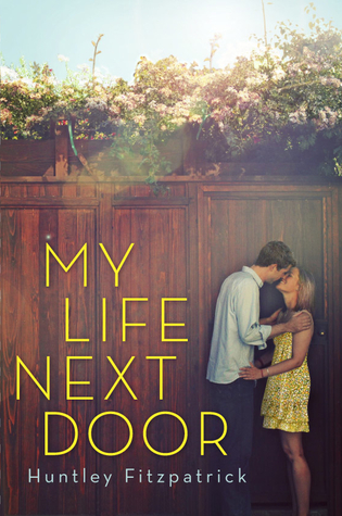
My Life Next Door by Huntley Fitzpatrick: When Samantha, the seventeen-year-old daugher of a wealthy,
perfectionistic, Republican state senator, falls in love with the boy
next door, whose family is large, boisterous, and just making ends meet,
she discovers a different way to live, but when her mother is involved
in a hit-and-run accident Sam must make some difficult choices.

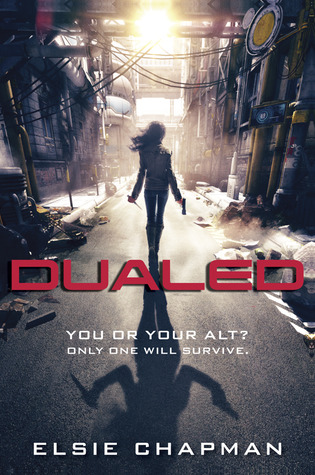
Dualed by Else Chapman: West Grayer lives in a world where every person has a twin, or Alt. Only
one can survive to adulthood, and West has just received her notice to
kill her Alt.

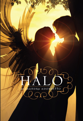
Halo by Alexandra Adornetto, plus sequels: When three angels are sent from heaven to protect the town of Venus Cove
against the gathering forces of darkness, their mission is threatened
as the youngest angel, Bethany, enrolls in high school and falls in love
with another student.

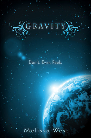
Gravity by Melissa West: Seventeen-year-old Ari Alexander is recruited by arrogant alien spy
Jackson Locke to help him save the Earth because Ari is a military
legacy who’s been trained by her father and exposed to war strategies
and societal information no one can know — especially an alien spy like
Jackson. Giving Jackson the information he needs will betray her father
and her country, but keeping silent will start a war.
(This is possibly the most mangled synopsis ever.)

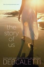
The Story of Us by Deb Caletti: After jilting two previous fiances, Cricket’s mother is finally marrying
the right man, but as wedding attendees arrive for a week of
festivities, complications arise for Cricket involving her own love
life, her beloved dog Jupiter, and her mother’s reluctance to marry.

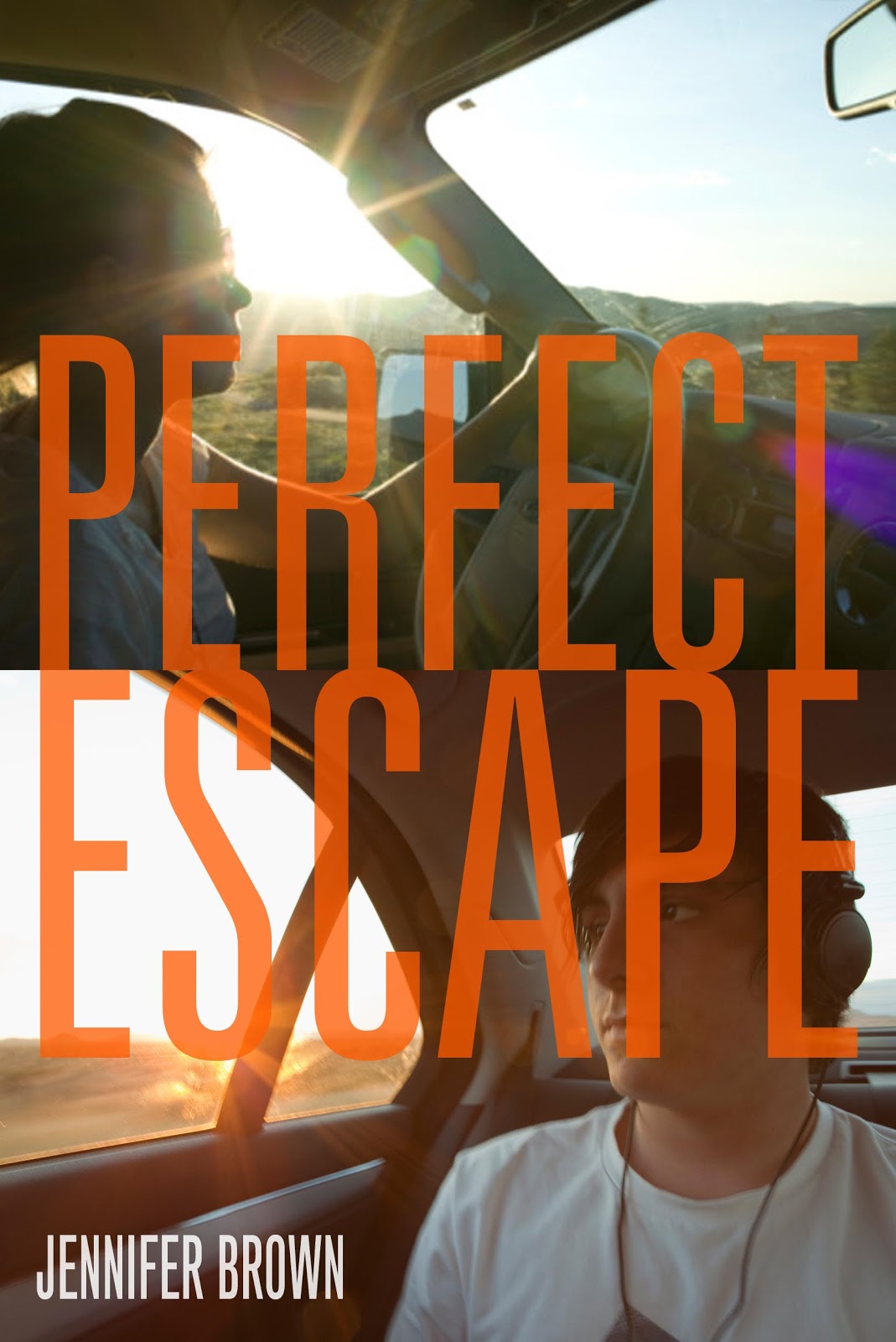
Perfect Escape by Jennifer Brown: Seventeen-year-old Kendra, living in the shadow of her brother’s
obsessive-compulsive disorder, takes a life-changing road trip with him.
Kelly reviewed this one.

The Beginning of After by Jennifer Castle: In the aftermath of a car accident that killed her family,
sixteen-year-old Laurel must face a new world of guilt, painful
memories, and the possibility of new relationships
. Kelly reviewed this one.

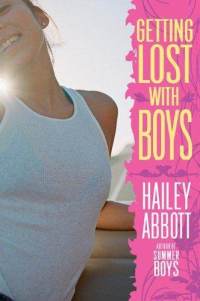
Getting Lost With Boys by Hailey Abbott: When Jacob Stein offers to be her travel companion on a road trip from
San Diego to her sister’s place in northern California, Cordelia Packer
never realized how much fun she could have getting lost with a boy.

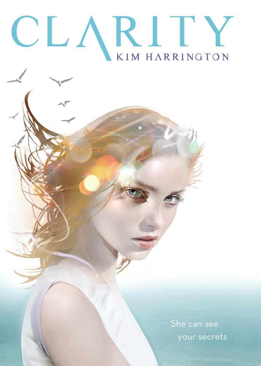
Clarity by Kim Harrington, plus sequel: Sixteen-year-old Clare Fern, a member of a family of psychics, helps the
mayor and a skeptical detective solve a murder in a Cape Cod town
during the height of tourist season–with her brother a prime suspect
. I reviewed this one, plus its sequel Perception.

Where it Began by Ann Redisch Stampler: After she is in a horrific car crash when drunk, Los Angeles high school
student Gabriella Gardiner assumes she stole her rich boyfriend’s car
and smashed it into a tree, but she cannot remember anything about the
events of the evening
.

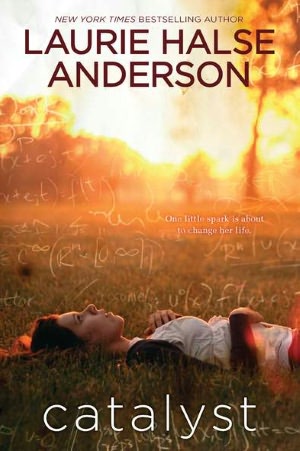
Catalyst by Laurie Halse Anderson: Eighteen-year-old Kate, who sometimes chafes at being a preacher’s
daughter, finds herself losing control in her senior year as she faces
difficult neighbors, the possibility that she may not be accepted by the
college of her choice, and an unexpected death
. Kelly talked more about this cover earlier.

The Summer I Turned Pretty by Jenny Han: Belly spends the summer she turns sixteen at the beach just like
every other summer of her life, but this time things are very different
. Kelly reviewed this one here.

Peace, Locomotion by Jacqueline Woodson: Through letters to his little sister, who is living in a different
foster home, sixth-grader Lonnie, also known as “Locomotion,” keeps a
record of their lives while they are apart, describing his own foster
family, including his foster brother who returns home after losing a leg
in the Iraq War
.

Whew. It is a cool effect, but perhaps a bit overused?

Filed Under: cover designs, Uncategorized, Young Adult

A Massive Amount of Mason Jars

October 5, 2012 |

Mason jars have been showing up more frequently on YA covers these days (at least to my eyes). I particularly like the image of a tornado held in one (see below), but I’m surprised none of them hold the most natural thing aside from food: fireflies. I like how the six below are a nice mix of contemporary/realistic and genre fiction. Once again, book descriptions are from Worldcat and links go to Goodreads.

Beautiful Disaster by Jamie McGuire: Travis Maddox, Eastern University’s playboy, makes a bet with good girl
Abby that if he loses, he will remain abstinent for a month, but if he
wins, Abby must live in his apartment for the same amount of time. (This book is actually an adult title, but since Abby is in college, I think it’s got cross-over appeal. Whether the idiotic premise will hook anyone is another story…)

Love and Other Perishable Items by Laura Buzo: A fifteen-year-old Australian girl gets her first job and first crush
on her unattainable university-aged co-worker, as both search for
meaning in their lives.
Surrender by Elana Johnson: In Freedom, where Thinkers rule and Rules should never be broken,
Raine, daughter of the Director, is expected to spy on her roommate, Vi,
and report back to him in case heavy brainwashing is not enough to
prevent Vi from remembering the secrets he is anxious to keep hidden.
 
Awaken by Katie Kacvinsky: In the year 2060, when people hardly ever leave the security of their
houses and instead do everything online, Madeline Freeman, the
seventeen-year-old daughter of the man who created the national digital
school attended by all citizens, is wooed by a group of radicals who are
trying to get people to “unplug.”
The Waiting Sky by Lara Zielin: Minnesota seventeen-year-old Jane McAllister has devoted years to
helping her out-of-control, alcoholic mother, but joining her brother in
chasing tornadoes for a summer gives her a fresh perspective, new
options, and her first real romance.
A World Away by Nancy Grossman: Sixteen-year-old Eliza, an Amish girl, goes to work for an “English”
family as a nanny to two young children, and must then choose between
two entirely different ways of life.

What ones have we missed?

Filed Under: cover designs, Uncategorized

The Eyes Have It

October 4, 2012 |

Single eyes on covers have been drawing my notice lately. I don’t mean the half-faces that are legion, I mean the disembodied eyes, the eyes without the rest of the face, often just floating in mid-air. It can give a pretty creepy effect. I’ve collected a few below. All synopses are from Worldcat and links lead to Goodreads.

172 Hours on the Moon by Johan Harstad: In 2019, teens Mia, Antoine, and Midori are selected by lottery to join
experienced astronauts on a NASA mission to the once top-secret moon
base, DARLAH 2, while in a Florida nursing home, a former astronaut
struggles to warn someone of the terrible danger there. Kelly reviewed this title earlier in the year.

The Diviners by Libba Bray: Seventeen-year-old Evie O’Neill is thrilled when she is exiled from
small-town Ohio to New York City in 1926, even when a rash of
occult-based murders thrusts Evie and her uncle, curator of The Museum
of American Folklore, Superstition, and the Occult, into the thick of
the investigation.

Num8ers by Rachel Ward: Fifteen-year-old Jem knows when she looks at someone the exact date they
will die, so she avoids relationships and tries to keep out of the way,
but when she meets a boy named Spider and they plan a day out together,
they become more involved than either of them had planned. I reviewed this one last year. The book’s sequels, The Chaos and Infinity, both feature a similar single eye.

Shatter Me series by Tahereh Mafi: Ostracized or incarcerated her whole life, seventeen-year-old Juliette
is freed on the condition that she use her horrific abilities in support
of The Reestablishment, a postapocalyptic dictatorship, but Adam, the
only person ever to show her affection, offers hope of a better future.

The few below aren’t images of disembodied eyes, but they bring us a close-up that shows us something reflected within it, which I think is pretty neat.

Blind Spot by Laura Ellen: Tricia Farni was last seen alive the night she fought with Roswell
Hart–a night Roz can’t remember. Can Roz piece together the events of
that night, despite the eye disease that robs her of most of her vision,
in order to clear her name and find a murderer?

Crash by Lisa McMann: Sixteen-year-old Jules, whose family owns an Italian restaurant and has a
history of mental illness, starts seeing a recurring vision about a
rival restaurant, a truck crash, and forbidden love.

13 to Life by Shannon Delany: Jessica Gillmansen, a high school junior, is hiding information about
her mother’s death when she meets Pietr Rusakova, a new student with a
family secret of his own, and the two bond as she investigates local
news stories about werewolves and the Russian mafia. All of the books in this series feature a similar take on this design, although not all of them have something reflected in the eye.

What notable covers have I missed?

Filed Under: cover designs, Uncategorized

Cover Doubles

September 27, 2012 |

I ran across this double-take while browsing Goodreads the other day. On the left is Loose Girl, a memoir by Kerry Cohen chronicling her years as a promiscuous young woman – using sex as a stand-in for attention, love, and intimacy – and her ensuing recovery. On the right is Kirsty Eagar’s YA novel Raw Blue, a book about a surfer girl who experienced something terrible in college, dropped out, and must confront it a couple of years later.

While I have read neither, I’m struck by the parallels between the two books, represented by the girl on the covers. Both books seem to deal somewhat strongly in feelings of shame and regret, and the girl shows this – her downward look, her hair obscuring most of her face, her passive expression. I don’t think either of the two covers are particularly striking, but the girl does communicate a certain tone.

It also seems like the model’s shirt has been edited to be a little less revealing in the Eagar title, which is interesting to me.

Filed Under: cover designs, Cover Doubles, Uncategorized

Four cover changes to consider

September 26, 2012 |

Ready for another round of book covers that have or will be changing their appearance when they move from hardcover to paperback? As usual, some of the changes are for the better and some leave quite a bit to be desired.

Meg Rosoff’s There is No Dog came out in hardcover — the one on the left — early this year. I’m pretty into this cover. It’s bright, and I like how the dog is made from the clouds themselves (which is pretty fitting given the book’s topic). The font for both the author’s name and the title are simple, and I think that the slight touches of color with red and white in them make them stand out just enough. The blurb on the front from Anthony Horowitz is simple and to the point. Rosoff doesn’t really need a huge blurb, given her acclaim as a YA author.

In March 2013, there will be a new paperback edition of Roseoff’s title. I think the cover change is interesting. It’s still simplistic, and it’s still bright — even brighter than the hardcover edition. Like the hardcover, the only colors on the cover are red, white, yellow, blue, and black. Primaries with the black and white to contrast. What’s different though is that the last word in the title is in a different font and lives inside the image of the dog. I like the effect quite a bit, actually. But what is maybe most interesting to me in terms of the cover change is that the blurb is different now. Rather than Horowitz’s single word, the blurb is now from People Magazine and a whole two words. I’m not sure whether it’s the case or not, but this cover may be aimed more toward an adult audience than a teen audience. At least that’s the impression I get, given the blurb and the very simplistic look (and interesting to note, at least to me, is the Horowitz blurb almost reads down from YA for me — his books are middle grade in my library).

I think both of these covers are pretty good. If I were to pick one, I’d probably go paperback just because I like the yellow and blue contrast.

On the left is the hardcover rendition of William Richter’s thriller Dark Eyes, which came out earlier this year as well. It’s gotten a number of comparisons to Steig Larsson’s The Girl with the Dragon Tattoo though I haven’t read it and can’t confirm that (and I’m suspicious since I think that’s an easy label to toss on any thriller featuring a female character). The cover is pretty vanilla, and it reminds me of another similar book, though I can’t put my finger on which one because it’s so generic. I am not saying it’s problematic that it’s generic because I think that’s one of the appeal factors for the cover of a thriller like this one, but it doesn’t have much that makes it stand apart, either. One kind of weird thing to me is that the girl’s hands look really big for her body. She has a toughness about her in the way she’s situated, though it looks to me like she’s got something in her eye…other than her hair, that is.

The paperback, due out in February 2013, takes on an entirely different look, despite being just as generic as the hardcover is. It’s a bunch of tall buildings in a city! They’re all tinted in various shades of purple. There is a girl reflecting off the side of one of those buildings, and I think it’s the same girl from the hardcover (or pretty darn close to it). And then, there is that blurb. Can you read it? Do you see who it is from? Pittacus Lore blurbs this book! Pittacus Lore who is a product of the James Frey fiction factor (maybe, maybe not) thought pretty highly of Richter’s work to blurb it. Except this gets me wondering: what does it mean if an author who doesn’t really exist blurbs your book? Could you not get a real blurb? Is it a message about the value of blurbs (that there is none)? Or was this some sort of marketing point for the Pittacus Lore machine? And then I start wondering when I see that blurb if this book isn’t really what it claims to be. Is it a real author who wrote this? So really, the paperback cover here has lost my interest entirely because I’m way more fascinated by this blurb and what the implications of it are.

Neither of those covers quite do it for me, but hardcover might be a little stronger, despite lacking the crucial Pittacus Lore blurb.

It seems like a lot of times when covers go from hardcover to paperback, the change includes the addition of a person. But in the case of Jessica Brody’s My Life Undecided, the switchover goes from using a model to using an object. As far as the hardcover is concerned, it’s nothing mind-boggling. Actually, I’d say it fits the book pretty well. This is mostly lighthearted and the girl on the cover reminds me of the main character pretty well. The way the title and author’s name appear on the cover fits the look of Brody’s first book, The Karma Club.

The paperback is quite different from the hardcover, and I kind of dig it. I love how it’s a mouse, which is extremely fitting for the book itself (which is about a girl who gets all of her life advice via her blog). It’s cute and plays into the lightheartedness of the story itself. What I don’t care for is the curly style of the title font around some of the letters — it’s a small thing, but actually, I really dislike it and can’t stop looking at it.

There’s not really a better cover in this case since I think both play into the content of the book pretty well. It’s curious there was a change, though, especially since the new paperback takes away from the branded-look for Brody’s books that started with her first title. The paperback edition of My Life Undecided will be available November 13.

When this book first came out, the cover image killed me. In fact, it still kills me. Here’s the thing: the cover for The Second Base Club has immense boy appeal, doesn’t it? I mean, that’s a bra made to look like baseballs. However, no boy I know would ever check out a book with a bra on the cover, made to look like baseballs or not. I can pretty safely say the same thing about girls. I mean — putting a bra on the cover of a book just seems like a bad idea, unless it’s romance and aimed at adults, and even then, I can’t say it’s necessarily going to be what draws people to pick up the book. Think about what it looks like to read a book with that cover in public. Especially if you’re a boy. Also, that tag line is pretty terrible. Although it seems to get to the heart of it all.

The paperback edition of The Second Base Club — due out in February 2013 — eliminates the bra issue, but now it brings in a creeper guy. Seriously, the guy is reaching over the girl and she’s definitely not into it. But what scares me a little more is the expression on his face. Is it me or is his head over sized? It looks almost Photoshopped onto the body. As weird as the positioning and the modeling are with the male in this image, the cover itself is much more appealing than the original, and I think it maintains a lot of guy appeal. It sort of reminds me of the covers of the “Carter” series, actually, and I don’t think that is a bad thing. Of interest is the change in tag lines, too. What originally only read “we’re not talking about baseball here” becomes a little more clarified and a little less sexual by adding that the character’s goals aren’t only about baseball.

I think the paperback cover wins this one hands down, though I really dislike the male model and the way he’s definitely taking advantage of the girl who is so not into him. But oh it’s better than that bra cover.

Any opinions about which books have a better hardcover or paperback edition? Anything you love or dislike in any of these? What do you make of the Pittacus Lore blurb? I hope it’s clear I’m not getting over that one for a little while. 

Filed Under: aesthetics, cover designs, Cover Redesigns, Uncategorized

  • « Previous Page
  • 1
  • …
  • 13
  • 14
  • 15
  • 16
  • 17
  • …
  • 38
  • Next Page »
  • Facebook
  • Instagram
  • Pinterest
  • Twitter

Search

Archives

We dig the CYBILS

STACKED has participated in the annual CYBILS awards since 2009. Click the image to learn more.

© Copyright 2015 STACKED · All Rights Reserved · Site Designed by Designer Blogs