• STACKED
  • About Us
  • Categories
    • Audiobooks
    • Book Lists
      • Debut YA Novels
      • Get Genrefied
      • On The Radar
    • Cover Designs
      • Cover Doubles
      • Cover Redesigns
      • Cover Trends
    • Feminism
      • Feminism For The Real World Anthology
      • Size Acceptance
    • In The Library
      • Challenges & Censorship
      • Collection Development
      • Discussion and Resource Guides
      • Readers Advisory
    • Professional Development
      • Book Awards
      • Conferences
    • The Publishing World
      • Data & Stats
    • Reading Life and Habits
    • Romance
    • Young Adult
  • Reviews + Features
    • About The Girls Series
    • Author Interviews
    • Contemporary YA Series
      • Contemporary Week 2012
      • Contemporary Week 2013
      • Contemporary Week 2014
    • Guest Posts
    • Link Round-Ups
      • Book Riot
    • Readers Advisory Week
    • Reviews
      • Adult
      • Audiobooks
      • Graphic Novels
      • Non-Fiction
      • Picture Books
      • YA Fiction
    • So You Want to Read YA Series
  • Review Policy

STACKED

books

  • STACKED
  • About Us
  • Categories
    • Audiobooks
    • Book Lists
      • Debut YA Novels
      • Get Genrefied
      • On The Radar
    • Cover Designs
      • Cover Doubles
      • Cover Redesigns
      • Cover Trends
    • Feminism
      • Feminism For The Real World Anthology
      • Size Acceptance
    • In The Library
      • Challenges & Censorship
      • Collection Development
      • Discussion and Resource Guides
      • Readers Advisory
    • Professional Development
      • Book Awards
      • Conferences
    • The Publishing World
      • Data & Stats
    • Reading Life and Habits
    • Romance
    • Young Adult
  • Reviews + Features
    • About The Girls Series
    • Author Interviews
    • Contemporary YA Series
      • Contemporary Week 2012
      • Contemporary Week 2013
      • Contemporary Week 2014
    • Guest Posts
    • Link Round-Ups
      • Book Riot
    • Readers Advisory Week
    • Reviews
      • Adult
      • Audiobooks
      • Graphic Novels
      • Non-Fiction
      • Picture Books
      • YA Fiction
    • So You Want to Read YA Series
  • Review Policy

Colorful Covers

September 26, 2013 |

A couple of years ago, there was a big brouhaha over how dark some people thought YA books had gotten – and I don’t mean just the contents. Many people decried the seemingly overwhelming amount of black covers, drawing the conclusion that the color of the covers reflected the darkness of its contents.

I have opinions on this (naturally), but that’s a topic for a whole other post (or several posts). What I did want to mention now is that I’ve actually seen a major growth in the amount of color being used on YA covers recently, most specifically fantasy covers. In particular, cover artists and designers seem to favor mixing blues, pinks, and purples in really striking ways. 

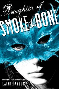
I’ve collected a montage of recent titles below that feature this type of color usage. They’re all published in 2013 or 2014. I personally love the color schemes on these. They’re beautiful and quite eye-catching. For now, they stand out because they are so colorful. If more books start following suit, that will obviously change, and they’ll begin to blend in just as the black covers have.

Filed Under: cover designs, Uncategorized

Two Double-Takes

August 21, 2013 |

A couple more double-takes for you today:

The Iron Witch by Karen Mahoney is a 2011 Flux title. It’s an urban fantasy about fairies and alchemy. (It’s been on my to-read shelf for a couple years now, too.) I really dig this cover, though that may be partially due to my weakness for sparkles. The markings on the girl’s arm are straight from the story, and I love that they extend to the design of the title as well. Plus, she’s obviously clutching something relevant too.

So Much it Hurts by Monique Polak is a 2013 Orca title about a girl who becomes romantically involved with an abusive older man. Here, the girl is much paler, and I’m not quite sure if she’s holding something in her hand, or if it’s been completely edited out. Also interesting to me is that her angle is slightly different – she’s a bit more turned down, making her look a bit more like she’s suffering or hiding, I think. I prefer the treatment in The Iron Witch, but I don’t think this cover is bad, either.

Fractured by Teri Terry is the second in Terry’s dystopian trilogy, published by Penguin in 2013. It’s also another book that features teens’ memories being wiped. The top portion of the cover makes it look pretty SF, I think. I wonder if this is just the ARC cover, since when I “look inside” on Amazon, I get a different (but still pretty generic) cover.

Torn by Cat Clarke is a contemporary realistic book that Kelly really dug about a teenage prank that leads to the death of a girl, and how it affects those involved. The treatment of the photo here is much different: the mirror-image girl looks like she might have just emerged from the pool, her hair soaked with chlorine. Her eyes are a different color, too, and she’s washed out. I prefer this cover – it seems to give off an eerier feel, and the girl looks a bit more suspicious since we can see she’s looking over her shoulder.

Filed Under: cover designs, Uncategorized

& Titled: Ampersands in YA Fiction

August 19, 2013 |

The ampersand is my favorite punctuation mark. I love it because it’s so versatile, and I love the history behind the mark (if you look at ampersands from the past, it began as a way to write the Latin word “et,” and it eventually moved from being “et” to standing up and looking like it does now as “&”). 

Over the last few years, more and more YA titles have featured the ampersand. And while I love how it looks aesthetically, it’s sometimes hard to search for book titles in a library catalog that feature an ampersand. The search operators can sometimes get caught up on it; often, though, a simple switch to a search by the author’s name or using “and” in place of the ampersand can solve the problem. 

Because I love ampersands and because I think it’s become a trendy title punctuation in the last few years, here’s a look at YA titles featuring them. All of these are books published between 2010 and now, with a couple of books that will be out in 2014. I’d love other traditionally published YA titles featuring ampersands, and I’m totally open to older titles. I’ve limited it to one book per series, as well as one book per author. Also excluded are short story anthologies — a number of the ones out in the last year or two especially use ampersands. 

All descriptions come from WorldCat.

Catch & Release by Blythe Woolston Eighteen-year-old Polly and impulsive, seventeen-year-old Odd survive a deadly outbreak of flesh-eating bacteria, but resulting wounds have destroyed their plans for the future and with little but their unlikely friendship and a shared affection for trout fishing, they set out on a road trip through the West.

Dash & Lily’s Book of Dares by Rachel Cohn and David Levithan: Told in the alternating voices of Dash and Lily, two sixteen-year-olds carry on a wintry scavenger hunt at Christmas-time in New York, neither knowing quite what–or who–they will find.

Rot & Ruin by Jonathan Maberry (the entire series carries on the ampersand titling): In a post-apocalyptic world where fences and border patrols guard the few people left from the zombies that have overtaken civilization, fifteen-year-old Benny Imura is finally convinced that he must follow in his older brother’s footsteps and become a bounty hunter.

Cinders & Sapphires by Leila Rasheed: The intertwined lives of the prominent Averley family and the servants of Somerton Court are forever changed when an old secret comes to light.

Sharks & Boys by Kristen Tracy: Feeling betrayed, fifteen-year-old Enid follows her boyfriend, Wick, from Vermont to Maryland where he and six others they know from twin studies rent a yacht, but after she sneaks aboard a storm sets them adrift without food or water, fighting for survival.

Charm & Strange by Stephanie Kuehn: A lonely teenager exiled to a remote Vermont boarding school in the wake of a family tragedy must either surrender his sanity to the wild wolves inside his mind or learn that surviving means more than not dying. 

A & L Do Summer by Jan Blazanin: In Iowa farm country, sixteen-year-old Aspen and her friend Laurel plan to get noticed the summer before their senior year and are unwittingly aided by pig triplets, a skunk, a chicken, bullies, a rookie policeman, and potential boyfriends.

Eleanor & Park by Rainbow Rowell: Set over the course of one school year in 1986, this is the story of two star-crossed misfits–smart enough to know that first love almost never lasts, but brave and desperate enough to try”.

Flicker & Burn by T M Goeglein (second book in the “Cold Fury” series): Sara Jane Rispoli continues searching for her missing mafia family, now running from mysterious creatures.  

17 & Gone by Nova Ren Suma: Seventeen-year-old Lauren has visions of girls her own age who are gone without a trace, but while she tries to understand why they are speaking to her and whether she is next, Lauren has a brush with death and a shocking truth emerges, changing everything.

Blink & Caution by Tim Wynne-Jones: Two teenagers who are living on the streets and barely getting by become involved in a complicated criminal plot, and make an unexpected connection with each other.

The Daughter of Smoke & Bone by Laini Taylor (all three books in the series carry out the ampersand in the title): Seventeen-year-old Karou, a lovely, enigmatic art student in a Prague boarding school, carries a sketchbook of hideous, frightening monsters–the chimaerae who form the only family she has ever known.

Etiquette & Espionage by Gail Carriger (all books in this series so far follow this pattern): In an alternate England of 1851, spirited fourteen-year-old Sophronia is enrolled in a finishing school where, she is suprised to learn, lessons include not only the fine arts of dance, dress, and etiquette, but also diversion, deceit, and espionage.

Extraordinary Secrets of April, May & June by Robin Benway: After their parents’ divorce, teenaged sisters April, May, and June recover special powers from childhood and use them to cope with moving to a new home and high school, but wonder if the gifts have a greater purpose.

Freshman Year & Other Unnatural Disasters by Meredith Zeitlin: Smart, occasionally insecure, and ambitious Brooklyn fourteen-year-old Kelsey Finkelstein embarks on her freshman year of high school in Manhattan with the intention of “rebranding” herself, but unfortunately everything she tries to do is a total disaster.

Between You & Me by Marisa Calin: Phyre, sixteen, narrates her life as if it were a film, capturing her crush on Mia, a student teacher of theater and film studies, as well as her fast friendship with a classmate referred to only as “you.”

Sex & Violence by Carrie Mesrobian: Sex has always come without consequences for Evan. Until the night when all the consequences land at once, leaving him scarred inside and out.

Tumble & Fall by Alexandra Coutts: With an asteroid set to strike Earth in just one week, three teens on an island off the Atlantic Coast wrestle with love, friendship, family, and regret as they decide how to live their final days.

And coming in 2014 are at least two more books featuring the ampersand title:

House of Ivy & Sorrow by Natalie Whipple: Seventeen-year-old Josephine Hemlock has spent her life hiding the fact that she’s a witch–but when the mysterious Curse that killed her mother returns, she might not be able to keep her magical and normal lives separate. 

Fire & Flood by Victoria Scott: Tella’s brother Cody is sick and getting worse, so when she finds instructions on how to become a contender in the dangerous Brimstone Bleed race where she can win a cure for him, she jumps at the chance–but there is no guarantee that she will win, or even survive.

Filed Under: aesthetics, ampersands, cover designs, title trends, Uncategorized, Young Adult

Hardcover to Paperback: Five Changes to Check Out

July 16, 2013 |

Ready to talk about more books getting makeovers in their paperback form? I have a slew of them, but I’m only going to talk about five for now (the rest are for future posts, no fear!). Let’s talk about the good, the bad, and the ugly.

Martine Leavitt’s My Book of Life by Angel is getting a really fresh look in the paperback, and I am a huge fan. I’ve read this one and while it wasn’t my favorite book, I don’t think that the original cover on the left was doing it much in the way of favor for teen readers. The story’s set in the late 1980s or early 1990s, during an epidemic of prostitution and drug sales in Vancouver, British Columbia. It’s a dark and gritty literary story, told in verse. The hardback cover wouldn’t tell you that though. It looks almost dated, like a book that came from the late 1980s or early 1990s, rather than one published in 2012. It does angle Leavitt as an award winner though, which I find interesting since that’s not on the paperback cover. In my mind, the hard cover looks like the literary book with award potential.

The paperback makeover, though, has total teen appeal. It shows this to not only be a dark and gritty story, but more than that, the new look reminds me of what Simon and Schuster did in their makeovers for Sonya Sones’s books (you can see the cover of her newest, To Be Perfectly Honest, as an example). The longer I think about the change and the way it reminds me of the new Sones looks, the more I really like it — I think they have exactly the audience who’ll want to pick this book up with the new design. The very thin font for the title works for me, as well. And the pops of color actually add a bit of edge to the image for me in a way that the fairly stark hardcover image doesn’t. Though I think the falling feather was meant to do that; it’s symbolic, but that says more to me about the audience for the hardcover as opposed to the paperback here.

I never bought the hardcover for my library, but I plan on ordering the paperback when it comes out February 18, since I think it’ll reach a whole new audience of readers.


Lauren Baratz-Logsted’s The Twin’s Daughter — which I read and reviewed a long time ago — is coming out with a new look in paperback January 14. I love the hardcover look so much. I love that it features the twins, and that the image itself has the knife piercing through it (which fits the story). It’s actually a pretty simple design, but it packs a punch with the pink and black. And I love the tiny drop of blood that works as the apostrophe for “Twin’s.” For me, this cover conveys the gothic feel of the book and it’s iconic.

So the first thought I had on the paperback recovering is that the “t” in “Twin’s” is the same font as the “T” on Twilight. I really am not a fan of the title font at all. Aside from not really making a lot of sense (if they are going for a Gothic-y font, they missed the mark a lot here), it’s not consistent with the straight lines and the curved letters. Also, the kerning is a little off on “Twin’s” between the apostrophe and the “s” (kerning is space between letters — you want it uniform usually, and here there’s a little bit too much space). The girl in the big dress looks like a throwback to all of the covers that kind of came out at the same time that The Twin’s Daughter did in hardcover, in that it’s fairly non-descript and non-memorable. And the tag line — while it does tell what the story is about — kills me: “The ultimate betrayal. A deadly mystery.” I think why it kills me is because that is telling what the book is about, since the image on the cover is not.

For me, the big winner is the original cover. It tells you the story visually in such a careful and yet perfect way. The paperback looks like so many other covers and relies on the tag line to convey anything about the story inside.

Patricia McCormick’s Never Fall Down was one of those books that actually featured a person of color on the hardcover book. And it should have, since this is a story about a Cambodian boy. It’s a near perfect cover for the story, and it quite fits with the look of the other books McCormick’s published in recent years. It’s simple, and yet it’s also powerful. In many ways, I think it looks like an award-winning book. Obviously this is something I’ve been thinking about a lot, since I’ve mentioned it more than once in this post alone, but this cover is straight forward and you know from looking at it what it is about. And you know it’s a “serious” book. You also know it’s written by a National Book Award Finalist. The hardcover is a solid cover.

But I love the paperback. I love it. The paperback, to me, has so much more teen appeal. Why? It’s not a face on a cover. While I applaud the design team for including a person of color on the hardcover, I do think the solid image of a face is still not the most memorable way for a book to stand out on the shelf (the fact that it is a person of color that makes it stand out says a lot about how rare this happens on covers). Never Fall Down‘s paperback look does a lot of things aesthetically that I dig: the title takes up almost the entire cover, and it’s not done in a way that’s just a font. There’s movement and action within the font itself. It’s the movement that stays with me — and the fact the shades of green really do pop against the otherwise black cover. The impact is stronger than it is with the font on the hardback cover. I also think they did a good job designing the new cover to allow the National Book Award Finalist award to fit, without interrupting the image itself.

The paperback edition will be available in early 2014.

I think I’ve talked about how much I loved Paul Zindel’s The Pigman when I was a middle schooler and then when I revisited it a couple years ago I not only loved it still, but I thought it was still relevant (minus some of the dating things with technology).

They’re reissuing the book with another new cover in January. And I love it. I think that the cover on the left — which is the trade paperback cover that’s been available for a few years now — is memorable and strong. I love the piggy bank, and I love that it’s a bright yellow. But I think the redesign on the right gets so many things right, too, in a way that plays homage to the cover on the right. You have the piggy bank still. That font though. I think it’s one of my favorites, and I love how they styled it, as well. It feels vey contemporary because of how simple and minimalist it is. The white background ties the entire thing together. It’s fresh, and I think this cover will sell the book to another generation of teen readers in exactly the way it should.

Now I am ready to reread it again for myself.

I think Lissa Price’s Starters wins the award for most startling (and most baffling) makeover out of this set of changes. The hardcover on the left has always left me feeling really cold. It’s so . . . white and so creepy because of that. It looks really young, as well, and it never really called to me. Kim read it and found it to be a really fun read.

Let’s dissect the hardcover a bit. Besides being very white, the only color is through the form of a blue eye on the right and a brown eye on the left. There’s also the blue from the title, and there’s the blue tagline “Survival is just the beginning.” Note, too, that Kami Garcia’s blurb notes that this is a great book for fans of Suzanne Collins’s The Hunger Games. Worth noting is the girl’s face on the cover is unmarred by any text or anything. She is staring right at you.

The paperback redesign on the right. Aside from the fact it’s no longer a white cover, we have a girl staring out at readers again, but this time both of her eyes are brown. And her eyebrows stand out, as do her lips, since she’s wearing lipstick. She looks much older than the girl on the left, and her face is partially obscured by the title of the book. The author’s name, too, is tattooed on her forehead. I’ve doubts the model here is actually a teenager, either. There’s a brand new tag line for the book: “You can’t get them out of your head.” Then there’s also the new blurb from MTV (rather than the one from Garcia), which simply calls the book “A bona fide page-turner.”

I find the new look to be as cold as the original, but in a different way. It looks generic this time. So while the hardcover was cold in the creepy sense, the paperback is cold in the generic sense. I find the shift in how the book is being sold to readers interesting. The original sells it as a dystopian adventure a la The Hunger Games (both from the blurb and from the tag line) and in the redesign, it’s now being sold as something different. Something that I actually can’t even put my finger on — it’s called a page turner, but who are them? Why are they in my head? The girl on the cover doesn’t add anything to suggest what kind of story this might be.

Even though I find the original cover cold and unappealing, I think it might be the better fit for the story. The paperback doesn’t tell me anything and it doesn’t suggest to me who the readership for the book might be, either. Starters is out in paperback on July 23.

What do you think? Agree? Disagree? Which of these covers does it better?

Filed Under: aesthetics, cover designs, Cover Redesigns, Uncategorized

Hardcover to Paperback Switches: 6 to Consider

April 11, 2013 |

Let’s have another conversation about cover changes. I love these posts, and I love thinking about the way that covers really do impact the audience to which a book is sold. Some of these changes are for the better, but some of them make me scratch my head a tiny bit. As usual, the hardcover is on the left and the paperback is on the right.

This isn’t the first time Jessica Brody’s contemporary novels have received a face lift when they’ve gone from hardcover to paperback. It sort of seems like the look she gets in hardcover is sharper than the one she gets in paperback, which tend to look more lighthearted and in the style of “chick lit” (if you’ll excuse my use of the term). With 52 Reasons to Hate My Father, I think the change to paperback is a huge improvement. I really dislike the hardcover. I don’t like the model and I think the use of the lights is super distracting (I keep thinking they’re diamonds, rather than lights). I think it’s sort of gaudy. There’s too much going on in it. 
The paperback, though, is a huge improvement. It gives the book a lighter feel to it, and the image is more cohesive and, I think, more relevant to the plot. Worth noting, though, is that beneath the author’s name, the note is that she’s the author of Unremembered. Unremembered came out on March 5, just recently, but the paperback edition of 52 Reasons to Hate My Father came out in paperback on February 5. I guess readers were just supposed to know her via her noteworthy book prior to it coming out? Or maybe this is a sign of how much is being hoped for for Unremembered? Whatever the reasoning behind that weird choice, I think the paperback edition of 52 Reasons is much better than the hardcover. 

Jennifer Miller’s The Year of the Gadfly isn’t a young adult book, but it was one of the titles on this year’s vetted nomination lists for the Alex Awards. It might be described as a cross between The Disreputable History of Frankie Landau Banks and The Mockingbirds. The hardcover on the left is, how to say, not appealing. It looks like an unmemorable literary tome. It says nothing as to what the content may be. I would say that there’s no hint this could be a book with great teen appeal either.

But oh that paperback. That paperback is one of my favorite covers in a very long time. This is a book that looks like it has appeal to teen readers. I love the use of the plaid for the entire girl. I love the way the yellow contrasts with the blue, but there is then the coordinating yellow stripe to tie it together. I love that she’s off centered. I love that the girl looks like she’s ready to take charge, too. She’s not crossing her arms and she’s not hiding. She’s standing proud and with confidence. Not to mention the font choice for the title and for the author’s name is so much better. There’s also the addition of a blurb for the paperback, which calls the book part Dead Poet’s Society and part Heathers, which again, hits some mega appeal factors for teen readers.

This is the kind of cover I can’t stop staring at. The Year of the Gadfly will be out in paperback on May 28, and I hope someone is kind enough to gift me a copy of this fine looking book. I’ve got a hardcover, but I want the paperback so bad.

Like Jessica Brody, Susane Colasanti is a regular to the change in cover looks when she goes from hardcover to paperback. In the case for Keep Holding On, I think it’s a hugely positive change. The reason is pretty simple though — it’s way less about the styling (which I like the handholding and the spots of red and pink giving just enough of a romantic feel) and more about the fact it’s much more timeless than the hardcover. The hardcover plays into the fashion trends of today. There are the skinny jeans. There are the Chucks. It feels very contemporary teen, whereas the paperback edition feels much more like the kind of book that won’t date.

Worth noting is the new tag line on the paperback: “Sometimes love is worth the risk.” Although this book certainly has some romance in it, the real meat behind the story is the plot about bullying (and this bullying comes through issues relating to social class). When the book first came out, that was the biggest selling point. So it’s interesting with the new tag line that the selling point’s changed to being more about the romance. I suspect had I read it with the new cover, I may have liked it more, since I found the bullying storyline weak.

Keep Holding On will be out in paperback on April 23. Interesting to note this might be the only paperback change for Colsanti’s books that actually doesn’t include a couple on it (just their hands).

I wish I could make the spacing on this pair less weird, but I can’t. On the left is the hardcover edition of Michelle Gagnon’s thriller Don’t Turn Around. Kind of creepy, with the hand coming out of the book, but the effect is also neat. I am a fan of orange covers because I think they’re pretty different (there are so few). But I really dislike ombre styling, which this cover is a major victim of in both the general cover and in the font coloring, too. The tag line for the hardcover is “Just keep running.” That doesn’t tell us a whole lot, but in conjunction with the title, I do think it says quite a bit. Also, I don’t want that hand after me.

The paperback version of Don’t Turn Around is nice and blue. I love the way the title has been played with quite a bit — I like the change in sizes there. This cover is, for the most part, very plain, but I think that plainness might be a huge advantage for the book. The cover reads as a thriller to me. Interestingly, the tag line also changed a little bit: “Off the grid. On the run.” Both of these covers are fine with me. I don’t necessarily think one is better or stronger than the other, nor do I think one will appeal to a different readership.

Don’t Turn Around will be available in paperback July 9.

I’m a little late to the party on this change, as the paperback edition of Jenny Downham’s You Against Me came out last September. But I think there’s something worth talking about here! 
The hardcover edition of the book is desperate, isn’t it? The girl and the boy are holding on to each other tightly. They fit the title and to some extent, it fits the content of the story, too. I kind of dig how gray the cover is. The only spot of color comes when the author’s name is highlighted. 
Now let’s talk about the paperback. There’s an entirely different feeling, as there is no longer an embrace between the boy and girl. The girl is walking away from the boy who is himself not even looking at the girl. He’s also got his hands in his pockets. There’s no stopping her nor is there even a sense of sadness about her leaving him. As is the case with the girl on a cover of a book, her hair is partially obscuring her face. The image conveys some sadness on her part, and it conveys complete indifference on his part. That’s quite different than the hardcover where there’s definite desperation between the girl and the boy. I don’t like the way the gray is on this cover, either. In combination with the picture, it’s just very sad. And while the book itself can’t be described as an uplifting read, there’s little to compel me toward picking up this copy. Even the slight color for the title is depressing: kind of pinkish red and brown. 
For me, this is a hardcover winner. 

While we’re on the boy-girl relationship displayed on the cover trope, how about the change for Katie Kacvinsky’s First Comes Love? The close up kiss kind of looks like every other book featuring a couple near kissing. The title fades into the background in favor of the faces, and the font choice is very thin to the point of being easy to miss. It is also the only spot of color on the cover. 
The paperback edition of First Comes Love brings something entirely new to the game, though. Here’s a very minimalist cover, and it’s one that features a nice neon-inspired green. That color not only makes the cover pop, but the use of another type of green on the heart-shaped cactus as the only image makes that image pop, too. What I don’t like about the change is the change in font for the title. Sure, it’s better than the thin font on the hardcover, but it looks very juvenile (the “first comes” part does). The “love” is only a little bit better. I don’t know if this cover conveys much about the book’s content, though. Maybe that love is thorny? I haven’t read it, so I can’t add much more. If it’s going for the love is thorny aspect, then this is a huge contrast from the hardcover’s almost-kiss. 
Even though I have some quibbles with the paperback, I think it’s a better cover overall. First Comes Love will be out in paperback May 7. 
What do you think? Which did it better in this batch of covers, the paperbacks or the hardcovers? 

Filed Under: aesthetics, cover designs, Cover Redesigns, Uncategorized

  • « Previous Page
  • 1
  • …
  • 10
  • 11
  • 12
  • 13
  • 14
  • …
  • 38
  • Next Page »
  • Facebook
  • Instagram
  • Pinterest
  • Twitter

Search

Archives

We dig the CYBILS

STACKED has participated in the annual CYBILS awards since 2009. Click the image to learn more.

© Copyright 2015 STACKED · All Rights Reserved · Site Designed by Designer Blogs