• STACKED
  • About Us
  • Categories
    • Audiobooks
    • Book Lists
      • Debut YA Novels
      • Get Genrefied
      • On The Radar
    • Cover Designs
      • Cover Doubles
      • Cover Redesigns
      • Cover Trends
    • Feminism
      • Feminism For The Real World Anthology
      • Size Acceptance
    • In The Library
      • Challenges & Censorship
      • Collection Development
      • Discussion and Resource Guides
      • Readers Advisory
    • Professional Development
      • Book Awards
      • Conferences
    • The Publishing World
      • Data & Stats
    • Reading Life and Habits
    • Romance
    • Young Adult
  • Reviews + Features
    • About The Girls Series
    • Author Interviews
    • Contemporary YA Series
      • Contemporary Week 2012
      • Contemporary Week 2013
      • Contemporary Week 2014
    • Guest Posts
    • Link Round-Ups
      • Book Riot
    • Readers Advisory Week
    • Reviews
      • Adult
      • Audiobooks
      • Graphic Novels
      • Non-Fiction
      • Picture Books
      • YA Fiction
    • So You Want to Read YA Series
  • Review Policy

STACKED

books

  • STACKED
  • About Us
  • Categories
    • Audiobooks
    • Book Lists
      • Debut YA Novels
      • Get Genrefied
      • On The Radar
    • Cover Designs
      • Cover Doubles
      • Cover Redesigns
      • Cover Trends
    • Feminism
      • Feminism For The Real World Anthology
      • Size Acceptance
    • In The Library
      • Challenges & Censorship
      • Collection Development
      • Discussion and Resource Guides
      • Readers Advisory
    • Professional Development
      • Book Awards
      • Conferences
    • The Publishing World
      • Data & Stats
    • Reading Life and Habits
    • Romance
    • Young Adult
  • Reviews + Features
    • About The Girls Series
    • Author Interviews
    • Contemporary YA Series
      • Contemporary Week 2012
      • Contemporary Week 2013
      • Contemporary Week 2014
    • Guest Posts
    • Link Round-Ups
      • Book Riot
    • Readers Advisory Week
    • Reviews
      • Adult
      • Audiobooks
      • Graphic Novels
      • Non-Fiction
      • Picture Books
      • YA Fiction
    • So You Want to Read YA Series
  • Review Policy

YA Reissue Cover Makeovers — Updating for New Readerships

January 13, 2014 |

Reissues of older YA works — those that have gone out of print, as well as those still in print but dated — aren’t a new concept. But as YA continues to grow and authors who were publishing before things heated up find themselves becoming more well-known, more older titles are seeing their covers getting facelifts. Sometimes, the reissue/redesigns come at a key anniversary for the book, as a means of introducing it to new audiences, and other times, these can come when a related book to a series appears, and the new look is meant to revive interest in it.

These reissues and redesigns typically fit newer trends in design and appeal to today’s market. Unlike mid-series redesigns, where the second book in a trilogy gets a new look and that new look carries throughout the rest of the series, these books are titles that have been out already but are getting entirely new looks through and through. An example of reissue and redesigned books you might be familiar with are the reworked Ellen Hopkins books, which maintain a lot of elements of the initial book covers, but they also appear new and fresh.

I find knowing about redesigns is helpful and worthwhile because it can help me make a decision when I’m weeding and updating the YA collection at work; if I know something is being redesigned and will have a wider appeal than the books I have, I might choose to weed and replace. Likewise, it’s helpful when I’m missing book two in a trilogy, as I might then choose to weed them all and replace with the updated look. It seems like 2014 is a big year for these reissue redesigns, so I thought it’d be interesting to round up a bunch of ones I’ve noticed recently and talk about whether they hit the mark or miss it.

Did you know this year marks the 40th anniversary of Robert Cormier’s The Chocolate War? You might remember last year’s read along, and one of the things I talked about was the evolution of the book’s cover. I think the reissue for the 40th anniversary on the right is excellent. It captures the mood and spirit of the book and doesn’t date it in the least. I love the font treatment for the title especially. The reissued cover will be out in late spring this year.

Though I think that Philip Pullman’s “His Dark Materials” series might be more middle grade than YA, I wanted to include this series in my post because the redesign it’s getting this spring ages it up a bit. The original covers above are illustrated and look quite juvenile. While they look appropriate for the readership, they also look dated. They look like books from the late 1990s (and early 2000s).

This isn’t the first redesign for the series, but another one done to keep it fresh and of interest to readers. But this one certainly looks current and maybe helps age up the series too. The lack of illustrations and focus instead on an iconic image helps that. These covers will hit shelves in April.

Did you know that Lauren Myracle’s ttyl turns ten years old this year? It doesn’t seem like they came out that long ago, but they did. The above are the original covers, and this year, in honor of the tenth anniversary, they’re being reissued with new covers. And I think the new covers are excellent.

The covers are nearly identical to the originals — right down to the color — but they’ve been updated to look more clean and modern. The emoticons are in today’s style, and the font used for the titles is much more in line with today’s design trends. The biggest change is that Myracle’s name is much larger, but it makes sense: she’s really become a well-known name in YA since these books came out. Perhaps due in part to these very books.

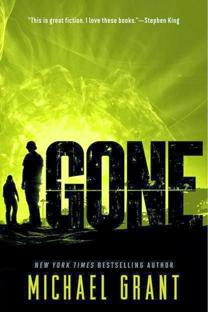
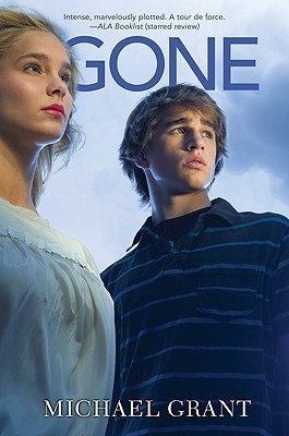
The original coves of Garth Nix’s Abhorsen series are above. They’ve changed a little bit over the years, though these are the covers which stick out in my mind whenever I think about them — the series came out when I was in high school.

In June, these are the covers the series will be getting. They’re not bad, but they remind me a lot of the “iconic” covers of Suzanne Collins’s The Hunger Games series. It’s a smart move since the covers might be more timeless and they certainly fit a trend going on right now, though they might also blend in because of that. I do think it’d introduce the series to new readers since they look fresher than the originals.

If you remember these covers for Ann Brashares’s Sisterhood of the Traveling Pants series, you’re probably of a certain generation. They’re illustrated with nary a real girl on them.

A few years ago, they got a facelift to include actual girls with pants that look like this:

These redesigns looked like a lot of other contemporary books featuring female main characters of the time. They also looked a lot older than the original covers, which I think was — and is — on trend with how a lot of YA books are designed.

This series is getting another new look this April, as the paperbacks are being relaunched in anticipation of Brashares’s new YA book.

The redesigns are certainly in line with current cover trends: we have a font-driven design. Aside from the bright colored font, though, I think the new covers are really boring. They’re minimalist, which I tend to like, but I think they blend too much into the landscape. There’s nothing that makes them stand out (that could be said about the second set of covers I linked to, too, which I think still are appealing to teen readers). Is it me or is there some weird photoshopping going on in the third cover with the butt of that girl’s jeans?

What’s most interesting to me is that the author is introduced as the author of The Here and Now. She’s no longer called the New York Times Bestselling author of this very series (as she was in the first set of covers).

The last series of redesigning come from Tom and Laura McNeal. Tom McNeal, as you may or may not know, wrote Far, Far Away last year, which garnered quite a bit of attention. I like the way they’re going to recover and reissue his and Laura’s backlists. The new looks are much fresher and appealing to today’s readers — older covers are on the left with the new covers on the right.

I especially like the new look to Zipped — it has an entirely different vibe and I want to pick it up.

The reissued covers will be available June 10.

These aren’t the only redesigned/reissued covers we’ll be seeing in the new year. Keep an eye out for even more of Judy Blume’s books to be redesigned (the first two have been revealed already over here) and Maggie Stiefvater’s Shiver series is getting a bit of a facelift (it’s primarily in color saturation, and you can see those redesigns here).

If you’re a fan of the Anne of Green Gables series, you might already know that Sourcebooks will be reissuing those, as well. It’s worth checking out the covers they’re using, too, which you can see the first two covers of here.

Any of these stand out to you as winners? Any you think were better in their original looks? I’d love to know, too, if you know of other reissues coming out this year.

Filed Under: aesthetics, cover designs, Uncategorized, Young Adult

2014 YA Cover Trends: A Look at What’s to Come, Part 2

December 17, 2013 |

Today’s look at 2014 cover trends is a little bit longer than yesterday, so if you enjoyed that peek at the year ahead in books, you’ll enjoy today’s even more. Again, there’s no science to these trends. I’ve pulled together some interesting things I’ve noticed by perusing publisher catalogs and looking at the covers as they’ve been revealed over the last few months.

All links go to Goodreads so you can add the books to your to-read lists if you want to, and I’m completely open to hearing about other traditionally published books coming out next year that might fit any of these trends. I know I’m going to miss some, and I know this is only a fraction of the books that will fall into these categories, since many covers for later 2014 titles haven’t been unveiled yet.

Insects


Insects seem to be the rage in the coming year. You have butterflies, of course, but then there are other bugs taking up some space on YA covers in 2014, too. What they all have in common is that they’re not just any old insects. They’re all winged (and most are flying).

Breakfast Served Anytime by Sarah Combs

Buzz Kill by Beth Fantaskey

Cured by Bethany Wiggins — The tagline “The Hunger Games with a wicked sting” actually makes me cringe a bit.

The Killing Jar by Jennifer Bosworth

The Haven by Carol Lynch Williams — This had a different cover initially, which I think I liked better. It spoke to the content a lot more (or at least what it sounds like the book is about, since I haven’t read it yet).

The Inventor’s Secret by Andrea Cremer — This one also had a different cover initially.


The Taking by Kimberly Derting

The Vanishing Season by Jodi Lynn Anderson

Unhinged by A. G. Howard

Wings by Elizabeth Richards

Girls Being Held


How’s this image as a contrast for strong girls on covers or in YA books more broadly? These are book covers featuring girls who are being held. And I jest with the first line: not all of these are about a weak girl, since some are meant to be fun. But some of them do make me cringe with the message they might be sending about being saved/rescued.

Biggest Flirts by Jennifer Echols

Forever by Karen Ann Hopkins

Of Neptune by Anna Banks

The Retribution of Mara Dyer by Michelle Hodkin

The Lonesome Young by Lucy Connors — The pitch for this one is Romeo and Juliet meets Justified.

In The Shadows


While we’re looking at couples, how about those couples who are shadowy figures in the cover? There are a bunch of them. I know this isn’t a new trend, but again, it’s one I’ve seen popping up more and more (I don’t mind it — it gives us people without giving us exactly who those people are, which leaves quite a bit to the reader’s imagination).


Between the Spark and the Burn by April Genevieve Tucholke — I can’t place my finger on it, but this cover is just really appealing to me.

Bright Before Sunrise by Tiffany Schmidt

The Geography of You and Me by Jennifer E. Smith

Heartbeat by Elizabeth Scott

Starling by Fiona Paul

Summer of Yesterday by Gaby Triana

The Secret Sky by Atia Abawi

The Worlds We Make by Megan Crewe

Getting Symbolic


I think we can thank Divergent and The Hunger Games for making this trend happen and allowing it to continue. These are books which feature some kind of big symbol in the middle of the cover to serve as something iconic to the story.

Dangerous by Shannon Hale

Flame by Amy Kathleen Ryan

Independent Study by Joelle Charbonneau

Into the Dark by Bree Despain

Sea of Shadows by Kelley Armstrong

Font-Driven Design


This was a trend I talked about last year for 2013 covers, and it’s a trend that’ll continue on well into 2014. These are covers where the title font takes up at least half the cover’s real estate and/or drives the entire design of the cover itself. For the most part, this is a technique I really like. It really hammers home the title of the book, and it gives a better sense of timelessness to the cover. Not all are perfect, but many of these are better than those covers which strive for memory with a specific image. Sometimes, simpler is better (plus, by being font-driven, the title of the book is more likely to be recalled). This is the biggest trend I’ve pulled, so enjoy this gallery of over 60 books.

Allies & Assassins by Justin Somper

Ask Again Later by Liz Czukas

Between the Spark and the Burn by April Genevieve Tucholke

Broken Hearts, Fences, and Other Things to Mend by Katie Finn

Burn Out by Kristi Helvig

Buzz Kill by Beth Fantaskey

Catch A Falling Star by Kim Culbertson

Chorus by Emma Trevayne

Cold Calls by Charles Benoit


Dangerous by Shannon Hale

Dirt Bikes, Drones, And Other Ways to Fly by Conrad Wesselhoeft

Don’t Call Me Baby by Gwendolyn Healey

End Times by Anna Schumacher

Endless by Kate Brian

Erased by Jennifer Rush

Fire & Flood by Victoria Scott

Flame by Amy Kathleen Ryan

Free to Fall by Lauren Miller

The Geography of You and Me by Jennifer E. Smith

A Girl Called Fearless by Catherine Linka

High & Dry by Sarah Skilton

House of Ivy & Sorrow by Natalie Whipple

Idols by Margaret Stohl

Illusive by Emily Lloyd-Jones

In The End by Demitria Lunetta

Isla and the Happily Ever After by Stephanie Perkins

Just Call My Name by Holly Goldberg Sloan

Killer Instinct by S. E. Green

Landry Park by Bethany Hagen

Let the Storm Break by Shannon Messenger

Life By Committee by Corey Ann Haydu

Liv, Forever by Amy Talkington

Love Letters to the Dead by Ava Dellaria

Nil by Lynne Matson

On the Road to Find Out by Rachel Toor

Open Road Summer by Emery Lord

Promise of Shadows by Justina Ireland

Push by Eve Silver

Side Effects May Vary by Julie Murphy

Since You’ve Been Gone by Morgan Matson

The Sound of Letting Go by Stasia Ward Kehoe

Starbird Murphy and the World Outside by Karen Finneyfrock

Storm by D. J. Machale

The Summer of Letting Go by Gae Polisner

Tease by Amanda Maciel

The Half Life of Molly Pierce by Katrina Leno

The Hit by Melvin Burgess

The Lure by Lynne Ewing

The Murder Complex by Lindsay Cummings

The Things You Kiss Goodbye by Leslie Connor

The Violet Hour by Whitney A. Miller

The Winner’s Curse by Marie Rutkoski

The Young World by Chris Weitz

Torn Away by Jennifer Brown

The True Adventures of Nicolo Zen by Nicholas Christopher — The cover reminds me so much of this one from last year.

Vivian Divine is Dead by Lauren Sabel

We Were Liars by E. Lockhart

Welcome to the Dark House by Laurie Faria Stolarz

While We Run by Karen Healey

White Space by Ilsa J. Bick

Why We Took the Car by Wolfgang Herrendorf

Wicked Games by Sean Olin

Wild by Alex Mallory

The Worlds We Make by Megan Crewe

Holding the Light / Street Lights


Two trends for the price of one category. Here we have people who are carrying light in their hands or we have streetlights in the cover image. I have no idea why this one popped out at me, but it did.

Fates by Lanie Bross

Love Reborn by Yvonne Woon

Heartbeat by Elizabeth Scott

There Will Come A Time by Carrie Arcos — I feel like I’ve read a lot of descriptions featuring twins for 2014, so I might have to do another book list of titles featuring twins in some way.

The Mirror Effect


Here’s an interesting one: more and more covers featuring either mirrored images or images that are reflections either on the top and bottom of the cover or on the left and right halves separately.

Alienated by Melissa Landers

Frozen by Erin Bowman

Guardian by Alex London

Split Second by Kasie West

The Haven by Carol Lynch Williams

Unravel by Imogen Howson

People of Color on Covers


This is not a trend, but rather, it’s something I noticed in the covers I looked at and it’s something I want to see more and more and more. I thought pointing out what I have seen would be worthwhile if for no other reason than to draw attention to them. I hope over the course of the new year that more covers feature people of color on them because there should be more covers like this.

A Time to Dance by Padma Venkatraman

Call Me By My Name by John Ed Bradley

Girl in Reverse by Barbara Stuber

Like No Other by Una LaMarche

Of Metal and Wishes by Sarah Fine

Pointe by Brandy Colbert

To All the Boys I’ve Loved Before by Jenny Han

While We Run by Karen Healey

Fat Girls! On Covers!


The exclamation marks are probably a little bit overstating it, but there are two — count them, two — covers that feature girls on them who are a little bit bigger. Both are sketches, of course, since an actual image of a fat girl would be expecting a lot, but this is still a step forward.

Girls Like Us by Gail Giles

The Break-Up Artist by Philip Siegel

Of course, these two positive covers are off-set a bit by the fact this book is coming out next year and features such an awful statement with its cover and that this book, which is about a fat girl, features fat girl arms and her hands holding a cupcake. Because, you know, fat people should always be associated with food.


To be fair, the author of the second book wrote about her cover and how they’ve mocked up an alternate possibility that actually features a fat body — not that it would happen, but rather done as a means of discussing the fat girl on covers issue. Except, I think the mockup is even more problematic than the first (despite the fact this is a major plot point, this image ALSO shames fat bodies as wrong).

There is a whole blog post or two in this, isn’t there?


Favorite Covers for 2014 (So Far)


To end this roundup of cover trends, I thought I’d share the ones that struck me as particularly good or memorable. These are my favorites, and each of them appeal to me in a very different way. Some I’ve already featured over the last couple of days and some I haven’t yet talked about.


After the End by Amy Plum
Demon Derby by Carrie Harris  
Don’t You Forget About Me by Kate Karyus Quinn 

Fan Art by Sarah Tregay

Far From You by Tess Sharpe

Fat Boy vs. The Cheerleaders by Geoff Herbach

Fiendish by Brenna Yovanoff

I Have A Bad Feeling About This by Jeff Strand

Life by Committee by Corey Ann Haydu

Rebel Belle by Rachel Hawkins

The Break-up Artist by Philip Siegel

The Chapel Wars by Lindsey Leavitt

The End or Something Like That by Ann Dee Ellis

So what do you think? Any favorites among these trends? Any covers you don’t like? Can you think of other trends so far in 2014 that you’ve seen in your own perusal of upcoming books? Let’s talk about covers and what we’re liking — and even not liking — in the coming year.

Filed Under: aesthetics, cover designs, Cover Trends, trends, Uncategorized

2014 YA Cover Trends: A Look at What’s to Come, Part 1

December 16, 2013 |

I like covers and I liked trends, so of course, I love looking at cover trends. This is especially true at the end of the year, when the covers for books coming out in 2014 have been popping up more and more. Like last year, I thought it would be fun to take a look at a handful of trends I’ve spotted in my cover research. In addition to talking about just cover trends, I thought it would be worth hitting on a few other trendy things I’ve picked up in reading blurbs and summaries of titles, so that’ll be scattered throughout today and tomorrow’s posts as well.

Not all of these are tried-and-true trends nor will they necessarily play out all year long, but they’re common things I’ve noticed among a number of covers that stuck out to me. Some books will pop up multiple times, and I’ll certainly miss some within the trends. It’s only a glimpse of covers I’ve seen, too, among the publisher catalogs that are readily available to peruse. In other words: this isn’t science. But I like to think of this series of posts as a look ahead to the new year in YA. Of course, if other 2014 titles which will be traditionally published fit any of these trends, I’d love to know in the comments. 
Links go to the book’s listing on Goodreads, since posting the descriptions with the titles would make these posts way too long. With that, let’s dig in! 
Feathered

Last year, I pointed out an interesting trend of birds on YA covers. We won’t be getting too far away from that in 2014, actually, as books like Conversion will keep it going a bit. But what I found to be an interesting trend this year was that feathers are making quite an appearance. There are bird feathers of all sorts to be found in the coming year. 

Bloodwitch by Amelia Atwater-Rhodes

Empower by Jessica Shirvington

Fire & Flood by Victoria Scott

Fragile Spirits by Mary Lindsey

Infinite by Jodi Meadows

The Island of Excess Love by Francesca Lia Block

Promise of Shadows by Justina Ireland
The Strange and Beautiful Sorrows of Ava Lavender by Leslye Walton
White Space by Ilsa J. Bick — this might be continuing the bird trend, too, but I’m looking at all of the many feathers. 
Something’s On Fire

It appears there’s something ablaze next year in YA (no, I won’t apologize for the pun). Here’s a handful of covers featuring a little — or a lot of — flame on them. I think there’s a bigger trend here, actually, of red being a predominant color on covers in 2014. 

Demon Derby by Carrie Harris

Fire & Flood by Victoria Scott

Incinerator by Niall Leonard

Summoned by Anne M. Pillsworth
Timestorm by Julie Cross
Daggers

The 2014 weapon of choice is the dagger. There are daggers as symbols and representative of the whole story on the cover, and then there are daggers in the hands of people. More specifically, those daggers are in the hands of females — is there something to that? Does it make her appear strong visually or is it because a dagger is a weapon of choice for female characters? Both? 

Defy by Sara B. Larson

Lady Thief by A. C. Gaughen — Incidentally, this is one of my favorite titles of 2014. It’s so simple but at the same time, it tells you so much about the story without even needing to look at the description of the book.

Passionaries by Tonya Hurley — This series was redesigned, and I think for the better. Though, this is still kind of lost on me a bit.

Rebel Belle by Rachel Hawkins

Summoned by Anne M. Pillsworth

The Falconer by Elizabeth May

The Queen’s Choice by Cayla Kluver
Warrior by Ellen Oh
The Winner’s Curse by Marie Rutkoski
The Illustrated Cover

Can we call this trend what it is? It’s the Eleanor & Park alike trend. Illustrated covers were very rare for YA, but there’s little doubt in my mind that that book’s success made illustrated covers look like a possible winning choice. But these aren’t just illustrated covers: they’re illustrated covers that make no illusions about the fact the story is a romance. 
While we’re at it, can we talk about another trend here, which is calling a number of these books read alikes to Eleanor & Park? Between Rowell’s book and the comparisons to John Green and/or his book The Fault in Our Stars, I think there’s definitely a push toward more realistic fiction in YA. But it’s a very specific kind of realistic fiction. 
Before I dive into that a little more, let’s look at the illustrated covers, shall we? Some of these are fully illustrated and others are illustrated with something non illustrated layered on top.
 

Fool Me Twice by Mandy Hubbard

Solving For Ex by Leigh Ann Kopans — The girl image here was used on a YA book in 2009 or 2010, and it happens to be the same stock image girl who is used in a Mango Languages advertisement, too. I can’t remember the name of the book, and I think they’d changed her hair color to be brown in it. Anyone know?

Wish You Were Italian by Kristin Rae

These first three aren’t the best at highlighting the real trend I’m noting, but I’m putting them first so the visual impact of the trend pops out in the next sets of covers.

Guy in Real Life by Steve Brezenoff

Like No Other by Una LaMarche

**Love and Other Foreign Words by Erin McCahan — This is called “perfect” for fans of John Green and Rainbow Rowell

Love By The Morning Star by Laura L. Sullivan

One Man Guy by Michael Barakiva

**Say What You Will by Cammie McGovern — The marketing for this book calls it The Fault in Our Stars meets Eleanor & Park. As, or maybe more, interesting is that the original pitch for this book was The Fault in Our Stars meets Wonder.

Trouble by Non Pratt

The Break-Up Artist by Philip Siegel

Summer on the Short Bus by Bethany Crandell

Both starred titles above were compared to both Green and Rowell’s books. But they’re not alone in with that comparison. Here’s a short list of titles out next year — and a couple set for 2015 — that are also comped to one or both of those in the coming year.

Maybe One Day by Melissa Kantor — this one notes that it follows in the tradition of The Fault in Our Stars. Which I guess suggests no one wrote about cancer before?

Side Effects May Vary by Julie Murphy — on Edelweiss, this one is called The Fault in Our Stars meets Sarah Dessen.

Invincible by Amy Reed — this is just the pitch for the book, which sounds like it’s due out some time next year. I’ll be interested in seeing if that’s the same pitch that’ll be used by marketing to sell the book to readers.

The End of the Beginning by Michelle Levy — pitched as a “darker” Eleanor & Park to be published in 2015.

Proof of Forever by Lexa Hillyer — in the same week the book above was announced, this book was announced as being a cross of The Interestings and The Fault in Our Stars. This is a 2015er, too.

I could probably pull up dozens more. Of course, it’s easy to call to Green and Rowell as comparisons in a pitch or with marketing. Big names. Big exposure. But I think the comparisons start to mean nothing after a while.

I point to a middle grade novel next year that’s being called “John Green for the middle grade.” But it’s a book with magic in it. So what does that even mean? The characters are actual people?

This is a trend that I hope goes out soon because it’s meaningless, it’s ascribing a huge amount of power to one or two individuals/books (I mean, “in the tradition” is a weighty phrase to toss around about a book which has only been out for two years), and it suggests that realistic books are one kind of thing, when we’re talking about a rise in realistic fiction. It also undermines originality with the text at hand when it’s heavily used as a marketing tool, in the sense that it may disappoint many readers and may turn off many other readers. While the comparisons are certainly helpful for those readers eager for a similar next read, they’re less helpful in showcasing the wide range of realistic fiction that exists. I also think it perpetuates the myth of “the next big thing.”

All that said, I have a feeling we’ll see this going on for another year or two at least.

& Ampersands

Remember how in 2012 and 2013 we had a lot of titles with ampersands?  Let’s add a bunch more in 2014, too.

Allies & Assassins by Justin Somper

Dreams of Gods & Monsters by Laini Taylor

Embers & Ash by T. M. Goeglein

Fire & Flood by Victoria Scott

High & Dry by Sarah Skilton — I am going to get this cover confused with Melvin Burgess’s The Hit, as they’re both red, with a giant pill capsule in the center and a title which is only two real words long.

House of Ivy & Sorrow by Natalie Whipple


Red Heads


There’s a long-running joke that there are more red heads in YA fiction than pretty much there are red heads in the world. I know I’ve read plenty of red heads. In 2014, we’ll get to see plenty of red heads on the covers of YA, too.

Did I mention a theme of red in the coming year?

Biggest Flirts by Jennifer Echols

Creators by Tiffany Truitt

Cress by Marissa Meyer

Deception’s Princess by Esther Friesner

Find Me Where the Water Ends by Rachel Carter

Night School Legacy by C. J. Daughtery


Minders by Michelle Jaffe

The Falconer by Elizabeth May

Tsarina by J. Nelle Patrick

Speech Bubbles


How about covers with speech bubbles on it to hold the title in place? This isn’t a huge trend — only three covers have caught my eye with it so far — but it was one that did catch my eye since I haven’t seen it used a whole lot.

Ask Again Later by Liz Czukas

Hung Up by Kristen Tracy

When Mr. Dog Bites by Brian Conaghan

Sunglasses


I want to wrap up today’s post on a fun one, which is sunglasses. There are a lot of sunglasses in 2014 making their appearance on people’s faces on covers. We’ve got hipster sunglasses to the straight-out-of-the-1990s look.


Don’t Even Think About It by Sarah Mlynowski

Geek Girl: Picture Perfect by Holly Smale

My Faire Lady by Laura Wettersten — Check out the flip flops, too. This cover is a riot and I think is completely spot-on for readership. You know exactly who this book is for and exactly who will pick it up off the shelf.

Since You’ve Been Gone by Morgan Matson

Tomorrow I’ll have a ton more cover trends for 2014 to show off, and I’ll pull out a handful of my favorites.

Any favorite covers among these? Any trends you’re enjoying? What’s catching your eye? I personally love the sunglasses one, and I think that the red cover look is really great — it pops on a shelf, since it’s such a bold color.

Filed Under: aesthetics, cover designs, Cover Trends, trends, Uncategorized

Hardcover to Paperback: Six YA Book Makeovers to Consider

December 2, 2013 |

Let’s do another round of hardcover to paperback makeovers, shall we? Every season, it’s fun to see what books are getting new looks, but it’s even more interesting to wonder whether the new covers nail the story better than the original. As usual, some of these are great changes and some definitely are not.

I picked up a copy of Steven Arntson’s The Wrap-Up List quite a while ago but never got around to reading it. I love the envelope cover, which is the initial hardcover look. It’s a really simplistic design, but it tells the reader quire a bit about the story. It’s gender-neutral, and it looks like the kind of book that could have good readership across age groups because there’s not a person on there nor is there an image that could be dated. But the argument here could be the exact opposite of what I’ve said: because it’s so simplistic a cover, it maybe doesn’t tell you anything about the story or about the intended audience of it. It’s possible that’s why I haven’t picked it up yet — I don’t know whether it’d fit whatever reading mood I’m in because I don’t know what it’s about. It’s not necessarily iconic nor memorable.

The paperback redesign on the right is also simplistic, but the addition of the tag line actually adds a lot to explaining what the story is about. This is a story about someone coming to terms with the end of their life! The wrap-up list then likely refers to the things they’re hoping to “wrap up” before they don’t have the time to do so any longer. The paperback also seems to “age” the book into a category a little bit more, too: it’s a torn piece of notebook paper, and the title itself is handwritten in pen. The note looks like it’s taped on the top of a student test. It’s a book meant for teen readers.

For me, this is a pretty even exchange. I think the paperback better targets the readership, but I don’t think either one is necessarily bad nor is either one outstanding. The Wrap-up List will be out in paperback from Houghton Mifflin Harcourt in paperback on May 13, 2014.

One of the things that made Out of the Easy‘s hardcover stand out to me was the color. It’s a couple of shades of really stand-out green, and it’s easy to spot on shelves. The cover image itself isn’t necessarily the most memorable, though. The girl looking at the bird cage fits the story (in a metaphoric sense), but I don’t know if it’s an iconic cover overall. It does, however, say this is a YA book. What’s interesting to pay attention to on the hardcover is what’s pulled out. The author’s name is large and noticeable, as is the title. But what caught my eye was that it notes she’s a New York Times Bestselling author. Hold that for a minute.

The paperback redesign, available March 4, does nothing for me. It reminds me a lot of an adult fiction novel, perhaps something literary or perhaps something geared toward female readers — I don’t want to call it chick lit nor women’s fiction, but that’s the vibe of the cover I’m getting. It’s kind of boring and forgettable in a way that the hardcover edition isn’t. It’s faded out, and even the lone hanging shirt and suitcase to me say something about the forgettable quality of the image. Check out, though, how the title and author treatments are different on the paperback: Ruta’s name is much larger and more noticeable, as she takes up two lines and nearly 1/3 of the real estate on the cover. The title, in contrast, is very small and positioned in such a way it’s easy to overlook. Rather than having Ruta called out as a NYT Bestseller by her name, she’s noted instead as an internationally best selling author (though the NYT recognition comes, too, just later on on the cover). And then there’s a blurb from Entertainment Weekly, too. For me, this cover is angled specifically at adult readers, rather than teen readers. It has a big name publication giving it acclaim, two notes of the author’s sales capabilities, and a cover that looks somewhat generic and inoffensive.

For me, the hardcover is much stronger than the paperback here for YA readers. Though for adult readers, I suspect the paperback is more appealing.

Michael Grant’s Gone series is getting a new makeover in paperback. Right now, the paperback editions of the hardcover books have the same cover, but with the publication of the final book in the series, the paperbacks are going in a new direction. So on the left, the hardcover edition of Gone, the first in the series. It’s a fairly generic — and I’ll even say unattractive — cover. Two people looking in the distances. They don’t really have anything memorable about them. But I’d say if anything, the original cover is gender neutral, even if it doesn’t tell you anything about the book itself. There is a tagline on the hardcover, “This is the way the world ends,” but that tag line in the original paperback edition changes. It’s instead a pull quote from a Booklist review. Later books in the series don’t have a tag line, but a pull quote from Stephen King.

I note the Stephen King pull quote because in the new paperback edition, shown on the right, it’s there but easy to miss. The white font sort of fades into the bright coloring of the background. For the most part, I dig this makeover. It’s gender neutral in the same way that the original covers are, but it gets rid of the people who are on it. And while I think they’re gender neutral, part of me wonders if the makeover helps give these books even more boy appeal than they originally had: they look more like action novels than they do Serious Stories with people on the front. Also worth noting that Grant’s name is much bigger on the new paperbacks, as is his distinction as a New York Times Bestseller.

For me, the new paperbacks are winners here. I think they’re much more appealing and they stand out. The other covers look like any number of other series (think Kevin Emerson’s series, for one).

To a cover makeover I don’t get at all: Robin LaFevers’s Dark Triumph. On the left, the original cover. I know very little about the time setting and story here, aside from what Kimberly’s written, so I don’t know about accuracy or relevancy to the story. But I know so much that this cover fits very well with the cover for the first book in the series, Grave Mercy. I like the tag line “Vengeance is divine,” and I like that this series has done a really good job of noting that it’s part of the His Fair Assassin series. It’s a very small detail, but it’s something worth its weight in a library setting for readers, as well as for those who help readers but may not be familiar with YA books. Overall, the cover on the left just fits.

But the paperback is getting a different look — but it’s a very small different look. The title and author treatments are identical, as are the tag line and noting of the series at the top of the cover. What’s changed is that the girl in the image is no longer looking from the side out, but she’s instead looking straight on at the reader. She’s not wearing a head covering, but instead, her hair is hanging down and loose. She doesn’t necessarily look like she belongs in a period in history in this cover. She looks very modern. Even somewhat goth. Rather than have her dagger to her chest, she’s now got it pointed out. This is a very action-oriented cover in the way that the other image is not. What’s interesting, too, is how the background’s changed. There’s light behind her in the paperback, where there is nothing but a closed space in the hardcover.

This isn’t a bad makeover in the least. I like that the designers took care to keep the style so similar that it won’t look weird when paired with Grave Mercy, which has not received a makeover in paperback form. But I can’t help wondering why the change? Was there something in the text that makes the paperback more true to the story than the hardcover? If anyone has read this one and wants to weigh in — whether one is a better and more truer design than the other — I’d love to know. Perhaps it has to do with historical accuracy?

The paperback edition of Dark Triumph will be available April 1.

It feels like I read Without Tess by Marcella Pixley a long time ago, and when I go back into my reviews, it turns out that I read and reviewed this one in September 2011. The hardcover on the left is very quiet, and I think it reflects the story quite well. I really like the title treatment and the use of the words and font down the front. They stand in place of any kind of tag line or blurb. The author’s name is small and in the corner, but it’s not hard to see and it stands out in dark gray against the stark white of the rest of the cover.

Of course, the quiet cover means that it doesn’t stand out on a shelf, nor does it necessarily give the reader any insight into what the story is about. But there is something to be considered about how the cover conveys tone very well here.

The paperback of Without Tess will release May 13, 2014, which is quite a long time between the initial publication in hardcover in 2011. Like the original, the cover here is also quiet, but it seems to be a different kind of quiet. This cover reflects the content a little bit more, and it portrays the sense of loss in a way that the flower and handful of words do not in the original. There’s been an addition of a blurb from Francisco X. Stork on the cover, which I think is a really nice name to have giving Pixley’s book some props — readers who dig the kind of quiet story Stork writes will likely find this one to be a good read. What I don’t like about the paperback, though, is the title font treatment. The color is right but I think that the font itself looks very young, casting this much more as a middle grade novel than as a young adult. Maybe it’s my screen resolution, but it looks as though there are small white lines aiming up toward the font, too, which only furthers the juvenile feeling. I also note that Pixley’s name is done in a thin, white font that is easy to miss with the blue background.

I think the hardcover of this book is much stronger, but I wouldn’t be surprised if the paperback has more appeal to a wider range of readers.

Anna Collomore’s psychological thriller The Ruining came out earlier this year with the cover on the left. It’s an eye-catching one: there’s the girl half underwater with the massive mansion in the back. It’s a neat contrast and a nice metaphor. I feel like this is quite a memorable cover because it’s so different. There’s not a blurb nor is there a tag line on the original cover. The title and the author’s name are done in pretty standard fonts that don’t detract from the greater image.

The paperback edition of Collomore’s The Ruining will be available February 6, 2014. And it’s completely different than the original cover: there’s a closeup of a girl who looks way, way older than a teenager. She’s clearly upset about something, and she looks slightly off. It’s a memorable facial expression, for sure. There’s a girl in the background, too, though little could be said about her expression nor of her body language because she’s so far back. Is she turning a light switch on or off? Is she just holding the wall to stay standing up? I like the pop of yellow and white that the wall brings to the cover, and I think that the pink used for the author’s name stands out nicely, too. But the title itself seems to get lost in this image in a way that doesn’t make the image stand out. It’s just easy to overlook. There’s a pull quote from a Kirkus review, too: “gripping stuff.” I don’t know how much that tells anyone anything about the book, nor do I think it helps give the cover something new or different, either.

It feels like this cover isn’t aimed at teen readers. It looks like the kind of cover you’d find in the adult section, and it’s really possible the target is adult readers here. If the girl looked younger, perhaps I’d feel differently. But she doesn’t look like she’s a teen. She also looks heavily photoshopped (unless that’s just my computer’s screen resolution). Either way, the new paperback doesn’t stand out to me and it’s easily forgettable in a way that the hardcover isn’t. You wouldn’t know this is a psychological thriller.

Hardcover wins this one, hands down.

So of the covers above, what do you think? Which ones are winners and which ones could have stuck to the original and been better?

Filed Under: aesthetics, cover designs, Cover Redesigns, Uncategorized, Young Adult

Hardcover to Paperback: Five to Check Out

October 22, 2013 |

One of my favorite things to look at in publisher catalogs each season are the titles being released in paperback and the changes that the covers may have undergone in the process. Sometimes it’s a huge change. Other times, it’s really subtle. Sometimes, it nails the story better than the original or highlights a different aspect of the story than the hardcover image did. And other times, it’s way off the mark.

In this edition of hardcover to paperback, most of the titles I wanted to talk about didn’t have huge changes. Many maintained a look they’d had in hardcover with slight tweaks (though one of the covers below got an entirely new look). None of these are bad changes, but some of them make me wonder what the change intends to do for the book in terms of selling it. If it’s not that different from the original, it makes me wonder why the change happened at all.

Let’s start with the big change.

The hardcover edition of Tiffany Schmidt’s Send Me a Sign is graphic and text driven — it plays into the idea of superstitions, which is a big element of the book. Mia, the main character, believes in signs. To me, the cover has a small element of sadness to it. While it’s bright, when you know what the book is about, the cover may suggest that there’s not necessarily a happy ending to the story. It’s a book about a girl diagnosed with cancer, and the white dandelion with its petals floating away may suggest death more than it does life. In many ways, the cover doesn’t tell you a whole lot about the story, though I think it does look like a YA novel. The swirly font may play into that a little bit. Note that there is a blurb.

The paperback cover of Send Me a Sign is something completely different. While anchored by one image of a boy and a girl, rather than font and a non-person image, it doesn’t do away with the original design completely. The font for the title is still swirly, and there is an homage to the signs and superstitions element to the plot with the four-leaf clover as the dot in the “i” for sign. Although I think the image itself isn’t entirely memorable — the couple looks like a couple that graces many a YA cover — what I love is that this cover speaks a lot more to both the content of the book and the readership of the book. There is a big romantic element to the story, and this image drives that message much more than the hardcover does. Teen readers who see this cover will know much more readily whether this is a book they want to read or not because it looks like many other books featuring similarly appealing story lines.

I happen to like both of the covers for this one. The first because it’s different from a lot of YA covers out there, and the second because it speaks better to the story.

Send Me a Sign will be available in paperback on January 14, 2014.

Jennifer McGowan’s Maid of Secrets is getting one of those makeovers I’m not sure I completely understand. On the left is the original hardcover. It’s not necessarily the kind of cover that stands out, but it also speaks to the content of the book. The girl has a great look on her face, including a fierceness in her eyes with just enough of a smile that it’s not a scary look. I love the dagger in her hands, since it offers up a little bit of an idea of the time frame of the story and even a little bit about what may be at stake. The font for the title isn’t necessarily memorable, but it works with the image to allow that image to stand out. And note that there is a blurb on the cover — a simple “Winning,” from Robin LaFevers, who is probably the perfect name to have gracing the cover of a book like this with a blurb. In many ways, I’d say the look of this particular cover suggests it’s a worthwhile read alike to LeFevers’s own series. I’m a big fan of cover alikes, since it does a lot of service to readers who want a book like one they’ve read before but don’t necessarily want to ask for help. It’s passive and easy.

The paperback look of the cover isn’t bad, but it also doesn’t do anything different. Sure, there are now three girls instead of a single one. What’s weird is that this cover seems to remove a lot of the power that the hardcover had, making it almost more of a story about the three girls than about power or intrigue. The girl in the middle is having her hair brushed, and the focus of the image is no longer on the expression on one girl’s face — it’s instead on the dresses the three girls have. I think in many ways there is a removal of power in this cover. There is still a dagger in the girl on the right’s hand, but look at how it’s much more an accessory to her dress than it is a tool she plans on using. The new cover changes up the title font, and I quite like it, though I think there is a lot more artistry at play with it than there is necessarily power. There’s no longer a blurb on the cover, as it’s been replaced with a note that this book is the first in a series — I actually find that helpful to be on the cover, since it will help readers know there are other books to come.

That said, will readers think that the paperback version of Maid of Secrets may appeal to readers who liked Robin LaFevers’s series? I’m not entirely sure. I don’t think they’ll be turned off by it, but I think they may not make the connection as readily. While I like both covers, they convey much different things, and I think the hardcover edges out the paperback for me.

The paperback edition of McGowan’s book will be available June 24, 2014.

The Tragedy Paper by Elizabeth Laban fascinates me from a cover perspective. It’s not entirely memorable, but it’s also not entirely forgettable either. There are a lot of elements in the cover that make it both: it’s a guy running away from something in a wooded area. There’s snow on the ground and snow falling. I feel like this describes a ton of covers, but I also feel like it describes this cover. I find the font for the title distracting and hard to read because it’s been made to look blurry and jagged. Since it’s white, that only adds to the challenge of not feeling like my eyes struggle to focus on it (basic design principles suggest that white font on a dark background is simply harder to read, no matter what). Note that the blurb for this book comes from an adult fiction author — Jennifer Weiner. That says a lot to me, too, particularly that this book may be aiming to be a crossover hit, as well as a book that is trying to be on trend with blurbs from well-known, New York Times Bestselling adult authors (see John Green’s blurb of The Fault in Our Stars from Jodi Picoult). The cover is being packaged in such a way that it looks like the kind of book that will receive award consideration or recognition. It’s an iconic-like cover with a blurb from someone well-known in the business, even beyond the YA world. This is not a bad cover.

But that paperback. Let’s talk about a cover that is meant for adults and not teens.

The cover for the paperback looks like a movie poster, and not in a good way. There is far too much going on in terms of design, with the original boy running through the woods layered on top of a girl who is looking away with a sadness in her eyes. I have a hard time believing the model looks like a teenager, too — she looks like a twenty-something, if not even older than that. But back to the boy running through the woods layer. I’m curious why it is he’s suddenly blurry now, too? And why did they choose to make the title font even more blurry than they were in the original hardcover look? I think they did a service in not making the author font blurry and also by making it not white, though that might be the strongest aspect of this cover. Also note that the blurb from Weiner was relocated to a position that makes it more prominent — upper right-hand corner. The Tragedy Paper‘s paperback cover looks like an adult trade paperback much more than it does a YA paperback. It loses an iconic YA look to it with the layering and further blurring of font, though I think that this book looks like one more adults would pick up than the one on the left.

That said, I am not a fan. I prefer the hardcover look of this one without question. The Tragedy Paper will be available in paperback on February 11, 2014.

Here is a makeover I don’t necessarily understand but I really, really like. Phoebe North’s Starglass is getting a new look in paperback. On the left is the original hardcover, and I think it’s a pretty good cover. I love the way the girl looks; even though her back is to the reader, we know there’s something she wants and she’s determined to go after it. It’s entirely in her body language, her stance, and even the wind in her hair doesn’t make her look like she’s anything less than ready to conquer the challenge ahead of her (because what she wants is ahead of her there). I love that she is dressed like a teenager, too — she’s wearing a longer coat and pants. I think the font for the title is fun and fitting, and you really get a nice sense of the book’s genre from the cover as a while. It’s science fiction. Likewise, I think the violet coloring of the cover as a whole helps it stand out on the shelves. Few covers are that color, and fewer still within science fiction are that color. The Veronica Roth blurb running along the top only helps make a case for readers to pick up the book.

On the right is the newly designed paperback of Starglass, and I really like this one, too. I may even like it a little bit more than the hardcover. In many ways, it looks like Beth Revis’s series, and I think the redesign tells readers that if they liked Revis’s book, they’ll probably want to give North’s a shot. The new cover makes it even more obvious this book is science fiction, but it’s not off-putting in any way. This is a girl looking down on Earth, and it’s clear from her body language that she, too, is determined to take advantage of her future (but maybe in this case, without forgetting the place where she may have came from). Again, I love the choice in how the model is styled here, too: she’s wearing pants and a killer pair of boots. Where I really liked the font for the title and author name on the hardcover, I love it on the paperback. There’s something about the clear glass look that really ties this cover all together. Again, the Roth quote is included, though I do find it interesting that Roth’s name is larger and much more obvious than North’s name on the cover.

While both covers do it really well, I prefer the paperback just a tiny bit more.

What I really appreciate about this particular cover makeover, though, is that the second book in the series, Starbreak, fits with either the hardcover or the paperback look:

Readers and librarians who purchased the hardcover of Starglass don’t have to worry about the second book in the series not looking like the first one at all. That is a huge reader service in the face of a redesign and one that as a librarian, I appreciate so much. It makes it clearer that these books belong together.

The paperback of Phoebe North’s Starglass will be available July 15, 2014.

I’m going to put this redesign of Sarah Skilton’s Bruised into the category of not understanding the intentions behind the redesign. On the left is the original cover, which is pretty excellent. I love the broken trophy of a tae kwon do girl — it’s a perfect representation of the story inside the book. The title font is nicely done, and I feel like the little splatters of blood hovering above the “i” tie into the reason why the tae kwon do girl is broken so well. The cover is fairly gender neutral, aside from the pony tail on the trophy, and it conveys the entirety of the story with very little. There is a tag line which reads “She failed to save his life. How will she live her own?” Again, a nice way to tie the cover together and tie it all right back to the story. Note that the author’s name is large and across the bottom, and there are no blurbs on the front cover (something that carries over to the paperback, as well, but it’s noteworthy because of how rare that seems to be).

The paperback redesign of Bruised is a head scratcher for me. It’s essentially the same cover, but with the title made to be a lot bigger and in a different style and stretched diagonally across the cover, rather than centered through the middle. It’s a nice font, but it’s lacking the sort of tie-in to the story that the original has with the blood splatters. The author’s name is now stacked on top of the title, and it’s been made smaller, but brighter. I think it might be easier to read, but it’s not as easy to find. As far as the image itself, we still have the broken trophy but it is not easy to identify as a broken trophy. The pieces are spread too far apart, and without studying it or having reference to what the original cover was, it’s not entirely clear what the image it supposed to be. It definitely loses its identity as a tae kwon do trophy, since there aren’t even legs in the shattered remains.

I can’t comment on the color change from bright blue to a deep blue, since I think both work fine and both are not the memorable aspect of the cover. For me, hands down, the hardcover is the winner here.

Sarah Skilton’s Bruised will be available in paperback on April 15, 2014.

What do you think? Which covers in these pairs do you prefer? Have you seen any other noteworthy hardcover to paperback changes lately? I keep a list of changes when I see them because I love thinking about the whats and whys of redesign.

Filed Under: aesthetics, cover designs, Cover Redesigns, Uncategorized, Young Adult

  • « Previous Page
  • 1
  • …
  • 9
  • 10
  • 11
  • 12
  • 13
  • …
  • 38
  • Next Page »
  • Facebook
  • Instagram
  • Pinterest
  • Twitter

Search

Archives

We dig the CYBILS

STACKED has participated in the annual CYBILS awards since 2009. Click the image to learn more.

© Copyright 2015 STACKED · All Rights Reserved · Site Designed by Designer Blogs