• STACKED
  • About Us
  • Categories
    • Audiobooks
    • Book Lists
      • Debut YA Novels
      • Get Genrefied
      • On The Radar
    • Cover Designs
      • Cover Doubles
      • Cover Redesigns
      • Cover Trends
    • Feminism
      • Feminism For The Real World Anthology
      • Size Acceptance
    • In The Library
      • Challenges & Censorship
      • Collection Development
      • Discussion and Resource Guides
      • Readers Advisory
    • Professional Development
      • Book Awards
      • Conferences
    • The Publishing World
      • Data & Stats
    • Reading Life and Habits
    • Romance
    • Young Adult
  • Reviews + Features
    • About The Girls Series
    • Author Interviews
    • Contemporary YA Series
      • Contemporary Week 2012
      • Contemporary Week 2013
      • Contemporary Week 2014
    • Guest Posts
    • Link Round-Ups
      • Book Riot
    • Readers Advisory Week
    • Reviews
      • Adult
      • Audiobooks
      • Graphic Novels
      • Non-Fiction
      • Picture Books
      • YA Fiction
    • So You Want to Read YA Series
  • Review Policy

STACKED

books

  • STACKED
  • About Us
  • Categories
    • Audiobooks
    • Book Lists
      • Debut YA Novels
      • Get Genrefied
      • On The Radar
    • Cover Designs
      • Cover Doubles
      • Cover Redesigns
      • Cover Trends
    • Feminism
      • Feminism For The Real World Anthology
      • Size Acceptance
    • In The Library
      • Challenges & Censorship
      • Collection Development
      • Discussion and Resource Guides
      • Readers Advisory
    • Professional Development
      • Book Awards
      • Conferences
    • The Publishing World
      • Data & Stats
    • Reading Life and Habits
    • Romance
    • Young Adult
  • Reviews + Features
    • About The Girls Series
    • Author Interviews
    • Contemporary YA Series
      • Contemporary Week 2012
      • Contemporary Week 2013
      • Contemporary Week 2014
    • Guest Posts
    • Link Round-Ups
      • Book Riot
    • Readers Advisory Week
    • Reviews
      • Adult
      • Audiobooks
      • Graphic Novels
      • Non-Fiction
      • Picture Books
      • YA Fiction
    • So You Want to Read YA Series
  • Review Policy

Cover Talk: Crossouts

February 14, 2018 |

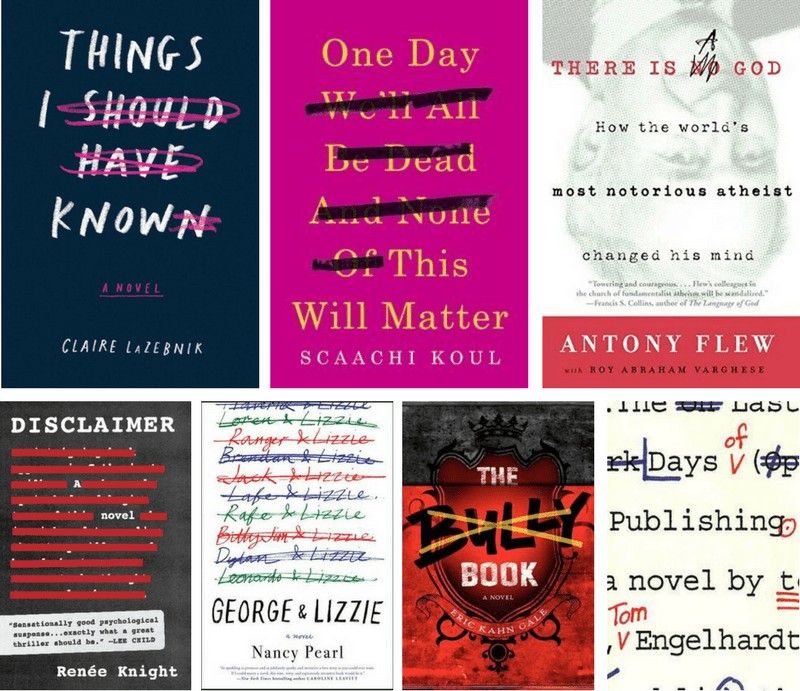
A little wordplay is always fun, and it’s especially fun when it’s worked into the cover of a book. I love how the covers I’ve highlighted below use the crossout technique to add another layer of meaning to the titles. Is the true title the one that includes or does not include the crossed out words? It’s not the same in each example, though context does helpfully give us the answer quickly. Interestingly, in The Bully Book, this technique is only used on the paperback; the original hardcover included the word Bully crossout-free. Disclaimer is the opposite: the publisher ditched the crossout technique for the paperback.

Are you a fan of this style of cover? What other books use this technique to good effect?

Filed Under: book covers, cover design, cover designs, Cover Trends

YA Cover Makeovers: Fresh New Looks for 6 Titles In Paperback

January 15, 2018 |

It seems like cover changes are roaring back. For a while, it could take a few months to pull together a list of YA books seeing redesigned covers in their paperback edition. But now, I’ve had no problem pulling together a huge list of titles seeing new looks.

As always, some of these covers are strong redesigns while others aren’t quite as strong as their original packaging. What seems to be most interesting in many of the redesigns collected here, though, is how much they’ve all sort of take on similar design elements with what seems to be an eye toward reaching adult readers more than teen readers.

Let’s take a peek. Love one of these? Dislike one of these? Seen other redesigns lately that are worth looking at? I’d love to hear about those things in the comments.

Original hardcover designs are on the left, and new paperback editions are on the right.


After The Fall by Kate Hart’s original cover reminded me of many other YA covers, including Stephanie Kuehn’s latest, When I Am Through With You. What made it stand out to me was the color choice: it’s really pleasing to the eye, but more than that, it really captures the mood of the story. It’s clear that this book has to do with something related to being outdoors (it does) and the reddened sky suggests something ominous happens (it does). The tag line for the original hardcover reads “The truth isn’t always what you expect.” I can’t say that adds a whole lot to either the title or the cover. It’s a true statement, but that offers little insight into the book itself. The font for the title is eye-catching and the way it’s spread over the entire cover is pretty appealing.

“Sometimes there’s no one to catch you” is the new tag line for the paperback edition and it’s much stronger and more insightful into what the book is actually about than the original. The paperback also suggests even more of an outdoors feel to the book, and it, too, still gives that subtle hint of something ominous lurking in the background with the color palette. It’s interesting that the font for the title goes in the complete opposite direction for this one: it’s really narrow and centered on the cover. I might be alone in this, but I think flipping “Fall” to be upside down is a bit cheesy, given the sort of feel the rest of the cover has — almost like the cover can’t be too series, even though the book itself is serious. This one screams “set in Arkansas” for me more than the original. This cover feels a little more angled toward adult readers than the original, if for no reason than it has a much more polished feel to it (save for that cheesy flipped word factor).

Both covers do the job, though I think the paperback is a little more unique and catered to the book itself. The tag line is definitely stronger. After the Fall hits shelves in paperback on January 23.


Marie Marquardt’s Dream Things True in hardcover is really bright and refreshing. Like many other YA books in the last few years, this one is driven by the title font, and in this case, it works well. The letters are bold and bright, and the font itself is unique and yet easy to read — sometimes fonts this big and bold can be tough on the eyes. The decision to make the “E” and the “A” in Dream different colors does draw attention to them, but it’s a little odd since there’s no understandable reason for the choice. The rest of the letters don’t have an ombre effect to them to the same depth, so those seem to stand out unnecessarily.

The couple in the bottom left-hand corner of this cover is interesting: he’s a little cold toward her reception. She looks like she’s quite engaged with him. As individuals, they’re a little challenging to see on screen, but in person, it’s very obvious he’s white and but her skin color is a little less obvious. She is either very tan or light brown.

I point the couple out specifically because in the paperback redesign, the couple is very easy to read on screen. She’s definitely brown and he’s definitely white. And more, they’re both walking away from one another, with nothing but their hands lingering together, as if they know the decision they’ve made as a couple is the right one for them. Although I’m generally not a fan of illustrated covers (more on that down below), in this particular case, with the right color combination, it works. The font choice for this edition is much less bold in terms of style, but the red on yellow makes it really pop. The script style of the font is easy enough to read, too, even with the sunbeams radiating through it. The use of a strip of blue stars on the left-hand side of the cover is clever, particularly when you consider how the couple is staged between the day and the night of the cover. This cover is much more mature than the hardcover and likely will appeal to more adult readers than the original.

But more than that, the fact you know immediately that this is a book about an interracial couple is what makes the paperback really stand out. Dream Things True is out in paperback on February 20.


An example of a book cover which really tells you nothing is The Edge of Everything by Jeff Giles in hardcover. It is literally a script-like font, with white text on a white background, and it’s quite hard to read: there’s a line under the “ed” of edge which tries to mirror the dash needed in the breaking up of the word everything and that ends up being really confusing to the eye. If we’re thinking about how covers look on screen — which is likely a huge factor in why we’re seeing more covers which focus on font-driven cover design — this one doesn’t really work. It tries to do too much.

The flames around the title are equally confusing. They look really fake, making me question whether they really are flames or not. More, I cannot figure out what is going on about the “h” in thing — is that a person? Why are they trying to look over the “e” in every? Is it to see the person who is hanging out over the “h” in the? And what about the little person below the “h” in thing? The longer I look at this, the more confused I get. If the focus is the edge of everything, shouldn’t the little people be standing on one of those letters looking down off the edge?

Bonus points for a James Dashner quote.

Although the paperback edition of the book doesn’t really tell you much about what it’s about, it’s definitely stronger and more pleasing to the eye. The title font is easy to read, and it chooses to be clever by being in all lowercase letters; that’s a decision that works for the eye. There’s a little bit of a magical quality to the color choices and billowy smoke behind the title, which fits with the fantasy genre of the book. That isn’t a bad thing and rather, encourages some intrigue into what the book might be about. The Dashner quote is gone, replaced by two book reviews which tell you nothing about the book (three words with tons of ellipses and a tiny little phrase don’t really offer insight except that some critics read the book) and there’s now a tag line: “For the perfect love, what would you be willing to lost?” It’s not perfect but it gives some context to the cover design in a way that the little people around the big font on the hardcover simply don’t.

Paperback all the way for this one. You can pick up The Edge of Everything in paperback June 5.


Each of Emery Lord’s YA books have been seeing new looks in paperback, and Open Road Summer is no different. The hardcover for this one isn’t especially noteworthy except for the fact it looks like every other romantic YA book which came out around the same time: a glowy, dreamy sun flare around a couple. This one is set in an open field, perhaps to really hammer home the summer setting. The font for the title takes up a little more than half the real estate and relies on some strange sizing to make work: Open and Road are uneven, with the “O” of open not being left-aligned like the “R” in road. Perhaps an issue of kearning and tracking? Summer isn’t the same size and it definitely looks like it was squished to fit. The longer I look at how the letters don’t line up on the left edge of the cover, the more my eyes are bothered.

The hardcover also has a small blurb from Elizabeth Eulberg in the top left-hand corner, which fills some of the empty space from the field behind.

There is a lot to like about the paperback redesign, even though it, too, is another illustrated cover. The title, set in the middle of the cover, is really eye-catching, and the decision to use two fonts is not just clever, but it allows for all three words to take up the same amount of space, rather than forcing a fit that doesn’t quite work. The color scheme here mirrors some of what goes on in the hardcover edition, though it’s brighter and less stuck in a particular time, place, and era (which is the problem with models on covers — they can be dated quickly by style). Unlike many other covers that have taken the illustrated route, this particular cover seems to track younger, rather than toward an adult readership.

Buried way down at the bottom of the redesign, there’s a tag line: “Your heart will lead you home…” Yes, those scare ellipses are included.

Although there’s nothing bad about the hardcover, the paperback for this one feels a little stronger, a little fresher, and a little more timeless. It also “matches” the other redesigns of Lord’s books. Open Road Summer will have its new paperback design available on March 6.


The Truth of Right Now by Kara Lee Corthron was one of the most underrated YA reads of 2017. In a year where books like The Hate U Give exploded on the scene, this one should have, too, but it didn’t. And try as I encouraged people to read it, so few did; those who did read it ended up being really glad they did.

Which, when I look at the original hardcover, I wonder if it didn’t click for readers on the shelf as something they’d want to pick up.

The hardcover features two people — a girl and a guy — on a subway. It’s entirely sketch, with very little color. That sketchiness is, I think, the power of that particular cover. The font for the title and the author’s name (which does a weird thing in being uneven in size) look like they’ve been designed in crayon, which only makes the sketchy nature of the cover stronger. This hardcover really pops for me because it’s so different, and it really reflects the story itself. But, I can also see where the feeling of being unfinished and raw is exactly what turned readers off from picking this up.

But the paperback!

This is a gorgeous image of New York City, which is where the novel is set. The image is so eye-appealing, and it manages to tell a whole lot of story with very little. The centering of the image across a walkway and stacking of the font above it creates all kinds of pretty lines without trying too hard to do just that. It feels like a spring day, but what really makes it work is the fact that it’s not necessarily sunny: there’s a bit of a foggy sheen to the sky, making everything pop against that. I don’t actually think that this cover tells you much about the book, especially not when it’s compared to the hardcover, but it’s so damn pretty that it’ll make readers at least look at the jacket copy.

No blurbs or tag lines on either cover. In a lot of ways, that in itself is unique.

The Truth of Right Now hit shelves in paperback on January 2, so you can pick it up now.


When The Moon Was Ours by Anna-Marie McLemore was a National Book Award finalist and the original hardcover design of this is utterly dreamy. The font for the title uses a nice combination of script-like letters with more standard fonts, giving it something special without sacrificing the readability. The gold against the black is easy to read, and the slight incorporation of flowers with the two main characters is clever and evokes a fantastical feel. More, what really makes this cover unique is that it feels like it’s a stage. We’re seeing the whole set along with the performers — there are the moons handing, the stage is the water tower, and the lights have been dimmed to make their stories shine. Written in tiny letters below the word Ours is a blurb from Laura Ruby.

This cover appeals to so many readers and more, tells those readers exactly the sort of feel to expect from it. It’s magical and dreamy.

Enter the paperback.

I mentioned earlier that I mostly dislike illustrated covers, and this is a perfect example of why. The magic is gone. This cover is super generic, with a color palette that does nothing especially interesting except blend it into the other generic illustrated covers. The giant moon in the middle of the cover looks more like a sun drowning in an ocean, and more, the fact that the moon is taking over the bottom of the letters in the is really harsh on the eyes. The choice to not capitalize the “t” in the is also jarring — the font for the title is already so insubstantial that the word follows the moon-sun in drowning in a sea of blue. The script for the Booklist review is nearly impossible to read on screen. The choice blurb there tells you nothing, either: “Lovely, necessary, and true” doesn’t give any insight into the book, which is a real shame with a cover that also offers nothing.

Everything that made the hardcover a special cover is gone with this one. There’s no magic. No hint of what the book’s about. No invitation to the reader to pick it up and enjoy. It’s generic. It’s boring. And it offers no hint of who the audience it’ll reach.

When The Moon Was Ours hits shelves in paperback February 13. But maybe skip it and seek out the hardcover instead.

Filed Under: cover design, cover designs, Cover Redesigns, Cover Trends, ya, ya fiction, Young Adult, young adult fiction

Teens of Color on 2018 YA Book Covers

September 18, 2017 |

One of my favorite annual round-ups has been this one: a look at the YA books hitting shelves in the next year featuring teens of color front and center. It’s been refreshing to see this become more common, though as always, we could use more, more, more.

Here’s a look at some excellent 2018 book covers where teens of color are front and center. Not all covers for next year’s books have been revealed yet, so this isn’t comprehensive. Grab your TBR and pop these right on it. All descriptions are from Goodreads.

Know of any I’ve missed from traditional publishers? Lay ’em in the comments.


After The Shot Drops by Randy Ribay (March 6)

Bunny and Nasir have been best friends forever, but when Bunny accepts an athletic scholarship across town, Nasir is betrayed. Bunny feels out of place among his new, privileged peers, and Nasir spends more time with his cousin, Wallace, who is being evicted. Nasir can’t help but wonder why the neighborhood is falling over itself to help Bunny when Wallace is in trouble.

When Wallace makes a bet against Bunny, Nasir is faced with an impossible decision—maybe a dangerous one.


American Panda by Gloria Chao (February 6)

At seventeen, Mei should be in high school, but skipping fourth grade was part of her parents’ master plan. Now a freshman at MIT, she is on track to fulfill the rest of this predetermined future: become a doctor, marry a preapproved Taiwanese Ivy Leaguer, produce a litter of babies.

With everything her parents have sacrificed to make her cushy life a reality, Mei can’t bring herself to tell them the truth–that she (1) hates germs, (2) falls asleep in biology lectures, and (3) has a crush on her classmate Darren Takahashi, who is decidedly not Taiwanese.

But when Mei reconnects with her brother, Xing, who is estranged from the family for dating the wrong woman, Mei starts to wonder if all the secrets are truly worth it. Can she find a way to be herself, whoever that is, before her web of lies unravels?


The Belles by Dhonielle Clayton (February 20, first in a series)

Camellia Beauregard is a Belle. In the opulent world of Orléans, Belles are revered, for they control Beauty, and Beauty is a commodity coveted above all else. In Orléans, the people are born gray, they are born damned, and only with the help of a Belle and her talents can they transform and be made beautiful.

But it’s not enough for Camellia to be just a Belle. She wants to be the favorite—the Belle chosen by the Queen of Orléans to live in the royal palace, to tend to the royal family and their court, to be recognized as the most talented Belle in the land. But once Camellia and her Belle sisters arrive at court, it becomes clear that being the favorite is not everything she always dreamed it would be. Behind the gilded palace walls live dark secrets, and Camellia soon learns that the very essence of her existence is a lie—that her powers are far greater, and could be more dangerous, than she ever imagined. And when the queen asks Camellia to risk her own life and help the ailing princess by using Belle powers in unintended ways, Camellia now faces an impossible decision.

With the future of Orléans and its people at stake, Camellia must decide—save herself and her sisters and the way of the Belles—or resuscitate the princess, risk her own life, and change the ways of her world forever.


Blood Of A Thousand Stars by Rhoda Belleza (February 20, second in a series)

Empress

With a revolution brewing, Rhee is faced with a choice: make a deal with her enemy, Nero, or denounce him and risk losing her crown.

Fugitive

Framed assassin Alyosha has one goal in mind: kill Nero. But to get his revenge, Aly may have to travel back to the very place he thought he’d left forever—home.

Princess

Kara knows that a single piece of technology located on the uninhabitable planet Wraeta may be the key to remembering—and erasing—the princess she once was.

Madman

Villainous media star Nero is out for blood, and he’ll go to any means necessary to control the galaxy.

Vicious politics and high-stakes action culminate in an epic showdown that will determine the fate of the universe.


Children of Blood and Bone by Tomi Adeyemi (March 6, first in a series)

Zélie Adebola remembers when the soil of Orïsha hummed with magic. Burners ignited flames, Tiders beckoned waves, and Zelie’s Reaper mother summoned forth souls.

But everything changed the night magic disappeared. Under the orders of a ruthless king, maji were targeted and killed, leaving Zélie without a mother and her people without hope.

Now, Zélie has one chance to bring back magic and strike against the monarchy. With the help of a rogue princess, Zélie must outwit and outrun the crown prince, who is hell-bent on eradicating magic for good.

Danger lurks in Orïsha, where snow leoponaires prowl and vengeful spirits wait in the waters. Yet the greatest danger may be Zélie herself as she struggles to control her powers—and her growing feelings for the enemy.


Dread Nation by Justina Ireland (April 3)

Jane McKeene was born two days before the dead began to walk the battlefields of Gettysburg and Chancellorsville—derailing the War Between the States and changing America forever. In this new nation, safety for all depends on the work of a few, and laws like the Native and Negro Reeducation Act require certain children attend combat schools to learn to put down the dead. But there are also opportunities—and Jane is studying to become an Attendant, trained in both weaponry and etiquette to protect the well-to-do. It’s a chance for a better life for Negro girls like Jane. After all, not even being the daughter of a wealthy white Southern woman could save her from society’s expectations.

But that’s not a life Jane wants. Almost finished with her education at Miss Preston’s School of Combat in Baltimore, Jane is set on returning to her Kentucky home and doesn’t pay much mind to the politics of the eastern cities, with their talk of returning America to the glory of its days before the dead rose. But when families around Baltimore County begin to go missing, Jane is caught in the middle of a conspiracy, one that finds her in a desperate fight for her life against some powerful enemies. And the restless dead, it would seem, are the least of her problems.


Everywhere You Want To Be by Christina June (May 1)

Matilda Castillo has always done what she was told, but when she gets injured senior years, she watches her dreams of becoming a contemporary dancer slip away. So when Tilly gets a once-in-a-lifetime opportunity to spend the summer with a New York dance troupe, nothing can stop her from saying yes–not her mother, not her fears of the big city, and not the commitment she made to Georgetown. Tilly’s mother allows her to go on two conditions: one, Tilly will regularly visit her abuela in New Jersey, and two, after the summer, she’ll give up dancing and go off to college.

Armed with her red vintage sunglasses and her pros and cons lists, Tilly strikes out, determined to turn a summer job into a career. Along the way she meets new friends … and new enemies. Tilly isn’t the only one desperate to dance, and fellow troupe member Sabrina Wolfrik intends to succeed at any cost. But despite dodging sabotage and blackmail attempts from Sabrina, Tilly can’t help but fall in love with the city, especially since Paolo, a handsome musician from her past, is also calling New York home for the summer.

As the weeks wind down and the competition with Sabrina heats up, Tilly’s future is on the line. She must decide whether to follow her mother’s path to Georgetown or leap into the unknown to pursue her own dreams.


A Girl Like That by Tanaz Bhathena (February 27)

Sixteen-year-old Zarin Wadia is many things: a bright and vivacious student, an orphan, a risk taker. She’s also the kind of girl that parents warn their kids to stay away from: a troublemaker whose many romances are the subject of endless gossip at school.  You don’t want to get involved with a girl like that, they say. So how is it that eighteen-year-old Porus Dumasia has only ever had eyes for her? And how did Zarin and Porus end up dead in a car together, crashed on the side of a highway in Jeddah, Saudi Arabia? When the religious police arrive on the scene, everything everyone thought they knew about Zarin is questioned. And as her story is pieced together, told through multiple perspectives, it becomes clear that she was far more than just a girl like that.


Let’s Talk About Love by Claire Kann (January 28)

Alice had her whole summer planned. Non-stop all-you-can-eat buffets while marathoning her favorite TV shows (best friends totally included) with the smallest dash of adulting–working at the library to pay her share of the rent. The only thing missing from her perfect plan? Her girlfriend (who ended things when Alice confessed she’s asexual). Alice is done with dating–no thank you, do not pass go, stick a fork in her, done.

But then Alice meets Takumi and she can’t stop thinking about him or the rom com-grade romance feels she did not ask for (uncertainty, butterflies, and swoons, oh my!).

When her blissful summer takes an unexpected turn, and Takumi becomes her knight with a shiny library employee badge (close enough), Alice has to decide if she’s willing to risk their friendship for a love that might not be reciprocated—or understood.


Love, Hate, and Other Filters by Samira Ahmed (January 16)

A searing #OwnVoices coming-of-age debut in which an Indian-American Muslim teen confronts Islamophobia and a reality she can neither explain nor escape–perfect for fans of Angie Thomas, Jacqueline Woodson, and Adam Silvera.

Maya Aziz is torn between futures: the one her parents expect for their good Indian daughter (i.e.; staying nearby in Chicago and being matched with a “suitable” Muslim boy), and the one where she goes to film school in New York City–and maybe, just maybe, kisses a guy she’s only known from afar. There’s the also the fun stuff, like laughing with her best friend Violet, making on-the-spot documentaries, sneaking away for private swimming lessons at a secret pond in the woods. But her world is shattered when a suicide bomber strikes in the American heartland; by chance, he shares Maya’s last name. What happens to the one Muslim family in town when their community is suddenly consumed with hatred and fear?


Meet Cute anthology by various YA authors (January 2)

Whether or not you believe in fate, or luck, or love at first sight, every romance has to start somewhere. MEET CUTE is an anthology of original short stories featuring tales of “how they first met” from some of today’s most popular YA authors.

Readers will experience Nina LaCour’s beautifully written piece about two Bay Area girls meeting via a cranky customer service Tweet, Sara Shepard’s glossy tale about a magazine intern and a young rock star, Nicola Yoon’s imaginative take on break-ups and make-ups, Katie Cotugno’s story of two teens hiding out from the police at a house party, and Huntley Fitzpatrick’s charming love story that begins over iced teas at a diner. There’s futuristic flirting from Kass Morgan and Katharine McGee, a riveting transgender heroine from Meredith Russo, a subway missed connection moment from Jocelyn Davies, and a girl determined to get out of her small town from Ibi Zoboi. Jennifer Armentrout writes a sweet story about finding love from a missing library book, Emery Lord has a heartwarming and funny tale of two girls stuck in an airport, Dhonielle Clayton takes a thoughtful, speculate approach to pre-destined love, and Julie Murphy dreams up a fun twist on reality dating show contestants.

This incredibly talented group of authors brings us a collection of stories that are at turns romantic and witty, epic and everyday, heartbreaking and real.


The Place Between Breaths by An Na (March 6)

Sixteen-year-old Grace is in a race against time—and in a race for her life—even if she doesn’t realize it yet…

She is smart, responsible, and contending with more than what most teens ever have to. Her mother struggled with schizophrenia for years until, one day, she simply disappeared—fleeing in fear that she was going to hurt herself or those she cared about. Ever since, Grace’s father has worked as a recruiter at one of the leading labs dedicated to studying the disease, trying to lure the world’s top scientists to the faculty to find a cure, hoping against hope it can happen in time to help his wife if she is ever found. But this makes him distant. Consumed.

Grace, in turn, does her part, interning at the lab in the gene sequencing department in hopes that one day they might make a breakthrough…and one day they do. Grace stumbles upon a string of code that could be the key. But something inside of Grace has started to unravel. Could her discovery just be a cruel side effect of the schizophrenia finally taking hold? Can she even tell the difference between what is real and what isn’t?


The Poet X by Elizabeth Acevedo (March 6)

Xiomara Batista feels unheard and unable to hide in her Harlem neighborhood. Ever since her body grew into curves, she has learned to let her fists and her fierceness do the talking.

But Xiomara has plenty she wants to say, and she pours all her frustration and passion onto the pages of a leather notebook, reciting the words to herself like prayers—especially after she catches feelings for a boy in her bio class named Aman, who her family can never know about. With Mami’s determination to force her daughter to obey the laws of the church, Xiomara understands that her thoughts are best kept to herself.

So when she is invited to join her school’s slam poetry club, she doesn’t know how she could ever attend without her mami finding out, much less speak her words out loud. But still, she can’t stop thinking about performing her poems.

Because in the face of a world that may not want to hear her, Xiomara refuses to be silent.

Fans of Jacqueline Woodson, Meg Medina, and Jason Reynolds will fall hard for this astonishing own voices novel-in-verse by an award-winning slam poet, about an Afro-Latina heroine who tells her story with blazing words and powerful truth.


Ship It by Britta Lundin (Spring 18)

The story of a fanfic writer named Claire who just knows the two male characters on her favorite show are in love, and tries to convince the showrunner to make the relationship happen on screen when she’s invited on a Comic Con tour with the cast.


Tyler Johnson Was Here by Jay Coles (March 20)

When Marvin Johnson’s twin, Tyler, goes to a party, Marvin decides to tag along to keep an eye on his brother. But what starts as harmless fun turns into a shooting, followed by a police raid.

The next day, Tyler has gone missing, and it’s up to Marvin to find him. But when Tyler is found dead, a video leaked online tells an even more chilling story: Tyler has been shot and killed by a police officer. Terrified as his mother unravels and mourning a brother who is now a hashtag, Marvin must learn what justice and freedom really mean.

Filed Under: book lists, cover design, cover designs, diversity, intersectionality, reading lists, ya, ya fiction, Young Adult, young adult fiction

YA Cover Makeovers: 5 Redesigns To Consider

September 11, 2017 |

It’s time for another round of YA cover makeovers. As usual, some of these are great redesigns, some are not so great, and some make you wonder why they were being changed at all. I’d love to know what you think of the covers, either the original or the redesign, in the comments, and if you have seen other recent changes worth noting, lay ’em in the comments, too. Original designs are on the left, and the paperback redesign is on the right.


Saving Hamlet by Molly Booth has undergone a pretty dramatic transformation. The original cover was entirely illustrative, and it was quite clear that the book had something to do with Hamlet. There’s Yorick there, as well as an image of the crown above the word “Hamlet,” and the spotlight gives a good indication it has something to do with theater. It’s a cute cover, though perhaps reads a little bit young. Yet, I can imagine the teens who see this being excited by it because they know exactly what it is they’re getting into.

The paperback redesign of this cover, though, didn’t strike me as YA when I first saw it. It reminded me of a romance novel, and that’s precisely why I stopped and looked at it more closely. This cover is very clever, incorporating parts of the original cover design into the new look. We have Yorick still, as well as the crown. We also have a font which, if not exactly the same, is really close to being the same. But the changes: we have a boy and a girl who are back to back. From afar, it looks like there are handcuffs, but upon a closer look, it’s clear each is holding their own hands and they’re hovering near the sword. This is a weird image, for sure, and while it’ll certainly appeal to readers seeking a romance, I’m not sure it hits the same demographic as the original cover. The new design also incorporates a tag line that doesn’t make a whole lot of sense without context: “Shakespeare gets real.” Was Shakespeare not real before? I can’t say I get it not having read the book.

Neither cover is better or worse. They cater to wildly different readerships. Saving Hamlet will hit shelves in paperback on November 7.


I kind of hated the original cover for Anna Banks’s Nemesis and I can say that I hate the paperback a little bit less. The original features a stone-faced girl and a color scheme that could only be described as bland. The only feature that stands out is her blonde hair, which tells me absolutely nothing about the book except that there’s a white girl at the center of the story. The tag line at the top, “She didn’t expect to fall in love — with her nemesis” only adds more to the nothing factor of the cover. It sounds like every other fantasy or dystopian novel tag line. It’s frustrating to not get a ready on genre at all, as I can’t tell who this book would be great for.

The paperback, which will be released October 3, isn’t hugely better in terms of giving a genre read, but from a design perspective, it’s worlds better. It looks, I think, a little more science fiction than fantasy, but that may be from the font alone — I can’t place it, but I’ve definitely seen that look for an author’s name. What this cover improves, though, is on color: we have at least a little bit. There’s also a nice sheen to the image in the center, and the girl on it is less easy to identify. The dropping of the tag line is also an improvement.

I don’t love either cover, but the paperback is much better, if for no reason other than it looks like it could be shelved alongside a bunch of other similar books for readers to pick up and know whether or not it is for them.


The Last True Love Story by Brendan Kiely came out last fall and it didn’t seem to land as loudly as it should have, given that Kiely had gained a significant amount of acclaim in his work with Jason Reynolds in American Boys. The cover for The Last True Love Story, however, is pretty quiet. It’s clear it’s a giant sky with movement, and the font itself sort of mirrors the look. It reads contemporary love story to me, though beyond the title, little exactly says that. . . and little indication of what is really inside the book. This is an example of a font-driven title that does the job of explaining the story but that doesn’t add much to the design itself.

The paperback, which just hit shelves, tells a little bit more. What’s interesting is how much it looks like a movie still: we see a girl who looks lost, we see the dreamy lights behind her, and then that’s mirrored by the dreamy motion and lights of the ferris wheel below. Brendan’s name has been moved from below the title to above, likely being the bigger selling feature than the title, and interestingly, the blurb from Julie Murphy takes up far more real estate on paperback than it did on the hard cover. Toning down the font for the title does the cover service, too. It’s not perfect, but this one screams mature, dreamy YA love story in a way the original doesn’t. The original nails YA love story but less of the “mature” and “dreamy” aspects. I’m really digging the buttery-yellow color for the author name, too — there’s a shade of yellow I’ve not seen much on YA books and adds to that dreamy feel.

My own reader tastes would pick up the paperback before the hard cover edition, but I can see the appeal for both. I think they hit the same readership, though they tell different stories.


Dust of 100 Dogs by AS King came out many years ago from Flux as a paperback original. This was King’s first book and one that doesn’t seem to get the same kind of talk or attention as her subsequent titles. It’s a pretty cool cover, focusing on three colors, a unique font design, and using the negative space really well.

King’s first book is being reissued on October 3 through Speak, an imprint of Penguin, which is where she’s now being published. The choice in reissuing is a smart one, given that she’s grown her audience since this book, and the designers were clever in making the new edition look really similar to the previous ones. The font is very close to being the same, though her name has been made white and more standard looking. There is now a list of acclaims beside her name, and a blurb from the New York Times. If you’re curious why they didn’t just keep the original design, my guess would be that it was copyrighted by the designer and/or house, so getting rights for that would be challenging. But the way they managed to keep it so similar, just using different pieces, is pretty impressive.

While I prefer the original cover, I’ve got no qualms with the reissue. I think the similarity is clever. I only wish that our girl was wearing something on her body in the new edition. Her boots blend in a little too much. (Also, look at how she went from knee-high heeled boots to less-high combat-style boots).


Here is the cover design baffling me the most out of the ones here. Krystal Sutherland’s Our Chemical Hearts hit shelves last fall with a cover that was super fresh and unique. I love the blue-hued fish and the way the font plays with the fish shapes. There’s a cool three dimensional effect, and it’s just so different. Does it say anything about the story? Absolutely not. This is a book about first love, but from that cover, you’d never know. And yet, the cover is cool and fresh enough to encourage readers to pick it up to find out what it could possibly be about. Fish? Maybe romance…but fish?

The paperback edition of the book, which hit shelves earlier this month, continues to tell us nothing about the story. It’s pretty, sure sure, but the choice in all lowercase letters for the title and author name is odd. This is a very bright and fun cover that achieves an effect of being just that. The blurbs for this book call it “John Green meets Rainbow Rowell” — we’re still not past that lazy and useless description — but the book doesn’t look like it would belong in the hands of fans of either of those authors. Working in favor of this cover over the original, though, is the blurb on top, as we know it’s a story about first love.

It also reminds me a lot of Natalie C. Parker’s forthcoming anthology Three Sides of a Heart.

Verdict? I really like the design and feel of both covers, yet neither one seems to fit the book. Either would stand out on a display but how would you know who to hand it to?


What do you think? Do you prefer any of these covers? Lay your opinions and thoughts in the comments.

Filed Under: book covers, cover design, cover designs, ya, ya fiction, Young Adult, young adult fiction

YA Hardcover to Paperback Makeovers: Six to Consider

June 12, 2017 |

It’s been a minute since I’ve done a look at YA book cover changes. For some reason, I keep a massive list of them but can forget to actually write about them when I’m working on posts. Alas, I’ve put together two at once — the one here and one for next month — and hope to continue highlighting these with more frequency because I love looking and thinking about YA book covers.

As usual, some of these changes are great and others are less so. I’d say on the whole, this round falls a little more into the “less so” category for me, but I suspect some of you might feel differently. As always, I’d love to hear what you think, which covers you prefer, and what cover changes you’ve seen lately that have caused you to pause and think.

Original covers in this round-up are on the left, with the redesigns on the right.


Kids of Appetite by David Arnold covers


Kids of Appetite kicks off this round of cover changes and I have to be honest: I dislike both covers. Quite a bit, in fact. The hardcover looks to me like it’s not only trying too hard, but also that it’s doing too much. The text takes up a significant amount of real estate, and a good portion of that is a tag line that doesn’t seem to add much. I’ve never been a huge fan of illustrate covers, and this one is no exception. As nice as it is to see an inclusive illustration, none of the characters have any personality since we’re only able to see their backs.

The paperback takes what the hardcover did and turned the kids into telescopes. One of them even has on a scarf which kills me. It’s trying so hard to be clever and literary. More, the paperback redesign takes on a new trend from this particular paperback imprint that I’ve not been fond of: it’s making the paperback cover into two pieces, wherein the design is on top, with an underlaid cover that has praise all over it (in redesigns like the one for Jeff Zentner’s The Serpent King or Jandy Nelson’s I’ll Give You The Sun, one of those cover pieces is simply a quote from inside the book, which literally tells you nothing about the book). These kinds of choices scream adult audience, serious literary business. And if that’s the angle, then it’s succeeding, but….it’s not a YA look. What the paperback does have going for it, though, is the lessening of text. The title and author look much better on this one. It’s also interesting that they not only cut the tag line, but they also got rid of “bestselling” before “author of Mosquitoland.”

Neither of these covers really does it for me. If I had to pick one, though, I’d likely go hardcover, if for no reason other than it features at least two teens of color on it.

Kids of Appetite by David Arnold will be available in paperback on September 5.


ten things we did by sarah mlynowski cover change


The original cover for Sarah Mlynowski’s Ten Things We Did (And Probably Shouldn’t Have) came at the same time we got the original cover for Siobhan Vivian’s Not That Kind of Girl. They feature the same couple in slightly different positions. Back in those olden days of YA in 2011, covers with people on them were all the rage. On the right, though, we have a brand new edition of Mlynowski’s title in paperback that seems to follow the conventions of 2017 design: illustrated and, as I’ve noticed in a number of “lighter” YA titles, totally covered in stuff. See, for example, Lauren Strasnik’s 16 Ways to Break a Heart. Maybe it’s the color choice, but the new Ten Things cover looks really middle grade leaning to me, despite the fact the cover does feature a wine bottle, red underwear, and other items that one wouldn’t associate with middle graders. It is also certainly not a middle grade read in terms of content.

This is a tough one for me, since I don’t especially care for either of the covers. It is interesting to note that the new design denotes that Mlynowski is a New York Times Bestselling author, whereas the original hardcover has a blurb from Sara Shepard. Neither of the covers really do much for what the book is about; I almost wish that the Strasnik design scheme was what we saw for this particular cover, as that might make it feel more appropriate or appealing.

Ten Things We Did hit paperback in its new look June 6.


amy chelsea stacie dee cover change


How about before saying anything about these covers, we pause and just appreciate how different the stories these covers are telling? And yet, what I love about both of them, is they both convey a sense of something Not Good happening. Amy Chelsea Stacie Dee in hardcover looks like a pretty solid horror novel. The doll face is creepy, and it’s made even creepier by the dirt splotches on the doll’s face. The title fonts work pretty well, too, as they’re sparse and it’s really the face of the doll which stands out on the cover. As someone who likes scary, this cover would be enough to make me pick it up.

The paperback edition, though, is also pretty damn good. I think that maybe the hair strands on covers could become cliche very quickly (there’s at least two others that I know of for 2017 alone, including the new E. Lockhart) but on this cover, it certainly does something interesting in conveying the idea this book might be more thriller than horror. The color differences on the hair locks is notable, as is the small pink bow. Like with the original hardcover, there’s a careful use of fonts with the title, wherein both “Amy” and “Dee” are in the same design and “Chelsea” and “Stacie” are in an alternate font. What I don’t like about this cover, though, is the use of the tag line. I think the effect of the cover is lost a bit in there being too much text on it now. Were it gone, the starkness would speak volumes.

Each cover tells a different story about the feel of the book — the one on the left is certainly horror, whereas the one on the right conveys thriller or mystery. I think both work, though as someone who hasn’t read this book, it’s challenging to discern which one is more fitting for the story. But in considering which might make me pick up the book….both actually would catch my eye enough. Perhaps the one on the right is geared a little more toward adult readers than teen readers, but it’s hard to say.

The paperback for Mary G. Thompson’s Amy Chelsea Stacie Dee will hit shelves October 3. It might hit my own TBR a little sooner than that.


unnatural deeds cover change


Unlike the previous set of covers, I don’t necessarily think the design change for Unnatural Deeds by Cyn Balog offers up anything different. The two images are even almost exactly the same in where they’ve been placed on the cover: dead center. On the original hardcover, we have a pair of scissors cutting a flower, while on the right, we have a take on the “moth to a flame” cliche (just, you know, a butterfly to a lightbulb without any shade on it). The font on both covers feels somewhat uncreative, and it bothers my eyes a bit that the paperback font is not an even size between “Unnatural” and “Deeds.” I also find the fact that part of the word “Unnatural” actually clips the lightbulb to be bothersome. Or maybe it’s the fact that it looks like the lightbulb was slightly altered to allow the title to fit?

An interesting difference between the two: we lost the blurb on the paperback edition. Both still feature the tag line — and neither image really captures the idea of needing to kill to protect. In a lot of ways, these feel like safe images for what sounds like a murder-y type read. Although the cliched nature of the paperback bothers me, there’s something about the black background that works much better than the odd, bottom-of-the-river green on the hardcover.

I can’t say I love either of these nor feel they’re particularly fresh. That said, I suspect teen readers might feel differently, especially those who know what kinds of covers to look for for the types of books they love to read. What’s cliche to me as an adult can, and does, often not feel that way to teens, in part because they haven’t seen it enough to be tired by it. If I had to pick one cover doing it a bit better, I’d go with the new paperback, though I really hope that title font gets fixed. Kirkus called this a “PG-13 version of Gone Girl” and I think we get that more with the paperback, too.

Unnatural Deeds will hit paperback on November 1.


the memory of things by gae polisner cover change


I don’t think I have a cover change I like more in this round-up than this one. Gae Polisner’s The Memory of Things is a 9/11 themed YA novel, and the hardcover made that super clear. The “I” in the title there was masked as the Twin Towers, kind of, if the Twin Towers were uneven in their size. The color of the original was a bright baby blue, and the image in the background of a white angel absolutely popped. But, aside from the small use of the Towers in the title font, the cover didn’t say much other than maybe it’s a book about angels. Despite having enjoyed Polisner’s previous books, there was nothing about this cover that really spoke to me, other than appreciating that it’s pretty sparse.

It’s interesting how much a YA book cover not filled with blurbs or tag lines can stand out for that alone.

The paperback edition of the novel doesn’t make the 9/11 connection clear, and in a lot of ways, that’s of service to the book. The yellow color pops and is fresh, and the image we see is that of a cityscape. As a non-New Yorker, this image doesn’t exactly place me in that city, though it does place me in A city; I think this is a hugely positive thing, as it will appeal to a larger range of readers who, like me, can tire of the same New York City story (I tend to think sometimes New York City publishing forgets that not everyone cares about NYC….growing up, all anyone ever wanted to do in my town was get to Chicago, and though we’re seeing more Chicago-set books now, they’re still few and far between). The almost generic feel of the city here, though, works really well, and I appreciate how the color and saturation of the image actually work against the yellow background. More, that font! The font itself tells a story in a way that the original didn’t. Like the hardcover, the paperback is clean, clear of extra text, and I think it literally pops from the screen and will pop from shelves.

No question, the paperback is the big winner here for me. It hits shelves on August 29.


salt to the sea cover change


Finally, here’s the paperback makeover for Ruta Sepetys’s Salt To The Sea. The original cover tells a pretty powerful story. It’s clear, at least to me, this is a historical fiction read, and there’s something to be a big element of survival to it. The color saturation and the lines in the image itself are powerful. It has a cold feeling to it, and there’s always something neat about a book cover that makes you feel a sensation just by looking at it.

What the original cover has that’s kind of annoying: so much text. Not only do we have the blurb from the Wall Street Journal review, we have a note that it’s by an international bestselling author of another book and that the book itself is a New York Times Bestselling novel. Do teen readers care? I don’t think that they read those blurbs and are suddenly moved to pick up the book. But alas, I’m curious about how much the teen appeal is in consideration.

I say that because the paperback book is not, at least in my mind, for teen readers. The cover is very adult historical fiction, and it also tells absolutely no story except that there might be people who died, as represented by shoes. I think the tag line also conveys that, and it’s a tag line that isn’t on the original hardcover. But at least we lost the other text in this rendition.

As noted before, notice how the paperback edition of this book is two-fold: there’s the cover, and then there’s a bigger cover beneath it, like with Kids of Appetite. This isn’t a particularly library friendly style, though it is a style that really screams Literary Fiction Adults Will Like. In this case, we lose the cool of the blue water and we now have a green hue to it. Though it is, without question, a pretty and appealing cover, it doesn’t tell nearly the story the hardcover does. Nor, do I think, does it care about reaching teen readers. None of those shoes even look like they’d belong to a teen (we have children’s shoes, as well as what appear to be a pair of shoes from an adult couple).

Hands down, for me, the hardcover does it better. I wish it had about half the text it has on it, but it gives so much more feeling and emotion, and I think it appeals far more to the audience for whom it was published (if YA is for teens, of course, which is in and of itself a debatable suggestion).

Salt To The Sea hits paperback on August 1. Interestingly, as I looked up the pub date on Amazon for this one, it was quoted as being great for readers who loved All The Light We Cannot See…another adult-aimed read.


Filed Under: aesthetics, book covers, cover design, cover designs, Cover Redesigns, Cover Trends, ya, ya fiction, Young Adult, young adult fiction

  • « Previous Page
  • 1
  • …
  • 3
  • 4
  • 5
  • 6
  • 7
  • …
  • 10
  • Next Page »
  • Facebook
  • Instagram
  • Pinterest
  • Twitter

Search

Archives

We dig the CYBILS

STACKED has participated in the annual CYBILS awards since 2009. Click the image to learn more.

© Copyright 2015 STACKED · All Rights Reserved · Site Designed by Designer Blogs