• STACKED
  • About Us
  • Categories
    • Audiobooks
    • Book Lists
      • Debut YA Novels
      • Get Genrefied
      • On The Radar
    • Cover Designs
      • Cover Doubles
      • Cover Redesigns
      • Cover Trends
    • Feminism
      • Feminism For The Real World Anthology
      • Size Acceptance
    • In The Library
      • Challenges & Censorship
      • Collection Development
      • Discussion and Resource Guides
      • Readers Advisory
    • Professional Development
      • Book Awards
      • Conferences
    • The Publishing World
      • Data & Stats
    • Reading Life and Habits
    • Romance
    • Young Adult
  • Reviews + Features
    • About The Girls Series
    • Author Interviews
    • Contemporary YA Series
      • Contemporary Week 2012
      • Contemporary Week 2013
      • Contemporary Week 2014
    • Guest Posts
    • Link Round-Ups
      • Book Riot
    • Readers Advisory Week
    • Reviews
      • Adult
      • Audiobooks
      • Graphic Novels
      • Non-Fiction
      • Picture Books
      • YA Fiction
    • So You Want to Read YA Series
  • Review Policy

STACKED

books

  • STACKED
  • About Us
  • Categories
    • Audiobooks
    • Book Lists
      • Debut YA Novels
      • Get Genrefied
      • On The Radar
    • Cover Designs
      • Cover Doubles
      • Cover Redesigns
      • Cover Trends
    • Feminism
      • Feminism For The Real World Anthology
      • Size Acceptance
    • In The Library
      • Challenges & Censorship
      • Collection Development
      • Discussion and Resource Guides
      • Readers Advisory
    • Professional Development
      • Book Awards
      • Conferences
    • The Publishing World
      • Data & Stats
    • Reading Life and Habits
    • Romance
    • Young Adult
  • Reviews + Features
    • About The Girls Series
    • Author Interviews
    • Contemporary YA Series
      • Contemporary Week 2012
      • Contemporary Week 2013
      • Contemporary Week 2014
    • Guest Posts
    • Link Round-Ups
      • Book Riot
    • Readers Advisory Week
    • Reviews
      • Adult
      • Audiobooks
      • Graphic Novels
      • Non-Fiction
      • Picture Books
      • YA Fiction
    • So You Want to Read YA Series
  • Review Policy

Fat girl alert!

June 26, 2010 |

It’s happened.

It took a long time, and it took a cover redesign, as well as a forthcoming show on ABC Family, but we have come to a day I have been looking forward to for a long time.

How awesome is that? This is an entirely marketable cover. It is appealing and relatable to so many young women out there. It’s not threatening, it’s not mocking, and it is a true representation.

A HUGE thanks goes out to Simon & Schuster for the redesign here. This is so much better than this, this, and this. Let’s not resort to this, this, or this again.

Filed Under: aesthetics, big issues, cover designs, Uncategorized

Shelf Check!

June 14, 2010 |

One of my big goals for bloggiesta was to get my books all onto shelves in a workable way. When we moved into our house, many of my books fit onto these three shelves. And yes, they are arranged by color. I straightened these guys out this weekend:


I also had a book shelf in my living room that houses my soon-to-be reviewed titles and my currently checked out library books. There are also a couple of recently purchases titles up there (I need to reread The Hunger Games and Catching Fire before Mockingjay comes out). I reorganized those bad boys this weekend so it matches the scheme on the office shelves.


This weekend, we added another member to our bookshelf family to our bedroom. My husband reads in bed at night, and he puts his books down on the floor. Not usually a problem, except when you have cats who like eating paper. So, in addition to a place for him to store his books, it was the perfect spot to organize my BEA haul.

And there you have it, a look at my home library. Most of the ARCs don’t stick around: they go to my work where I give them away to the kids I work with. So while it looks really full, the first set of shelves is my “real” personal library.

. . . and don’t books look prettier on a shelf in color order? It’s inspiring to me.

Filed Under: aesthetics, Uncategorized

Lois Duncan: A cover retrospective

June 10, 2010 |

Lois Duncan: you’ve read her work. Her thrillers were core to my teenage reading years, and it was at that time that film makers produced I Know What You Did Last Summer, as well. Let’s talk a walk down memory lane and check out some of her covers past, present, and remastered.

A Git of Magic, published in 1960. I think this is the original cover. WHAT is with the person in the background — are they dancing? levitating? having a seizure?

Here are a couple of different renditions, with the signature style of her newer covers featured last:


Season of the Two – Heart published in 1964. Definitely fits what the aesthetic of the 1960s young adult book was, right down to the color tones.

Point of Violence published in 1966. I love the crime club selection style here, as it really does set it apart — you know other books in that time period had similar covers if they were crime selections. That sort of cover work really aids in reader advisory. I sometimes wish we still had this sort of visual aid (we do in some ways but not like this!).

1966 also brought us Ransom. This one underwent a title change, as well. It is also known as Five Were Missing.


This one’s been redesigned a couple times. The first stands out, fits with the aesthetic of Duncan’s other titles, and screams thriller with its tag line. I might have to say the second redesign is kind of hokey. It reminds me of a Buffy the Vampire Slayer cast shot.


1973 brought us When the Bow Breaks. This is one that again fit with the books I’ve seen or had from the 1970s.

Of course, what would a Duncan retrospective be without this 1973 classic?

That is our original cover for I Know What You Did Last Summer.

Film style, of course.

I love this one! Talk about spooky.

Killing Mr. Griffin came to us in 1978, and it, too, got the movie treatment.


I think the last one’s my favorite. I like how similar they all are, but they each still provoke just a little bit of a different feeling.

Let’s move on to the 1980s. Duncan brought us these titles in that decade:
1981’s Stranger with My Face. I love this cover. It is so 1981 — think about how much this is reminiscent of the original Sweet Valley series!
I love this one. This is the first title of Duncan’s that really looks like something other than a white girl/boy.

1985 brought us Locked In Time, featuring a cover model who looks about 35. But this one, too, has gotten a few make overs.


She looks much older than teen aged, too, doesn’t she?

1989 brought us Don’t Look Behind You. This one SCREAMS 1980s and teenage thriller. A red corded telephone transports us back to such an innocent era, doesn’t it?

And finally, we’ve reached the 1990s.


I really like all three of these. The crystal ball and snow globe images are eerie.

Duncan hasn’t written much for the teen group in the 2000s, as Hotel for Dogs is aimed at a younger crowd. However, as you have seen, many of her books have been repackaged over and over. These have incredible staying power, and it has been smart of the publishers to redesign the covers to fit the ever-changing aesthetics of our culture.

Do you have a favorite here? I think mine might be the incredibly cheesey 1989 Don’t Look Behind You. I bet it would still circulate like crazy with that cover!

Filed Under: aesthetics, Authors, cover designs, Uncategorized

Cover Spotlight: Nancy Werlin

May 19, 2010 |

I’ve been trying to read more Nancy Werlin lately for a number of reasons. I read The Rules of Survival last year and really liked it. Her early mysteries were also released (or rereleased) on audio with very appealing covers and copy descriptions, and she has a new book publishing this year. She’s a perennial favorite among teens, as well.

She’s also been the recipient of new covers for almost all of her books, including many interesting redesigns when the book goes from hard cover to paperback. Although her repitoire isn’t as lengthy as, say, Richard Peck, she’s been publishing for a while and the changes to the covers have certainly made even her older titles quite contemporary.


1994’s Are You Alone on Purpose before and after. I think it’s quite interesting that the gender of the main character on the cover is different.


1998’s The Killer’s Cousin before and after. I completely love the new cover. It has a very contemporary feel but it also feels timeless. The cover on the left feels like a 90s teen book design.


2000’s Locked Inside doesn’t work in the same way that The Killer’s Cousin does for me. The new design, on the right, feels older than the cover on the left (the original). Very My So-Called Life.


2001’s Black Mirror has two covers that work well, I think. I prefer the newer one on the right slightly more, as I think it’s a littler clearer that the story focuses on a person of color. The one on the left gives a bit of the wilderness feel to it. I think the cover on the left might have more boy appeal to it, too.


2004’s Double Helix with the audiobook cover on the left and the book’s unchanged cover on the right. I love this book’s cover: it conveys the science element quite clearly, and this is a title that stands out on a shelf.


2006’s The Rules of Survival with the hardcover on the left and the paperback on the right. Talk about two different audiences. The left screams boy appeal while the right, in its purple, definitely has a better girl factor. This one works well both ways.


2008’s Impossible with the hardcover on the left and the paperback on the right. I like both of them for different reasons. The one on the left feels fresh to me, while the one on the right feels girly. Both of those feelings work for me.

September 2010’s Extraordinary has a really cool, girly cover to it. I will be interested to see how this one may get made over into paperback — after I read it, of course.

Filed Under: aesthetics, cover designs, Uncategorized, Young Adult

Double take and things that look quite similar

May 12, 2010 |

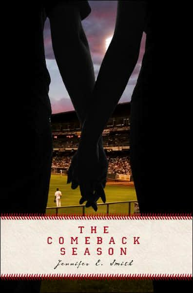
Hand holding is so hot right now, isn’t it? Check out this double take, followed by many of the similar covers flooding the market right now:

Sing Me to Sleep by Angela Morrison was published by March 2010 by Razorbill.


Sharing Sam by Katherine Applegate was published March 2004 by Delacorte.

I’m a bigger fan of Sing Me to Sleep, as I think the snow falling and the font for the title works much better than Sharing Sam.


Know of any others or do you have a favorite? Share in the comments!

Edit (5/15/10)

Thanks to Linda over at Jacket Whys (a blog that if you have any interest in cover design, you need to check out), here are a few more hand-holding covers:


Filed Under: aesthetics, cover designs, Uncategorized

  • « Previous Page
  • 1
  • …
  • 20
  • 21
  • 22
  • 23
  • 24
  • …
  • 32
  • Next Page »
  • Facebook
  • Instagram
  • Pinterest
  • Twitter

Search

Archives

We dig the CYBILS

STACKED has participated in the annual CYBILS awards since 2009. Click the image to learn more.

© Copyright 2015 STACKED · All Rights Reserved · Site Designed by Designer Blogs