• STACKED
  • About Us
  • Categories
    • Audiobooks
    • Book Lists
      • Debut YA Novels
      • Get Genrefied
      • On The Radar
    • Cover Designs
      • Cover Doubles
      • Cover Redesigns
      • Cover Trends
    • Feminism
      • Feminism For The Real World Anthology
      • Size Acceptance
    • In The Library
      • Challenges & Censorship
      • Collection Development
      • Discussion and Resource Guides
      • Readers Advisory
    • Professional Development
      • Book Awards
      • Conferences
    • The Publishing World
      • Data & Stats
    • Reading Life and Habits
    • Romance
    • Young Adult
  • Reviews + Features
    • About The Girls Series
    • Author Interviews
    • Contemporary YA Series
      • Contemporary Week 2012
      • Contemporary Week 2013
      • Contemporary Week 2014
    • Guest Posts
    • Link Round-Ups
      • Book Riot
    • Readers Advisory Week
    • Reviews
      • Adult
      • Audiobooks
      • Graphic Novels
      • Non-Fiction
      • Picture Books
      • YA Fiction
    • So You Want to Read YA Series
  • Review Policy

STACKED

books

  • STACKED
  • About Us
  • Categories
    • Audiobooks
    • Book Lists
      • Debut YA Novels
      • Get Genrefied
      • On The Radar
    • Cover Designs
      • Cover Doubles
      • Cover Redesigns
      • Cover Trends
    • Feminism
      • Feminism For The Real World Anthology
      • Size Acceptance
    • In The Library
      • Challenges & Censorship
      • Collection Development
      • Discussion and Resource Guides
      • Readers Advisory
    • Professional Development
      • Book Awards
      • Conferences
    • The Publishing World
      • Data & Stats
    • Reading Life and Habits
    • Romance
    • Young Adult
  • Reviews + Features
    • About The Girls Series
    • Author Interviews
    • Contemporary YA Series
      • Contemporary Week 2012
      • Contemporary Week 2013
      • Contemporary Week 2014
    • Guest Posts
    • Link Round-Ups
      • Book Riot
    • Readers Advisory Week
    • Reviews
      • Adult
      • Audiobooks
      • Graphic Novels
      • Non-Fiction
      • Picture Books
      • YA Fiction
    • So You Want to Read YA Series
  • Review Policy

Double Take, Dead Flower Style

October 12, 2010 |


With thanks to one of our loyal readers, Terry, comes this double take. They aren’t exactly the same, but the are of the same theme.


You Are Not Here by Samantha Schutz


Such a Pretty Girl by Laura Wiess

But wait! In addition to the dead flowers, we have a nice collection of pretty sad looking flowers, too:

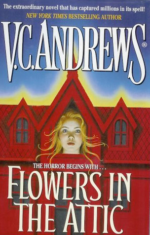
Flowers in the Attic & Petals on the Wind by V. C. Andrews
If There Be Thorns & Seeds of Yesterday by V. C. Andrews


Kissed by an Angel by Elizabeth Chandler

I think I like the single dead flower the most. Maybe it works with the title a little bit more for me. I also feel like I’ve seen this theme worked through a few other covers. In a world of a million black covers, I’m not sure how much it stands out.

Can you think of any others?

Filed Under: aesthetics, cover designs, Cover Doubles, Uncategorized

Mostly Good Girls by Leila Sales

October 6, 2010 |

If ever a book cover did disservice to a fantastic story, it would be this one. Leila Sales’s Mostly Good Girls is a story that really stands out in a crowd and would appeal to so many readers, but unfortunately, this cover kills me. It suggests the story is something else entirely, and while it will draw some readers in, it won’t draw the readers in who probably want this story most of all.

Violet and Katie are best friends, and they have been for a long time. The two of them attend an all-girls private school near Boston, and both of them are go-getting type of girls: Violet is working hard to improve her standardized test scores and put together the school’s literary journal, where she serves as editor, and Katie has earned a perfect score on her tests and works with Violet on the junior yearbook. We begin this story as the two of them list other girls in their class and “how far they’ve gone.” Both get a good giggle out of the girls who are more experienced, as neither of them is all that interested in any particular boys. But that will change. . .

Mostly Good Girls follows Violet and Katie’s changing friendship through their junior year of high school. When Katie earns her perfect test score, Violet becomes envious, and in her determination to outdo her best friend, she misses her best friend change. Katie, despite having everything, chooses to start dating Martin, a high school graduate who chose to work as a barista instead of attend college. In Violet’s eyes, Katie’s lowered her standards, but that’s because she can’s see the true problem brewing within Katie. This will be the tipping point in the story, and it will ultimately redefine their friendship and call to question what friendship even is.

Sales’s book is not written in a completely traditional narrative story but is instead told in vignettes. We know the story takes place over one school year, but the chapters are brief snippets in time and in place. This works exceedingly well in this book, as so much of what the story would do to fill in time and space holes would bore readers. Violet and Katie are normal characters. Neither has a particularly challenging aspect to their lives; they are utterly relatable but in the course of being so, they don’t have a huge obstacle to overcome physically or emotionally. Or at least, that’s kind of what we’re led to believe.

Not only is there a non-traditional method of story telling at work here, but the humor! This is a funny book. There was more than one time I laughed out loud while reading it, and there may or may not have been passages I read out loud for my husband because I found them spot on funny. Violet and Katie are a little snarky, and they conquer problems in a manner I would. When the literary journal had some extra space due to a profuse amount of garbage being submitted, the girls write a joint story that mocks their school. I may or may not have done that once in my life, too.

Besides being funny, the situations the girls find themselves in ring true on so many levels. When Katie pairs off with Martin, she invites Violet along. Violet, in the interest of being a good friend, follows along, despite being extremely uncomfortable in this environment. She wants to be a good friend. And when she sees what Martin and his roommates are like, she’s further unsettled. Who hasn’t found themselves in a similar situation?

There is a little romance in this book. We see Katie pair off with Martin, and while we don’t necessarily see the romance blossom as readers. But we do see and experience a number of great moments with Violet, as she develops a crush on Scott. He attends a nearby all-boys school. Unfortunately, a lot gets in the way of their relationship developing beyond friendship, and some of these interruptions are downright hilarious (in particular, Violet needs a ride home from a night out with a bunch of Scott’s classmates and Katie, and when Scott pipes in to offer the ride, we see her imagining this being what leads to their ultimate marriage. Unfortunately, another guy — a less appealing one — offers a ride over Scott’s, since he lives closer. A dream deferred, if you will). Did I mention I was laughing a lot while reading this because I could relate to more than one incident here?

Back to my cover comments: this cover does not work. It does not scream that this is a story about friendship or that it’s a funny book. Instead, it says this is a school drama, and it probably involves skanky girls (look at how short her skirt is). The cover will appeal to fans of Pretty Little Liars and similar titles, but this book will not necessarily make most readers of that series happy. This is a much lighter book, with little to no interpersonal drama. Instead, this is the kind of book fans of Sarah Dessen, Jenny Han, and Siobhan Vivian will love. Many teen girls will NEED this book, to show to them that friendship isn’t always constant and that things change and shift and that that is okay and normal. This is contemporary, realistic, and funny, and without a lot of good handselling, I’m afraid it might not get into the hands of those who need it most and those who would see themselves and their friendships played out here. But believe me when I say this is a title that most teen collections need; there are too few stories about friendship that play out so realistically.

* Review copy picked up at BEA.

Filed Under: aesthetics, cover designs, Reviews, Uncategorized, Young Adult

One cover through time

October 5, 2010 |

You’ve seen a few of my cover features where I’ll talk you on a path down different covers from an author’s career. This time, I wanted to take one cover of a book that’s been around for 31 years and show the different iterations.

Most readers know this book, but I don’t know how many have actually read it. I read this book when I was in 7th grade, which I probably wouldn’t recommend. Although the cover’s changed a lot and now is actually marketed at teens, I’m still not entirely sure on the teen appeal of it. You be the judge:

This is the first cover of the first edition from 1979. This is the exact cover my copy had, and the other three books in this series had similar stylings, too.


This is another early cover, and I think it captures a bit of the feeling of the movie’s poster.


This is the original movie poster. It’s been made a little more contemporary over time, too.

The DVD cover still gives off the creepiness, but to me, the oldest kids look way older than I ever imagined. The mother looks perfectly evil.


This is another movie cover, and I think this one might be my favorite. It really captures the mood of the book, though the oldest kids still look a little old to me.

This cover looks a bit like a combination of the first and second ones above. I’m a fan of the use of color in this one, as I think the color actually makes it a little bit creepier.

I hope someone can provide a little expertise for me. While looking up some covers, I stumbled across this one. Can we just say this one is totally not at all indicative of the story? This is too much like a romance and too little like a horror novel. And the color seems way inappropriate. I think this is a recent Canadian cover, but can anyone verify?

Speaking of foreign covers, here’s an older UK cover. This one leaves no mystery as to the book’s genre. Oh, to be a pale girl coming out of a flower.

And one in Spanish. Doesn’t this cover kind of remind you a bit of Independence Day?


What would we do if this book didn’t just have a girl on the cover? The wind and the coloring of the sky behind give this a nice spooky touch, even if the girl tells us nothing. Notice, too, she’s Virginia Andrews here and not V.C.?

I know nothing about this one, but it gets to the point, too. A shadowy face and the large haunted house.

This is today’s cover, and it’s sold in a two-volume collection. You can find this sold in the teen sections of your local bookstore, too. While it’s got teen appeal, the cover’s the same as a few others (check back soon for that feature) and I’m not sure how today’s teens will feel about the story. Is it still horror? I would love to know what they think. All I can tell is that hipsters are using a key movie promotion image for clothing, which bothers me just a bit.

I know I’m interested in picking it up again and reliving the story that haunted me for years.

Which cover appeals most or captures the book the most for you? Do you know of other covers (US or foreign)? Share them in the comments!

Filed Under: Adult, aesthetics, cover designs, Uncategorized

Covers change the story, part 2

September 22, 2010 |

I’m a fan of Simone Elkeles’s Perfect Chemistry and Leaving Paradise series. They’re edgy, raw, and at times, downright sexy. But those aren’t her only books. She’s also put out another series which I haven’t yet read. But judging by these covers, it looks like a sweeter series than her others (sweeter as in, it’s probably appropriate for a bit younger readership than her other two books). Check out the covers:


They’re simple, clean, and they stand out on a shelf pretty easily. Imagine my shock when I went to a bookstore this week and saw what I thought was a new book by Elkeles (and then was surprised in myself for not knowing there was a new one):


I picked it up and read it. It’s not a new book: it’s a compilation of the other three books in one volume.

Now is it me, or does that cover not only look like every other book on the market, but it changes the entire tone of the story. Rather than looking like a sweeter read, it looks like her other two series. . . and like a bodice-ripping romance.

I hate the makeover. What about you?

Filed Under: aesthetics, cover designs, Uncategorized

Double Take, Royal style

September 10, 2010 |

Putting one’s hand over one’s heart sets a tone, y’know? This is especially true when it happens twice!


The Education of Bet by Lauren Baratz-Logsted was published by Houghton Mifflin in July 2010.

Whisper My Name by Jane Eagland was published by Young Picador in August 2010.

It’s the same photo, just cropped differently and colored differently. I prefer the first because the color’s a little more vibrant and it stands out a little more (and it has a much less annoying font going on).

Which works better for you?

Filed Under: aesthetics, cover designs, Cover Doubles, Uncategorized

  • « Previous Page
  • 1
  • …
  • 17
  • 18
  • 19
  • 20
  • 21
  • …
  • 32
  • Next Page »
  • Facebook
  • Instagram
  • Pinterest
  • Twitter

Search

Archives

We dig the CYBILS

STACKED has participated in the annual CYBILS awards since 2009. Click the image to learn more.

© Copyright 2015 STACKED · All Rights Reserved · Site Designed by Designer Blogs