• STACKED
  • About Us
  • Categories
    • Audiobooks
    • Book Lists
      • Debut YA Novels
      • Get Genrefied
      • On The Radar
    • Cover Designs
      • Cover Doubles
      • Cover Redesigns
      • Cover Trends
    • Feminism
      • Feminism For The Real World Anthology
      • Size Acceptance
    • In The Library
      • Challenges & Censorship
      • Collection Development
      • Discussion and Resource Guides
      • Readers Advisory
    • Professional Development
      • Book Awards
      • Conferences
    • The Publishing World
      • Data & Stats
    • Reading Life and Habits
    • Romance
    • Young Adult
  • Reviews + Features
    • About The Girls Series
    • Author Interviews
    • Contemporary YA Series
      • Contemporary Week 2012
      • Contemporary Week 2013
      • Contemporary Week 2014
    • Guest Posts
    • Link Round-Ups
      • Book Riot
    • Readers Advisory Week
    • Reviews
      • Adult
      • Audiobooks
      • Graphic Novels
      • Non-Fiction
      • Picture Books
      • YA Fiction
    • So You Want to Read YA Series
  • Review Policy

STACKED

books

  • STACKED
  • About Us
  • Categories
    • Audiobooks
    • Book Lists
      • Debut YA Novels
      • Get Genrefied
      • On The Radar
    • Cover Designs
      • Cover Doubles
      • Cover Redesigns
      • Cover Trends
    • Feminism
      • Feminism For The Real World Anthology
      • Size Acceptance
    • In The Library
      • Challenges & Censorship
      • Collection Development
      • Discussion and Resource Guides
      • Readers Advisory
    • Professional Development
      • Book Awards
      • Conferences
    • The Publishing World
      • Data & Stats
    • Reading Life and Habits
    • Romance
    • Young Adult
  • Reviews + Features
    • About The Girls Series
    • Author Interviews
    • Contemporary YA Series
      • Contemporary Week 2012
      • Contemporary Week 2013
      • Contemporary Week 2014
    • Guest Posts
    • Link Round-Ups
      • Book Riot
    • Readers Advisory Week
    • Reviews
      • Adult
      • Audiobooks
      • Graphic Novels
      • Non-Fiction
      • Picture Books
      • YA Fiction
    • So You Want to Read YA Series
  • Review Policy

Covers Change the Story

September 28, 2011 |

I’ve caught a lot of changes in book covers when they go from hardcover to paperback, as well as a number of general repackaging looks. As usual, some of these are excellent and some are not. Covers sell a book, as it’s often what draws a reader in who may otherwise not be familiar with the story, so when the cover changes, it’s always interesting to see what elements are being played up. Here’s a look at a few of the recent changes I’ve found that are worth stopping to think about, both in terms of design and in terms of marketing.

Let’s start with a change I think is really beneficial:


The Half Life of Planets by Emily Franklin and Brendan Halpin: The original cover gives a way vintage feel to the story. It dates it, and I don’t think it does so in a good way. I read this book quite a while ago, but I don’t remember it being a historical fiction, which is what the cover here seems to suggest. The LP and the style of dress of the two characters don’t feel contemporary, and I think that does a bit of a disservice, unfortunately. The font for the title and the author name also don’t work and only serve to further the vintage feel. Frankly, I don’t know many teens who would get this cover, especially the album aspect of it.


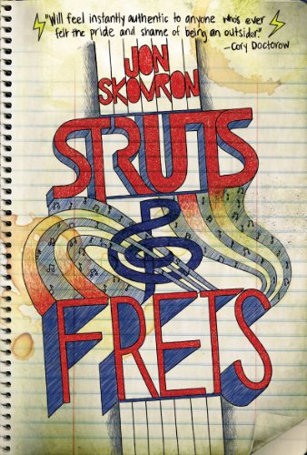
This paperback makeover is fantastic. I love the fact it doesn’t have an aged feel to it, but instead, it’s incredibly contemporary. The font is fun and has a definite teen vibe to it. The perspective of the guitar against the black and starry background is a bit reminiscent of Star Wars and that’s a good thing. More than that though, the red guitar really pops on the cover; despite there being a number of covers that feature guitars, this one jumps from the shelves. I think the cover fits the story much more, and I think that it has much more appeal to the intended audience than the original. No faded vintage feel here!

Lisa McMann’s Cryer’s Cross has such a great cover. Although it might be considered a bit of a spoiler, it’s such a knock out — the desk in the darkened room gives the horror feel that the pages inside work with, rather than against. The desk features graffiti, but beyond that, it’s worn and old and the vibe that emerges is perfectly suited to the story. I love that the title isn’t separate from the image, but instead, it is part of the image itself. It’s creative and it fits, too, with Lisa’s Wake series in the font and placement of her name. Check out the tag line, too: “The smaller the town, the bigger the secrets.” It’s perfect for the book.

But oh, I do not like the paperback make over:


Let’s start with the tag line change: “Some secrets have the power to bury you.” The story is set in a small town, and that plays a huge part in the creepy factor of the book; the change in tag line makes the story sound so generic and like every other book out there. Swap this one with any of the paranormal romances out there. It’s unfortunate because this book is not a paranormal romance in the least. It’s a horror story. Now, for the trope I am so sick of in covers: the girl on the ground being saved by a boy. Guess what doesn’t play a big role in the story? Romance. Yet, this cover plays into the idea of romance, and the tag line only enhances it. Frankly, this cover is a disservice to readers, as it makes the book like every other book on the market when in fact, it’s quite different. The trees in the background make this look paranormal, right? Take those out and put in a pink or purple background and the cover could then become one for a Lurlene McDaniels book. And don’t get me started on the fact the girl looks stiff and the male looks much too old to be a teenager. The whole set up devalues the role of the female in the book, too, which is probably part of why it bothers me so much — the main thrust of the book hinges upon one girl who uncovers an ages-old mystery in the story, yet this cover makes it look like the girl is being saved from some secret that will “bury her.” Enter suave looking male to save her.

Let me step back and talk about the problem here on a greater level. The trend I’ve been seeing more and more in young adult books and in young adult book trailers is the one to play up the romance in a book, and this is especially true in books that aren’t contemporary romances. That is to say, books that feature a paranormal, horror, fantasy, or science fiction story line seem to be falling victim to this a lot more than what you’d expect. This cover/trailer treatment, in my mind, devalues females as lead characters. It sends the message that girls can’t be strong in worlds outside our own and ones that make sense to us. Whether the story says that or not — and often, as is the case in the McMann book, the story says precisely the opposite of what the cover says — it’s playing into a trend that’s not healthy. It’s not okay to suggest that a male is always a saving force and that the female needs to be saved or loved to be strong. Moreover, it’s always a female in a submissive position. Notice above that the male is on the top and the girl is on the bottom. Notice, too, that the male has his arm above the girl’s head — he is dominating her not only physically, but intellectually, too. She doesn’t have a finger on him, and her body language suggests that she’s open to be taken and saved. This makes me so uncomfortable, especially knowing what I do about this particular book. Moreover, can we please have stronger females on the cover of non-contemporary books? Less girl lying in submissive positions and more girls being strong and powerful, please. Girls in worlds other than our own can be just as strong as those here. And get this — the more we show that on covers, the more female readers we can entice to genres like science fiction and fantasy, where often, there is a stigma about reading those sorts of books.

This cover does nothing at all for the book, and it’s especially disheartening given the fantastic hardcover version of this novel and how well it fits the story. This one feels a bit like a meme.


It’s so rare that a young adult novel gets an illustrated cover treatment, but Laini Taylor’s Lips Touch Three Times got it, and it works so well. This is one of my favorite covers, despite having a lot of elements I don’t like to it. It’s the illustration that makes it work, and the colors play perfectly into the content, as well. The novel features Jim Di Bartolo’s illustrations, and they use the same color schemes. What works, I think, is the contrasting use of colors — the red flames against the light blue font and eerily icy eyes. The red lips pop against the pale skin of the girl, and I love how the curls in the hair flow with the curl of the flames. There’s a lot of flow and a nice echo effect throughout.

As much as I like the cover, I don’t necessarily know if it’s got the right appeal to it. It’s less that it’s not appealing, but more that it is an illustrated cover and that makes it read like it’s geared toward a younger readership (despite the flames).


And I’m sure it’ll be pretty clear how I stand on the change for this cover. It feels like an adult romance — the kind that come in a smaller package that you can pick up at the grocery store. By that I don’t mean trashy; I mean it’s something I’ve seen so many times that it’s not distinguishable from anything else on the market. It does also feel very adult, versus the original cover. Maybe it’s the way the colors really contrast and the way the red lip is shiny in less of a symbolic manner but in more of a come hither manner. This cover doesn’t give a fantasy vibe, but instead, it gives a romance vibe, and I think that’s a disservice to the incredible fantasy worlds inside the story (that yes, do involve kisses, but not in the romance sense). Moreover, I think it’s sad that Jim Di Bartolo’s illustration isn’t the cover image anymore; instead, we get a headless model, which is my favorite kind. I’m not sure this cover hit the mark with audience appeal either. It’s misleading.


Ship Breaker by Paolo Bacigalupi is a cover that doesn’t speak to me one way or the other. It kind of blends into everything else, and I don’t necessarily mean that in a bad way or a good way. There’s not a striking image on the cover that’s memorable, aside from the cover font, which takes up the bulk of the cover. I like the font and placement, and I think that it sort of speaks to the story inside. However, the rusty-colored background doesn’t add much; it doesn’t tell a story itself. I understand it to be the side of a ship, given the title, but otherwise, it sort of exists and doesn’t do much more. Again, it’s not bad or good. It just is. It’s a bit of a sleeper in terms of covers.


The paperback makeover, though? Fantastic. Although it has the creepy half face in the background, I quite love how evocative this recovered book looks. We finally get an image to the story, and though the cover font changed, I like this one as much as I like the original. This cover reminds me greatly of the Kenneth Oppel Airborn series covers, and I think that is a huge benefit to this particular novel. Although I admit to not having read either the Oppel series nor this book, I do think there is readership crossover, so this sort of cover pairing makes perfect sense, whether it was intentional or not. This cover has a rusty look to it, but it’s used in a much more effective manner than it is in the hardback cover; this time it’s used to develop a sense of place and time, rather than simply as the backdrop. Rather than being a pass over cover now, this one really pops and I think it has mega boy appeal. It’s nice to have something that doesn’t look embarrassing to read, too.

I’m a huge believer in the idea that covers can be an easy means of reader’s advisory (that for non-librarians is the term for helping people find a book to read based on what else they’ve read and enjoyed). Whenever a cover can play into that, it makes for happier readers, I think. Teens and adults do often pick up their books on the covers, and the more reminiscent a new read is to one that has been enjoyed before, the more trust a reader builds into new reading experiences, whether that’s fair or not.

What do you think? Do any of these covers better serve the reader than others? And please: I want your feedback on the romance on the cover issue. It’s one that strikes me as something people aren’t talking about, yet it’s something that is incredibly important to think about and talk about.

Filed Under: aesthetics, cover designs, Uncategorized

Double Take: Unmasked

September 7, 2011 |

This one was so obvious when I opened last week’s Publisher’s Weekly that I’m honestly surprised it made the final cut.


Michael Stein’s The Rape of the Muse will be published by Permanent Press on October 1, 2011. It’s an adult fiction title. You can read more about the book here.

It should surprise no one who reads or knows anything about YA lit that that cover is a double to this one:


Guardian of the Dead by Karen Healey was published last year.

I find it interesting that the placement of the mask wasn’t even changed, nor was the background black color changed. The eye colors were swapped out, but beyond that, it’s the same stock image. I don’t find the font appealing on the Stein book, and I think it’s a little jarring to mix up how the italics are used. That said, I like the fact it is all black and white. There’s definitely an eeriness to it.

For me, though, the Healey cover will always be a winner. I’m still sad it got changed.

Filed Under: aesthetics, cover designs, Cover Doubles, Uncategorized

Cover Doubles: He Loves Me, He Loves Me Not?

August 26, 2011 |

These aren’t exact replicas of one another, but they’re so close, they could be. I like the images on both covers, as I think they stand out from the typical girl-on-the-cover look.


I’m Not Her by Janet Gurtler published May 1 by Sourcebooks. I love the title placement and font on this one. The only thing I can say about this, really, is that it looks younger than the intended audience, I think. This is a teen book, but it reads more middle grade to me, as the girl modeling has a much younger look to her — even though you can’t see her, you can tell she’s less mature than a teen girl.


Second Hand Heart by Catherine Ryan Hyde published by BlackSwan (a London publisher) in 2010. I love the yellow title font against the green grass, and for some reason, I love how the flower petals look on this cover, as opposed to the Gurtler cover. For some reason, this girl reads older to me than the other cover model does, as well. Perhaps it’s the perspective, as we don’t see a shirt, which is one of the elements that made the first cover look younger.

Does one stand out to you more? I think they’re both pretty good.

Filed Under: aesthetics, cover designs, Cover Doubles, Uncategorized

Cover Changes Round 3, or When Things Aren’t Getting Better

August 4, 2011 |

It’s been a while since we’ve talked covers here, and I thought it would be fun to look at some recent cover changes. Some of these are good, some are bad, and some are straight up strange. Without further ado.


I’m quite fond of the cover for Jennifer Donnelly’s Revolution. I like that it’s current and historical, which really speaks to the story itself. The half-and-half color and black and white set up is eye catching, and this stands out on the shelf. As much as I don’t usually like people on the cover, this one just works.

But then, it was changed.


I really dislike this change. The girl looks like she’s mid-sneeze, and why she’s pressing the key against a weird part of her face (not kissing it or rubbing it in some sort of sentimental way) is beyond me. Her fingers are also oddly similarly sized for being different fingers. I think this doesn’t tell anything about the story, and the cover is generic enough to match every other book cover with a girl’s face on it. And if we’re going to talk about the historical aspect being not represented here, we can, but I think that the heavy eye make up does that enough itself. Also, I don’t think this looks like a teenager at all. I’m also not a fan of the muted color scheme, as it isn’t eye catching at all.

The next two cover changes really irk me. As you know, I really dislike how YA books have shied away from featuring plus size girls on the cover, and both of these books have suffered from this syndrome in their hard cover versions.


Fat Cat by Robin Brande’s original cover isn’t bad, actually. I like the color combo, and I think that it stands out on the shelf because it’s not a girl, and because it’s purple and yellow. Even though it doesn’t feature a plus size girl (which the book does), I think this is an acceptable cover. It doesn’t have food on it, and it doesn’t have a skinny girl lying around pretending to be the main character.

Unfortunately, that changed in the paperback version.

Please, can we get anymore stereotypical? A bag of potato chips? The title spelled out in the chips (and an eaten apple — because let’s make sure there’s something healthy there, too). I hate this cover. It’s a total disservice to the content inside, and it does nothing but perpetuate the idea that I so greatly hate. This cover has a tag line on it which reads “How far would you go to change your life, win the science fair, and get back at the guy who broke your heart?” Not bad, but again, the image does nothing for that. Why did this cover need to change? The first one was pretty stand out, and now, it just falls into the trend that doesn’t need to continue being perpetuated. Honestly, there needs to be more said about this issue because raising a stink about white washing covers has caused things to change — why isn’t the same being done for fat washing? It’s not okay.

I’ve talked about Cherie Bennett’s cover for Life in the Fat Lane before. This is actually the reprint cover, as the original cover from this 1999 books looked like this. I hate this cover so much. It’s disgusting and triggering, and it’s completely unrealistic. Because anyone believes someone who pinches that little on her stomach is fat.

Unfortunately, the new paperback does no favors, either.


Did you guys know this book is about a 200 pound girl? Would you get that from this cover? That girl is, at most, 150 pounds (if she’s 8 feet tall, perhaps). This cover makes me irate in so many ways, and it’s again another wretched example of putting a skinny girl on a cover. Can I tell you something? If you’re a fat girl looking for a story about a fat girl and this is what the cover looks like, I don’t think you’re going to relate to the story at all. Why the hell would you want to pick it up? If you’re a 200 pound teen girl, you don’t look like that. You’re turning off your audience in one image. Let’s also talk briefly about the tag line: “It could happen to you.” Fat — and let me say this with emphasis — is not a disease you catch. Fat people can do stuff that not fat people can do. I know, right? So this book then aims to make readers feel bad about their bodies and that they don’t look like the 200 pound girl on the cover. Absolutely disgusting.

If you’re trying to reach a certain readership, and you present them with this image and that tag line, you are failing so hard. This is a complete wreck, and it’s really unfortunate, but the fact of the matter is, I won’t buy a book with a cover that so greatly distorts things and that aims to make readers feel BAD about who they are. Because you know what, that’s what this does. What a shame.

I have to admit to not reading this book because I am so turned off, but I should also say this: it doesn’t sound like a body positive book from the description. The girl begins skinny (perhaps that explains this cover?) but then packs on the pounds and gets to be a “blimp,” as the description on GoodReads says. Maybe the cover isn’t so far off. But then that begs the question of why this book is still in print and being pushed, since it’s clearly not meant to make anyone feel good, especially when the last line in the description considers fat girls a world in which to be “left alone.”


There seem to be two camps of readers: those who love Melinda Marchetta and those who can’t get into her. I fall squarely into the “can’t” side of the equation, and I’ve given her three goes before. Alas, I adore this cover for Finnikin of the Rock. It perfectly captures the fantasy of the story, and the colors and placement of the sword make this a stand out on the shelf. I love book covers that capture the elements of the story, and this is one of them. What else I like about this cover is that it sort of looks like there is a face in the background — you have to focus a little bit, but the red dot on the sword handle, combined with the way the tree branches bend at the top and the curve of red and black at the bottom sort of make a face shape.

And here’s the small makeover the paperback cover got:


This time, there really is a face! I think this makes the cover a little creepier, which still works quite well. What I find interesting is that they moved the placement of the title and the author on the paperback — the author went to the top of the cover and the title to the bottom (along with a blurb). The sword changed a bit too, now lacking the red that laced up the blade. The coloring is a tad bit different too; this one’s more muted than the hard cover, perhaps because of the addition of the face element. For me, both covers work quite well, and I think both speak to the content and they appeal greatly to the readership.


The cover for Karen Healey’s Guardian of the Dead has always been one of my favorites. It captures the story so well, and the image is hard to miss on the shelf. While it’s a dark cover, the white mask really speaks to the Maori legends at play in the story, and that, combined with the trees in the background and red title font, really do make it eye catching. There are a lot of pleasing visual elements here. Also, it’s just the right amount of creepy, too, to draw both fans of creepy stories and those who might not be sure if they do or not.


I do not like the paperback redesign, though. It steals away all of the awesome elements of the hard cover, and it instead gives us this washed out red person. The title font even loses its spark in the redesign, fading instead of standing out. While I understand the importance of having the Morris sticker on the front, for me, that’s the only thing that stands out on the cover. This is one that fades into the shelf space, and it tells nothing about the story at all. Why did they take away the mask? The trees? The awesome title font? The paperback cover is forgettable.


I’ve always had a love for Jon Skovron’s cover for Struts & Frets. I love the way that it’s set up like a sketch book, and the font for the title is so perfect. Even with a person on the cover, it’s still a knock out, as the person really gets to the story, I think. The color of the cover is striking, too: how many covers feature a neon green against red? This is a knock out.

And let’s look at the redesign — I don’t get why it was redone, but I like this one, too:


The same cool sketch set up, but this time instead of being stars from the center out, it’s just the notepad with a bit of a green hue to it. I love the treble in the middle, along with the streams of what I assume are meant to be sound. I dig the way the neck of the guitar plays into the title itself, which serves as the tuning peg. It’s very smartly designed and extremely appealing. I also dig the title font and coloring, as they mirror the original. I feel like this didn’t need the redesign, since the hard cover was pretty darn good, but this book lucked out because both covers are excellent.

The last cover redesign I want to talk about is one that came to my attention via Melissa Walker’s Cover Story post.


I completely adore this cover. I love the semi-faded title font and author font, and I love how the flag is the backdrop. All we get for people are the silhouettes. It’s pitch perfect in capturing the story, and it’s a cover that pops on the shelf. Stripes! They don’t get used enough in cover designs, and I think it’s effective here from that stand point and because of simply what it represents in the context of the story.

As Melissa’s post talked about, all of Reinhardt’s paperback books are getting a redesign to become more cohesive and easily identifiable. I like the idea of having authors have their books look like they belong together (from the publisher’s/author’s perspective, it’s branding) but for me, it’s about reader’s advisory and about shelving. I love when I can look at a book’s cover and know who I could recommend it for because it is reminiscent of other authors who are similar.


That said, I think this redesign takes away some of the elements that make the hard cover such a wow cover. This is pretty generic. Though, I think the fact it’s brighter than the hard cover does give into the hint that while this story is a bit of a tear jerker, it is ultimately a hopeful journey. And, too, it plays into the idea of the journey with the road and brothers walking together (though the taller guy from the back looks more like a dad than a 19 or 20 year old boy, doesn’t it?).

What do you think? Are any of the recovers better than others? Worse?

Filed Under: aesthetics, cover designs, Uncategorized

Double Take: Shadows in the Water

June 24, 2011 |

Check out this double take, wet pavement style.


The Lucky Kind by Alyssa B. Sheinmel: I’ve reviewed this title before. I really like this cover, despite the fact I don’t think it represents the story at all, except for maybe reflecting the quiet nature of the story inside. I like the coloring, and I like the font quite a bit. The Lucky Kind was published in May by Knopf/Random House.

Then I saw this one:


Dry as Rain by Gina Holmes will be published by Tyndale House in September. When I first saw the cover, I thought it looked familiar, but it was different enough not to be a double take. But upon closer look, it is actually the same stock photo, just stretched and cut through the middle by the title and author bar; it was so blown up that the street lamp from the cover above doesn’t make it into this cover. You can tell it’s the same photo by the way the couple holds their hands, by the umbrella in both images, and by the outfit the guy is wearing in both photos.

I haven’t read Holmes’s book, but it seems like the image fits with this book a little bit more. Perhaps because these do look like adults and it does give an idea of a book for more mature readers than the Sheinmel book.

I don’t think one cover does it better than the other, though I think they so give quite different feelings to each cover with the placement of text and sizing of image. The first gives more insight into environment and offers the idea that place is an important element in the story, whereas the second, focused in more on the couple, offers the idea that the relationship is more important than the environment.

What do you think? Does one do it better?

Filed Under: aesthetics, cover designs, Cover Doubles, Uncategorized

  • « Previous Page
  • 1
  • …
  • 13
  • 14
  • 15
  • 16
  • 17
  • …
  • 32
  • Next Page »
  • Facebook
  • Instagram
  • Pinterest
  • Twitter

Search

Archives

We dig the CYBILS

STACKED has participated in the annual CYBILS awards since 2009. Click the image to learn more.

© Copyright 2015 STACKED · All Rights Reserved · Site Designed by Designer Blogs