• STACKED
  • About Us
  • Categories
    • Audiobooks
    • Book Lists
      • Debut YA Novels
      • Get Genrefied
      • On The Radar
    • Cover Designs
      • Cover Doubles
      • Cover Redesigns
      • Cover Trends
    • Feminism
      • Feminism For The Real World Anthology
      • Size Acceptance
    • In The Library
      • Challenges & Censorship
      • Collection Development
      • Discussion and Resource Guides
      • Readers Advisory
    • Professional Development
      • Book Awards
      • Conferences
    • The Publishing World
      • Data & Stats
    • Reading Life and Habits
    • Romance
    • Young Adult
  • Reviews + Features
    • About The Girls Series
    • Author Interviews
    • Contemporary YA Series
      • Contemporary Week 2012
      • Contemporary Week 2013
      • Contemporary Week 2014
    • Guest Posts
    • Link Round-Ups
      • Book Riot
    • Readers Advisory Week
    • Reviews
      • Adult
      • Audiobooks
      • Graphic Novels
      • Non-Fiction
      • Picture Books
      • YA Fiction
    • So You Want to Read YA Series
  • Review Policy

STACKED

books

  • STACKED
  • About Us
  • Categories
    • Audiobooks
    • Book Lists
      • Debut YA Novels
      • Get Genrefied
      • On The Radar
    • Cover Designs
      • Cover Doubles
      • Cover Redesigns
      • Cover Trends
    • Feminism
      • Feminism For The Real World Anthology
      • Size Acceptance
    • In The Library
      • Challenges & Censorship
      • Collection Development
      • Discussion and Resource Guides
      • Readers Advisory
    • Professional Development
      • Book Awards
      • Conferences
    • The Publishing World
      • Data & Stats
    • Reading Life and Habits
    • Romance
    • Young Adult
  • Reviews + Features
    • About The Girls Series
    • Author Interviews
    • Contemporary YA Series
      • Contemporary Week 2012
      • Contemporary Week 2013
      • Contemporary Week 2014
    • Guest Posts
    • Link Round-Ups
      • Book Riot
    • Readers Advisory Week
    • Reviews
      • Adult
      • Audiobooks
      • Graphic Novels
      • Non-Fiction
      • Picture Books
      • YA Fiction
    • So You Want to Read YA Series
  • Review Policy

A Literary Mixtape

January 18, 2012 |

I’ve seen a cover trend over the last few years I really like. These books would look really neat together on a display, especially with appropriate props, when they’re all available. They’re a mix of adult and young adult, but they have one thing in common: cassette tapes. They’re visually appealing, and the way the tapes themselves have been incorporated into the cover varies enough they don’t at all look like double takes. I also appreciate none of these books are historical novels. At least for me, there’s not really a feeling of nostalgia in the covers, either.

When I was compiling these, I thought there might be a couple more out there. If you can think of what those might be, drop a comment and I’ll add them. All descriptions come from WorldCat.


Supergirl Mixtapes by Meagan Brothers (April 24, 2012): Sixteen-year-old Maria leaves her father and grandmother in Red Hill, South Carolina, to live with her mother, an artist who lives with her young boyfriend in a tiny apartment in Manhattan’s Lower East Side.


Greyhound by Steffan Piper: When Sebastien Rane’s mother can’t be bothered to take care of him, she sends him to his grandmother’s across the country on a Greyhound bus. I’ve read and reviewed this one.


Love is a Mix Tape by Rob Sheffield: A memoir, in which, Rob Sheffield, a veteran rock and pop culture critic and staff writer for “Rolling Stone” magazine, tells the story of his musical coming of age, and how rock music, the first love of his life, led him to his second, a girl named Renee.


Talking to Girls about Duran Duran by Rob Sheffield: Sheffield gets two books on this list. When he turned 13 in 1980, Sheffield had a lot to learn about women, love, music and himself, and here he offers a glimpse into his transformation from pasty, geeky “hermit boy” into a young man with his first girlfriend, his first apartment, and a sense of the world. It’s all here: Inept flirtations. Dumb crushes. Deplorable fashion choices. Members Only jackets. Girls, every last one of whom seems to be madly in love with the bassist of Duran Duran. Sheffield’s coming-of-age story has a playlist that any child of the eighties or anyone who just loves music will sing along with. These songs–and Sheffield’s writing–will remind readers of that first kiss, that first car, and the moments that shaped their lives.

Maybe that one is a bit more nostalgic than the others in terms of content, but I don’t get it from the cover.


Way to Go by Tom Ryan (Spring 2012, Orca books): I couldn’t find this one up at WorldCat yet, so I’ll just go ahead and direct you to Tom’s website for the lengthier description. I think of all the cassette tape covers, this one is my favorite. I love the lime green and how vibrant a feel it has. This one stands out on a shelf without a problem. (After I posted this, Tom got in touch with me to say the cover changed a little bit — you can check out the amended cover here. Same cassette tape, different title font).

Even though these aren’t all YA or all adult covers, these are books that’ll work with either audience, particularly because of the music tie-ins. It’s interesting, too, they’re all illustrations, rather than stock images (though arguably the Brothers title isn’t, but the writing on it sure is).

Can you think of any others to add with a cassette tape on the cover?

Filed Under: aesthetics, cover designs, Uncategorized

Double Take: Long flowing hair and a strong eye

November 23, 2011 |

I had every intention of putting together another trends in 2012 post, but while browsing through covers, I came across a double take. This one made me look more than twice. I’m about as certain as I can be they’re the same image, just with different treatments.


Coming out in March next year from Orion Books (a UK publisher) is the second book in Mia James’s paranormal romance series, Darkness Falls. Stop and study this one a second. At first glance, the model’s eyes look closed to me. But a closer inspection reveals they’re open. They’re just the same color as her skin, making them eerie. We know something is up with this girl. The cover on the whole is dark and fitting for the paranormal genre. It’s not entirely unexpected or noteworthy.


Suzanne Young’s A Want So Wicked will come out from Balzer + Bray (Harper Collins) in June of next year. I’m not a big girl-on-the-cover fan, but I love the bluish purple treatment on this one a lot. It’s stand out to me, even if the girl herself isn’t necessarily memorable. But look at her closely. It’s the same girl as the cover above, but the treatment is vastly different. Rather than have the haunting eyes, this pair of eyes looks strong and powerful in a different way. I think she looks slightly wicked in a different way, and I get that from not only the gaze itself, but how pronounced her eyebrows are.

Both covers feature the same face, the same make up, and the same hair, but it’s incredible to me how different these are, simply by the use of color and light on the model and on the background. There’s a softness to Young’s cover treatment that doesn’t undermine the power in the girl, as much as the darkness intensifies the power in the James cover.

That said, I prefer Young’s cover because of the lightness it has to it. The color stands out on shelves, and the slight glitter sheen to it only helps. The James cover, for me, is almost cliche within the genre; for many readers, though, that’s its selling point.

Filed Under: aesthetics, cover designs, Cover Doubles, Uncategorized

An Attention to Shoes

November 8, 2011 |

I pointed out the trend of girls underwater as one that’ll continue in 2012, but here’s another one that I can’t help noticing again and again: images of shoes. Most of them involve feet or legs and a good ole pair of Chucks. Kind of funny, I think, since I don’t know many teens who wear them — Toms seem to be the shoe of choice today.

Alas. These covers are cute, but after a while, they blend in to one another and they blend into a number of other covers that featured similar stylings or angles. I know there are a few other shoe-related covers (like Cinder and In Honor), but I’m focusing on the ones that hone in on the shoes and feet and have little else going on.


Technically, Sarah Tregay’s Love & Leftovers comes out from HarperCollins at the tail end of this year (December 27), but I’m including it. This romance is written in verse, and the cover reminds me of Susan Juby’s Getting the Girl, also published by Harper. I think it has to do with the fact the girl’s on her tip toes and the shoes are red. That’s not to say I don’t think this cover is cute or appropriate because it is — but it’s far from original or stand out.


I haven’t read Melissa Jensen’s first book, Falling in Love with English Boys, but I knew the second I saw the cover of this book that this was her second book featuring a girl kicking her leg in the air. Weird, right? I like this cover and think it fits the story description. The painting used in place of the faces is effective and cute. It does make the cover stand out a little (and note that the female in the painting appears to be on the side with the male shoes and vice versa). The Fine Art of Truth or Dare will be published by Speak/Penguin in February.


Madeline George’s The Difference Between You and Me offers us no Chucks, at least. This one’s a pair of boots and a pair of very pink, very girly shoes. Perfect for the vibe of two verrrry different girls involved in the story. The cover feels really adult romance to me, and I think that’s a compliment to the cover. I love how the title is centered in a separate oval which looks a bit like a Victorian-inspired mirror might. This feels classic, yet the shoes give it a modern vibe. The only thing that could make this better is getting rid of the pink banner at the top with the author’s name and blurb. I think going with a white font could have been more effective and given the image a fuller effect. George’s book will be published in March by Viking.


The Boy on Cinnamon Street by Phoebe Stone will be published in February by Arthur Levine/Scholastic books. I’m sensing a theme in the contemporary romance covers here. This one is sweet. I love how it’s on blacktop, and I really dig the chalk heart around the title. The font isn’t overwhelming nor is it super bold; it fits into the image itself, which tells a whole story. Let me admit something here: I am not a shoe person. At all. Yet, I am drawn to the shoes the girl at the top of the picture is wearing. What this cover does right that the George cover doesn’t is the author and mini-bio at the top. It’s not in a loud banner color, and it fits the cover itself. The image works as a whole, rather than being put together in separate pieces that don’t quite flow. For me, this is a sweet cover, and I appreciate it for that.


One for the Murphys by Lynda Mullaly Hunt will be published in May by Penguin. So the first thing I thought of when I saw this cover was The Romeo and Juliet Code by Phoebe Stone (sound familiar? Maybe she’s getting all the shoe cover treatments, too. Check out the cover of another one of her books.). The set up is similar in that the front of the photo is from the knees back to the feet, and the girl in the picture is lying away from the camera in a bed of really green grass. Like the Stone cover, the girl’s crossing her Chuck-wearing feet, too. What I find weird about this cover is the giraffe. It looks really Photoshopped into the image and is jarring against the grass, the girl, and the basketball. I get it probably fits in the story with the idea of growing up. I do like the title treatment, and I think the fact it’s circled and DOES stand out against the image as a whole works here.


Veera Hiranandani’s The Whole Story of Half a Girl takes the trend a little differently. The shoes are a focal point, for sure, but I think the frayed knees in the jeans helps make the image a little more stand-out. However, I know I’ve seen this cover before. I can’t pinpoint it, though. This is a sweet cover and I think that, despite being a headless girl, the publisher’s done a good job of representing a half-Indian girl through her skin tone. It’s a bummer it’s not center stage, but it’s not white washed, either. I love the title treatment on this cover, and I think the popped out circle with the swirly white font works. I’m a big fan of a cover where the image is whole and uninterrupted, and I feel this accomplishes that. I like, too, the fact that there’s writing on the toes of the shoes, too. Age appropriate, for sure. Hiranandani’s novel will be published in January by Delacorte.

Moving away from legs with our shoes and onto shoes alone. First is Hannah Moskowitz’s Gone, Gone, Gone, to be published by Simon Pulse in April. This might be one of my favorite covers in a while. It’s evocative and haunting and it achieves this without including a person or a single expression. A pair of empty shoes in a gray room. Perfect. More than that, though, the designer did a great job of making the title stand out just enough and making the rest of the cover text fade into the background. The shoes are telling the entire story. It’s a quiet cover, but it’s a darn effective one. Even in an abundance of shoe covers, this one rises above the pack.

Last up is Aaron Karo’s Lexipros and Cons, to be published by FSG/Macmillan in April, is the loudest cover among the pack for sure. Aside from the almost dizzying orange background, the bright green shoe in the center screams for attention. It’s particularly interesting to look at this cover in conversation with the Moskowitz: they both feature shoes and no people, but they tell such different stories, both because of how the shoe looks and the background. I’m not sure if I’m a fan of this cover, given that the story itself sounds like it’s not the lightest reading (it deals with OCD and the challenges therein); this screams funny book to me. However, there is something to say about being so loud — this cover sure stands out, even if it follows into the hot orange cover trend. I think the use of images in the title itself takes this a little over-the-top, and I wish it had been a straight font treatment.

The main character in this book, by the way, is named Chuck Taylor.

So of all the covers above, I think Gone, Gone, Gone is my favorite — it gives me the right kind of chills as a reader and the solitary image is powerful. I find it fascinating, though, how a couple of these authors seem to be repeat shoe cover receivers. Branding, perhaps?

What do you think? Favorites? Can you think of others that fall into this theme coming out in 2012?

Filed Under: aesthetics, cover designs, Uncategorized

Covered in 2012: There’s always room to drown

October 28, 2011 |

I’ve been keeping tabs on the cover images popping up for 2012 releases, and you can keep checking back for some of the trends I’ve spotted over the next couple of weeks. I like to watch these things because for me, covers are what makes a title stand out. Not that I require a cover to meet the story, necessarily, but it’s a visual reminder of a description or a title or an author for me. A distinct cover is a great recall tool; having too many covers that feature the same themes makes a book a little more forgettable, not only in the mind but also on the shelves. It can’t hold its own.

Remember last year the surge of books featuring girls floating under water? It appears this trend will float us through 2012, too.


Anne Greenwood Brown’s Lies Beneath is a mermaid story, slated for release by Delacorte in June 2012. Mermaids are so not my thing but this one is set in Lake Superior, and I’m kind of fascinated by that.


Sarah Wylie’s All These Lives is a story of twins and cancer, and it is also slated for release in June of next year by Farrer, Straus, and Giroux.


So glad this underwater gal can also show off the wind swept hair effect so well. The Unquiet, by Jeannine Garsee, sounds a little bit like a few of the mind-bending books that have come out this year about mental illness. This one will be published next year by Bloomsbury.


Paige Harbison’s The New Girl is a mystery set in a prestigious academy, slated to be released by Harlequin in January 2012. I wonder if it involves drowning.

Of the covers above, the one that sticks out to me is Garsee’s. It’s not different than most of the others, but it has a crispness to it that strikes me a little more than the others. The book itself sounds like it’s up my alley too, with its psychological bent in the premise.

Can you think of any other 2012 releases featuring the girl under water? Do any of these covers speak to you more than any of the others?

Filed Under: aesthetics, cover designs, Uncategorized

Classic Horror: One Cover’s Evolution Through Time

October 10, 2011 |

Since we’re posting about horror on Mondays here this month, I thought it would be fitting to talk a bit about covers — that can set the whole mood for the novel. But rather than give a showing of many covers, I thought I’d instead take a walk through the evolution and changes of one classic horror novel: Bram Stoker’s Dracula. This novel has been in print since it first published in 1897, which is really impressive and suggests just how important this particular book is to our literary history.

It’s fascinating to see how it’s been interpreted over the years and how it’s been repackaged to appeal to different readers and to call attention to different aspects of the story itself. The book had both American and British publication, so the covers vary a bit therein as well. For more details about the history of Dracula’s publication (and where I picked up my source information), check out this site. It’s much more in depth and offers an interesting look at the parallel lives of the book in Britain vs the US. Since it would be a book-length post to talk about all of the cover versions through the years, I’m offering just a sample of some of the most interesting ones. First, though, a couple original covers to see where everything started:


This is the original cover for the novel. The cover is pretty typical of covers in that era, yellow cloth over board (yes, you now know I did take an entire course on the history of the book and that I do, in fact, remember a lot of it). It’s a very simple cover but I think the font for the title does hint at exactly what lies inside: it’s a little bit Gothic, with the R reaching further below the lines of the other letters following it. It’s also red, which stands out a little differently than a black or white would at the time. This is the original British cover, for those interested in the British vs. American publication histories.


This cloth over board cover is the first American version of the novel, published in 1899. Unlike the British version, this one offers us an image on the cover, though we get a bit more of a bland cloth. It features Dracula’s castle on the hill, along with bats along the side. I pulled this cover up from an auction site, which also talks about how there is a gilt sun in the image, too, which you can see if you squint at the image in the valley to the right of the castle. I’m a big fan of the thin and unimposing font and design, as I think it heightens the creepy vibe.


This is the 1901 British edition of Dracula. Quite a difference from the last two covers — this one features Dracula scaling down the castle walls. It’s also only in black and white and looks very much dime-store novel to me, rather than classic.

Just as a contrast, here’s the 1902 US edition — white boards with green and red on it, along with garland in the center. It seems like a weird choice for me, as it feels much more like Christmas novel than a horror. This is a small thing, but I do like the font choice quite a bit; the “c” in particular has a depth and darkness to it that sort of stands out against the rest of the cover. Like the original British cover, too, this one has an “r” that dips below the other letters.

Since I don’t want to make this a history lesson in the publication of the book (you can get that at the site I linked to earlier), I’m going to dive right into offering a ton of different cover interpretations, including some that work marvelously and some which are flops. There’s no particular order to these covers.


This cover scares me to no end. This Wordsworth Classic cover is from 1997, and it features a creepy vampire. Maybe it’s creepy because it feels like it’s quite a realistic portrayal of a vampire: the pale skin, the scraggly hair, the teeth, and the hooded cape. There’s also the layer of the landscape in the background that is dark and spot-on Gothic. As much as the cover creeps me out and I think does justice to the story, it’s also not a cover I’d want to pick up because, even for 1997, it feels quite dated. Perhaps it’s the font for the title and author, along with the picture-style cropping that centers the cover image on the jacket and leaves plenty of room for black space (which doesn’t add to the image at all). Moreover, it strikes me as the kind of book that you’d have to read in high school and wouldn’t enjoy.


This cover rendition might be one of my favorites, despite not sharing a whole lot through image. It was published in 2005 by Back Bay Books (Hachette). What works so well for this cover is the red damask — for me, this reads horror. The half face image, flipped on its side, heightens that creepy factor, as well. And the font is spot on, a gold color that utilizes just the right amount of script. This cover looks plush almost, and I think that works really well for conveying the story; it’s a bit of a trick, if you will. Comparing this one to, say, the cover immediately before it tells two different stories. The last cover is cold and classic, but this one feels warm and current. That warmth, though, isn’t the cuddly kind.


Here’s a cover I love and a cover that would make me pick up the book — this is the 100th anniversary edition of Stoker’s book, published in 1986 (not sure how that works), published by Signet Classics. This is a haunting cover in a very different way from the Wordsworth Classic — this one features the castle on the hill, along with a fog dusted forest of tangled limbs. But there’s also this glow of icy blue in the back of the castle that offers just a little hint at something else. While the font is dated, it, too, contributes to the classic Gothic feel of the novel. I don’t find it obtrusive, as the image really jumps from the cover. Perhaps what I think stands out to me about this cover is how much it’s reminiscent of the first American edition of this novel, right down to the lightness in the valley by the castle.


The first illustrated version of Dracula was the cover posted above in only black and white, with the vampire scaling down the wall of the castle. This illustrated version was published in 2006, and it might be the most uncomfortable cover I’ve looked at of this novel. It reminds me a lot of a possessed vampire — perhaps alien or robotic possession? The hands are like daggers, but it’s the eyes of this vampire that make me extremely uncomfortable. Frankly, this cover reads more like a science fiction novel than a horror novel in execution. The white behind the vampire’s head is a little unsettling for me, too, given how dark the rest of the cover is.


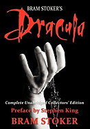
Here’s a really recent rendition of Dracula, published in January of this year by NMD Books. I love the title font; it’s perfectly representational of the horror feel, red and dripping. I like, too, that that font isn’t used again for the (too much) author/preface text below or it would have impacted the power it has. I can’t say, though, much else appeals to me about this cover. While I like the idea of the hand and the necklace chain woven between the fingers, it’s cropped and Photoshopped strangely. The white-gray color is too sharp a contrast with the black and red. The image looks amateur, especially compared to other takes on the cover image.


Let’s go back to a 1957 version, published by Perma Books. Something about this cover screams classic horror to me; it’s quite reminiscent of a lot of the movie covers of the time. This might be one of the few iterations of this cover that doesn’t feature a Gothic typeset, but I think this font works quite well. Aside from being red (a trend, you’ll notice), it’s a bit shivery. It’s got that horror vibe without being over the top nor too obvious. But the illustration and image on the cover? I’m not sure. The blue is actually kind of light hearted, along with the pink box with a yellow sun. The shadowed hand with the claw-like fingers almost feels comical as it reaches toward the woman, which is an actual image, rather than clip art or illustration. While those things don’t really add up to the vibe I get about the book, there is something classically pulp about this cover that I really do enjoy.


This Modern Library edition is from 2001, and the reason I wanted to talk about this one wasn’t the red (though that’s been a theme), nor is it because it fits into the style of all the Modern Library editions. But I wanted to talk about the symbolism here: the neck with a cross on it. One of the things that really stands out to me in looking at the different versions of Dracula is the choice of images used to represent the novel. We’ve seen castles, we’ve seen vampires, and we’ve seen variations on both those themes. But this cover crosses into something completely different, and that’s the symbolic. The cross carries a lot of weight on the cover and offers an interpretation of the story that’s different than so many of the others. I don’t want to say there’s hope in this cover because I don’t think that’s the case; rather, this cover suggests the idea that religion is strong and powerful. It’s over the model’s neck — a place of vulnerability — and protects it.

The last cover I want to talk about is this recent (September 2011) Vintage Spanish edition. I’m not sure why, but I think of all the covers of Dracula, this one might be the most evocative and most provocative for me — it gets to the heart of the story without ever once giving a hint at this being a vampire novel. We know, though, looking at the bare neck. Placing the title and author right there only add to that. I love that this is a painting and not a photo, too, as I think it makes it just that much different and yet conveys the classic feel of the book. We all know what’s going to happen here, too.

I’ve taken a little walk through a handful of Dracula covers, and I’m eager to know what you think — do you like any more than another? Maybe what interests me more is what your favorite covers are; there are hundreds of versions of the cover, some that were published and some that are straight up fan art. Share a link in the comments with your favorite. What better way to set the mood for a good horror read than a gallery of covers of one of the classics in the genre?

Filed Under: aesthetics, cover designs, Horror, Uncategorized

  • « Previous Page
  • 1
  • …
  • 12
  • 13
  • 14
  • 15
  • 16
  • …
  • 32
  • Next Page »
  • Facebook
  • Instagram
  • Pinterest
  • Twitter

Search

Archives

We dig the CYBILS

STACKED has participated in the annual CYBILS awards since 2009. Click the image to learn more.

© Copyright 2015 STACKED · All Rights Reserved · Site Designed by Designer Blogs